UI Design Strategies for Email Conversions: Capturing Attention & Driving Results
In a world of fleeting attention spans, you cannot expect conversions from a boring email. You need emails that are easy to use and impossible to ignore. You need to craft emails that not only land in the relevant inbox but also leave a lasting impact on your audience. And for this, you need to pay attention to the UI design strategies for marketing emails. It is all about creating scannable layouts, persuasive CTA buttons, and mobile-friendly designs that grab attention and get results
But are emails important in marketing even in this social-media-favoring era? Here’s a fact that might answer your question.
By the year 2025, the global count of email users is projected to reach 4.6 billion users. So, yes, email marketing is not going anywhere. And therefore it makes perfect sense to spend time perfecting your email strategy and your email design in particular. We have spoken about email marketing strategies earlier. So, in this blog, we’ll be tackling the design part, the UI design strategies in particular. Before we get there, let’s first understand the role that UI design plays in the conversion of a marketing email.
The power of UI design in marketing email conversions
From instantly grabbing the reader’s attention to helping them navigate through the email smoothly and convincing them to click the CTA (call to action), the UI design in an email has a strong role to play in its effectiveness. The UI design strategies we’ll be discussing in a while matter because even the most enticing email message will go unnoticed without a smooth and sensible UI.
So now, let’s look at a few reasons why UI design is important in the conversions of a marketing email.
- With the right UI design strategies you create a visually appealing email that users do not regret opening. Once you have gotten a user’s attention there is a good chance of delivering the message too.
- A user-friendly UI in your marketing email means that users do not have to struggle to navigate through the content and find what you are trying to tell them. This means that they can grasp the message quickly.
- Approximately 81% of email subscribers show a preference for reading emails on their smartphones. And by attention to UI design strategies for marketing emails, you can create emails that adapt flawlessly to various screen sizes.
- UI design plays a key role in making your CTA buttons visually distinct and thus increasing conversions.
Convinced? Let’s now dive into the UI design strategies that can effectively boost the effectiveness of your marketing emails.
The key to designing engaging emails – 6 UI design strategies
1. A header that lays a strong foundation
Your header makes the first virtual handshake with your audience. A lot of factors determine whether your email header falls flat or grabs attention. Let’s look at a few of them:
- Branding – one of the easiest and most popular ideas utilized by most brands to make their head stand out is to add the company logo in this space. This way you instantly imprint your brand in your email subscriber’s mind.
- The use of contrasting colors – if your header is going to blend into your email background, it does not make much of an impact. So, add your brand palette and contrasting background color.
- Keep it simple and clean – don’t pack too many details into your header. Too much information or visual clutter may overwhelm recipients and lead to lower engagement.
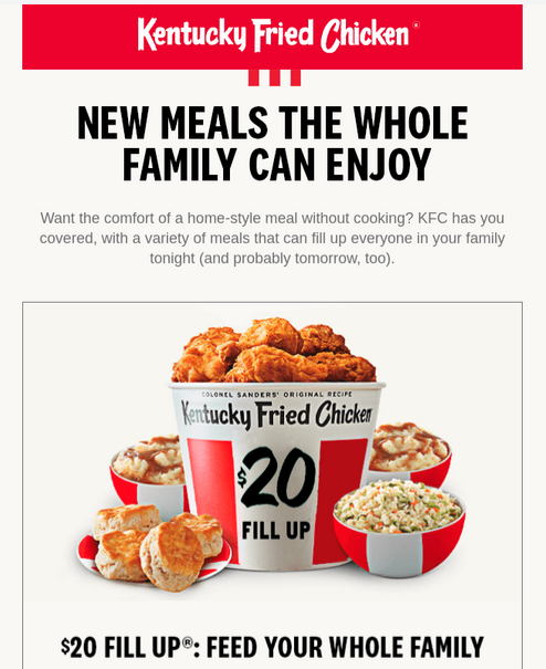
The below email from KFC uses a header that strongly establishes the brand without any visual clutter.
2. A well-defined visual hierarchy
When you are struggling to come up with the right layout for your marketing emails, prioritize visual hierarchy and you can never go wrong. So, one of the most important UI design strategies to remember when designing emails is to pay attention to visual hierarchy.
When it comes to communicating your message to your target audience, you might have a lot of ideas in mind. But when you have to put them down into one single email, you need to ensure that there is a logical order of presenting the facts that lead up to the message. That’s what visual hierarchy does. It helps guide the email recipient through the email content. And yes, whether you have a short email or a long one, you simply cannot ignore visual hierarchy.
Let’s talk about some tips to ensure visual hierarchy in your email UI:
- Use text to create hierarchy – differentiate heading text, subheading text, and body text. Big bold headings, slightly smaller fonts for subheadings, and even smaller yet conveniently readable fonts for the body text – you know the drill! The below email from Evernote clearly uses font size and bold formatting to define the order of priority for various text sections within the email. This makes it easier to draw attention to the important parts of the message.
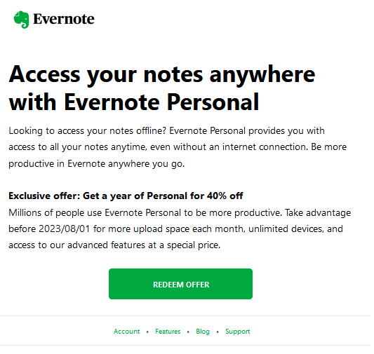
- In the above email, in the midst of the text-heavy design, all eyes are on the CTA. One of the reasons for this is the use of white space around the CTA button. White space or negative space is another element that helps adjust the hierarchy in your email. Use it to draw attention to a specific element or to indicate the difference between two different sections in your email.
3. Clear call-to-action
Every little detail about your email CTA determines the conversion of your marketing email. And therefore, positioning your CTA and choosing the right design for it are among the top priorities when you are thinking about the UI design strategies for your marketing emails.
Let’s first talk about the positioning of the CTA button. Your CTA should be prominently visible and easily accessible. It’s a good idea to place your CTA at the top right after providing the value proposition in your email. The primary CTA of the email should be placed above the fold. If users have to scroll down to find the CTA, the chances of them clicking the CTA drastically drops.
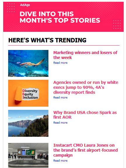
Then comes the decision about the number of CTAs to use in your email. The choice entirely depends on the purpose of your email. For an email that’s meant to take the recipient to the next stage in the purchase funnel, a single CTA works. But in the case of emails featuring shopping guides, weekly round-ups, and so on, multiple CTAs make better sense. In such cases, place the CTA right next to the respective product or post being discussed. The below blog round-up email from AdAge shows how this is done.
Customize the CTA to suit the context of the email and the next step in the buyer’s journey. Personalized CTAs outperform basic CTAs by a staggering 202%. Take the below event announcement email from Adobe for example. Since it is a live session, the email incorporates a link to directly add the event to the recipient’s calendar.

If you are looking for tips on designing CTAs that stand out in your design, check out the KIMP blog on CTA design.
4. Use interactive elements
Media elements have become critical components in UI design. Therefore we cannot leave them out when discussing the UI design strategies for marketing emails. Micro-interactions can become that little nudge your marketing email needs.
So, what kinds of interactive elements can you use in your email design?
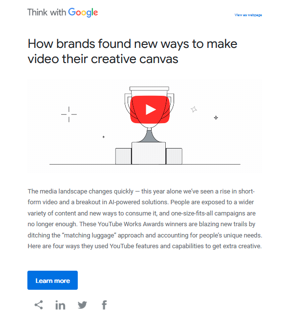
- Animated GIFs – these are the most popular options because movement attracts attention and GIFs are of small size and therefore do not affect the loading times of your email. Google, Canva, and a host of other brands use simple animations to bring their marketing emails to life. The below email from Think With Google, for example, has simple animated sparkles to grab attention instantly.
- Carousels – the other exciting element you could add to enhance the UI of your emails will be carousels. When you have a new product catalog to promote or a new limited edition collection, carousels do the job really well.
- Polls and surveys for instant feedback – when the recipients can directly record their responses through the email it saves them time and makes the feedback process simpler for them. This increases the chances of receiving feedback.

KIMP Tip: Branded carousels and GIFs can also be used to add a touch of gamification like scratch-offs. These increase the interactivity of the email and thus boost the conversion.
Need help creating branded carousels or GIFs or even with UI design for your business, a KIMP Graphics subscription takes care of all of these.
5. Add menus and anchor links
Data shows that about 1 in 5 emails are not optimized for smartphones. But nearly 61.9% of emails are opened on mobile devices. This disconnect highlights the importance of adopting mobile-responsive UI designs to ensure a seamless and engaging user experience for the majority of email recipients who access their emails on their smartphones. What’s one way to make your marketing emails easier to navigate on smartphones? Add menus and easy navigation links.
For example, when the email runs long, an accordion element helps in consolidating the information allowing users to delve into sections they wish to explore further.
You can also add anchor links to quickly take users to specific sections within the email. These look even better in the form of quick-jump buttons. (like the “back to top” button you see in most places).
Another way to customize the navigation within the email will be to use traditional menus that let users quickly head to specific pages on your website. Take a look at the below email from Target. Right below the header with the brand logo, you see a menu similar to that on the website. This makes it easier for users to visit the respective pages from the email. It reduces the number of clicks and makes it easier to find specific locations within the website.

6. Prioritize simplicity
Aiming for simplicity in your email design is one of the most powerful UI design strategies that works irrespective of the objective of the email and the target audience. A simple clutter-free layout makes the email easier to read on all devices. Additionally, you should also keep in mind the dwindling attention spans of internet users.
A study by Litmus found that people often spend just around 9 seconds looking at an email. To ensure that your message is delivered within these 9 seconds, stay away from confusing cluttered layouts or even overwhelming content presentations. Instead, opt for a clean and simple UI for your email.

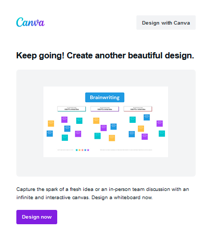
One way to achieve a simple layout will be to go with a single-column layout. This way you do not have a lot of distracting content blocks placed side by side. Therefore, users can glide through the information effortlessly as they scroll down. Additionally, a single-column layout works really well on mobile devices. Take the below Canva email for example. Crisp text, a visual to attract attention, an easily readable font, and a single-column layout – the email is a perfect example of simplicity in marketing emails.
Wondering how to establish your brand while aiming for a minimal design? Leave your email and UI design to the professionals!
Create engaging UI designs with KIMP
Overwhelmed by all these UI design strategies? Wondering how to make them work so that you see the conversions you expect from your marketing emails? Working with professional UI designers is one easy way to do that. This way, you do not have to worry about visual hierarchy, finding the right layout, optimizing for responsiveness, positioning the CTAs for conversions, and choosing interactive elements for engagement. The professionals will sort them out for you so that your message materializes beautifully in the form of a user-friendly email.
Sounds like something you would like to explore? Set up a call with the KIMP team and we’ll tell you how to simplify your email and other marketing designs as well as UI designs in the most cost-effective way!
Or sign up for a free 7-day trial of KIMP!