UI Design Elements 101: Tips and Techniques
In the not-so-distant past, our interactions with digital devices were characterized by the satisfying click of manual buttons. So much so that some of us developed the art of typing without looking. Things changed with the introduction of touch screens.
With the advent of touchscreens, the way we interact with applications on digital screens has changed. And yet, when you open your favorite app your fingers maneuver in the right direction because you have gotten familiar with exactly where the different functions are. This natural flow in our interactions exemplifies the significance of User Interface (UI) design elements – the driving force behind our seamless digital experiences.
These UI design elements enable users to engage with applications through simple taps and swipes. So, what does it take to build a user-friendly user interface? From intuitive navigation and interactive components to visual hierarchy and micro-interactions, let us delve into the dynamic world of UI design elements, unraveling the secrets to crafting an interface that users will love.
What are UI design elements and why should you know about them?

UI design elements are the building blocks of a UI design. It is what establishes the visual experience and interactivity on a website, or mobile app. Irrespective of the device for which these pages are designed, UI design elements ensure that there is two-way communication happening.
Accordingly, you need to add elements that help users navigate through the content and take a step or provide an input. To simplify this, UI elements are categorized into groups based on their functionalities. This makes it easier for you to check if you have added the essential elements for the kinds of interactions you expect on your page. Below are the well-known categories when it comes to UI design elements.
- Navigational elements – help users navigate through the interface or even jump between pages
- Informational elements – they inform the user what a particular section is about or even the progress of an action based on the input from the user
- Input controls – these are the elements that allow users to execute their decision by giving an input or making a choice.
- Container elements – they contain other elements which could be design elements, media, and other content
Having briefly understood the functionality-based categories in UI elements, let’s now talk about the essential ones to include in your design. Because less is more when it comes to UI design. You do not want to present too many options that leave users confused. Or too few options that leave them puzzled about what to do and where to find the details they are looking for.
Essential UI design elements to include for better engagement
Let’s expand over the categories we just discussed and look at some of the most commonly used UI design elements in each. And we’ll also quickly look at some tips on the design and optimal placement of these elements in order to achieve a user-friendly user interface.
Navigational UI elements
As the name indicates, these are the UI design elements you need to include in order to help users navigate to the right page or position to find the information they are looking for. Let’s now look at some of the most commonly used UI design elements that help boost interactions on a website or app.
1. Navigation bars
In the below snapshot from the Amazon home page, the bar in black where you get a glimpse of the various categories of products you can shop for is the navigation bar.
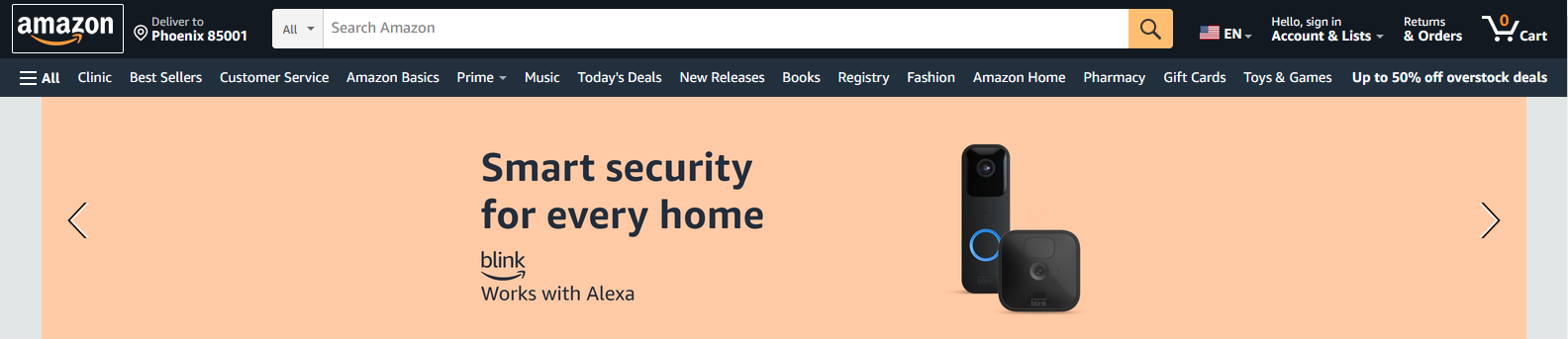
The menu bar is the elementary block that helps users quickly get an overview of the different locations on the website. This can be as a standard horizontal bar as with the Amazon website or as a tab bar (as in the case of mobile applications). A sticky navigation bar averts the need for scrolling all the way up in order to navigate to a different section on the site.
KIMP Tips:
- The optimal position for the navigation bar is at the top. This can be right below a website banner if you have one. If it is a mobile application, the sidebar on the left works too.
- Use crisp labels that directly convey where they lead customers too.
- Color changes and other hover-related feedback enhance usability.
Finding it hard to identify the right type of navigation bar for a user interface or finalizing its placement? Leave it to the professional UI designers at KIMP!
2. Breadcrumbs
Take a look at the below snapshot from the website of Entrepreneur magazine. Notice the trail of topics indicating that the particular page is within the ‘Management’ category within the ‘Leadership’ segment. This indicates the path you have taken on the website.
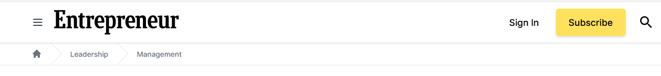
Not all websites include breadcrumbs but it is a good-to-have UI element. It makes it easier for users to go back to the section they visited earlier or browse more in the same category.
KIMP Tips:
- Just below the horizontal menu bar is a good placement for breadcrumbs. This also maintains the visual hierarchy on the page.
- Adding icons like the arrow navigation in the above example helps distinguish the segments and establish the relationship between them.
- To distinguish between the main menu bar and the breadcrumb, you can use smaller and lightweight fonts with a strong way to differentiate between hover and active states in them.
3. Hamburger menu
This is a compressed version of the menu bar element and is a great option, especially for the mobile app interface. Some websites use a combination of both the hamburger menu and the menu bar for ease of access.
Amazon uses both these menu elements as you can see in the mobile app snapshot below.
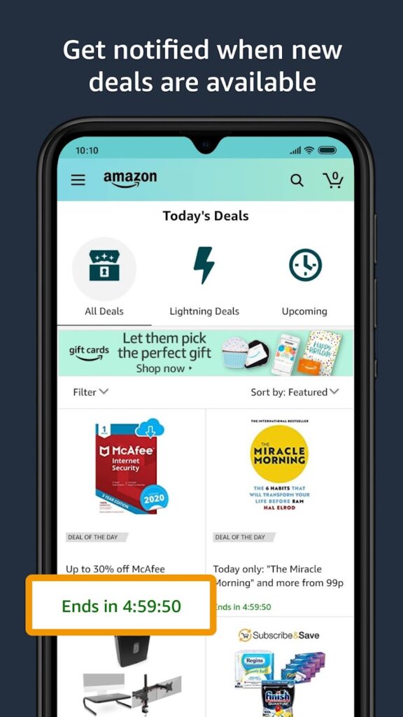
The hamburger menu gets its name from the signature hamburger-like appearance consisting of 3 horizontal lines which is instantly distinguishable as the menu icon.
KIMP Tips:
- Top corners are the perfect placement for a website UI design.
- In the case of mobile applications, a bottom-right placement makes accessing the hamburger menu really easy.
- Simple and smooth animations to indicate the expansion and collapse of the hamburger menu enhance usability.
4. Pagination
In the below snapshot from the Hootsuite blog, the section with page numbers at the bottom is the pagination. This UI element is particularly handy within your blog site where you have multiple pages of content for users to browse. Pagination is also helpful when you have to post long articles that are split into multiple pages.

KIMP Tips:
- The ideal placement for pagination is at the bottom of the page preferably centered so that it is hard to miss.
- To make the navigation through pages even simpler, add options to manually enter a page number or quickly move to the next/previous pages and first/last pages.
- Since pagination does not look good when it takes up a lot of space, you need to use a font that looks good when scaled down. Sans-serif fonts work well without taking up too much space or restricting readability.
5. Search bar
On some websites, users search from the website menu, and on some, finding what they are looking for by navigating through different categories and collections might be tedious. In such cases, customers might look for a search bar that lets them quickly find what they are looking for.
Ecommerce websites are a good example of this. When you are looking for say a photo frame, you might not always have the patience to identify the product category where photo frames are listed. Instead, you might find it easier to key in the term into the search bar.
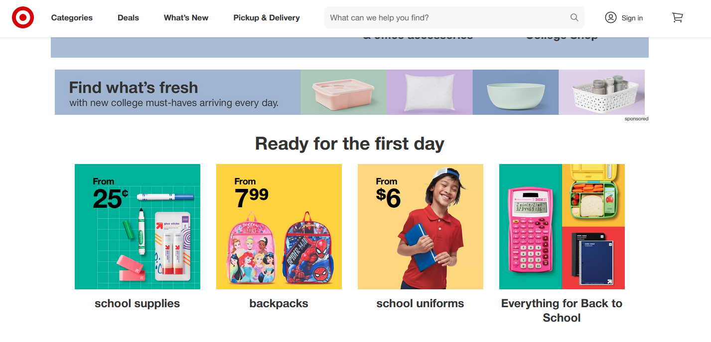
The Target website, for example, uses a sticky horizontal navigational bar on top with a Search Bar embedded in it.
KIMP Tips:
Instead of using generic text like “search” add a crisp description of what customers can find through the search bar. Something like “What can we help you find?”, as you see on the Target website, or “Looking for something specific?”. Or you can also find cues from your niche. For example, on a food ordering website, you can use something like “Search for restaurants or cuisines” or “Find your next delicious meal”.
Informational UI design elements
These aid users to better understand your website and the various segments in it. Sometimes these UI design elements are also used to educate users about what happens when they click on a particular button or select a particular option. Let’s look at some of the most useful informational UI elements you can add.
1. Tooltips
Have you noticed the text that appears when you hover over some elements on a website? These often tell you what the particular menu option does.
The below snapshot from the Amazon website shows how you can use tooltips to direct attention to a particular function on the page.

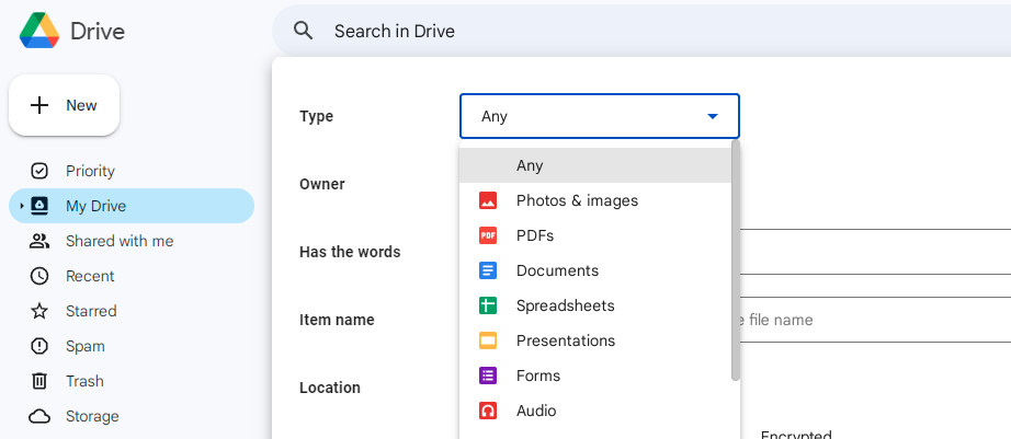
Another very handy application of tooltips is when you use illustrated icons so that the menu options do not take up too much space. For example, hovering over various items on Google Drive displays such tooltips. The “View Details” text in the below example is a tooltip.

KIMP Tips:
- Evidently, the optimal placement for tooltips is close to the respective icon or menu item they describe.
- Ensure that the tooltip is not displayed masking the perspective menu icon. A reasonable amount of space ensures that the text is readable without being obstructed by the mouse pointer.
- Use concise labels – wordy tooltips are not aesthetically appealing nor do users have the patience to read long text as they hover over items.
2. Progress indicators

Progress indicators are useful UI design elements that give timely feedback on an action that the user had taken recently. For example, when you upload or download content on the site or when you place an order, you see a progress bar displayed. This indicates the status of the download or the order. It helps you track the response to the input you gave.
These are also handy in telling users that there are more steps coming up. In the case of uploads or downloads, these will be steps the user has to take and in the case of order tracking these indicate the steps the business takes.
KIMP Tips:
- The best place to add your progress indicator will be right next to the CTA that comes after or just below the action button that the user previously clicked.
- Horizontal bars with milestone markers and circles indicating the progress in percentage are the most commonly used. Add animations for a more engaging experience.
3. Alerts/notifications
The Notifications menu item on Twitter seen in the snapshot below is an example of using Alert elements on a website. Sometimes, these are part of the navigation menu as you see on Twitter or they can be displayed at the top right corner of the website on the header.
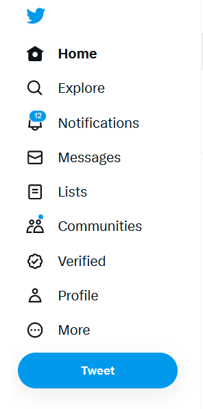
The purpose of the notification UI element is to notify users of an update. This can be an offer announcement that needs their attention or a useful update on their order or account status.
KIMP Tips:
- The bell icon is the most common option for the notification element.
- To make the most of this element, animate the bell icon when there is an update. And add labels to indicate the number of updates to catch up on. These ensure that the user’s attention is immediately drawn to the notification element.
Input controls
Input controls are the UI design elements that allow users to input some kind of information in order to proceed to the next step. Often, the navigational flow on the website branches out based on the input provided. In other words, each input directs users in a different direction.
The placement of the input controls depends entirely on the function of the respective element and the supporting text sections that go with it.
So, what are the commonly used input controls? Let’s find out.
1. Button
Mimicking the functions of a physical button on a keyboard or a keypad on a feature phone, buttons are the most important UI design elements on any page. These are the elements that present the CTA (call to action) on a page and therefore act as drivers for conversion.
Therefore, the wrong text on a button, the wrong placement, or the wrong size or poor contrast making these buttons go unnoticed often means that users drop off. Unlike other elements where there can be multiple actions and purposes, every button on a page has a single defined purpose.
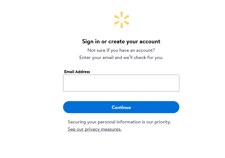
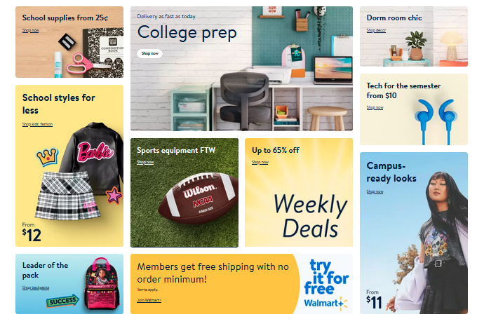
For example, the “Continue” button on the Walmart website’s account creation landing page means that once the user keys in an email id and clicks on the button, they will be redirected to the next step in the account creation process.
2. Radio button
The radio button allows a bit of personalization before users click on a button on the page. These are used to indicate mutually exclusive options on the page where the user can only choose one before proceeding to the next page.
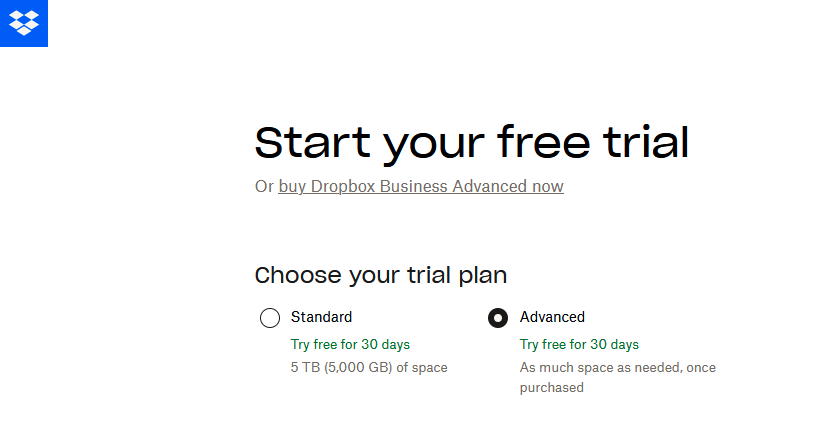
The below radio buttons on the Dropbox website allow you to choose a plan you wish to proceed with when you choose to sign up for a free trial.
3. Toggle button
When there is an input field that involves a “yes/no” decision, then a toggle button makes a great choice. It is more creative than using traditional radio buttons labeled “yes” and “no”. Moreover, the toggle button also takes up very little space.
Use easily recognizable color differences like a colorless button vs a green button for “no” and “yes” respectively. The red and green difference between a “no” and “yes” choice is also a good option.
4. Dropdown list
Like radio buttons, these dropdown lists are also useful UI design elements when the user should be able to choose only one option at a time. But in this case, instead of adding the options side by side or listing them down vertically, they are compactly packed in a dropdown list. The list is displayed only when the user clicks on the field. It is particularly useful when the options are plenty and when you have limited space to display them.
We’ll take Google Drive again as our example. When you want to search for specific items or filter search you see a form where some of the fields have a text field to manually enter the value and some have dropdown lists. Like the file type option in the snapshot below.
The other variations of dropdown lists to explore are the listboxes and comboboxes. Listbox lets users select multiple options from the dropdown list.
Or if you would like to go with a hybrid option letting users either enter their own value or select from the options available use a combobox. It occupies the same space as dropdown lists but provides added functionality.
5. Checkboxes
When you want to allow more than one input from the user at a given time, then checkboxes are handy. This is useful when you have to allow filtering search results based on multiple options.
To understand this better, take a look at the “Free” and “Premium” options appearing in the dropdown list on the Freepik site below. Once you select a specific category of designs you can further narrow down based on whether the displayed designs are free or paid. This is a good example of the kind of applications to explore with checkboxes.

6. Text field
Text fields are particularly useful on the homepage where the user has to sign in or on a landing page with a form. You can adjust the placement of the text field element as well as its size depending on the details to be filled in and the CTA on the page. It can either be placed on the page directly, as in the case of a search field or page number entry in pagination or can appear as a part of a form with multiple fields for the user to fill out.
Container elements
While the other UI design elements we discussed until now are more for the functional aspects, container elements are those that help give a structure to the layout. These are elements that contain media or other types of content or even other UI elements. They simply help organize the elements in a coherent and visually appealing manner. Evidently, you need them in order to establish a clear visual hierarchy which helps in communicating the message as intended.
So, what are these container elements to explore in your UI design? Let’s find out.
1. Cards
Card-based containers are the most versatile UI design elements. They come in handy when you have to create a visually immersive layout for your website or app. By arranging
cards of various dimensions you get to explore different layouts for your page. Additionally, with media-rich cards, you can also categorize the content on the page.
Take the Walmart website’s home page for example. The aesthetic arrangement of cards focusing on various offers and product categories in focus help drive engagement to these pages.
KIMP Tips:
- Identify the right grid structure for your cards to work well without causing a cluttered look. In the Walmart example we saw, since the cards are of different dimensions, the columns are fixed and there is a uniform spacing between these cards. Together these little details make the cards look appealing.
- Stick to a limited color palette for the cards or go monochrome if required. If you are creating several cards for different products, add a clutter-free image of the product on a white background for uniformity.
When the same team takes care of the designing of graphics to feature on these cards and the UI design part, things get so much simpler. Want to see how this streamlines your process? Get KIMP!
2. Accordions
Accordions are container elements with collapsible sections within them just like the folds of an accordion.
When there is a lot of information to convey and when you can segregate that information into categories, then an accordion works. For example, the below snapshot shows the FAQs section on the KIMP website. Accordions are particularly useful in the FAQs section on your website. Because they let you present all the answers a new customer might be looking for without crowding the layout.

KIMP Tips:
- Keep the labels brief.
- Don’t forget to add visual cues that these are collapsible sections. Arrows pointing sideward when closed and downward when open, a “+” sign when closed and a “-” sign when open are some ways in which you can clearly indicate the state of each section.
3. Carousels
When you have a single media element or a block of text to display, you use cards. When you have multiple chunks of text to display, you use accordions. But what should you use when you have multiple media elements to display? That’s when carousels come into the picture. You can add them either as a single wide slide or as a horizontal gallery of scrollable slides.
For example, to display an array of the options available in its streaming services, Apple uses automatically scrolling carousels. In this particular application, carousels come in handy to display variety. So, they make a great choice to showcase your portfolio or the multitude of services you offer or even an assortment of recent blog posts on your website.

- Limit the number of items in a carousel. You do not want to overwhelm users.
- Add endless scroll to make it easier for users to get back to something they liked earlier.
- Don’t forget to include navigation indicators in the form of arrows or chevrons, swipe or drag indicators, progress bars or even paginations.
UI design made simple with KIMP
Summing up, there are endless choices when you are choosing UI design elements. How you put them together and how you stay on brand while creating an engaging layout influence whether or not these elements solve their purpose. Working with UI designers can make this happen. Did you know that UI design is also part of your KIMP subscription now?
Want to hear more about this? Book a call with the KIMP team today!