Canva Design Tips: Insights from Canva Designers to Elevate Your Creations
Canva has transformed the way DIY design works. Aspiring designers as well as marketers who want to explore their creative side can now try their hands at designing their graphics without prior design experience. All thanks to Canva templates and the endless customization options it offers.
However, it is this simplicity of Canva that can be a bane sometimes. Because if you are a marketer using Canva to create your brand’s graphics, you know that your competitor also has access to the template library and customization options. This means that you need to go that extra distance to personalize your design, give it your creative touch and make it look and feel like your brand. And not feel like a copy of what’s already out there!
All this pressure makes customizing Canva designs feel like an intimidating task. But let’s change that! How? Well, hear it from Canva designers who have explored every category of design and all the cool customization options on Canva.
We’ve rounded up the most useful Canva design tips that anyone trying their hands at this tool might find useful.
Before we get to our design tips, let’s quickly look at the plans that Canva offers and how they impact the extent to which you can customize your designs.
Canva pricing and plans
Whether you are working with Canva designers or creating your designs yourself, the paid plans on Canva might feel like a better alternative in the long run. Because these plans come with a wider selection of design assets as well as access to a lot more features when compared to the Free plan. And given that you are creating designs that represent your brand, you need all the options there are.
So, what are the paid plans offered by Canva? How do these plans enhance your scope of designing on Canva?
- Canva Pro
- Canva Teams
In terms of access to image editing tools, options to save designs in various formats as well as access to premium design elements, both Pro and Teams are similar. The Teams plan simply adds more features that simplify collaboration and streamline the design workflow in a company. Let’s talk about the Pro plan first.
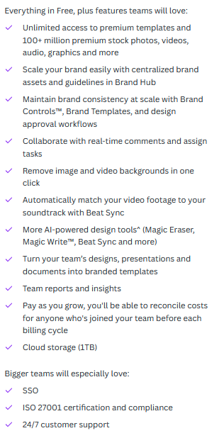
Canva Pro

The above image shows a snapshot of what the Pro plan comes with. As you can see, the main advantages this plan offers in tweaking your designs include:
- Option to explore a larger library of templates and design elements (meaning that you can create a more unique design for your brand every time)
- Support for 100 brand kits (meaning you can save multiple brands and instantly apply various brand identity elements – a handy feature for marketing agencies handling several brands)
- Additional options like custom resizing, background removal (useful while creating ecommerce product images), AI-powered design tools (for finer image editing even without prior design experience)
Canva Teams
From the image, it is pretty evident that Canva Teams differs mainly because you gain access to all the editing features we discussed in Canva Pro along with the option to add more than 2 members for real-time collaboration. Additionally, the plan also lets you add up to 300 brand kits (while Pro only supports up to 100). So, if you are a large marketing agency investing in Canva designs, you might find this plan to be a better option.
Considering all the collaboration advantages that Canva Teams offers, you might also find this plan a more practical choice when you work with Canva designers. This way you will be able to add your internal team members as well as Canva designers to your profile. And as and how your Canva designers start working on your designs, you will be able to track progress in real-time.
Having spoken about the core differences in Canva plans and how they influence the freedom to customize your designs let’s now get to those design tips we promised you. We hope these quick insights from Canva designers will change the way you design on Canva or even how you collaborate with Canva designers.
5 useful design tips from Canva designers
1. Learn the language of colors
One of the most critical decisions that Canva designers make is the color palette for the design. Yes, your brand colors take priority but you would need supplementary colors to add more depth to your design.
But remember that colors evoke emotions. So you do not want a confusing palette that sends out an unclear message. To avoid this, stick to a simple palette of three or four colors. Anything more than this will make the design look crowded and unprofessional.
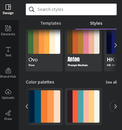
Looking for inspiration? Canva’s standard color palettes are a great place to start.
If you need ready-to-use color palettes on Canva, you will find them under the Styles menu in the Design tab while editing your design.
KIMP Tips:
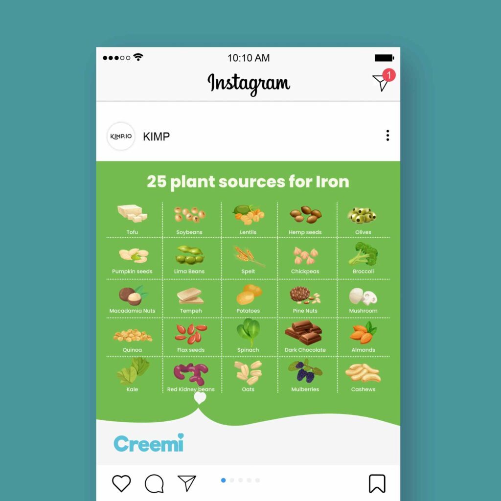
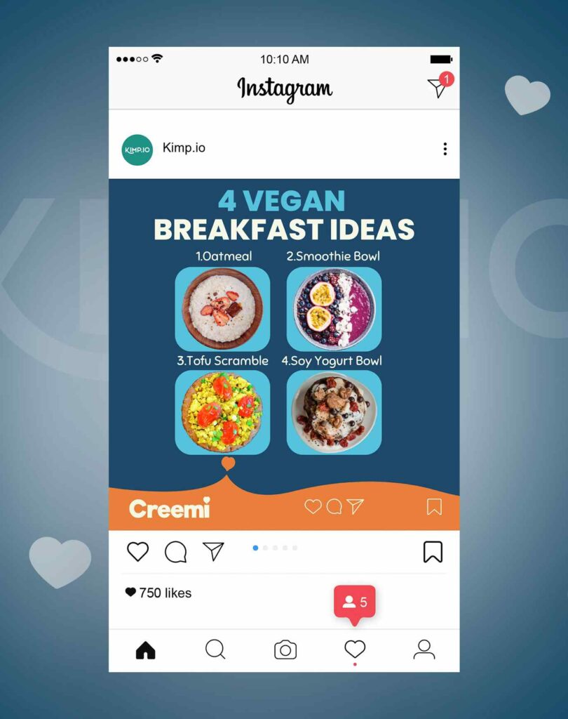
If your design has several products/images to be featured, a single dominant color will do the job. This lets the individual images shine (as in the below image).
Struggling to put colors together? Understand the color wheel and choose combinations based on color harmonies. The below design for example uses a complementary color palette that looks visually appealing.
2. Pair the right fonts
Typography is a building block in design. Because fonts hold the ability to either exude professionalism and enhance visual allure, or transform the design into a subject of ridicule. You need fonts that are easy to read and aesthetically appealing too. For this, it helps when you do some research on font psychology.
But that’s not all! There is the topic of combining fonts because sometimes one is not enough. Font pairing is easy on Canva with all the standard templates available. Most Canva font combinations are delivered as pairs as two fonts are often enough to create the right level of variety without affecting the visual harmony in the design.
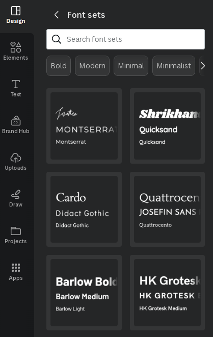
For quick inspiration on Canva, choose from the standard Font Sets from the Styles tab in the Design menu.
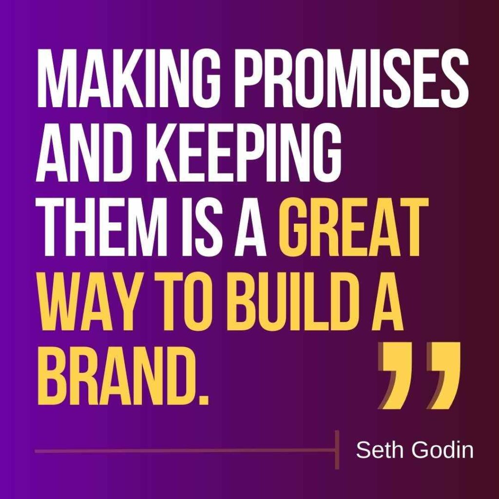
If you are not sure how to pair fonts, choose one statement font and one simpler font. The statement font can be used to draw attention and the simpler font can capture critical information in the design. A combination of one serif font and one sans-serif font is a very popular option. The below design shows how this combination creates a balanced look.

KIMP Tips:
Similar to restricting the number of different colors in your design, even with fonts, less is more. Because too many fonts can mess with the hierarchy of the design and affect the visual appeal as well. That’s why most Canva designers stick to a combination of two fonts.
Need a more professional look? Choose just one legible and elegant font and play with line weight and font size variations. The below design shows how you can establish a hierarchy by varying the font size.
3. Using photos in your design
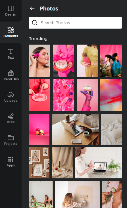
Photos don’t just make a design look attractive but also convey the information clearly. Canva has a brilliant collection of stock photos in various categories and the Pro accounts have access to an even larger range. You can choose from the trending photos in the Elements section.
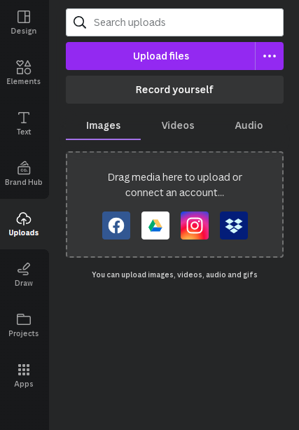
Or you can upload your own photos as well. In the Uploads section, you can add photos from your computer, or from your social media accounts.
KIMP Tips:
Choose relevant photos- you do not want to crowd the image or confuse your audience using irrelevant images. For this, clearly define the purpose of the photo – is it to supplement the information provided in the text, or is the photo the hero component in the design (this might be the case for product images)?
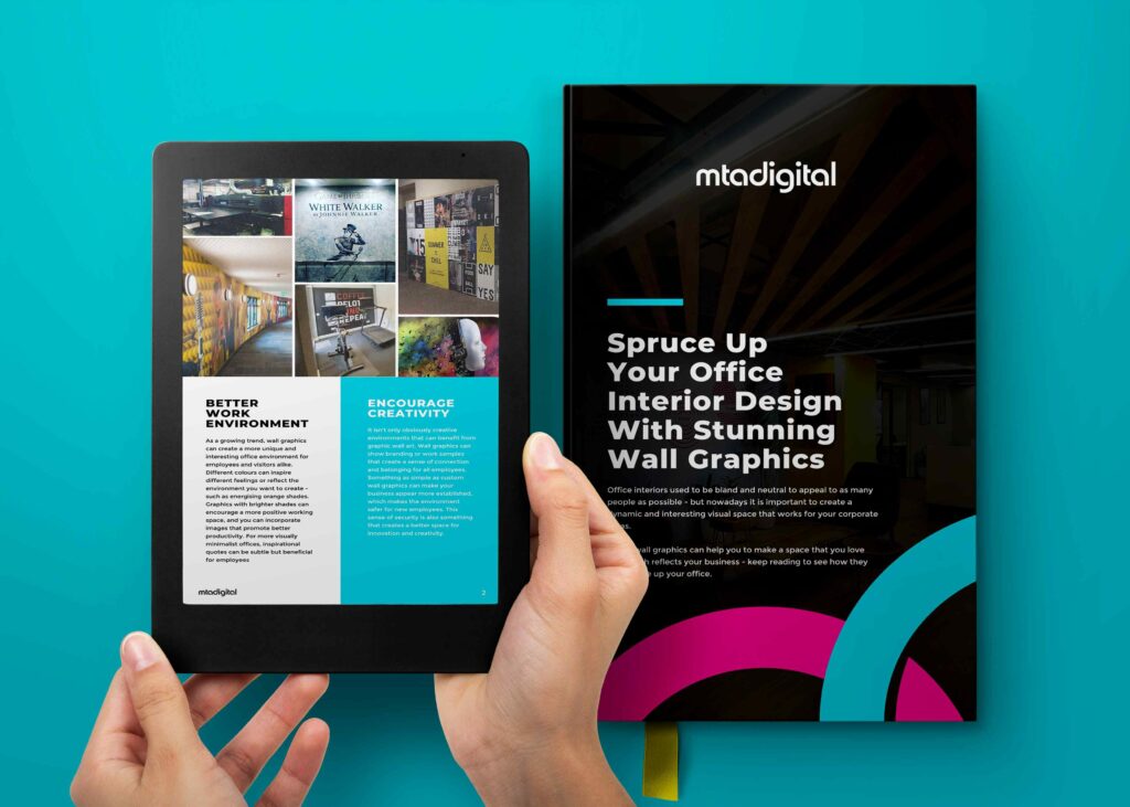
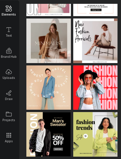
When your photo is the hero element, design around it. You can use colors from the photo for the rest of the design for a more seamless look. The below fashion templates on Canva show how this can be done.
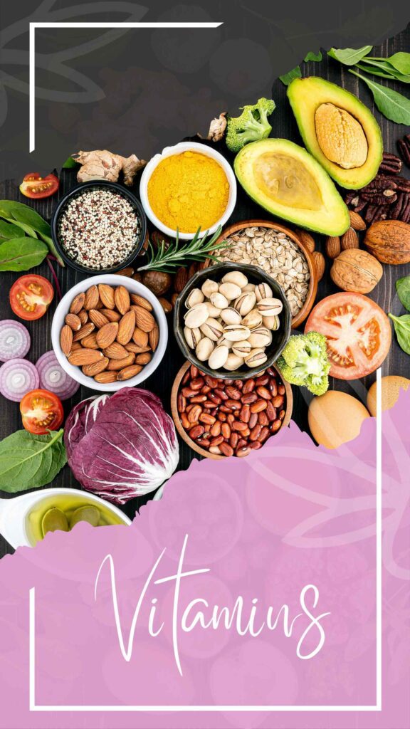
If your photo is only a supplementary detail and you want the text to dominate, send it to the background and make it translucent so that the text pops out, as in the below design.

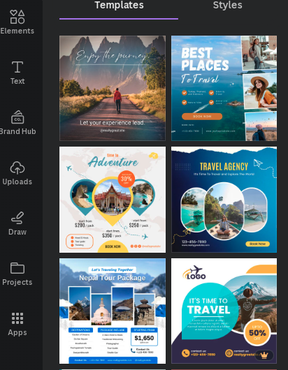
When you have multiple photos within the same design, use standard grids or crop them in shapes to arrange them aesthetically. For example, when you are creating a promotional design for a travel package, you might want to include snapshots of various destinations covered. The below travel templates on Canva show how you can creatively combine several photos in one design without a cluttered look.
4. Contrast – the inevitable design element
Contrast is a crucial element in design – be it the contrast of color or the contrast of size. Because without contrast, your design elements cannot be distinguished from one another.
For example, when you have a busy background- a textured or patterned background or even a photo background, the text on the front might not be easy to read. So what can you do about this?
- Make the photo background translucent and use fonts of thicker line weights.
- Or use solid-filled rectangles, ovals, or other shapes right behind the text layer. This way your text stands out from the background, as you can see in the below design.
The other kind of issue arises when there is poor contrast of colors. When you have solid backgrounds or gradient backgrounds, the color of the text in the foreground determines how easy or difficult it is to read the text. While black and white might seem like the obvious choice, any complementary color works too.
Finally, the other critical type of contrast is the contrast of size. If all your design elements are of the same size, or if all the text sections in the design are of the same size, it drastically affects the hierarchy in the design. How will your reader know what to read first and what to read at last? Without this hierarchy, your information is not conveyed as intended.
To avoid this, here is a quick tip from Canva designers. Use the default text styles in Canva as a starting point. There is a clear contrast between the title text, subheading text, and body text.
5. Put your brand in the forefront
While you execute all the above design elements and tips in your Canva designs, you should also be mindful of your brand identity. Canva designers recommend using the Brand Hub on Canva to achieve this. Brand Hub access is available with both Teams and Pro plans.
According to Canva, Brand Hub is “one central place to make, manage and market your brands”. This was previously called Brand Kit on Canva and all the Brand Kits you had set up earlier will now be accessible through Brand Hub.
Brand Hub is where you can add and access all your brand assets conveniently. These include:
- Brand colors
- Brand fonts
- Photos
- Icons
- Logo variations
By setting up your brands, you can easily achieve visual consistency that helps in establishing your brand’s identity in a competitive space. When you are a marketer juggling graphics for multiple brands you do not have to import colors or fonts each time or even try to remember the brand elements for each brand you manage. The Brand Hub simplifies it for you.
Work with Canva designers to save time and effort
Keep all these tips in mind when you design again on Canva. But this is only the tip of the iceberg. Canva has been evolving explosively and now with the suite of AI editing options added, there’s so much you can do on Canva. So, to be sure that you make the most of your Canva subscription work with professional Canva designers who can help tweak your design to your liking.
As an added advantage you also get to save a lot of time and effort otherwise spent browsing through the Canva library, making color and font decisions, referring to design principles, etc. Canva designers who have extensively worked with the tool know its ins and outs and they also spend time understanding your brand. When both these insights come together, magic happens.
That’s one reason why you should consider investing in KIMP’s Canva plans. Not sure if this will really enhance your design workflow? Sign up for our hassle-free 7-day free trial.