The New Reddit Logo: Rebranding the Front Page of the Internet
Reddit – the one place that several people think of when they think AMAs (Ask Me Anythings)! The place to find the latest trends and intriguing discussions. To connect with like-minded people and find answers to even the most peculiar questions. And today Reddit is also a great place for brands to build awareness, drive more website traffic, and even generate leads. Okay, all that you already know. Now what’s new to discuss? The new Reddit logo, of course!
Opinions on rebrands often tend to be polarized. That’s why brands rebrand only when it’s absolutely necessary – like a shift in the brand’s direction, their ethos, etc. So, what was this necessary driver behind Reddit’s rebranding? How have its customers responded to the updated new look? Those are the questions this blog will be answering as we dissect the new Reddit logo and identity.
Reddit – A Quick Look At The Brand’s Backstory
To understand the relevance of the rebranding and what the change means to the brand, let’s talk about how it all began.
In 2005, Steve Huffman and Alexis Ohanian who were college roommates, came up with an idea for a business model that would allow users to order food via text message and this was named My Mobile Menu. The business did not kick off as intended. In June 2005, the duo released a website dubbed back then as the “front page of the internet”.
The website was created as a space for users to share links to other sites and articles they came across – more like an online reference manual (the front page!).
As the website grew what truly set it apart was the fact that it had an algorithm that let users choose what content to push to the top – with the upvote option. Such customizations and unique ideas helped the platform gain popularity and today it stands as the 9th most visited website in the world. That’s good growth for two decades, don’t you agree?
So that was a quick look at its history. Without further ado, let’s look at the new Reddit logo.
The New Reddit Logo – What Has Changed?
In the above image, the logo on the left is the old logo and the one on the right is the new one. Here are a few things you probably noticed right away:
- The new one moves to a skeuomorphic design contrasting the flat design used earlier.
- The Reddit mascot (Snoo) is visibly more cheerful and playful in the new logo.
- Finally, the font is bolder, more refined, and with an unmissable new detail as well! (more on this a little later)
However, the brand has chosen to retain the Orangered color that has been the signature brand color of Reddit from its time of inception. That’s one way the brand has chosen to retain some of its signature traits while representing a shift.
Having covered an overview of the changes, let’s now discuss the details of this new Reddit logo design.
A refreshed Snoo
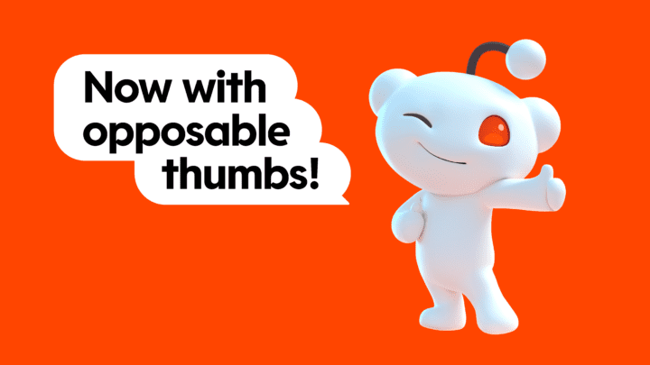
Take a look at the below picture of Snoo, the very popular friendly alien mascot of Reddit. Didn’t we say the new one is more playful? And as Reddit points out, this one also has opposable thumbs.
To understand how much the personality of Snoo has been updated, take a look at some of the older versions of this mascot in the below post where the brand talks about Collectibles designed based on Snoo.
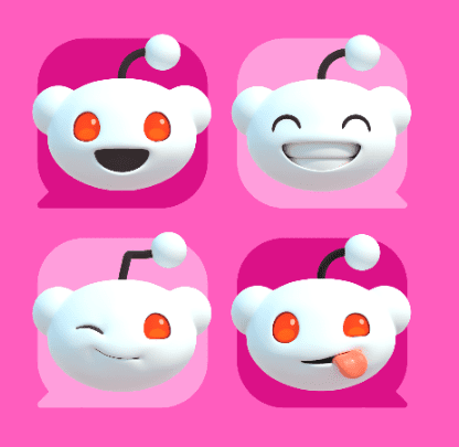
Moreover, the brand has also tried to humanize the mascot a bit more by introducing a fresh set of emotions/expressions. We have seen Reddit use these expressions across various applications to capture the essence of being eclectic, candid, and playful.
A bespoke typeface that sets the stage
The lively custom typeface used in the logo is definitely an attention grabber and one of the fundamental elements of the new Reddit logo. Did you notice that one little detail we spoke about earlier? Hint – it’s got to do with conversations (the thing the platform is all about)!
If you guessed that we are talking about the little divots in the letterforms, then you’re absolutely right!
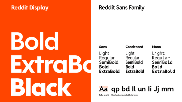
For the new brand identity, Reddit worked with Pentagram to create a bespoke font that accommodates the brand’s core focus – a tiny speech bubble. They ended up doing this brilliantly by concealing speech bubbles in their counterforms.
In fact, Pentagram created two different fonts for the new identity. The above font called Reddit Display is the primary brand font used in the logo and in most hero text and headlines. As for the rest of the text representing the Reddit brand, they have yet another clean and modern, visibly casual typeface called Reddit Sans which is available in different variations. The below image compares the structure of these fonts side by side.
The new brand colors
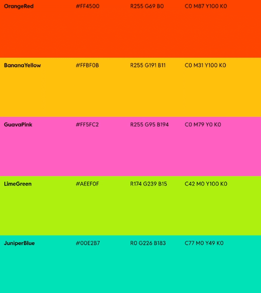
Orangered, as we discussed earlier, has become a strong brand identifier and is also a rare one to come by because you do not find too many brands use such vivid orange hues in their core branding. And a good rebranding campaign retains the best parts of the old brand – so did Reddit!
However, they have also added a bunch of other bold and peppy hues to their brand color palette now. These are colors that perfectly contrast and complement the primary Orangered while also adding a fun twist to the brand’s designs.
These other brand colors for Reddit are: GuavaPink, LimeGreen, BananaYellow, and JuniperBlue.
The variety here is meant to capture the diversity of the Reddit communities and the diversity of the users on the platform. The below image shows how Reddit has been using this new color palette in various places.

3D elements in the identity
To complement the new Reddit logo, there is also a bunch of new 3D elements introduced into the identity. These are elements that define the various communities and segments within Reddit – like questions, conversations, gaming, and so on.
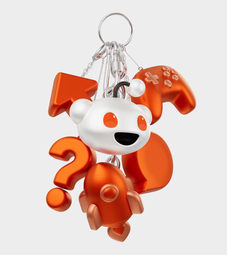
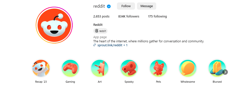
These 3D elements have been appearing in various places including the website and on Story Highlights on Reddit’s Instagram page.
In fact, to transition to this new look, the brand has been using some of its defining 3D icons and elements on social media posts and other designs, like the one below.
KIMP Tip: The refreshed new elements in Reddit’s brand identity show what it means to create a more unified and recognizable brand identity with a clearly defined visual style. From icons to mascot, brand colors to logo, social media profile pictures and cover images every single visual element that represents your brand should be cohesive. That’s when you leave a lasting impact on your audience.
Transitions and animations
What we loved the most about the new Reddit brand identity is that it is beyond just a new logo or a new look – it is a wholesome design ecosystem created with meticulous details. One of them is the transitions they have added to the new design.
According to Pentagram, the design firm behind this stunning rebranding, the motion behaviors created for the new identity include stretching of the bubble, vertical stacking, and layering of content. These are meant to mimic “sliding drawers and doors”. This again aligns with what Reddit is about – opening new doors to interesting conversations and perspectives and presenting people with a treasure trove of information.
So that was a summation of what has changed in the new Reddit logo and identity. Let’s now talk about the reason behind these changes and the response that the brand has received.
Why Did Reddit Rebrand?
An evolved identity
From the time of their launch, Reddit has changed in a lot of ways. And today, they stand as one of the most powerful online forums characterized by the discussions and conversations that happen on the platform.
With the niche of the brand having taken a clear shape over the years, they wanted to build an identity that emphasizes these signature traits that define the brand. And that’s where this rebranding comes in!
From the stronger characterization of Snoo to the more vibrant color palette now in use, the refreshed identity accurately captures this evolved brand in many ways.
Moreover, Reddit has also evolved from being an online discussion forum to a reliable advertising platform for brands. Therefore, it now caters to not just internet users looking for answers but also businesses looking for a place to meet their audiences and understand them better.
The touch of sophistication added to the refreshed identity adds a touch of professionalism considering Reddit’s diversified target audience segments.
To create something more cohesive
According to Pentagram, one of the reasons behind Reddit’s decision to rebrand was to create a more streamlined system for the brand. Over the years the brand has grown and evolved in many ways.
According to Statista, as of December 2023, Reddit clocked about 2.1 billion website visits. This number has been steadily growing over the past few years showing that the brand has been expanding steadily.
So, a lot has changed about the Reddit brand while the Reddit logo has remained the same. Therefore, with the new Reddit logo, an assortment of brand identifiers has also been introduced as we discussed in the previous section. Together these help the brand create a more consistent look and feel across their discussion forum, business hub, analytics interfaces, social media platforms and digital and print ads.
Let’s look at how Reddit is implementing these changes. The below image gives a snapshot of the refreshed website that cleverly incorporates the fresh identity.

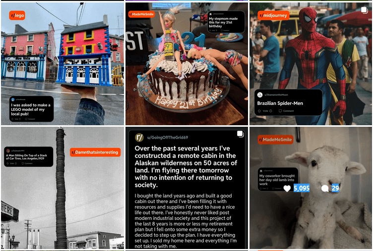
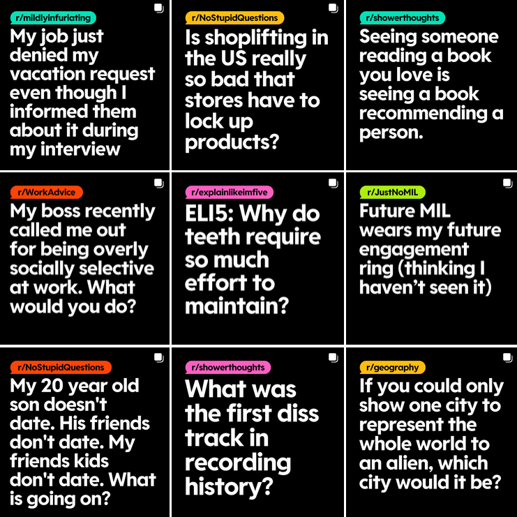
The first image below shows the Instagram grid of Reddit before rebranding and the next one shows the current grid with the new identity in place. Notice the kind of visual consistency that the brand has been able to bring into its social media aesthetics as a result of its clearly defined identity and brand elements.
KIMP Tip: Establishing cohesion is a compelling reason for rebranding. Because just like the clutter that an office desk accumulates over time, a brand’s identity might start gathering clutter over the years as the brand grows. So, a rebranding campaign that clearly defines the visual style and elements, tone of voice, and personality of the brand can benefit the brand greatly.
A possible connection to Reddit’s IPO
A big speculation around the new Reddit logo and rebranding is that this move is perhaps a step toward the big change that the brand is embracing soon. Reddit is reportedly launching its IPO in March after more than 2 years of talks about this move.
Pinterest was the last social media platform to go public and this was back in 2019. Now Reddit would become the next big social media platform to make this move. Naturally, creating a well-defined brand with an organized identity will build more credibility and authority that a brand needs when going public.
Moreover, with this rebranding campaign, the brand has grabbed the attention of the internet audience. Discussions dissecting the logo and users sharing their thoughts about the rebranding have created a lot of buzz around the Reddit brand. This can be good for the brand when it goes public.
Have People Accepted the New Reddit Logo?
As with most big rebrands, the new Reddit logo has received mixed responses. A survey conducted by a popular survey platform Conjointly found that several users find the new Reddit logo “more likable, elegant, and polished”.
Whereas, the Twitterati (or should we call them X’erati now that Twitter is X 🤔) have different opinions. Some are raving about how “adorable” the new Snoo looks while some are not in favor of the new design. But it’s been just a few weeks since the rebranding and Reddit is yet to make a big campaign to add more meaning to the rebranding. So, we’ll have to wait and see if people get used to the new Reddit logo quickly or if there will be more friction.
Rebrand Confidently With Designs by KIMP
It’s clear from Reddit’s rebranding campaign that rebranding goes beyond just changing your logo. It is about creating a unified system that clearly defines the direction of your brand and lays down the ground rules for representing your brand on various platforms through various media.
A signature color scheme, a memorable mascot to humanize your brand, personalized typefaces, cohesive visual elements – and a whole lot more goes into a good rebranding campaign. What if one designated design team can take care of all these designs? Tracking the progress and monitoring the response becomes easier, don’t you think? That’s what an unlimited design subscription like KIMP offers.
Ready to explore the unlimited design model? Register now for a free 7-day trial!