The Little Known History Of Symbols In Graphic Design
If you had to communicate to your customers without using words, what would you do? Symbols are perhaps the first thing that comes to your mind, right?
We see them in so many places. For example, want to make your logo shorter? Replace the “and” in your brand name with an ampersand symbol. Want to grab the attention of the Insta-savvy Gen Zers? A hashtag symbol will do the trick.
See how we make different connections with symbols? That’s the power of symbols that you need to tap into for your marketing designs.

The best part is that they communicate the message beyond language barriers. And that can be a big deal for marketers. So, in this blog, we’ll look at some of the commonly used symbols in marketing. And the history behind them.
- Symbols in Graphic Design- A Bit of History
- The Significance of Symbols in Graphic Design
- Symbols in Graphic Design: the Simpler the Better
- Commonly seen symbols in graphic design and what they mean
- A few other symbols in graphic design
- Tap Into the Power of Symbols in Graphic Design With a Kimp Graphics Subscription
Symbols in Graphic Design- A Bit of History
But have you ever wondered how and when people started using symbols to communicate?

Does the above image look familiar? Something you see in history books and hieroglyphics. Symbolism is not new to us. For thousands of years, people have been communicating through symbols. The interpretations can be different sometimes, but the use of symbolism is common in many cultures.
Sit tight. We are going to talk about some common symbols that most people recognize. And how you can use them in your visuals for marketing. But before that, we hear you. We hear that one question puzzling you. Why are symbols such a big deal anyway? Let’s answer that first.
The Significance of Symbols in Graphic Design
Look around you – on packaging labels, brand logos, or even the next website you open. You are likely to see symbols being used in some form. So, learning about symbols can be of great value, especially when it comes to marketing designs.
We are not asking you to go into a full-on Robert Langdon mode and decipher esoteric symbols on pyramids. Just step back a little and try to understand the symbols you come across often and their associations. Like a thunderbolt for electricity or a heart symbol for love.
When you know what symbols to use and where to use them, you will be able to communicate a powerful message without using words. And also within a small space. Does that not sound perfect for your marketing visuals?
So, yes, start using symbols in your designs. But, remember to keep it simple. You want to convey a message not deliver a puzzle for your customers to decrypt.
Kimp tip: Symbols are easy to incorporate. By using symbols in your logo design you are conveying a powerful message to make a strong impression on your target audience. Talk to your graphic design team to understand what kind of symbols align with your brand.
Want to find the right symbol to use in your logo design? Talk to the Kimp team today and make the most of symbols and other imagery.
Symbols in Graphic Design: the Simpler the Better
A word of caution here. Unless your marketing material targets semiotics enthusiasts, stick with simple symbols. While most people are familiar with common symbols like the infinity symbol, they might not understand the meaning behind ancient symbols.
Prehistoric symbolism can be alluring and the symbols can make your design look vintage. But people might not know why you chose that particular symbol. So, the whole purpose of your design is lost there. The symbol’s usage should ring a bell with your audience. Only then your design’s objective will be fulfilled.

For example, if you plan to use an exotic symbol like the Ouroboros, you should fully understand the meaning behind it. These are symbols connected to mythologies and there are some mystic interpretations of these symbols still in use.
If you do not have a message so deep or one that is fully in line with the meaning, it is better to stay away from allegorical symbols like these. Stick with simple ones that most people connect with. It is easier that way. And more effective too.
Wondering what these simple ones are? We’ll dive into them right away. And also a little history behind them and some ideas on how to use them.
Commonly seen symbols in graphic design and what they mean
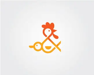
1. Ampersand

Trivia: Did you know that the Ampersand symbol is actually a glyph, a combination of letters ‘e’ and ‘t’? Et is the Latin word for ‘and’. The first symbol in the image below was the first ever version of ampersand used.
How the ampersand symbol has changed over the years.

History: There is no record of when the symbol was first used. But it was part of the graffiti found on the famous wall of Pompeii, back from 79AD.
Symbolism: The symbol is used for things that are usually together. You will find it used to join two or more names that are a part of a common entity.
Though ‘and’ is used in most formal citations, you will see the symbol being used in brand names. This happens when there are two or more partners or parties that together constitute the brand.
The ice cream brand Ben & Jerry’s, for example, is the namesake brand and the ampersand here unites the names of the founders.
Ampersand in marketing
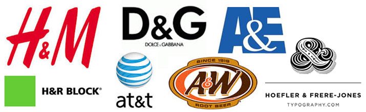
How you use the ampersand in your design is totally up to you. Like other symbols, you can simply use this symbol in between letters or words in the brand name. Or you can use it to create a visual anchor for the logo.
Styling an ampersand is also pretty simple. So you can easily make it look like the rest of the font. Look at the variations of this symbol in the below logos from popular brands that use it.
2. Hashtag

Trivia: Long before the Twitter generation named this sign the “hashtag” it was called the number sign or a hash mark. The inspiration for this symbol was the abbreviated form of libra pondo, the Latin version of the word “pound” for the measurement of weight.

Symbolism: The symbol was first used by Chris Messina who suggested to Twitter about using a ‘#’ symbol to help group Tweets, in 2007. Though the idea was initially rejected by Twitter, the concept soon picked up. And today it is hard to imagine a social media plan without this symbol.
Hashtag in marketing
Today brands use the symbol to create new trends for their campaigns on social media. They also occur in ads, logos, and websites.

In ads, the symbols are mainly to show that it is a trend to look out for or an announcement that instills anticipation. And sometimes you will find it in logos. This shows that the brand is social media savvy or one that caters to some kind of social networking service.
3. Dollar sign

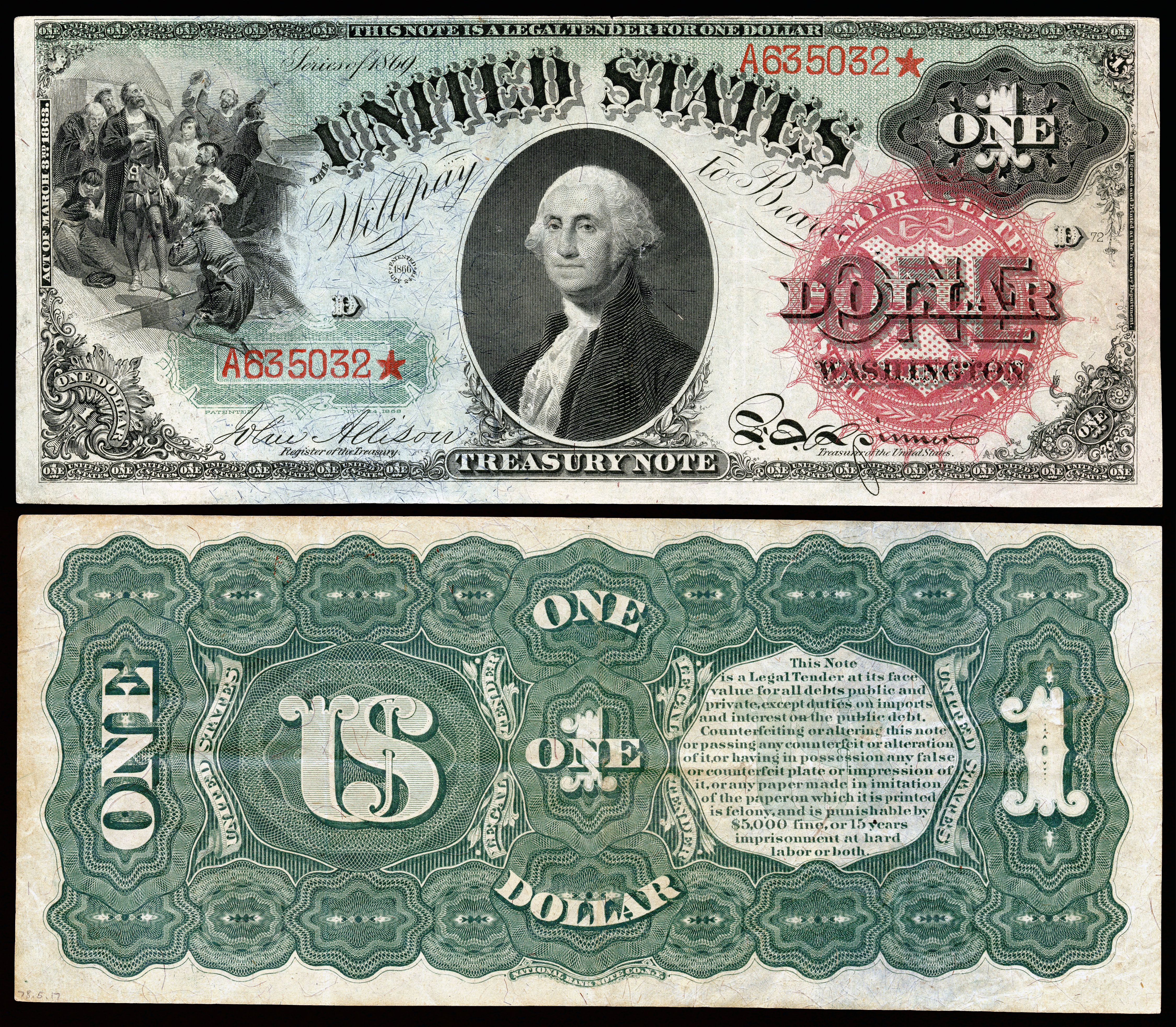
Trivia: The US dollar sign that is known around the world as a symbol that represents money, is also called the peso sign because the symbol is inspired by the Spanish American peso.
History: The first-ever official use of the symbol known today is from a financial document from 1792, signed by the then US President, George Washington. On the dollar bill, however, the first-ever use of a symbol close to the dollar sign was in the year 1869. Today it can be found on the national currency notes of several countries.
Symbolism: Today you will see the symbol being used to indicate money. In games, this can denote a money bag. When you take emojis, there is the famous “money-mouth” emoji. In short, to represent wealth and money in some form, this symbol comes in handy.

Dollar sign in marketing
With the dollar sign in your logo or signage, you tell your customers that you are a financial institution without telling your customers that you are a financial institution.

It comes in handy when you have to create an ad that talks about saving money or some big discounts. In website design, you will also find the symbol to be useful in designing icons that indicate pricing or payments.
Kimp tip: Using symbols like the dollar sign to indicate what your business does is a great way to communicate your brand message to your customers. From marketing visuals to the logo of your brand, you can use the dollar sign in so many places.
Looking for creative use of symbols in your visuals without making them appear too cliched? The Kimp team is here to help.
4. Arrow

Trivia: Before the arrow symbol, manicules (pictogram of a hand pointing in one direction) were used to draw attention to something or indicate direction. On maps, even a detailed bow and arrow symbol was used, or at least an arrow illustrated with details like a feathered tail.
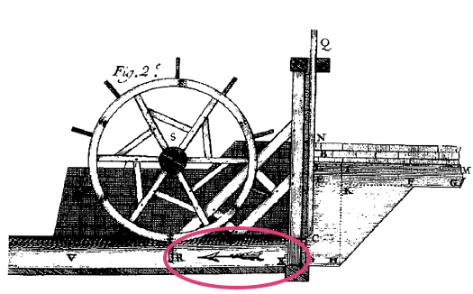
History: The less ornate version of the arrow symbol that we use today was mostly used in maps from the 18th century. Mathematician David Hilbert was the first person to start using arrows to indicate inferences and logical connections.
Symbolism: There are so many applications of the arrow symbol today. To indicate movement, and point in a particular direction. Arrows can also be seen as a symbol of war or when they pierce a heart, a symbol of love. It can also be indicative of strength when used in tattoo designs.

Arrow symbol in marketing
Retail businesses, brands in the logistics and transportation industry, travel businesses, or any brand that needs to capture the concept of motion can use arrows in their logo.

You can also use arrows in almost all kinds of designs to point in a particular direction or draw focus to a specific point in the design. Arrows are also of great help when you have to define hierarchy.
In the FedEx logo, the arrow indicates movement as the business helps people transport things. And in the Amazon logo, the symbol indicates that the brand caters to all kinds of products, from ‘a’ to ‘z’.
5. Checkmark

Trivia: In most parts of the world, the checkmark is used when something is correct or completed. But in countries like Quebec and Sweden, the checkmark symbol actually symbolizes “wrong”.
History: The checkmark most likely evolved from the letter ‘v’ from the word veritas meaning “truth” in Latin. Precursors of the checkmark symbol were used in the Babylonian tablets containing rationing details. It is assumed that this was a mark used to indicate the successful issue of ration to the corresponding person.
Symbolism: The most common meaning of a checkmark is ‘correct’, or ‘done’, indicating completion. In color psychology, green color is said to indicate a ‘go’ signal. And in symbolism, a checkmark has a similar meaning. That’s why you will notice a green checkmark in most places. This indicates that something is good to go or complete. On the whole, this is a positive symbol.
Checkmark in marketing
In logos, the checkmark is useful if you need to show that your brand is for the go-getters who love to get things done. You can also use it in your marketing materials to indicate a ‘yes’ to something. It can be anything from showing a milestone achievement to meeting an objective.

The checkmark in the logo of Norton Antivirus indicates the simplicity of getting things done, in this case, installing virus protection on a computer. Another brand that uses a checkmark in its logo is Verizon.
6. Heart symbol

Trivia: The symbol itself comes from a rough sketch of the shape of the human heart. And since the olden days, the human heart has been connected with the emotion of love.
History: There is a centuries-old connection between the word “heart” and love. But, the use of the heart symbol, as we know it today, to indicate love dates back to the 15th century.
Heart symbol in marketing
Charity organizations, hospitals specializing in cardiology, and brands catering to gifts for loved ones are just a few types of businesses that might find the heart symbol to be relevant in their logo design. And you can use this symbol in your valentine’s day marketing campaigns or simply to represent love, care, and affection in any context.

In the above packaging design, you might have read the text as “I love me” automatically seeing the heart symbol. Using a symbol instead of the word “heart” makes the text visually appealing and the overall design interactive.
7. Infinity symbol

Trivia: The infinity symbol is a variation of the Ouroboros we had spoken about earlier, the never-ending loop.
History: As a decorative element, this symbol; has been in use since the early days. There have been artworks from the Viking age bearing this symbol.
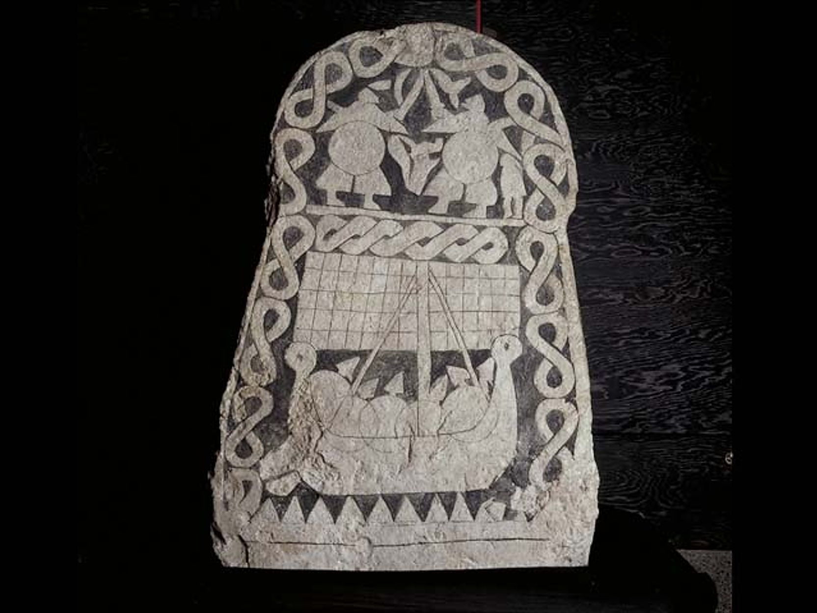
The actual association of the symbol to the concept of “infinity” happened when John Wallis first used the symbol in mathematics. He applied the idea to indicate numbers that were too large, or in other words, approaching infinity.
Symbolism: The most common definition of this symbol is “limitless”, something that has no end or something that lasts forever. Everlasting love, perpetual ideas, the expansiveness of the universe, and a host of other things can be represented with this symbol.
Infinity symbol in marketing
When you want to depict unlimited potential or something that is eternal, the infinity symbol works well. Of course, you can use the literal meaning of the symbol by replacing the word “infinity” with it.

A few other symbols in graphic design
If you did not find your brand’s soulmate in one of the above symbols here are a few more to explore and the corresponding meaning that most people associate with them.
- Dove- peace
- Owl- wisdom
- Rose- love
- Lion- bravery, strength
- Dragon- power

Kimp tip: With some rare symbols like these, there tend to be different associations in different parts of the world. And sometimes, your message goes unnoticed. To avoid this, discuss with your graphic design team and come up with designs that help connect your brand with the chosen symbol. Use strong copies to get the message across. And doing this consistently will get your customers to eventually understand the connection.
Looking for a way to streamline your graphic designs for better consistency and strong brand messaging? Give Kimp Graphics subscription a shot.
Tap Into the Power of Symbols in Graphic Design With a Kimp Graphics Subscription
Of course, you can create your own version of these commonly known symbols in order to make the most of symbolism in marketing. Like the stylized ampersand and dollar symbols you might see in many places. That helps you add a personal touch to your branding. It gives you the power to communicate with visuals. Some brands use well-known symbols. While others come up with an all-new symbol that soon becomes an iconic reminder of their brands, like the McDonald’s arch, for example. With Kimp’s graphic and video subscriptions, you get to consistently incorporate a customized version of a symbol of your choice, both in videos and graphic designs.
So, what are you waiting for? Sign up for a free trial now and discover the many ways to incorporate these symbols in your marketing visuals.