Marketing Copy – The Essential Building Block Of A Good Design
When you look at an ad on social media, what grabs your attention? The visuals in the ad perhaps? But then what you interpret from the ad and what steps you take next depend on one other thing, the marketing copy. Don’t you agree?
Brands bend over backward when it comes to getting their audience’s attention. What if we told you that a mix of good copy and catchy design can get you there?

The fact is, good marketing incorporates good design to grab attention and convey the message. And good copy to support or elaborate the message and get customers to take the next step.
So, without a doubt, you need both design and copy. But then, can one exist without the other? Which one should you focus on first? And how do these impact each other? We’ll answer all these questions in this blog, one by one.
Let’s look at the first question: in marketing can copy or design exist without the other?
Marketing Copy and Design Go Hand-in-hand
While the world argues which one is more important, we say marketing copy and design go hand-in-hand. One without the other simply means a weaker version of the campaign of your dreams. The difference is as simple as how boring a text-only Facebook post might appear. Or how you sometimes cannot understand the purpose of an image on Facebook when there is no image description.
Let’s give you an example. 47% of consumers choose to open or not open an email just by reading the subject line. And adding a video to an email can increase the CTR by 200-300 %. This implies that if a good copy can get people to open an email, good design leads them to the next step. So, yes, you need both good copy and good design to get better conversions.
It’s not just that, when you combine copy and design intuitively, you leave a lasting impact on your audience. We’ll give you an example from one of Ikea’s ads that took a dig at Apple.
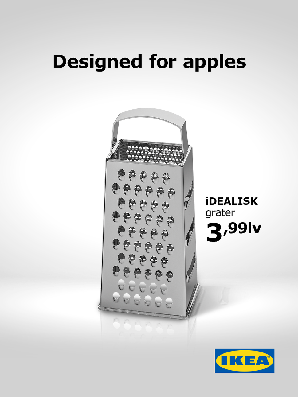
Now compare the Ikea ad with the Mac Pro image from Apple:

The ad from Ikea manages to establish the satire due to two main reasons:
- The brilliant design where the right angle of the cheese grater is captured. And the overall composition of the design looks very similar to most images from Apple. The minimalistic design makes you instantly relate it to Apple as well.
- The second ingredient is the witty copy.
Separately the copy or the design might not have made an impact after all. But together, they result in a memorable ad. So, yes, combine a catchy design with a crisp copy for maximum impact.
But, What Comes First, Marketing Copy or Design?

Your copywriter waits for you to furnish the design in order to come up with a suitable copy for it. But your designer tells you that freezing the design is not possible without knowing the copy. We’ve all been there!
That leaves us with one big question. Copy or design – which one should come first? This is a never-ending debate. The truth is, there is no one-size-fits-all approach here. A lot depends on things like:
- Whether you have internal or external teams handling copy and design
- The workflow you define for your process
- Objectives of the campaign
- Type of design you want
For print ads, for example, you cannot simply add the copy later on to your design. The copy needs to be there for the designer to create a flyer design that makes an impact.
On the other hand, if you want your social media posts to be simple and rich in visuals, you can always add the copy to the post description if it’s not possible to get the copy ready before the design.
However, we recommend having the copy ready first and then going with the design. This will be the smoothest way to deal with it. And also the most optimized route without too many back and forth changes.
This is because, unless you are an illustrator yourself and you are adept at sketching your emotions, the easiest way to convey the message will be with words. When you are able to put your ideas into words, your designer will be able to give a visual form to your words.
We are all-in for the copy-first approach for good design.
So How Does Marketing Copy Impact Design?
1. Helps the team come up with a better design concept
Every visual element in a design has a different role to play. Sometimes text supports the visuals and sometimes it is the other way round.

Take the above design for example. The copy plays a bigger role here. So, the designer has made sure that the text section dominates the design while the visual elements merely support the copy and create an attention-grabbing composition.
Another reason to have the copy ready is so your designer knows how much text there is and thus plans where to place it.
Visual balance is one thing that most designers try to establish. This makes the design pleasing to the eyes. And in visual balance can be symmetric balance or asymmetric balance. Every single element including the text section within the design determines the balance in a design.
For example, in radial symmetry, the focus can be directed to a single point. And the hero text is often placed at this focal point.
In the cases where there is no text on the image but the copy will only be part of the post description on social media, the copy can still be useful. Your designer can come up with a concept that aligns with the tone and message conveyed in the copy so that they work well together.
2. Understand and set the hierarchy in a design
Hierarchy is what directs the reader within the design. Visual hierarchy ensures that the text and other visual elements in the design are processed in the order intended.
If your customers read the contact information first and then go on to read lines of text and view the illustrations or photos in the image, they might probably forget about the contact information they read in the first place.
To avoid this, you will want to communicate a memorable message first and then present the contact information or your CTA button. This will get them to take an action in the end.

In the above billboard, if the designer had not incorporated the negative space on the left, the chances of a user’s attention being directed to the chunky copy in the design will have been less. And considering the length of the copy, the font colors have been chosen so as to establish a strong contrast and thus make the copy easier to read.
3. Ensure that the goals are aligned
Take a look at the brochure design below.

The goal is to get customers to visit the link or scan the QR code. So, in the above design, the size and alignment of the bottles are such that your eyes naturally move toward the QR code. The copy at the bottom also directs customers to the same goal.
If you look at designs that convert they all have a singular well-defined goal. And all the design elements and the copy are aligned with this common goal.
When your design tells the customer to do one thing and the copy conveys something else, do you think the overall design will work? Probably not. Remember that sending out confusing signals leads to a drop in conversion rates. That’s why having the copy ready before the design helps designers understand the goal of the design better.
4. Work on setting the brand’s tone of messaging
When you create a style guide for your brand, you capture everything from the color palette to the usage of your logo and even the brand messaging and tone of messaging. And among all these, the tone of messaging for your brand can be one tricky concept.

Take Headspace for example. The brand has a very friendly tone in its ads. And most ad copies make you ponder over specific concepts. The designs in the ads from this brand perfectly supplement the tone of the copy. There is the friendly headspace mascot in a cheerful color palette. And most designs have inherent meaning to support the copy.
So, when you look at an ad you feel that the text and the visual elements all communicate in the same tone.
This clearly shows that copy is important. Because it helps designers understand not just the message to be conveyed but also the tone of the message.
Do you want your design to appear friendly or professional, playful or sophisticated? When your copy and designs both reflect this tone, it makes the intended impact on your audience. And doing this consistently helps establish a strong recognizable tone for your brand.
Kimp Tip: Colors and the type of visual elements you use in your design have a strong role to play in determining the tone of the design. So, understand the tone of the copy and pick colors that capture this tone accurately.
Want to explore the impact of colors and consistently adhere to your brand’s tone of messaging? Work with a dedicated team of designers by choosing a Kimp subscription.
How Does Design Affect the Effectiveness of Copy?
1. All eyes on the CTA

In the above image, the website address will have been just another line in the copy if the designer had not chosen to accent the section. The design here helps in separating the rest of the copy from the CTA.
As you can see, with the right design, you can emphasize the call-to-action in the ad and tell customers what to do next.
2. Bring copy to life with typography
A lot depends on typography. From the way customers perceive a word in the design to the priority they give to that word and the order in which they read the text sections.
Have a look at the below email from Chipotle:
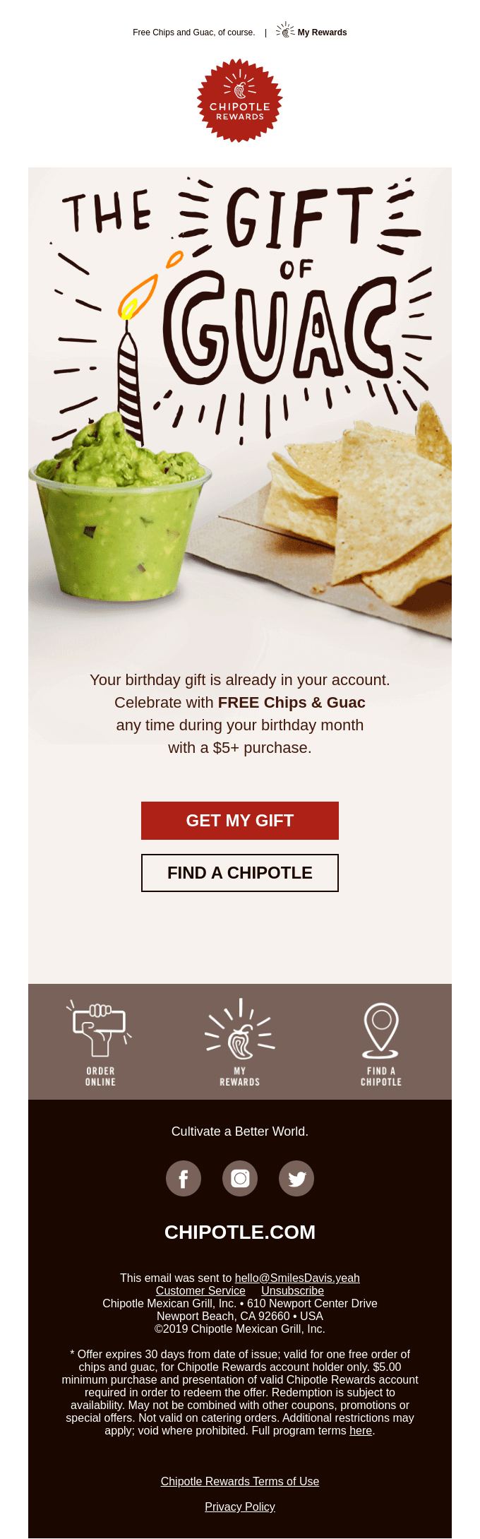
“The Gift of Guac” is an intelligent copy that answers the question in the subject line “what’s better than birthday cake”. But this brilliant copy will not have had the same impact had a simple serif or sans-serif typeface been used. The decorative typeface and the large font size together grab attention and convey the “party” feeling essential for the email. The illustrated candle adds to the impact.
Kimp Tip: Simple illustrations and text effects can bring an ordinary image to life. If you are wondering how to make your copy stand out, try adding illustrations that add meaning to the marketing copy.
Want illustrations done for your social media or email campaigns? It comes with your Kimp Graphics subscription.
3. When there is a deeper meaning to convey
Sometimes, design helps establish a deeper meaning. The below ad is a great example.
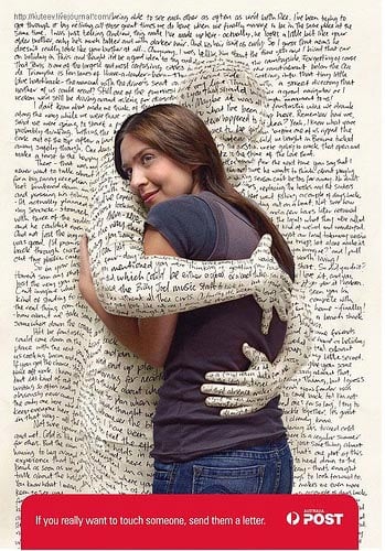
This one has a pretty good copy. It conveys the message. But the visuals are what makes the ad memorable. It makes you feel the many things the advertiser wanted you to feel.
When an ad makes an emotional connection with the audience, it stays in their memories longer. And this gives brands a competitive edge.
So, when you have beautifully drafted copy for your ads, it takes the right visuals to achieve the desired results. And to do justice to the time and effort spent in drafting the copy.
4. Set the mood
Take a look at the below web banner design:

This design has a very simple copy. But that’s exactly how the brand likes to keep things. At the same time, the ad should also set the right mood. That’s where design steps in. From the color palette to the image editing and typography, everything is pieced together to create the vibe. The design here represents the energy and power that should be conveyed in order to make it easier to relate to the product advertised.
Kimp Tip: Other than playing with the font styles and colors, adding simple animations is another way to set the mood. The object in focus can be animated with a transition effect that matches the emotion of the ad.
Bring your social media ads and posts to life with simple animations that come as a part of the Kimp Video subscription.
5. Build on a word of focus
Copywriting sets the stage for your campaign. Your copywriter comes up with something powerful.
And sometimes, there is one word that needs to garner all attention. This can be because that is the word that is intended to trigger the intended emotions. What do you do then? Use design to build on the word of focus.

Take the above example. Simply talking about the financing options provided by the brand will not have made much of an impact. So, it focuses on letting people know that they will be able to buy their dream vehicle without hiccups. The ad and the copy are intended to get people to think of their dream bike and experience the yearning for it.
The design builds on this by creating a silhouette of a motorbike. It creates a sense of mystery that draws your attention. And when you see this design, you mentally fit in the image of your dream bike in the space. Now that’s exactly the intent of the message. That’s how design builds on the copy and evokes the intended emotion.
Kimp Graphic Subscriptions – Where Your Marketing Copy Comes to Life
Some brands struggle to get designs that match the powerful copy they have for their campaigns. Sounds familiar? Kimp’s unlimited graphic design services cater to a wide range of graphic designs and motion graphics based on the plan you choose. And with unlimited revisions, you can be sure that your team adds all the finishing touches you need to get designs that reflect your idea and emotions.
Start with a free trial and see how a design subscription can benefit your brand.