Design 101: The Little Known History Of Infographics
Infographics are the fourth most popular content form on the Internet today.
And it’s no wonder why. Humans are visual creatures. We may forget what we read, but we will always retain what we saw.

So, what makes Infographics so special in comparison to any other type of visual content? Well, do you remember the saying “A picture is worth a thousand words”?
Infographics don’t just bring you a thousand words with their imagery. They help you make sense of them too, with their copy. So, they’re truly the best of both worlds.

A bundle of information crisply juxtaposed with visual aids, Infographics dominate Social Media platforms today.
It’s hard to imagine a time without them. But that brings up some interesting questions. Are Infographics a new phenomenon? Are they just an innovative product of digital marketing, invented for disseminating information?
The answer would be no.
People have been creating countless infographics since the beginning of time, even before the term existed.
So, when did this all start? When did humans choose visual aids over the written word for sharing their messages?
At Kimp, we are always curious about all things visual and graphical. So, we went down the rabbit hole of history and traced back the origin of every content marketer’s favorite tool – the Infographic.
Come with us while we take a look at this fascinating journey.
The History of Infographics
Okay, all the marketers and creators reading this – let us ask you something. Do you think that these professions are new? Things that were born out of the giant cultural phenomenon we call the Internet culture? We’re assuming that your answer is yes.
Well, consider this. Creating, selling a product, and “influencing” all work really well and feel so natural. Right?
Well, that is because the marketing and content business is as old as civilization itself.
And, it may all have started with the Infographic itself.
*Drumroll please*

The History of Infographics: Early Civilization
The Drawing on the Wall
Do you remember the cave painting you saw in your school books? The drawings served as proof of language and communication amongst cavemen.
Some experts now believe these to be the earliest usages of Infographics. As language evolved, humans used a combination of images and text to convey their message.
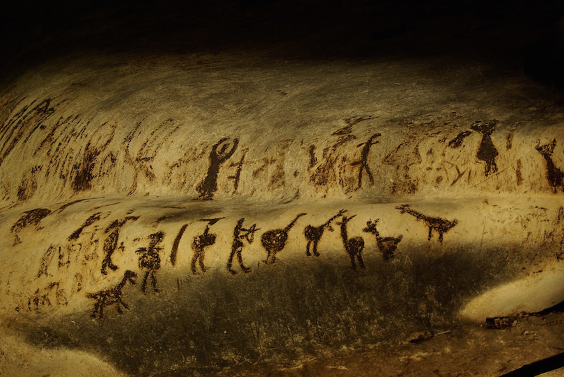
As early as 25 000 years ago in the caves of Brazil, Infographics have been documented in our history. From Brazil to France to China, evidence tells us that Infographics, though by other names, existed in other early civilizations too.
Egyptians Hieroglyphs
Another example of pictures and text coming together to record and convey information is the Egyptian Hieroglyphs. Egyptians are famously credited with inventing the pictorial script. They developed the most sophisticated language with each image representing a distinct action, sound, or context.

Hieroglyphs closely resemble the modern-day graphs and pictorial representations that later evolved into the infographics we see today. They were a popular communication system and have recorded evidence of work, life, and religion of that era.
Maps
If cave paintings and Hieroglyphs are not convincing enough for you, consider maps. Maps are nothing but a visual representation of a location, and the surrounding landmarks shrunk to a scale. The oldest map we have now is the Babylonian map of the world, dating back to 700 BC. From 600 BC to 700 A to the early 1600s, history is filled with examples where the need for data visualization grew apparent, and countless maps, charts, and other models were developed as a result.

Source: World History Encyclopedia
The History of Infographics: 18th century Data Visualization
The modern-day infographic we all know – a combination of colors and charts – saw its humble beginnings in the 18th century.
Alexander von Humboldt
Recorded history does not recognize “Infographics” as an official visual tool of communication. So, few recorded usages can tell us unequivocally when the first infographic was used.
But, it is widely accepted that the first instance of a picture in which an object or process is broken down and detailed was by Alexander von Humboldt in 1802.
This infographic depicted the various vegetation that grew on Chimborazo.

Source: The Happy Hermit
Charts, Maps, and Infographics.
The father of Statistical Graphs, William Playfair is associated with Infographics due to his invention of bar graphs, pie charts, and line graphs.
Playfair is known for publishing The Commercial and Political Atlas in 1786 as well.
The 1700s also saw one of the first intentionally created infographics by Joseph Priestley, who created a “Chart of Biography” with timelines and details on historical figures. He claimed that this felt like the most efficient way of conveying the information “with more exactness, and in less time than it would by reading”.

Source: Pinterest
Just as in ancient times, maps are one of the most widely used forms of Infographics in the 16th century. Edmund Halley created the first data-based contour map in 1701 and went on to include details on atmospheric conditions in the map.
The beginning of Data Visualization
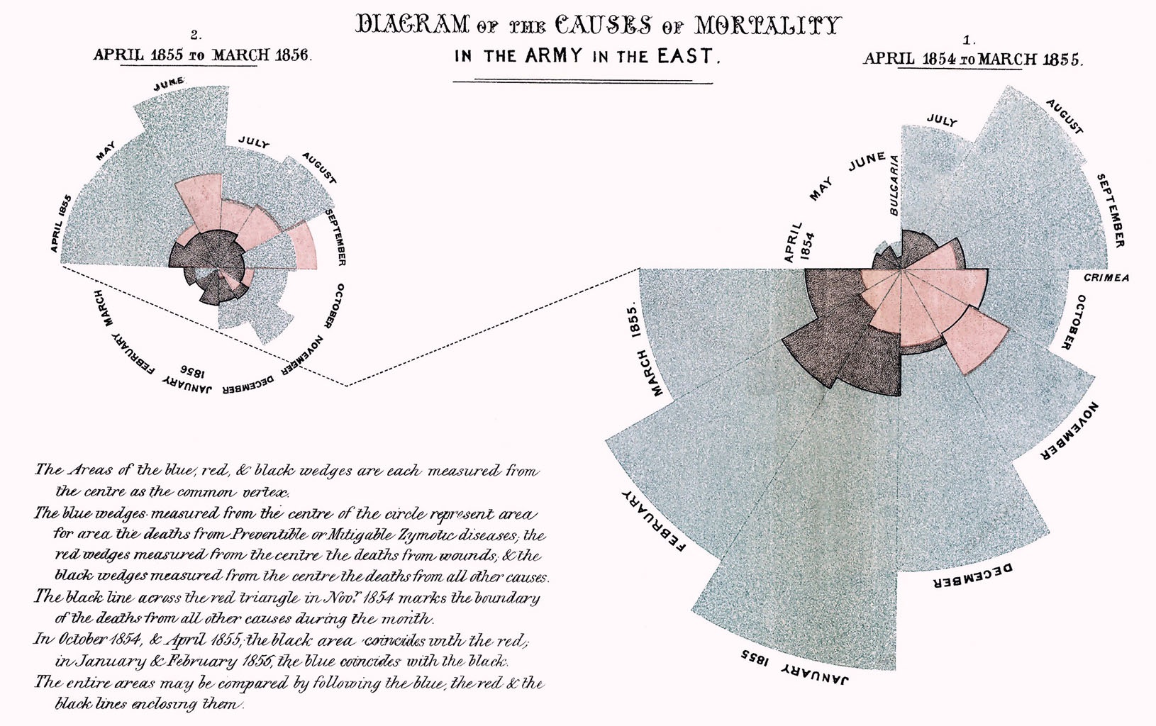
Outside of the world of mathematics and physics, Florence Nightingale began the practice of recording information in pictorial formats. She did so to more clearly represent the large number of preventable deaths during the Crimean War (1853-1856).
Nightingale recorded death tolls in the form of rose diagrams or coxcomb charts across different hospitals. Her work demonstrates that more soldiers were dying of malnutrition and unsanitary conditions than of wounds. This led her to advocate for better healthcare systems aided by the data she had at hand.
Source: Vanderbilt University
Much like Nightingale, Charles Joseph Minard recorded the deaths of Napoleon’s army as they began their march on Russia in 1812. In this case, Minard set out to illustrate how unsuccessful this campaign was.
Some other notable works in Healthcare and Data Visualization in the 1800s include the works of André-Michel Guerry, in the 1830s and John Snow in 1854. The former created maps to show how crime and education levels were connected. John Snow meanwhile raised the alarm of water quality and related flair-ups of Cholera in London.
These instances propelled what modern-day historians like to call the era of Data Visualization that grew exponentially in the 20th century.
The History of Infographics: 20th Century Data Visualization Trends
As more data became available, the importance and significance of data visualization only grew.
The 19th century saw the advent of pie charts, graphs, and other 3D models outside of academics and in mainstream media for entertainment as well.
Some of the notable names and usage of Infographics in this era include:
1) The Olympic Sports poster design by Otl Aicher in 1972 used pictogram sets created especially for this poster. These pictograms later got immortalized as the signs used for public utilities such as telephone booths, gas stations, and even the man/woman stick figure signs we see worldwide.

Source: Pinterest
2) 1972 seemed to be the year of Infographics. NASA employed infographics in its attempt to identify and contact extraterrestrials. The spacecraft Pioneer 10 was equipped with Aluminum placards with pictorial representations of the human race and the planet’s position in the solar system.

Source: NASA
3) From 1975-1994, various designers and data scientists researched the right way to use visuals and data in communication. Edward Tufte is said to be the father of data visualization. One of his notable ideas on the topic is a term he coined in his book The Visual Display of Quantitative Information: Chartjunk. Chartunk refers to any visual elements which are not necessary to understand the information presented in a chart.
4) And lastly in this notable list, we have Peter Sullivan, a British Graphic Designer. Sullivan made infographics for The Sunday Times for over thirty years and went on to write the book on Newspaper Graphics.
Modern Day Data Visualization
The abundance of Information, Free Press, and growing popularity of Visual Content has ushered in the most vocal era of Data Visualization ever.
Today, Infographics are not outliers in content creation and marketing. In fact, they are the norm.
In the early 21st century, Media houses began using pictorial representations and Infographics in everyday matters. Some of the most popular publications that get attention based on their infographics include Upshot and FiveThirtyEight.

Source: Pinterest
Marketing and Infographics
The Internet changed the face of marketing drastically. What was once just a method of acquiring customers and accelerating sales became so much more than that.
Marketing became a channel of communication between customers and brands. And it has evolved to include content marketing, changing the ways in which brands present data and stories in public forums.
But not all content is created equally. Some types are better than others when it comes to cutting across the competition and engaging consumers’ shrinking attention spans.
We’re talking, of course, about Infographics.
Infographics ticks all the boxes:
- Visually Attractive to capture and retain the attention of viewers long enough to convey a message.
- An effective medium to convey long-form information in bite-sized snippets as opposed to text.
- Easily shareable across different mediums making it one of the most repurposed contents on the internet.
Leveraging the power of Infographics
We can share statistics with you as to why marketers seem to love Infographics to communicate with their customers. And believe us, there are many.
But right now we’re going to focus on how you can use infographics to fuel your growth in the competitive world of social media marketing.
Businesses and Creators can use Infographics to:
Create Brand Awareness
Starting a new social media page? Designing a flyer for a new store launch? Incorporate Infographics. Use attractive (original, if you can) visuals with less text to talk about your story, product details, and other brand information.
Small bite-sized information with pictures is received better than traditional text-based announcements.
Share resources, product information, and exclusive details
Imagine you have a new product launch. Your product manual is probably the most thorough piece of content you have about your product. But it’s also going to be lengthy and difficult to engage potential customers with.
Condense the most important pieces of information and vital resources into an infographic that adds value for potential users but does not overload them with information.

Detail the Customer Journey
One of the challenges that businesses face online is that customers keep reaching out to them for the next steps after placing an order. It creates anxiety for the customer when they don’t know what happens next and increases your workload as well.
Create an Infographic to capture the steps of a customers’ journey with you.
Infographics are easy to understand for customers and easy for you to share with them as part of an order confirmation. A real win-win situation.
Diversify your content marketing
Bored of creating the same content every day? Looking for ways to diversify your content calendar but stumped?
A great way to break out of the content creation slump and still provide value for your users is by repurposing content. You can transform your existing long-form text and video content into infographics.
Infographics are compatible with all platforms and provide value to your customers in less time than other content forms. Plus you can use them as a teaser and link them back to the longer form content they were inspired by. This in turn can help increase website traffic or direct potential customers to your social media profiles.
Professionally designed Infographics with Kimp
How did you like this little rewind reel we did on the History of Infographics?
Ready to start adding infographics to your content calendar? Professionally designed Infographics can uplift your social media pages and lend credibility to the content you share with your users.
Kimp works with businesses across the world to help them with high-quality graphics for their marketing efforts.
Would you like to give us a try? Sign up for the free trial and find out how working with a dedicated design team can help you design better and scale faster.