Designing for Wellness: Packaging Design Ideas + Tips for Healthcare Brands
Imagine this: You’re browsing the pharmacy aisle, scanning through rows of healthcare products. What grabs your attention? Is it the flashiest packaging design, or the one that whispers trust and reassurance? The latter, of course! This is what makes designing packaging for healthcare brands slightly tricky.

Unlike other industries, healthcare isn’t just about aesthetics. Sure, creativity has its place, but building trust should be your top priority. Fancy fonts and dazzling colors might look cool, but can they win the trust of customers in the healthcare aisle? Can they instill the confidence people seek when it comes to their well-being?
So, the question remains: How do you design healthcare packaging that fosters trust and stands out? This blog will give you the answer along with some inspiring examples to spark your creativity.
But before we dive into design tips, let’s take a moment to understand the unique role packaging plays in the healthcare segment.
- Packaging Design: The Trust-Builder in the World of Healthcare
- Beyond Aesthetics: Design Tips For Credible Packaging For Healthcare Brands
- Pay attention to the font factor
- Trust-building through the efficient choice of colors
- Minimalism can be a superpower for healthcare brands
- Incorporate visuals that tell a story
- Clear visual representation of the key ingredient
- Tailored to the interests of your audience
- Decode information with relevant icons
- Balancing brand identity and trust
- Get a KIMP Subscription for Your Healthcare Brand & Design Packaging That Nurtures Trust
Packaging Design: The Trust-Builder in the World of Healthcare
Packaging design is important for all industries because packaging is often the first tangible encounter between a brand and its consumer. However, the packaging design for healthcare brands presents a unique landscape. Because the stakes are higher and the design rules are different!
So, why does packaging truly matter in the healthcare segment?
- Clear communication of the message: If there is one product category where customers spend a lot of time reading the label, it is this. So good packaging design ensures that every little detail is presented clearly.
- Simplifying user experience: People do not always understand the how-to’s when it comes to healthcare products. So, they look into the packaging for information. This could be the dosage and restrictions in the case of products like health supplements or say the usage instructions in the case of skincare and skin treatment products. Organized packaging design ensures that this information is captured accurately.
- Provide brand differentiation: The healthcare market size has been expanding rapidly and it is projected to reach a value of USD 21.06 trillion by the year 2030. Which means that the competition that prevails in the industry is constantly on the rise. So, brand differentiation is something that brands cannot ignore. Sleek and straightforward packaging design helps establish the brand strongly and differentiate it from the competitors.
So packaging design for healthcare brands should not only look good but also do good for your brand and your customers. How do you achieve that? Let’s find out!
Beyond Aesthetics: Design Tips For Credible Packaging For Healthcare Brands
Pay attention to the font factor
Fonts can be fancy and decorative as well as elegant and refined or even casual and quirky. But when it comes to packaging design for healthcare brands, it’s about building trust rather than creating catchy aesthetics. So, forget fancy script fonts and raw brush strokes. Unlike other industries where playful fonts can help attract attention, in the healthcare segment, clarity and legibility rise above all else.
Take the below design for example. In this case, the product is meant to establish a certain allure – an air of sophistication to capture the idea that the serum pampers the skin. Therefore, the elegant serif font goes well with the packaging design. That and the fact that the logo design also incorporates a sleek serif font.

In this case, a plain sans-serif font would have looked too ordinary and not luxurious enough for the brand or product in the picture. However, some healthcare brands – like the ones selling medical devices might benefit from straightforward sans-serif fonts.
So, carefully pick the font style that suits your brand and product best. Additionally, the font should also be easy to read both when scaled down and scaled up.
KIMP Tips:
- Stick to fonts that are easy to read in print.
- Avoid blaring font contrasts that can distract or confuse your customers.
- Stay away from font styles that do not align with your brand’s personality.
- Maintain consistency in font style across all marketing designs.
- Choose font colors that allow the text to stand out from the background.
Trust-building through the efficient choice of colors
Choosing colors is one of the pivotal steps in designing packaging for healthcare brands. Because, like fonts, you cannot settle for something gaudy colors and irrelevant color palettes. Sometimes these wrong choices can lead to misinterpretation of the information provided. Like
While several industries benefit from vibrant palettes to represent energy or fun, healthcare demands colors that evoke calmness, confidence, and reliability.
Whereas, the best way to decide the right color palette would be to understand what is being promoted. If this is the label design for a health supplement with various options then perhaps a different signature color for each variant! For example, the below packaging design takes cues from the ingredients.

KIMP Tips:
- If you do not know where to start or if there is no specific color associated with the hero ingredient, stick to whites, and cool colors like purples, blues, and greens.
- Use color sparingly and strategically to highlight key information.
- Stay away from overly saturated palettes.
Minimalism can be a superpower for healthcare brands
When people are contemplating their options and looking for a product that takes care of their well-being, they are not always in the mood to decode complicated designs. While several other industries can benefit from elaborate graphics, the healthcare industry benefits from clear clutter-free options.
Take the packaging design below for example. With a sleek and minimalistic design like this one, the key details are always in the spotlight. And customers instantly know whether the product meets their needs. This helps them make quick decisions and also steers them away from products with cluttered and overloaded packaging designs. Additionally, the clarity that minimalism brings with it helps build trust.

KIMP Tips:
- Integrate clean lines and negative spaces like the design featured above.
- Organize information in clear grids to segregate the details effectively.
- Use a limited color palette without busy patterns.
Incorporate visuals that tell a story
Visuals go beyond decoration when it comes to packaging for healthcare brands. Rather than merely featuring the product, featuring visuals that tell what the product does or the main ingredients will add more value. Think images of people leading healthy lifestyles or witnessing the transformative power of the product promoted.
Take the below packaging design for example. At one glance you can grasp the core ingredient in the product and the benefit it brings. Such visuals that tell a story are the best use of space on a healthcare product’s packaging.

KIMP Tips:
- Choose visuals that communicate the emotions of well-being, improved health, and relief.
- Feature real people benefit from the product rather than overused stock images.
Clear visual representation of the key ingredient
Illustrating the “hero ingredient” can be a powerful strategy in the packaging design of healthcare brands. Because when customers are choosing products that help them invest in their well-being, knowing what’s in the bottle makes a big difference.
While artistic flourishes might pique interest in other aisles, the healthcare industry thrives on transparency. So, pick the key ingredient to highlight and include a clear visual representation of it.
If you think that a simple photo of the key ingredient will not make the intended impact, combine it with relevant illustrations. The below packaging design incorporates a photo of castor seeds and illustrated versions of the castor plant. Together they retain the core focus of the product which is essential in the healthcare segment.

KIMP Tips:
- Use realistic illustrations avoiding quirky visual styles.
- Pair visuals with relevant informative text to emphasize the significance of the focused ingredient.
Tailored to the interests of your audience
Designing packaging that appeals to the target audience is a necessity across industries and the healthcare segment is no exception. From the imagery to the fonts and the overall visual style, the nuances of your healthcare product packaging design should be in tune with the audience it is designed for.
Take the healthcare products designed for kids for example. Have you noticed how most brands incorporate bright colors and lively visuals and illustrations in OTC medicines and supplements formulated for kids? There is one reason why this works – brands know that children often associate medicines with unpleasant experiences. Therefore lively designs on the packaging can help mellow it down and ensure that the medicine or supplement does not appear intimidating and grim.
The warm and playful theme in the below image featuring the packaging design of a health supplement for kids is a good example.

Similarly, packaging design for a product designed for vegans benefits from nature-inspired visuals and earthy color palettes.
KIMP Tips:
- Research to understand the specific needs and preferences of your target audience.
- Compare the themes that work in your industries, the ideas that work for your competitors.
- Ensure a well-rounded application of the ideas instead of merely switching out the fonts or only the visuals. Every little design element should be aligned with your target audience and should harmoniously come together to form an aesthetically appealing and credible design.
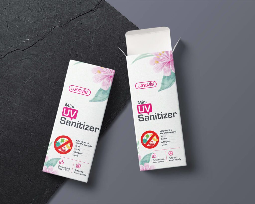
Decode information with relevant icons
Meaningful icons can drastically elevate the impact of the packaging design for healthcare brands. Because sometimes there is a lot of information to convey and conveying them through text can take up a lot of space. Therefore, breaking down the information into easily digestible visuals, like icons can make a big difference.
Besides, relevant illustrated representations ensure that the customer does not miss any crucial detail – like say allergen information. Or if this is medical equipment designed for use at home by people who aren’t professionals in the field, then an illustrated demonstration of how to use the device will help customers.
For example. the design here uses icons to quickly convey a few key features of the product.
KIMP Tips:
- Use standardized symbols like the FDA-approved ones for medical devices etc.
- Stick to simplicity when it comes to designing these icons.
- Adding concise text with the icons helps amplify the clarity of the message.
Balancing brand identity and trust
While implementing all of the above tips to achieve more user-friendly and clear packaging designs for healthcare brands, it is also important not to ignore the core brand identity. Because when given a choice, people are more likely to choose from healthcare brands they trust – brands they are exposed to at hospitals and clinics. Therefore, you need packaging design that helps establish your brand and preserves its identity.
To represent the brand consistently, colors and fonts are the most effective elements. Take the below design for example. It mindfully distributes the brand color in various places without interrupting the whole theme. You can tell that pink is a prominent color, a color of great value and purpose in the design but that does not distract you away from the main colors or the product information itself. That’s one way to do it.
KIMP Tips:
- In addition to integrating brand colors effectively, display your brand’s logo in a prominent position.
- Add your mascot to the design if it appears in sync with the rest of the theme.
- Be sure to balance your primary and secondary brand colors effectively.
Get a KIMP Subscription for Your Healthcare Brand & Design Packaging That Nurtures Trust
In conclusion, packaging design is serious business in the world of healthcare. And healthcare brands have a lot of details to pay attention to. Beyond aesthetics, packaging design can help build credibility for the brand and showcase the brand’s transparency. To achieve this, you need effective storytelling, simple layouts, a clear visual hierarchy, and a good understanding of the target audience.
Along with all these you also need to ensure adherence to regulations governing healthcare packaging and keep the overall design accessible to diverse audiences. Working with a professional design team can this possible. And an unlimited design service like KIMP ensures that these happen without interrupting your workflows for other marketing designs for your brand.
Want to see how that works? Register now for a free 7-day trial!