Halloween Aesthetic: 6 Tips To Design Eerie-sistible Campaigns
Halloween – what comes to your mind the moment you hear this word? Bats, Jack-o’-lantern? But if you are a business owner or a marketer, you perhaps thought of “ads” and “seasonal campaigns”. We get it. Times like these can make you feel excited and edgy at the same time. You need campaigns that drive conversions. Campaigns that look the part! So, let’s talk about pulling together that perfect Halloween aesthetic.

You might have brilliant ideas in mind. But you do not want the designs to be cobwebby? You know exactly what kind of theme to work with. However, you cannot deviate from your brand too much. So, how do you make all of that work? Let’s break it down in this blog. We’ll talk about some scary-good design ideas to create your Halloween campaign’s promotional graphics.
So, grab your broomstick – and here we go!
Why is Halloween Marketing Such a Big Deal?
Seasonal advertising is a tried and tested method to give your marketing a periodic push forward. But not all festivals need to be treated the same. For some, you just need to create a simple social media post or a single marketing email. And for others, brands go the distance and change their Instagram aesthetic or even introduce new packaging designs to dress up for the occasion. Halloween definitely belongs to the second category. Don’t believe us. Here are some statistics that might convince you.
- According to the National Retail Federation, in 2022, the projected spending for Halloween in the U.S. was $10.6 billion. When there is such huge spending expected from consumers, without a doubt, this is a season to up your marketing game.
- And the above expenses were projected to be split among categories like candies, costumes, greeting cards, and decorations. So, if your business caters to products in one of these categories, then a well-planned and executed Halloween campaign can make a huge difference.
- Online search accounts for 36% and Facebook, a 20% share when it comes to the places where people look for Halloween inspiration. So, if you are going to share inspiring ideas and creative Halloween decoration guides, it can help put your business in the spotlight.
So, Halloween is a great time to come up with some creative campaigns for your brand. But one difference is that this would be a good time to work on engagement and conversations with your customers rather than conversions. This would be a good time to create posts that increase your brand’s visibility rather than try to sell a product. Of course, with a convincing design, a sale happens eventually. So, it all boils down to your Halloween campaign ideas. And how accurate and engaging your Halloween aesthetic is.
Halloween Aesthetic: A Bag of Tricks and Treats for Brands
What do you think of the below campaign from Burger King?
Spooky and to the point, isn’t it? Burger King nailed it with the eerie background score and the imagery of a clown that sends a chill. In short, its aesthetic was just perfect for the occasion. And it was brilliant enough to attract the attention of the right target group. As a result, global sales went up by 15% and restaurant traffic went up by 21%.
Now that’s the kind of conversion any brand would expect. Another notable aspect is that Burger King does not even belong to the niches that are the most popular during Halloween, namely costumes, candies, and decorations. That’s what well-timed and well-designed Halloween campaigns can do for your brand.
Videos or images, whatever you have in mind for your Halloween campaigns, here are some design tips that might help.
1. Let’s talk about colors first
No other colors scream Halloween as orange and black do. You find them everywhere from costumes to decorations. Naturally, they make fool-proof choices for your marketing designs as well.
Bright orange has often been associated with energy, excitement. As for the use of orange during Halloween, it comes from the tradition of carving pumpkins. The good-old Jack-o’-lantern without which the occasion seems incomplete.
The spooky side of black needs no introduction. And it’s a color most people associate with night and therefore perfect for your Halloween campaigns. Of course, when combined with the relevant imagery.

The orange-black palette along with the spooky imagery in the above design tell you that it is about a Halloween campaign, even before you read the content. That’s exactly how your Halloween ads and posts should look. The colors should convey the concept in a moment. That’s when your customers will stop and take a second look.
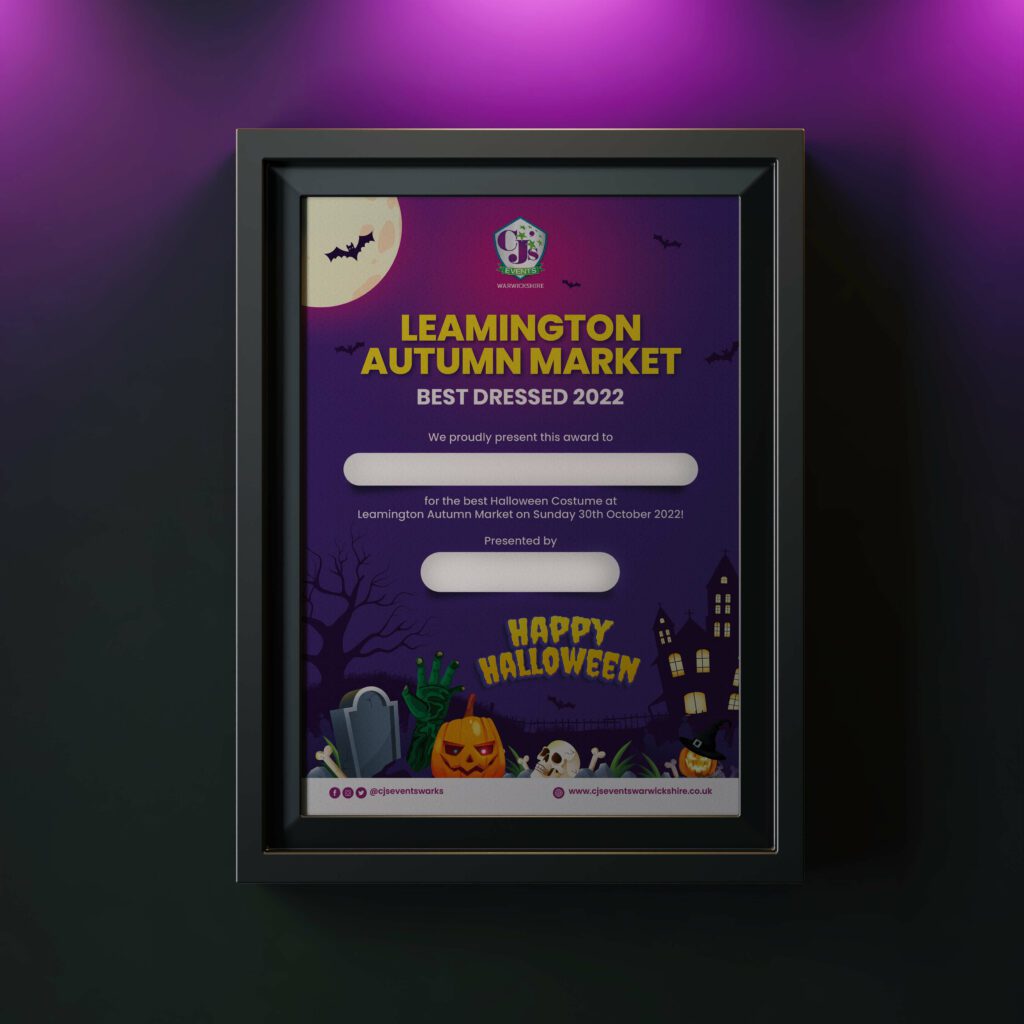
Purple and green are other relevant colors to use. Because purple is a color you can easily connect with witchcraft. And green can make you think of a witch’s cauldron with its bubbling potion. The below design uses purple to create a Halloween mood.
KIMP Tip: If one of the above-recommended colors happens to be your brand color, then you are in luck. Otherwise, use your brand colors as the reference to choose your Halloween colors.
For example, if your brand color is yellow, orange and yellow look good together but there is not much of a contrast in most use cases. However, purple is a complementary color to yellow. So, you can use purple in your Halloween designs. That way you will not have to leave out your brand colors in the design.
2. And now for the fonts
Colors are associated with different moods. So, unless you combine other design elements like fonts and symbols, colors are not enough to establish your Halloween aesthetic. Combine the right colors and fonts and you’re halfway there.

What do you think of the font choice in the above design? Don’t you think it’s just perfect for the mood?
The fonts you choose can be rusty, vintage fonts, or spooky ones with bones in place of the strokes. Anything that makes you jump out of your skin will be a perfect fit for Halloween. If you do not know where to begin, let’s talk about some fonts you can use in your Halloween designs.
- October Crow

A touch of medieval + eerie, this font is great for the title text in your Halloween designs.
- Goat
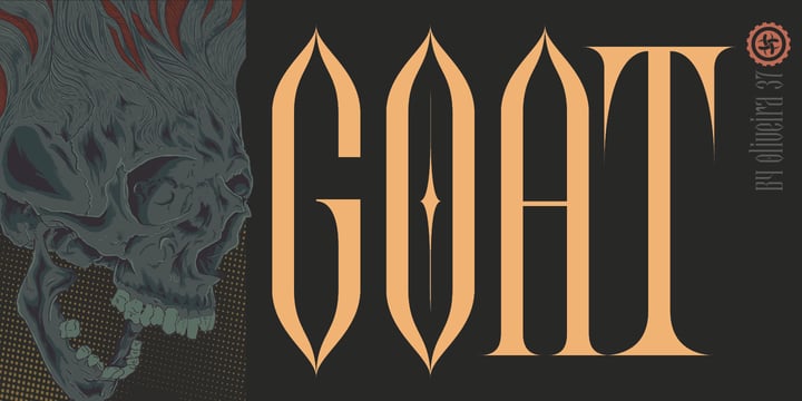
If you want to leave behind the hackneyed concept of scares and thrills and want to go instead with something chic and vintage, Goat works well. And the best part is that it still has that grim vibe to it. It’s sure to remind you of Gothic castles and vampires. Perfect for Halloween, right?
- Nosferotica

If your regular brand fonts are modern and clean and you need something to complement them, then Nosferotica might work. It has a subtle sinister touch that can make your designs look Halloween-ready.
KIMP Tip: One quick search and you’ll find plenty of options for Halloween fonts. Choose one that does not look too cliched like the blood-dripping, pumpkin-embedded styles. After all, you do not want the font style to interfere with the imagery in the design.
3. What’s good design without relevant imagery!
With the colors and fonts sorted, imagery adds the apt finishing touch. Together the trio can capture the intended spirit of your design. And in our case, the Halloween spirit (no pun intended 😉 )

The above design is pretty simple. Notice the difference the addition of Jack-o’-lantern makes! That’s why imagery is very important in the Halloween aesthetic.
There are many symbols that most people instantly connect with Halloween. These include:
- Bats
- Jack-O-Lanterns
- Witches
- Spiders
- Skeletons
- Ghosts
You can add them as stock elements where you grab these symbols as icons and add them to your designs.

Or you can pick a wholesome Halloween scene from one of your favorite stock sites and then customize it with your copy and some minor changes to the aesthetic so that it suits your brand.

You can also use illustrations that subtly incorporate these Halloween elements but in a visual style that matches your brand persona.

Or you can work with the KIMP team to have custom graphics or custom illustrations created for your Halloween campaign.
4. Edit your photos to capture the mood
Have you noticed how the simplest of photos can be turned into masterpieces with the right edits? Similarly, to make your designs look more like Halloween, you can use existing presets that add a vintage touch or a distorted effect. We’ll give you a few more ideas to try.
Add light streaks to create a ghastly effect

Adjust the opacity of specific elements to create an apparition-like appearance.

Play with texture effects to create a soft diffused effect that can set an eerie tone.
Use a glitch effect or motion blur to create a fuzzy and mysterious scene.

If you are planning to use your product images or lifestyle shots, separate the subject from the background and superimpose the subject onto a spooky backdrop.
Background removal is also part of the KIMP Graphics subscription. So, if you want to repurpose an existing image and create a Halloween design with it, it is pretty easy.
5. Videos for maximum impact
For Halloween 2014, IKEA released a short parody of the iconic horror classic, The Shining.
You’ll see little Danny on his wheels maneuvering through an IKEA store instead of the Overlook Hotel. This ad works due to a number of reasons. But we would like to point out a few that can inspire you for your next Halloween video ad.
- The imagery – from the iconic overalls that Danny wears to the costumes of the twins, everything has been recreated to make you nostalgic.
- Did you catch the “REDRUG” scribbled on a wardrobe in place of the “REDRUM” from the movie? It’s all in the little details like these. These are details that get people talking about your ad. And these are details that win the hearts of true fans of the pop culture references you use.
- The flickering lights, eerie silence, and dim background score are the other elements that add to the effect.
- In the last scene where the parents appear in place of the twins, the backdrop remains unchanged except for the lighting. See the difference for yourself. That’s another cue to take when you edit your Halloween promotional videos. Dim the lighting and you’ll see a huge change.
Or if you think videos are too much work, choose a KIMP Video subscription. Custom animations, video editing – everything is covered at a fixed monthly price.
6. Even with all this, you can stay on brand
While adding all the Halloween colors, symbols, fonts, and edits, can you still retain your brand’s visual identity in the design? Definitely. All it takes is to identify strong visual elements that people instantly connect with your brand. This can be your mascot or your logo or your tagline even.
Take a look at this Halloween design:

Here is a general promotional graphic design for the same brand.

The image of a rider with his popcorn tub is an easily recognizable element, isn’t it? As you can see, it’s not difficult to stay on brand while you design for Halloween campaigns.
Now that you know how to tweak your designs to achieve the perfect Halloween aesthetic, we’ll also talk about some examples from famous brands.
Halloween Aesthetic: Inspiration From Campaigns of Big Brands
1. Marks & Spencer promoting its Halloween range
Our limited-edition, double choc yummy mummy Colin the Caterpillar is here! 👻 He’s coated in a layer of Colin’s classic milk chocolate AND a layer of creamy white chocolate – WOW. 🤤 🍫🐛 Discover our Halloween range in store now! pic.twitter.com/ccyiETMko3
— M&S (@marksandspencer) October 19, 2022
The above post was from Marks & Spencer promoting its Colin the Caterpillar as a part of the Halloween range. There are 2 things we like about this aesthetic:
- Marks & Spencer’s social media pages are filled with food-related content. The above post stays cohesive with the rest of the content.
- The spiders and overall eerie backdrop in the picture perfectly capture the Halloween aesthetic.
2. Ford promoting Raptor
Brace yourself for a ride you might not see coming. This Halloween is rated “R” for Raptor. https://t.co/etWu5aJEnB pic.twitter.com/H0C5RbBSgX
— Ford Motor Company (@Ford) October 31, 2022
The above video from Ford is a teaser to promote its new car Raptor planned to release around Halloween. The ad exemplifies the intuitive use of Halloween aesthetic to create the intended eerie vibe for the season. From vintage filters to flashing lights and signature Halloween colors, the little details in the video help establish the theme effectively.
Need help editing your videos for that scary-good Halloween theme? Get a KIMP Video subscription.
3. McDonald’s Halloween Menu
McDonald’s is very serious about holiday marketing and Halloween is no exception. This year, McDonald’s has announced its exclusive Halloween menu in various locations. This includes limited-time additions to the menu served in Halloween-inspired packaging.
Instead of keeping it gloomy and scary as most brands do, McDonald’s has gone vibrant with its Halloween makeover for the year. Check out the new packaging displayed in the
🍔 Trick or Treat Yourself at McDonald's! 🍦🍏
— McDonald's Liverpool (@Mcd_Liverpool) October 18, 2023
Introducing our spooktacular NEW Halloween menu, featuring ghoulishly good treats like the Philly Cheese Stack, McCrispy® BBQ Smokehouse, Toffee Apple Pie, Twix Toffee Apple McFlurry®, and M&M's Halloween McFlurry®! 🥧🍦 #Liverpool pic.twitter.com/eEByDhtIjd
From Halloween treats to adorably illustrated versions of the signature Halloween symbols and Halloween colors, the new packaging includes Halloween aesthetic in various forms.
4. Airheads Scarefest
Renowned taffy candy brand, Airheads has announced its 2023 Halloween campaign titled A.I.RHeads Scarefest. This campaign leverages the latest craze in AI content creation and captures the Halloween theme while doing this. The idea is to use AI to create a fun and scary short film that features the Airheads balloon as the protagonist.
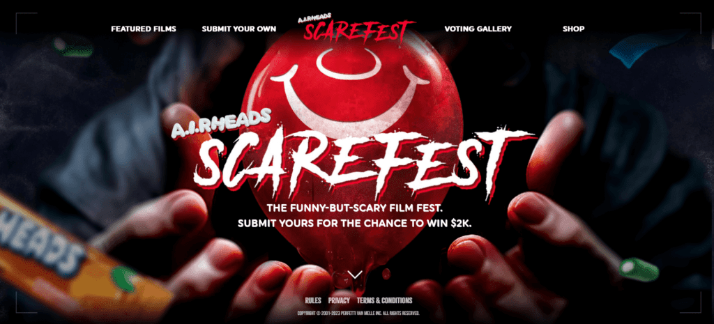
The designated website for the contest features an eerie Halloween aesthetic incorporating spooky fonts, glitch effects, and a dark background.
KIMP Tip: The Airheads contest puts the brand’s balloon mascot front and center highlighting the strength of having a versatile mascot for your brand. This ensures that every user who interacts with the brand or takes part in the contest will remember the mascot and hence the brand.
5. Reese’s Halloween candy and more
Reese’s never fails to surprise its audience for Halloween. After all, it is one of the favorite brands that people think of this trick-or-treating season. The brand’s 2023 lineup includes a collection of skeleton-themed treats that are sure to make a head-turning addition to your trick-or-treat bowl.
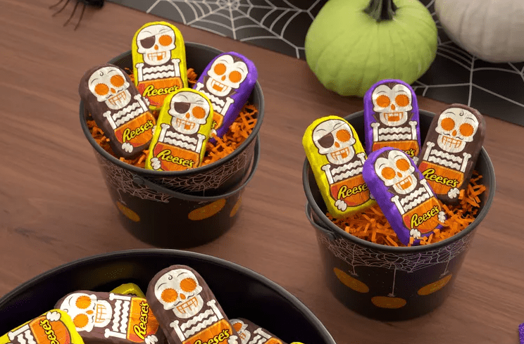
As another unexpected twist, this year, Reese’s is wooing its audience not just with its exclusive Halloween range of treats but also with new Halloween-themed merchandise. The Reese’s Secret Stash Trick-or-Treat Bag does look super-cool with the giant Jack-o-lantern on the front and the overall design as well.
Reese’s thus shows how brands can effectively incorporate the Halloween aesthetic into their packaging and merchandise design as well.
Create Fa-boo-lous Halloween Aesthetic for Your Brand With KIMP
Occasion-relevant designs do not have to be difficult after all. A little planning, lots of inspiration, and a clear understanding of campaign goals can get you there. With all this in place, there is not much to change to help your brand dress up for the season. Halloween is no different. And without a doubt, the easiest way to do this is by working with a professional design team like KIMP. You can save so much time as you prepare for the busy days.
So, what are you waiting for? Register now for a free 7-day trial.