15 Common Design Mistakes Made By Non-Designers
You could be a professional graphic designer and still make mistakes. There is always the possibility of human error. On the other hand if you’re not a designer, the chances of making some common graphic design mistakes are even higher.

Because you don’t know what you don’t know. That’s where this blog comes in. To make your job easier and help you create better designs, we have put together a list of common graphic design mistakes that you need to avoid.
Common design mistakes and how to avoid them
Using fonts in ineffective ways
Typography is something that is very important in any design. It reflects greatly on your brand. And if you happen to be working on a logo design typography matters even more.
One reason for this, is that your choice of font determines whether your messaging will be legible. Or if you use a font that does not stand out, the impact will be lost. The right approach here would be to use fonts that are impactful, easy to read and embody the personality of your brand.
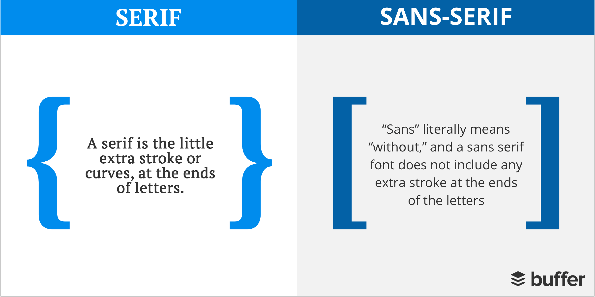
A common design mistake is to use too many fonts in a single design. Depending on how big your design is, and the amount of text, you can opt to simply use one, in varying weights. Or up to 3 fonts. Going beyond the appropriate number of fonts that your design calls for will just make it look busy and cluttered. Stick to using just fonts that are from the same font family or that complement each other.
Your font(s) needs to also fall in line with the ambiance of your design or the feel of it. For example, if you would like to have a tranquil vibe, use rounder, and free-flowing fonts. If you want to convey a stronger message, make sure that you use a bolder and thicker font.
Use of poor kerning on the font
Kerning is all about the spacing that you leave between the letters in your copy. If you look at the example below, you will see that the example “after kerning” looks much better than the one “before kerning”.
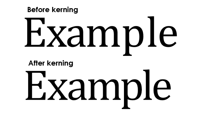
If you want to make sure that the design is balanced visually, kerning is very important. Without it, the readability will be compromised and the letters may even start to look like they are running together. So how can you avoid this? Make sure that you add spaces that are equally perceived between the letters. Then do the squint test. Basically squint your eyes so that you are able to see the spacing between the letters without the letters themselves distracting you. Finally, make sure that the spacing between the words is also equal and not just between the letters.
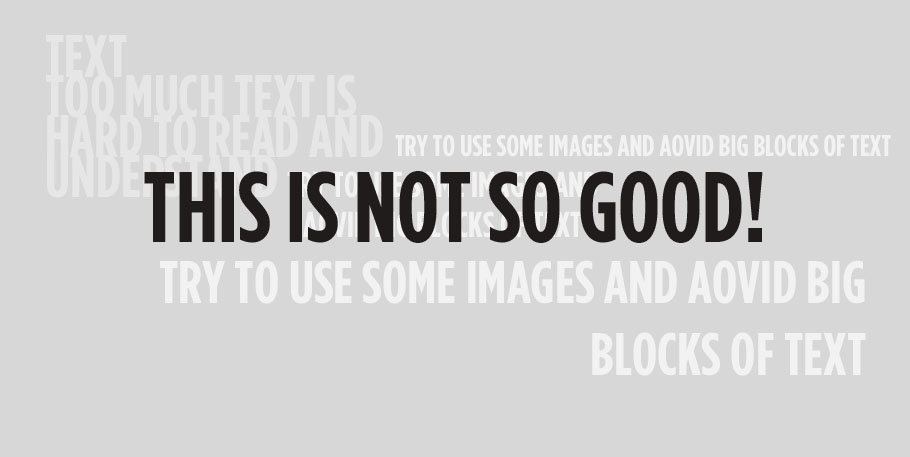
Too much text in your design
Some of the most common design mistakes have to do with your copy. More specifically, using way too much! This could make your design cluttered and ineffective. And it might take away from the opportunity to use images, illustrations, or elements to visually convey your message. So try to keep your text concise, direct, and if possible, impactful. Avoid using large blocks of text at all costs.
Working with the right file formats
Save and package your files correctly
If you want your designs to be printed correctly (if they are for print that is), you need to have them saved and packaged correctly. Be sure to let your designer know exactly how your design will be used. And the formats that you’ll require so that they can provide them.

For print, you’ll want your designs done with the CMYK color code (digital designs use the RGB color code). And typically you’ll need the fonts, images and graphics used in your design(s) organized into different folders.
If you’re not sure exactly what formats you’ll need for print, chat with your printer to ask them if they have any guidelines for you to follow. Many printers will have preferred bleed sizes, and trim border sizes. And they may require you to follow certain specifications like minimum font sizes.
You’ll save yourself, and your designer a lot of trouble, if you find out all these details from the get-go!
Do not use raster images in logo designs
We’ve touched on how typography can impact logo designs. But there are other common design mistakes associated with logo design too. One example is using a raster image, e.g. a photograph, in your logo design. Your logo needs to be created as a vector so that you can scale it without losing quality. It is perfectly fine to be inspired by a raster image and use that as your reference. But do not use that particular file format in your logo.
Graphic elements and colors
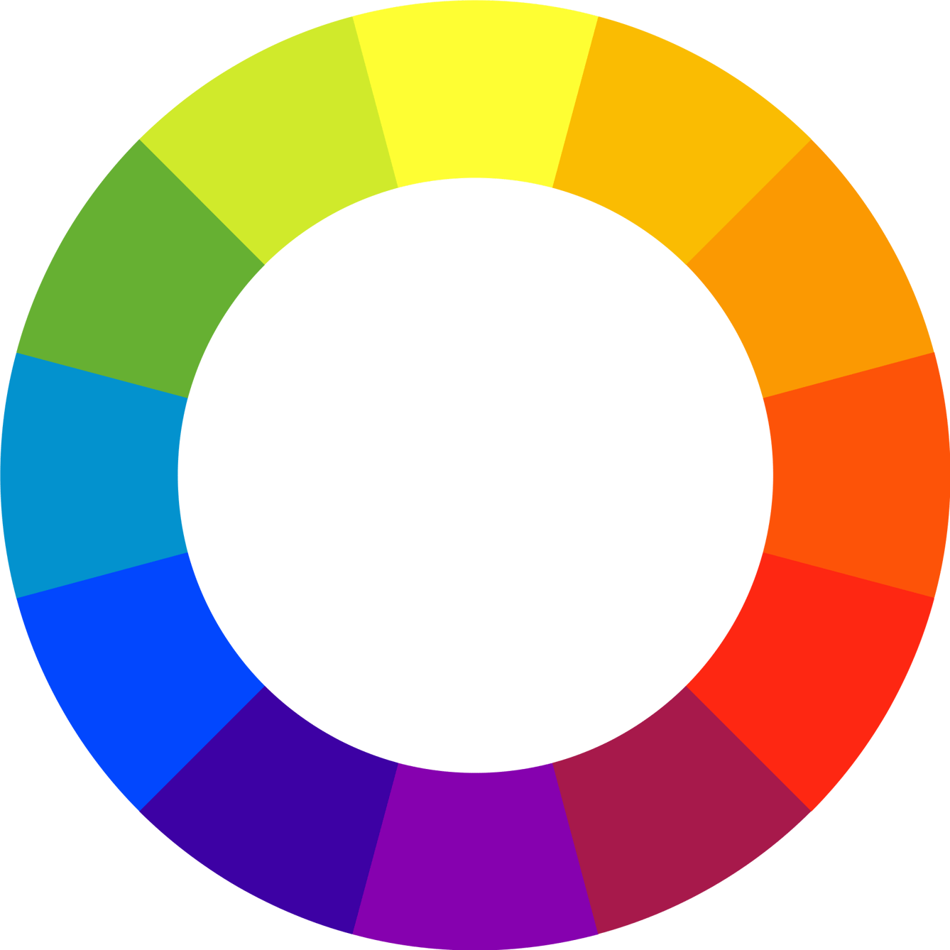
Elements and colors – how much is too much?
Your designs need to have the correct balance of colors and elements so that they look good. If the design is busy and cluttered because of the use of too many colors and elements, it won’t get any kind of message across. So aim to include only what the design absolutely requires. Discuss this with your designer. Let them know what your brand colors are. And if there are any colors you are using as part of a complementary palette. Or for contrast. If you don’t already have any particular preferences in place, they’ll be able to help you identify what will work best for your brand.
Avoid the desktop-first mindset
When it comes to your digital marketing, there is a higher possibility that your target audience will see your designs on their mobile devices than on a desktop. A report from Comscore says that mobile devices account for 70% of the time people spend on social media. So be sure to resize your designs to take into account all of the different placements you’ll be using. Check out the recommended sizes on each platform for this. And you’ll also want to create different versions to A/B test with. One of the benefits of digital marketing is the relatively low cost to try out different types of designs to see how they perform.
Not leaving sufficient white space
Some of the most common design mistakes can be a result of the very best of intentions. You might be tempted to cram every possible thing you can into your designs. But if you overload them and try to fill every bit of space, you won’t be giving the individual elements a chance to stand out.

Adding white space can actually salvage a design because it makes it instantly easier to understand. For example, leaving enough white space around the CTA button will put focus on it. Take a look at the example below. You will see how the right use of white space makes the lettering much clearer.
To avoid making this mistake, always use padding and margins in every element of the design that you are creating. And keep working with your designer to remove anything that isn’t absolutely essential for creating the effect you want, and getting across the message you need to.
Take trends into consideration
You don’t need to jump on all the bandwagons for every last trend. In fact, you shouldn’t. But you should thoughtfully evaluate, and incorporate any of them which are relevant to your brand and to your designs.
Especially when it comes to digital marketing, it is great to refresh your creatives on a regular basis. Just be mindful of doing this in ways that work for your brand. Your designer can be your sounding board here, and also help you come up with a few mockups or test designs to try out. See how your audience responds – or doesn’t – before you go into an all-out overhaul of your creatives. This could be a matter of trying out vibrant colors over pastels for a certain campaign. Or trying out thin lines and geometric shapes to create a futuristic feel.
The specific trends that will work for you are those that are aligned with your branding, or how you want your branding to evolve.
Not designing for your audience
If your designs do not resonate with your audience, you won’t be seeing any results. One of the most common design mistakes is to design according to your personal preferences rather than those of your audience. At best this could mean being ignored or dismissed as irrelevant. At worst it could mean creating a design that’s outright inappropriate.
For this reason, make sure that you research your target audience and what their affinities and preferences are. And break all of this down for your designer. This way they can also help you when you request revisions. They’ll be able to ask you if the revisions are aligned with your personal preferences or your audiences’.
Using too many flat vector images is a bad idea
Flat vector images became really popular in the recent past and still continue to be used quite often. They have one big drawback. They’re often done in a very similar style, and can even use similar color palettes.

This means they can lack the specificity that you need for your designs. Here’s where working with a designer will come in handy. If you find a particular stock vector that you like, you can ask them to customize it to be aligned with your branding. Alternatively, you can get completely custom illustrations done. These will take longer, so you’ll just have to weigh the pros and cons of each approach.
Using outdated effects
There were some effects like bevel, emboss, and shadow that used to be really popular around the 90s. If you’re using them now, then you’d better make sure that they actually make sense in your designs. And there might actually be a more contemporary alternative. So try doing some research, and check in with your designer to find out what they might suggest. Otherwise, insisting that they use these types of effects might lead to your designs appearing outdated and amateurish.
Misaligned elements are a bad idea
When you do not align the elements in your design, you’ll make it difficult to understand. It won’t be clear what your messaging is, what the CTA is, or how the various images or elements complement each other.

Lacking consistency
Consistency is the golden rule in branding. No matter what types of designs you’re getting done, make sure that your brand is represented in a consistent way. This applies to colors, fonts, themes, imagery, elements, and messaging. To help you and your designer get on the same page, be sure to share our brand style guide. Don’t have one yet? Not to worry. You can work with them to create one so that you have a blueprint for all of your future design projects. And your customers will immediately recognize that your designs belong to your brand.
A brand style guide isn’t set in stone. And you’re of course free to evolve your brand over time and experiment with individual designs. But overall, it’s best to follow a consistent design style.
Making your audience hunt for information
Be sure to use visual hierarchy in your designs to make it clear which information is most important. And the sequence in which the information/content should be consumed. In order to help your designer with this, you’ll need to let them know which text is the headline, subheadline, or descriptive text, and what the CTA will be. You’ll also need to share any brand assets or images that need to be included. Ad be sure to let them know about the goal of the design.
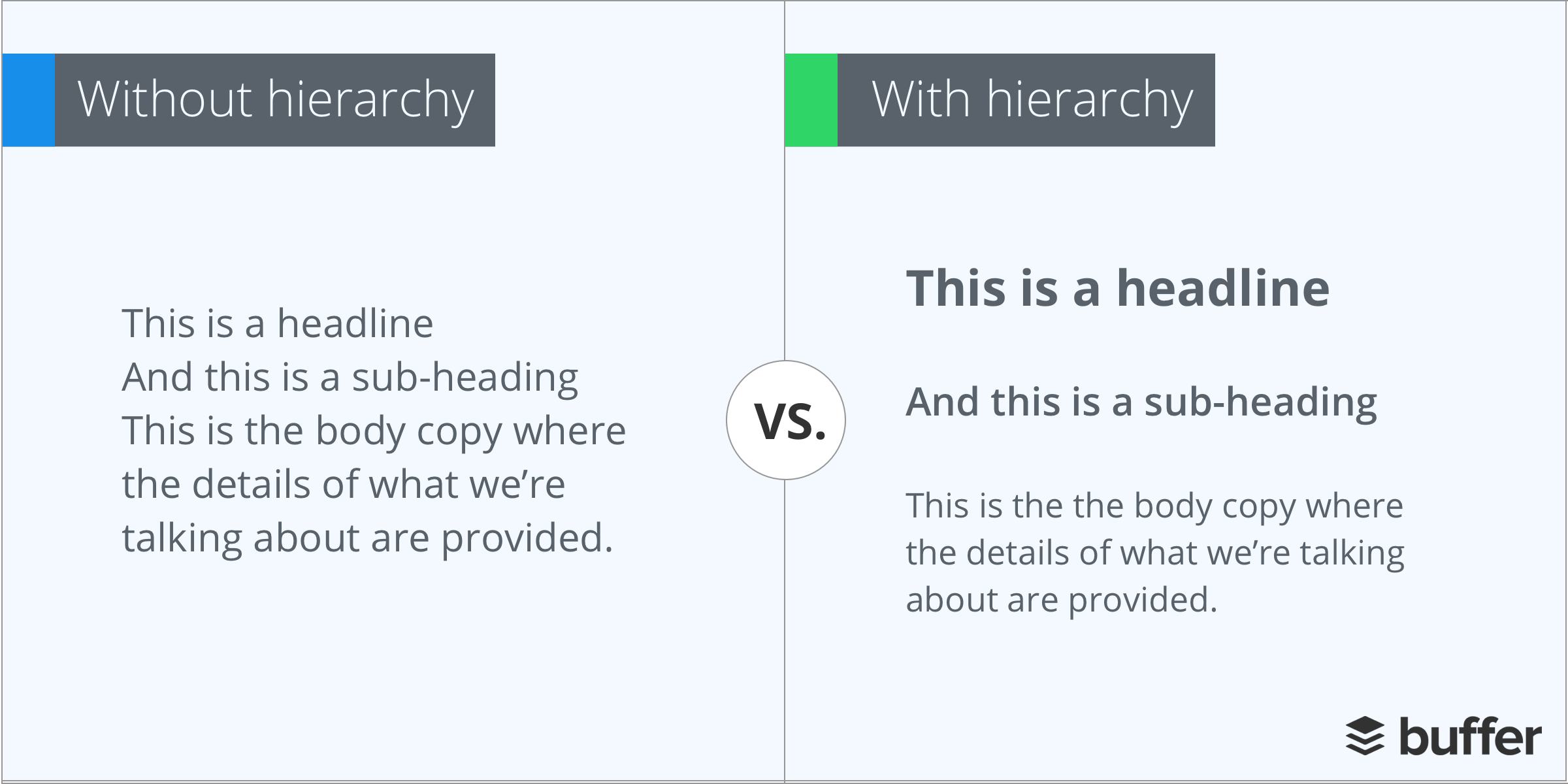
If for instance, you’re introducing a new product, your designer will then know to emphasize the product image. And any additional text in a way that enhances and complements it. If your customers have to hunt for information, and can’t see immediately why your design is relevant to them, they will quickly lose interest.
Make mistakes until you’re an expert
It might make you nervous to think about all of the common design mistakes that might crop up in your designs. But the more you’re aware of, the better you can fine-tune your creative briefs, and work with your designer. Whether you have much of a background in design or not, getting to know some of these dos and don’ts will help you get better results for your brand.