Business Card Design Secrets Every Entrepreneur Should Know
There was a time when launching a business did not feel complete until you got a snazzy business card with your name on it. But today, you can launch a business in minutes, sitting at your desk. But does that make the business card any less valid? Spoiler alert: it doesn’t. Business cards are still very much relevant, even in the digital age.

So, here’s what your business truly needs: a business card that captures the trust factor in print designs while and manages to connect with the gadget-savvy generation of today! Does that sound too difficult? We’ll simplify it for you in this blog. But while we set the stage for presenting some business card design tips, here are some quick-fire business card facts to make you appreciate this marketing tool just a little more.
- Random Business Card Facts
- Graphic Design: Business Card Design Tips
- 1. Begin with a game plan
- 2. Pick a theme and build on it
- 3. The thin line between simple and boring
- 4. Creativity vs exaggeration
- 5. Keep it relevant to your brand
- 6. Typography makes or breaks the design
- 7. Hierarchy to simplify the message
- 8. You cannot compromise on the visual balance
- 9. Do not underestimate the power of negative spaces
- 10. Using a photograph in business cards
- 11. Pay attention to the little details of the composition
- 12. Framing of the content
- 13. CTA to effectively bridge the gap between print and digital
- Graphic Design – Business Cards: Creative ideas to try
- Design Impactful Business Cards With Kimp Graphics
Random Business Card Facts
- Business cards have been around for a long time now. The one in the image below is from the year 1895.

- You cannot receive a card and simply tuck it into your wallet while you are in Japan. In Japanese culture, you should receive the card with thanks and spend some time examining it.
- In China, you have better chances of impressing the receiver if you hand over a Chinese version of your card.
- You should carry enough cards with you when you attend a conference in the Middle East. Otherwise, you might be the only person not handing out cards at the end of the conference.
- In Western culture, the etiquette for handing out and receiving business cards is slightly more flexible. But it still will be a valuable asset to carry when you attend corporate gatherings.
Hoping that we have established the need for a business card now, let’s dive right into the design tips.
Graphic Design: Business Card Design Tips

Your business card might often be the first contact people make with your brand. Before you even capture their name, contact details, and interests. When distributed right, your card only reaches people who are viable targets for your brand or partners who will add value to your business. So, it becomes a cost-effective way to introduce your brand to the right people. If the design conveys the intended message that is.
Keeping the different perspectives of the millennials and GenZers in mind, you need to design a card that gets the message across and persuades your target to take an action. It should convince them that your business is worth working with amidst the endless choices they have in front of them. So, here are a few design tips that will help you start off on the right foot.
1. Begin with a game plan
Remember that designing a business card takes more than just plugging your brand name, logo, and contact details into an online template. There is a good amount of thought process involved.
- You should have a budget figured out
- Try to gather information about the standard sizes and material choices
- Be clear about the objective of your card and then decide the CTA based on this
- And finally, outline the information you want on your card
2. Pick a theme and build on it

As with every other piece of graphic design, your business card will also need a strong foundation. And a design theme will be that foundation in this case. Your theme includes the colors you choose based on the emotions you wish to evoke. The right theme ensures that you make a strong first impression.
Having a theme also makes sure that the design looks cohesive on both sides. You will not want a card where the back looks nothing like what’s on the front. At least try and match up the accent colors. It will make a big impact. And finally, a running theme also makes the card look professional.
3. The thin line between simple and boring
If an entrepreneur hands you the below card, will you actually make an impression of the business from it?

To keep up with the dwindling attention spans, brands adopt minimalistic designs. But that should not lead to something too plain and uninspiring like the one above.
Minimalism does work in business cards. When used right, you can create a lasting impact with a minimalistic business card design. The below image is a good example of simple is good.

It cuts the fluff and only has what’s essential. It keeps the design on point, just like your business. A fuss-free collaboration is what vendors can expect while transacting with you. If that’s the message you want to convey, such minimalistic designs work wonders.
4. Creativity vs exaggeration
If minimalism feels like a been-there-done-that for you, then you can get creative. But again, remember you do not have to exaggerate to make an impact. On something small and sensible like a business card, you only need what’s pertinent.
Too many details make your card look cluttered. There are higher chances of people missing out on the important details amidst the crowded design.
Kimp Tip: Just because adding symbols and visual elements make your card look good, you should not add too many of them. All the distraction draws people away from the intended CTA.
Looking for a creative business card design that does not confuse your customers? Get in touch with the Kimp Team and we’ll help create a stunning card for your business.
5. Keep it relevant to your brand

One way to draw a line between exaggeration and monotony is to go with a brand-relevant design that powerfully captures all the key details. Start by outlining the design and then cut back on anything that feels disconnected from your brand. Subtle visual elements that capture the essence of your brand will add more strength to your design. Like the film reel detail in the above image.
But there should be no icon or imagery that bears no semblance to your business’ personality. Sending confusing signals is definitely a big NO.
Even in digital designs, this does not work. But at least people are in front of their computers and they might immediately Google your business. And perhaps thus find more about your business. But here, they are handed over a card. Their impression is formed, almost immediately. By the time they Google your business or connect with it digitally only to realize that it is a totally different thing from what your business card shows, the damage is done.
6. Typography makes or breaks the design

The text content on your card has the strongest role to play. After all, it is about getting people to pick up their phones to make that call. Or even check out your website.
To begin with, it is a small space and the printed fonts are going to be small. So, you need to be extra careful about the fonts you choose. Decorative fonts look great but limit them to your brand name section.
For the contact details, pick the crispest looking font in a color that looks best on the background color you have chosen. Sans serif typefaces work in most cases.
Combine font styles that look visually pleasant together. And possibly something that captures your brand personality as well.
Kimp Tip: Too many font styles make your design look like it was haphazardly done. No font variation at all makes it look unexciting. You do not want both. So, a combination of two typefaces will be easy to work with. Of course, you can alter the text size and show additional variations.
Picking the right typography styles for business cards can seem confusing. We get it. Book a call with the Kimp Team today and we’ll help you choose the right fonts to design a visually memorable business card for your brand.
7. Hierarchy to simplify the message

We often talk about visual hierarchy in design. It really matters. A lot. In ads, large UX designs, or even on a small business card.
You have text and you have visuals. But when you jumble them out of place the impact might not really be the same. Why’s that? We relate elements to the others that lie immediately next to them or above or below them.
Hierarchy is that which helps establish a connection between the individual components in the design. This way, the same relation and flow that you have in mind while creating the design will be conveyed to the onlooker as well.
Wondering how to create visual hierarchy in designs? Check out this blog post on visual hierarchy.
8. You cannot compromise on the visual balance
Hierarchy manages to establish a natural flow that makes it easier to interpret the message on your card. Visual balance, on the other hand, ensures that your design pleases the eyes of the onlooker.

The above design does not strain your eyes. It looks smooth and well-balanced. That gets your eyes to travel naturally. And that’s what you want with a business card design.
9. Do not underestimate the power of negative spaces
Negative space in design is any space that does not contain text and other visual elements. When you are creating a small design like a business card, there is already a space constraint. In such cases, the negative space will be useful as a visual cue to draw attention to something.

In the above example, the negative space automatically draws your eyes to the website detail at the bottom. Negative space in business cards also helps strengthen the legibility of the content when used appropriately.
10. Using a photograph in business cards
Solopreneurs will find it beneficial to add a photograph to their business cards. It does not just add a personal touch but also gives a face to relate with the brand from the first interaction.

Realtors, for example, will find it easier to build trust and get people to remember them, by adding a photo. But be sure that you choose a professional photo, one with a warm expression that will encourage people to connect with you.
Kimp Tip: Removing the background and making your photo blend naturally with the rest of the design will be one way to stay in the lines of branding while including your photo.
Looking for business card designs that incorporate your photo? Talk to the Kimp team today and find out about the creative ways to do that.
11. Pay attention to the little details of the composition

As you carefully sew together one visual element at a time, your logo needs to be prominent but the rest of the text matters too. So, it is about how they all look together.
While giving importance to your logo make sure that it does not take up so much space so that the text has to be scaled down too much. Use enough negative space around the logo and the text sections as well.
Every little detail matters. You cannot compromise on the legibility simply because you want the design to be bold and creative. If because of the font or the poor contrast of the background the contact details are not clear, it can backfire.
If the email address is not clear, when a customer tries to drop an email inquiry, it bounces back. Or they dial the number but it connects somewhere else. If this happens, you lose them. Valuable leads who could have become customers if only the details were easy to read.
A test print might be the only thing that saves you here. A design that looks good on a computer monitor might sometimes feel different when you print it out. The colors and even the fonts. You will want the effect to be exactly as planned.
12. Framing of the content

Business cards are printed out in large batches and then the individual pieces are cut. So, you should be extra careful about the bleeds when you design your card.
Once you have ensured that the overall composition is clear, you should frame it right. For cleaner cuts, you should have a tiny space left out on all four sides. This clearance will ensure that while cutting the cards tiny sections of the design do not get chopped off.
Keep your logo center-aligned if possible. And keep the text away from the edges.
To know more about bleed, trim and other design terms that help you understand business card designs better, we have a blog on the common design terms for every non-designer to understand.
13. CTA to effectively bridge the gap between print and digital

What do you want people to do once they receive your card? Call your business or drop in an email? Or perhaps connect with you on social media? When you have a clear CTA, make it explicit in your design. Emphasize the contact details section.
And to make things simpler for people with gadgets in their hands at all times, add a QR code to take them to your website or social media pages. This will be the maximum utilization of the business card real estate. And that’s a good move!
With these easy tips, you should be able to design a business card that makes an impact at first glance. But as with most marketing materials today, it is alright to bend the rules. And try something out of the box. In fact, that’s how you get people to notice you. So here are some novel ideas to try for your business card design.
Graphic Design – Business Cards: Creative ideas to try
- The paper you choose and the printing quality determine how your card feels when someone actually holds it. Incorporate unique options like handmade cardstock to make a difference.
- Flat designs are everywhere. Give it some texture. Rectangles and squares are too common. Try an unconventional shape. Triangles and circles work too. Or if you do not want to extend your budget due to excess material costs in unconventional shapes, you can try experimenting with the orientation. Like the vertical design in the card below.

- A card that only conveys the contact details is common. Create something that people can actually use. The below card doubles up as a spaghetti measuring tool.

- 39% of people hesitate to do business if the business card looks or feels cheap. So, try to explore materials that add a premium touch. When you attend a large business summit, among all the business cards you receive, you are more likely to retain a wooden business card or even a stainless steel one rather than the usual plastic and paper variants.

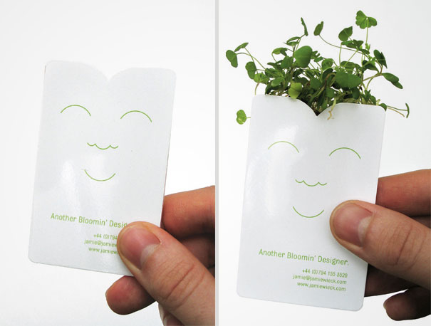
- Make heads turn with an eco-friendly design. Using seed-embedded paper or even printing your business card on a seed pouch are a few cool ideas that have been trending.
Design Impactful Business Cards With Kimp Graphics
When it comes to business card designs, step out of your comfort zone. You might end up creating something refreshing, something people will like to hold on to. With your dedicated design team to back you up, you can confidently explore all the cool trends in business card designs. You get unlimited revisions. So, you can keep tweaking and tuning it till you are fully confident that it is a design that resonates with your brand.
Start your free trial today.