Mobile App Design: 6 UI Design Best Practices
How many apps have you installed on your phone? Perhaps you are not using most of them but every time you see the app you think of the brand, correct? And the next time you see a social media ad from the brand or a billboard it’s easy to recall the brand. This instant brand recall means a better chance of conversion.
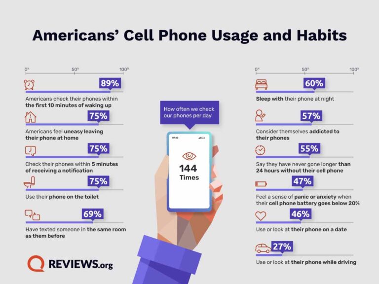
Data shows that approximately 89% of Americans reach for their phones within the initial 10 minutes of waking up. This means that when you create an intuitive mobile app and convince your target audience to download it, there is a good chance of making them remember your brand within the first 10 minutes of waking up.
Now even if they come across other ads throughout the day, the first recollection of your brand they had that day will still matter. Isn’t that huge in marketing? That’s why mobile apps are infallible elements in marketing. But for this to work in favor of your brand’s growth, you need the app to be user-friendly. A poor user interface ends up frustrating your customer and therefore increases the chances of the customer abandoning your brand.
Now how can you avoid that? By creating engaging and convenient user interfaces for your mobile app design, of course. That’s what we’ll be discussing today in this blog.
Let’s quickly look at some mobile app usage statics to understand the ups and downs of mobile apps in a brand’s marketing.
Why are mobile apps important for businesses?
- More than one-fifth (21%) of Millennials access an app more than 50 times daily. See what’s happening here? Engagement! And that’s what businesses crave. Hence mobile apps are great for boosting engagement.
- Mobile devices account for approximately 59.9% of all global ecommerce sales meaning that a well-designed mobile app helps boost sales. Need we say more?
- Push notifications are a great help in audience retention. Don’t believe us? Here’s a stat to prove it. When you have a new subscriber, even just one push notification from your app within the first week since app installation is effective enough to bring retention rates up by 71%.
With all these stats proving the point, comes the real question. Then why do some apps make a business a global sensation and others fall flat? The answer could be right in front of you – yes, we are talking about the mobile app design, the user interface in particular. Because a confusing app, a sluggish interface, or even complicated navigation could cause them to rethink whether your app deserves a spot on their precious phone real estate. That’s what we are going to tackle now. User interface best practices for mobile app design!
Tips to create a user-friendly UI in mobile app design
1. Choose the right colors
Colors are the most prominent details anyone notices about an app. So, how do you choose the right colors for your mobile app design?
The first factor is branding. The colors you choose should reflect your brand. If you do not already have brand colors defined, now is a good time.
Ready to play a guessing game? Take a look at the image above and see if you can guess the app or brand from its colors. That’s right, the dark green hue instantly brings Starbucks to mind, doesn’t it? Colors hold incredible power, especially when it comes to mobile app design.
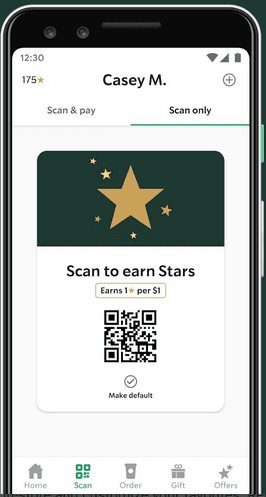
For new brands, choosing the perfect app colors becomes an essential visual cue, leaving a lasting impression on users. And for established brands, their app’s color scheme becomes a secret weapon for instant brand recognition! It’s like having their logo right there in users’ minds, creating an unbreakable connection.
The second aspect with respect to colors will be color psychology. We’ll give you an example. A simple black interface on a food ordering app will not make anyone hungry or excited about food. You need lively colors like yellow and red to evoke the right emotions.
Now that we’ve seen how to choose the color for your mobile app design, let’s talk about where to use them.
KIMP Tips:
- While brand colors are important, they do not necessarily have to fill the screen. You do not want to cause eye fatigue. Use them instead in navigation & menus, buttons/CTAs, alerts & notifications as well as in container UI elements.
- Do not use too many colors – they dilute the impact of the core color.
- Avoid colors with blaring contrast that can cause eye strain. Understand the color wheel and choose colors that work well together.
2. Practical typography decisions
Fonts directly influence the readability in mobile app design. Therefore, you need to choose fonts with a clear purpose. You cannot go with the fonts used in your brand logo unless it is a crisp and readable typeface.
Take the Coca-Cola brand for example. It is noted for its signature script typeface in its logo. But imagine having to navigate through an app where all text is in this script face! That would have been tough. Coca-Cola knows this and therefore uses a simple sans-serif font instead.
KIMP Tips:
- To make the fonts you choose for your mobile app design work you need a legible font and the appropriate font size. Decorative fonts are best left to your other marketing designs.
- Pay attention to every single attribute related to typography like leading, kerning, and tracking. The aim is to make the text on your app easy to read.
- Make a list of the places where you have text appearing on your app. This includes heading, subheading, and body text on pages, text on labels and app menu, button text, and so on. You need to strike a balance between font variations across these categories and coherence. In other words, keep the variations subtle. Consistent font styles ensure visual harmony in your mobile app design.
3. A layout that makes navigation simpler
There are various aspects of a mobile app UI design where you can exercise creativity but layout is not one among them. This is one attribute where practicality surpasses all others. Because no matter what business you own, no matter the purpose of your app, when it comes to layout, the idea is to deliver a seamless experience.
The first thing to do will be to prioritize simplicity. Apps are meant to make the experience simpler and faster for users. Simple layouts make this happen.
Then comes the smooth and seamless flow within the app. Users should not have to spend hours trying to figure out where to find what. Instead, your mobile app layout should look well organized making it easier for users to find what they need.
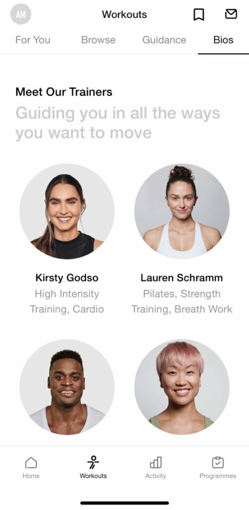
To achieve this you need logical grouping of elements. And these elements can then be segregated into tabs/pages. Within each page, grid layouts make it simpler to navigate through the content.
Below are a few snapshots from the Nike Training Club app. You will find different types of grid layouts on each tab. Some have carousels to reduce the scrolling involved (as you see in the second image). Overall, there is an order in the layout that makes the UI convenient to use even if it is the first time you are using the app.
KIMP Tips:
- To make the most effective layout decisions for your mobile app design, map out user journeys. This will help you segregate app actions based on frequency of use and other parameters.
- Ensure that the layout you choose looks good on various screen sizes.
4. Optimizing for screen orientations
When discussing UI for mobile app design we throw around the word “seamless” quite often. Because that’s truly how the experience has to be and from every angle. It’s not just about fluid navigation from one page to another but also about the seamless transition of the layout when the device goes from portrait to landscape orientation.
Before you finalize your layout, ensure that the overall design is responsive. The content on the page should effortlessly fit into various screen sizes thus delivering a consistent experience to the user. Choose flexible layouts that accommodate such adjustments.
One of the main steps to do to ensure this will be to add sufficient negative spaces around the corners and edges. This is to ensure that there is no critical information lost around the edges. Remember that some phones use hole-punch displays while some use notches. Considering this hardware aspect, if the CTA on a page in your mobile app happens to be right below the notch or punch hole, there is a good chance that the button does not get clicked!
KIMP Tips:
While the core interactions within your app can focus on the portrait orientation (since this is how most users use their smartphones), you should also consider navigation bars and side drawers that make it easier to use the app in landscape orientation.
The layout will include some extra elements and skip out on others on transitioning from one orientation to another. The decision here depends on the purpose of your app and the actions users perform. Take the YouTube app for example. The below snapshots show what a video in the app looks like in the portrait and landscape orientations respectively.

Finding the most flexible layout for your mobile app design seems overwhelming? Leave it to the professionals!
5. Negative space considerations
You might have a lot of elements in your mobile app. But to make them all work well, to organize them, and to ensure that there is a visible harmony in your mobile app interface, you need strategically use negative space in the UI design.
The first reason why negative space matters is readability. When the text within your app and the labels are all crowded, it becomes difficult to read the content. Even the best font will not help in this case.
The second reason is to simplify navigation. Without enough space, users do not have clear touch targets within the app. This leads to misclicks which hamper the experience. Additionally, when misclicks happen multiple times, it can frustrate the user.
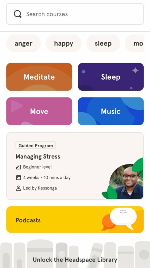
The third reason why you need negative space in a mobile app UI design is to organize content. Within your app, you might have different kinds of content. To organize them and to create a visual differentiation you need negative space. Take a look at the below snapshot from the Headspace app. The proper use of negative space helps establish the difference between the search tags, featured categories, and podcasts section.
The fourth reason to prioritize negative space is to create emphasis. When there is negative space surrounding an element, you are drawing attention toward it. Evidently, you need to use negative space effectively around CTA buttons to guide users to take intended actions.
KIMP Tips:
The above four reasons we cited talk about the functional reasons why you need negative space in your mobile app design. Additionally, negative space also has a role to play in the aesthetics of your mobile app. Because without negative space, even the most aesthetic elements will end up creating visual clutter than appealing to the user.
6. The magic of micro-interactions
Touchscreens might make a world of difference when it comes to the flexibility of using mobile applications. However, the lack of tactile responses to a user’s interactions with the app needs to be addressed. This is why some apps, especially games, and others involving consistent interactions support haptic feedback. However, one other way to tackle the gap is to focus on the micro-interactions in your mobile app design.
Micro-interactions are those little animations, color changes, and other noticeable ways in which your app interface responds when users perform certain actions. These are pivotal in keeping your app engaging. Of course, you do not have to use dramatic animations to make an impression. All it takes is a collection of thoughtful micro-interactions.
To achieve a balance between overdoing the feedback and creating engagement, consider the context and come up with a list of the most purposeful micro-interactions. Something like a subtle color change or even a simple animation, when you hit the like button, will be good.
For example, the color change on the Like Button in the Facebook app along with the sound feedback tells a user that the “Like” response was recorded.
KIMP Tips:
Animated UI design elements like a progress bar can be effective micro-interactions within an app. This is where a touch of personalization can go a long way. Animating your mascot to indicate progress is a good way to make users forget about the frustration of waiting for something to load or download.
Want to create simple animations to enhance the UI design of your mobile app? Get a KIMP subscription!
Take your mobile app UI design to the next level with KIMP
Designing the UI for your mobile app, as you can see, involves a lot of meticulous decisions. Some of them are better when you have prior UI design experience. That’s why working with professional UI designers can be one of the most convenient ways to create the best mobile apps for your business. What if you could combine your UI design workflow and your marketing design workflow streamlining your budget? Sounds great right? That’s one reason why businesses trust unlimited design services like KIMP.
Want to experience the perks of a design subscription without long-term commitments? Sign up for a 7-day free trial today!