How To Create A Pitch Deck Design That Will Get You Funded
If you are a startup, or any kind of business that is looking to get funding, chances are you’ll need a pitch deck design. Whether it’s a formal requirement for any type of funding that you’re looking for, or not, having a well-designed pitch deck up your sleeve can help you convince even the toughest of prospects to hear you out.

There are many different approaches you can take with your pitch deck design, and with the help of your designer you can identify the one that’s best for you, to play to your strengths. Raising the capital that you need from investors is something that is challenging and time consuming. But it’s a non-negotiable for many, not just for covering operating costs, or costs associated with scaling, but to establish value as well.
This is why your pitch deck design needs to tell a story that is both compelling and informative. Throughout this blog, we’ll cover the components of a great pitch deck design, and how you can incorporate them into your own!
How to approach your pitch deck design
Keep your brand simple
Your brand identity is a rather large investment. So it might not be something you’ve been able to invest in just yet. Unless you’ve tried out Kimp. 😉 That said, it is still important to be able to communicate what your brand is about to your investors. This will differentiate your pitch, and it will also demonstrate you prioritize marketing and branding – important functions for any business.
So what do you do? If you don’t have a brand that is already fully developed, keep things simple. Choose a color palette that has perhaps two or three hues that convey the personality of your brand. You can check out our blog for tips on choosing the right color palette for your brand. Colors have the power to communicate and reinforce the meaning and messages that you stand for. So choose options that are appropriate, and impactful, for your particular industry or niche.
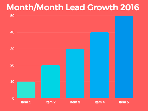
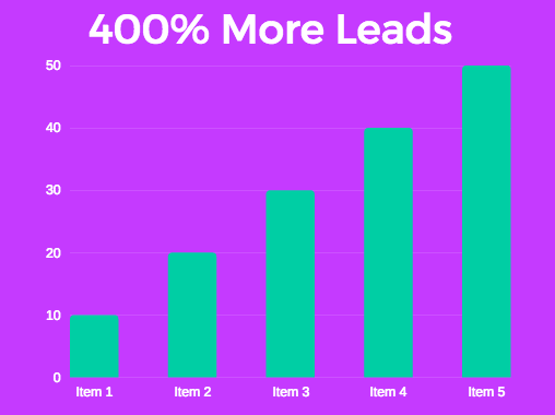
Use numbers, charts to quickly deliver meaning
Remember that you’re trying to make a good impression in the most direct and effective manner possible. Don’t make your investors dig through paragraphs to find out why they should invest in you. They won’t. Chances are the walls of text will turn them off or they’ll just miss what you’re hoping to highlight.
Instead use tools like infographics, charts, and important stats to get your points across. Whether you’re talking about staffing, operations, or budgets, avoid lengthy text, and opt for a graph or a chart, with key figures highlighted. Pie charts are great for this purpose. Just make sure to use the right colors, sufficient contrast, to draw attention to where you want it to be. Having a chat with your designer about your options can go a long way. Don’t make them guess at what’s most important in your pitch deck design. Let them know, and get their ideas for how you can visualize it.
Use icons so that text is simplified and minimized
Using icons will serve two main purposes. They will give a lot of personality to your pitch deck and they will also help to convey information quickly without the need for as much text. At the same time, if your investors want to read further about a particular topic, icons can serve as headlines and convey different categories in a visually appealing way. So using them will help your investors quickly identify the details they’re most interested in.
To make sure that the icons that you’re using reinforce your brand identity, let your designer know as much as you can about your brand. If you’re working with them for the first time, share as much as you can of your previous marketing materials and/or information about your industry (e.g. examples of your competitors’ branding). This will help them with coming up with options that work best for your brand.
Provide visual competitor analysis
Giving your investors a competitor analysis will let them know how you fit in amongst the other players targeting the same market. You can incorporate pricing and value propositions here, and indicate which brands are on the lower or higher end, and where you land. Your goal is to show how you are unique. Sure you’re all solving similar problems but who are you solving them for, and how is your particular solution addressing things differently? If you’re targeting a particular subset of customers, and/or are doing it with a twist that your competitors aren’t, play this up!
The simplest way to visually depict this would be using an XY graph, and placing logos rather than individual points.
Zero in on key concepts with word clouds
Word clouds can take many different forms, but their function is the same – to pull focus to the most important trends or concepts in a particular grouping. This can be done by placing words in different sized circles, with the most prominent words in larger sized fonts/circles. They can also be presented as tetris-like arrangements.
Break large chunks of information into tiled layouts
Have a lot of different, but equally important pieces of information to get across? Say hello to tiled layouts. A tiled layout allows you to create multiple snapshots of information, arranged alongside one another without becoming cluttered.
Consider dividing an individual slide into anywhere from 6 to 10 sections, and provide your designer with the text for each. You’ll want to try to keep the text at a roughly uniform length so that there is a sense of balance in your design. Your designer will then use techniques like adding borders, alternating colors, and incorporating icons to ensure that each piece of info is easy to recognize and read.
Use a timeline to share your milestones
If you want to showcase your progress, milestones, rollouts and/or spending, consider using a timeline. It’s an effective way to show your investors where you’ve been, and where you’re projecting that you’re headed to. This can include very detailed information, and as the person that knows your business best, you’ll know all the nitty gritty details.
But in your timeline, you’ll want to visually pull focus to your greatest hits. Trim down your text as much as you can and ask your designer for guidance on whether that’ll suffice to create an easy to read timeline. It can be as simple as just two or three sections with several milestones in each of them.
Show off your team
Central to the importance of impressing your investors is showing off your team in your pitch deck design. When considering potential investments, investors will want to know more about the teams behind them. Professional photographs go a long way here, as do descriptions of experience, motivation for starting or scaling the business, and various roles, including short and long-term responsibilities.
Use powerful images to add visual appeal
The right images can serve a few purposes in your pitch deck design. They can reinforce your brand’s visual identity, break up sections of text, and create a more compelling experience overall. Be sure to choose images that reflect your business activities and/or your target audience. And have them serve as the background, sized to span the full width and height of each slide for more impact. If you’ll be emailing your pitch deck design, be sure to save it as a PDF, or to ask your designer to do so. This will ensure that all your formatting, fonts, and imagery stay intact.
What to avoid in your pitch deck design
Just like there are best practices for a pitch deck design, there are things you should avoid. Below you’ll find a list of the things you shouldn’t do in your pitch deck.
Avoid using excessive and unnecessary information
Get your points across clearly, and arrange them in a way that allows them to build on each other. Don’t simply repeat the same few value propositions over and over. You want to get your investors’ attention, not hit them over the head with one aspect of your business. And a note on financials in particular: be transparent, concise, and never inflate your numbers.. Avoid including every last piece of information, but make sure that you provide a thorough and clear overview in visually appealing ways.
Don’t aim for more than 15 slides
There’s a lot of wisdom floating around about pitch deck designs and it seems that the consensus is that you should aim for about 15 slides. If you’ll have any more, limit the amount of text and err for highly visual slides.
In terms of text, try to limit yourself to 20 words or less, between a headline and a description. Your script can be longer of course, but you want your slides to be concise so that your investors are with you throughout the presentation.
Don’t include irrelevant images
Your visuals must have an impact. And you want it to be one that reinforces your message. Not one which causes confusion about who you are or what you’ve set out to do. Maintain consistency with your brand when you choose images, and be sure to give your designer references for the types of images you’d like if you’ll be getting their help to source stock images.
Ensure your pitch deck design has great contrast
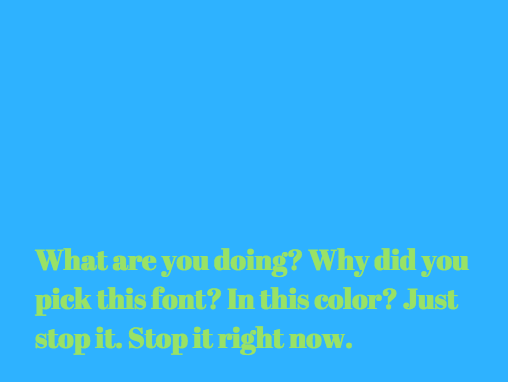

You have no way of knowing whether any of your potential investors have a visual impairment. Be sure that you plan for all possible scenarios, and create a pitch deck design that is accessible and easy to read. In the example above you can hardly make out the text.
Avoid data that doesn’t make an obvious point
Visualizing your data is great. It helps you validate and build up your case in a visually compelling way. But only if that data is relevant and clearly represents the value you create. Otherwise, you’ll deflect your audience’s attention from your goal.
Get that pitch deck design done
If you want to get your pitch deck design done right, you’ve got to make sure you’re working with all the right pieces. Include details on the market size and opportunity, your business model and financials, the competitive landscape, your competitive advantage, your team, and your go-to-market strategy. Tailor it to your audience and make sure that you’re telling your story with headlines and bite-sized tidbits that you will elaborate on when you present. The first test of this will be when you put together a brief for your designer. And whether you’re able to clearly convey your priorities for your design. Once you’ve got that done, you’ll get to see how good design can tell your story in a compelling way.