Design Secrets for Mobile Marketing Success
Are you looking to reach a wider audience and improve the visibility of your brand? Then you should place your brand’s ad on a device that customers carry with them most of the time.
You guessed it right, a smartphone.

Some digital milestones changed the marketing industry altogether. And one of them is the first-ever mobile marketing campaign in Europe, by Universal Music Group in the year 2001. As smartphones were not very common back then, the campaign used SMS service. But today, with massive displays and stunning resolution, things have changed. Better-looking ads that are more interactive have become a reality.
The worldwide spending on mobile advertising might be more than 339 billion USD by the year 2023. This means that marketers should brace themselves for stiff competition. Brands and marketers also always look for new ways to make their mobile ads look and feel better. But how do you do that? Let’s talk about mobile marketing.
- The Many Perks of Using Mobile Ads
- Mobile Ads – Designing for Success
- 1. Understand and explore the different ad types
- 2. For banner ads, typography has a critical role to play
- 3. Size your banner ads right
- 4. Design CTAs that customers would like to click
- 5. Allow users the freedom to close the ad without any hassle
- 6. Avoid information overload
- 7. Acing the art of video ads for mobile marketing
- 8. The power of vertical videos
- 9. Pay attention to color psychology
- 10. Check for the must-haves in your ads
- Transforming Your Mobile Marketing Strategies With Kimp’s Unlimited Graphic Design Services
The Many Perks of Using Mobile Ads
Should you bother about mobile marketing at all? (Spoiler alert: You should!)
Mobile marketing is for businesses struggling to grab the attention of relevant audiences. It is also for brands and marketers who need cost-effective ways to drive traffic to their websites.

25% of firms believe that investing in mobile marketing enhances their SEO. Other than SEO, here are a few more benefits of building a strong mobile marketing strategy for your business-
- There are so many places where you can meet your audience – inside an app, on mobile websites, in between a game, or even with an old-school SMS. And more channels mean that you can diversify your marketing strategy for better reach.
- Geotargeting would be a piece of cake – so you can be sure that your ads will appear only to customers in the targeted region. And this means better cost-effectiveness and relevance too.
- Mobile marketing makes content easily shareable. It also improves the chances of expanding your network through targeted leads.
- There are several types of mobile ads to choose from based on the campaign objective and budget.
- Monitoring the performance becomes simpler
We all encounter many ads each day. Some of them we voluntarily allow and some appear as a pleasant interlude. But there are also others that feel intrusive. And these ads annoy us so much that we end up quitting the app that displayed them. Has this happened to you? Blame it on the wrong placement of the ad or poor design optimization.
So, knowing that mobile ads are beneficial, how can you design them to offer a better experience? Let’s talk about optimizing ads for mobile phones.
Mobile Ads – Designing for Success
1. Understand and explore the different ad types

Have you noticed how videos work better than images in some places? And text works better than images in others? Similarly, even in ads, different types of ads work in different ways. So, choosing the right ad type will be the first step in successful ad design. The right ad type will make it convenient to get your message across to your audience.
For those who have not considered exploring all the mobile ad types yet, here’s a peek into the options you have-
- Banner ads – these are those sleek ads you see in specific sections of the screen and some of them expand in a click. If you can come up with a petite design concept and a one-liner that will grab attention, these work really well.
- Interstitial ads – they use the whole screen and so you can get creative with the type of graphics you use in them. With the right timing and visually pleasing designs, these ads can be highly engaging.
- Video ads – videos speak beyond language. So, short and crisp video ads can improve conversions.
- Native ads – These are like banner ads but optimized to blend in with the environment where they appear.
- Rewarded ads – these are the ads that you see in the middle of a game or app but they come with rewards. Users get app resources or game credits and other perks for allowing these ads.
If not for the specific terms, you might have known these ad types already. The best way to use your mobile marketing budget would be to diversify your plan and design two or more of these ad types as required.
2. For banner ads, typography has a critical role to play
Visual content is not just about fancy photographs and images. Sometimes a simple customized illustration or even creative typography will do the trick. Remember that, banner ads are small. And crowded banner ad designs might look Interruptive, especially on smaller screens.
Typography includes the font you use, colors, size, and overall composition of the text content. You should incorporate a creative mix of these attributes to create typography aligned with your brand design.
All this while ensuring that there is no compromise on readability. Decorative fonts and handwriting scripts might not always be legible in small banner ads.
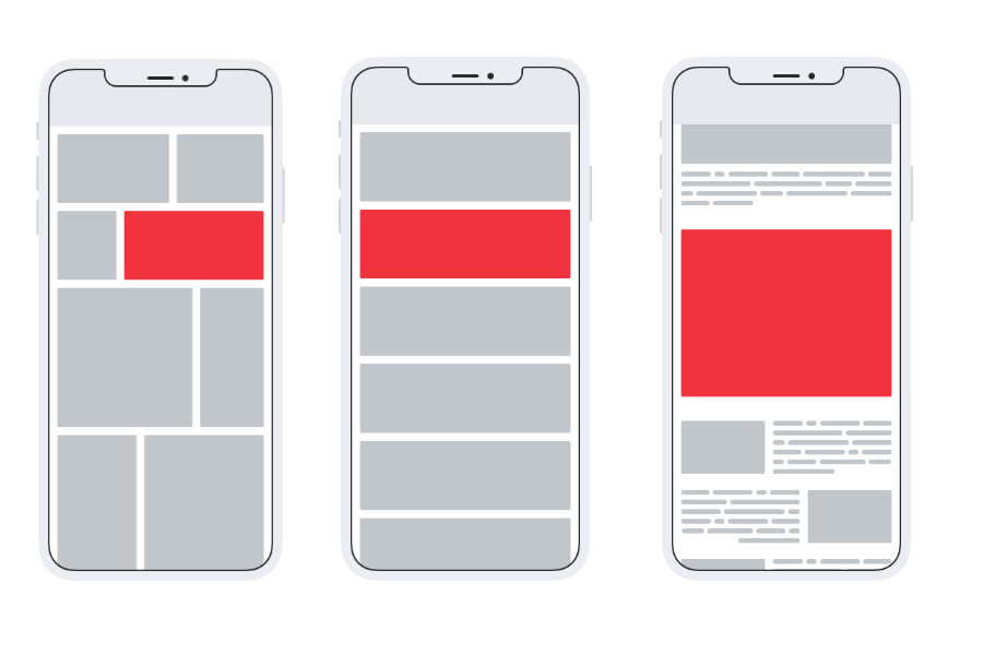
When you do this, you can create a small and simple banner ad that still conveys the message effectively. Like the banner design below.

Kimp Tip: While you play with the font sizes to create variations in the design, do not take the visual balance in the design lightly. Another critical element to remember will be the consistency in font style so it looks similar to the rest of your campaigns.
Does that sound confusing? Check out Kimp’s blog post on typography tips that help you convey your message in a small space.
3. Size your banner ads right
Leaderboard banner, half-page banner, large rectangle banner – there are specific sizes in banner ads. Using the right frame size will ensure that when your banner appears in the intended spot, your ad design makes the impact it should.
You should know about these sizes because they determine whether you can use only text or both text and visuals in your banner. If you decide to use images in your banner, they work best in medium rectangle and large mobile banner ads.
Ignoring the size of the banner design makes even meticulously crafted designs look oddly warped or stretched. There should also be a clear outline, preferably in a color that contrasts the background color of your ad design so that your ad ‘pops’. Once you have got the size-appropriate design, you can confidently purchase the relevant ad space.
4. Design CTAs that customers would like to click
With the touch display on a mobile screen, you have a large scope for placing your call to action button. Yet, while designing for a mobile device, it is all about the experience. Some positions on the screen are just not convenient to interact with. To know about this you should understand the thumb zone concept in a smartphone display.

The bottom right and left portions of the screen and the center of the screen would be the most favorable areas for easy access. So, placing your CTAs in these regions would make better sense.
You should be particularly wary about seamless navigation when you are designing interstitial ads or full-screen ads.
Other than the position of the button, the design is also important. A rectangular green button is, by default, seen as the clickable area on a mobile screen. So, using this would be a straightforward way to simplify the CTA for your viewers.
5. Allow users the freedom to close the ad without any hassle
Going by the thumb zone concept mentioned above, the top portions of the screen are the most inconvenient spots to reach. And this is one reason why several ads come with a close button placed in the top corners. The brief few moments it takes for the user to reach the close button are valuable. And if there are eye-grabbing visuals, the ad gets the viewer’s attention within this time.
However, make sure that the cross button is not too small or indistinguishable. Ads that simply won’t close are quite frustrating. The ad experience consists of the whole interaction from the beginning to the end including the closure of the ad.
You would not want the impact of a great ad to be dampened by the fact that users cannot find the close button in it.
6. Avoid information overload
Visual clutter will be the biggest turn-off in a mobile ad. The intention of mobile ads is to offer an interactive experience to customers. And this should happen without affecting the personalized interface their device presents. So, your ads should have brevity at the crux of the concept.
Incorporating one simple concept and getting it right will be better than adding too much information in these ads. For example, an announcement about a sale with a simple clickable button on the sale page.

To accentuate the effectiveness of your message you can use –
- Images – in the case of native and interstitial ads
- Animated text in the case of slim banner ads.
With large interstitial ads, you also have the option to explore innovative concepts like visual metaphors to create a visual hook.
If you are looking for ideas on how to create crisp and easily clickable ads for your business, check out Kimp’s blog post on the same.
7. Acing the art of video ads for mobile marketing
From YouTube videos to Reels on Instagram and Facebook, people love watching all types of videos on their smartphones. So, video ads work really well, especially on mobile devices.
However, you should also understand that long video ads might annoy customers more than engage them. So, keep them short and engaging. With creative design, short ads can have similar effects as long ads. The key is to familiarize yourself with the concept of emotional peaks and then position these peaks at the right spots in your video.

With the dwindling attention span of the current generation of smartphone users, make sure that you have a fast-loading ad. And within the first few seconds, this ad should attract attention and tell customers how it will create value for them.
Another critical factor to remember would be to allow the ad video to play muted by default. You would want to surprise your audience, not startle them! Would you as a smartphone user like it if a video ad plays at a loud volume when you are sitting on a bus? Your customers wouldn’t either. If you’re worried about viewers missing out on the message in a muted mode, you can always add text overlays.
Kimp tip: From the aspect ratios of your videos to the captions included, you should pay attention to the nuances of the ad for a better mobile experience.
Looking to create video ads for your brand? Choose a Kimp Video subscription today.
8. The power of vertical videos
Most marketers come up with a great video concept for their ads and these ads look great on a mobile device. But there is one tiny problem that some marketers ignore: the orientation of the video.
When you are watching a long video on YouTube, you might tilt your phone and view it in horizontal mode. But would you do this for a short video that is only a few seconds long? Probably not! So, customers might not really be keen on tilting their phone for a quick ad break in their app which is usually vertical. In fact, smartphone users hold their phones vertically for nearly 94% of the total time they spend on their devices.
Vertical videos and square videos that look great in both orientations are the best choices for mobile video ads. With a vertical video, you get to use the entire screen and productively engage your viewers with appealing visuals.
9. Pay attention to color psychology
Bright colors are often seen as energetic choices. But the truth is that in the middle of an app experience or while a viewer is busy reading a blog post, a bright ad might appear quite intrusive. At the same time, you cannot use white or muted colors predominantly and risk the chances of your ad getting lost.

Black sends out a signal of sophistication, pastels have a pleasant effect, and green is often seen as a color of good health. Explore the meaning of different colors and the impact they have on the viewers.
Remember that your ad might be positioned on different backgrounds, so choose a suitable color that stands out. This is one other reason why we had earlier spoken about using distinctive borders to frame your ad.
10. Check for the must-haves in your ads
As you carefully abide by the many rules of optimizing mobile ads, you cannot miss out on a few key concepts.
- Choosing a color palette that resonates with your ad theme is important. Equally important is choosing colors that stand out in diverse backgrounds. While doing all this you cannot allow a deviation from your brand’s standard color palette.
- Positioning your logo in the right spot would be as important as the rest of your ad design.
- Keep the copy simple but powerful
- Ensure that your visuals and text copy convey the same message
In short, any ad should have four main sections – the primary proposition or message, the call to action button, your brand’s logo, and the close button. Everything else you add depends on your creativity and these can all make or break the hierarchy of your ad design. That gives you one more reason to work with a professional for your mobile ad designs.
Kimp Tip: Given the small space that your ad gets, you might not always be able to highlight all the essential points there. You can use landing pages to supplement these ads and further enhance conversions.
Looking to create ads and landing pages that look consistent? A Kimp Graphics subscription is just what you need.
Transforming Your Mobile Marketing Strategies With Kimp’s Unlimited Graphic Design Services
As you can see, a few simple changes to your ad design will transform the way your mobile ads perform. For all the marketing efforts you put in, you definitely need the best ad designs to get your message to your customers. Gather leads and make your existing customers come back for more all with the help of trendy ad designs perfectly optimized for mobile screens.
Curious to know how? Book a call with the Kimp team today. Or sign up for your 7-day free trial.