Magazine Ads: Design Strategies for Maximum Impact
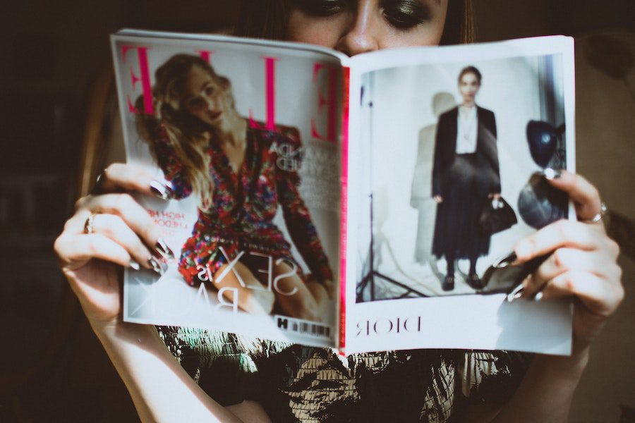
Do you remember the last time you held a magazine in your hands? Feeling the unique texture of the papers as you flip through the pages, being transported to a visually engaging world – a unique sensory experience, isn’t it? And each page has a story to tell. Amidst these stories, there’s one other thing that grabs your attention – the aesthetic magazine ads!
But in a world where screens and swipes and the click of a button determines conversions and cart abandonments, are old-school advertising efforts like magazine ads really worth spending time on? We hear you! And your question is very valid. Short answer: yes. In this blog, we’ll delve into the “why” briefly and then give you some tips to make the most of magazine ads in the digital age.
Without further ado, let’s go!
Reasons why magazine ads are a worthy investment in the digital age
In a world dominated by digital screens, the tactile allure of print materials like magazines can be a huge differentiator. For a marketer or business owner looking for ways to get noticed, this differentiator can be a big deal, don’t you agree? Well, the benefits of investing in magazine ads go beyond just the tactile allure.
- Businesses are projected to spend about US$13.73bn on magazine ads in 2023. That’s a good number considering the skepticism surrounding the effectiveness of magazine advertising in the digital age.
- Data shows that magazine ads lead to a 36% rise in “brand favorability” in comparison with online display ads. In essence, magazine ads tend to positively influence customers’ perceptions of a brand rendering this form of print advertising to be a worthy element in the modern-day marketing strategy.
- When it comes to trust, print advertising materials like magazine ads have a clear upper hand. Because studies show that nearly 82% of consumers tend to trust print ads when making purchase decisions.
- Magazine ads make it easier to target niche audiences. Because readers are very particular about the magazines they read. So, by finding the right magazine to advertise in, you are increasing your chances of reaching the right audience.
So, to sum it up, there are still a lot of brands spending on magazine ads, they help create a positive brand image, they help build trust and reach the right audience. That’s a good mix of marketing benefits to consider investing in magazine ads, correct? So, now let’s talk about the design of these ads.
7 tips for designing engaging magazine ads for your brand
One of the biggest advantages that a magazine ad has but a print ad doesn’t is the distraction-free immersive experience it delivers. While on a digital screen, users are constantly jumping from one app to another. But the moment they pick up a magazine, or even a newspaper for that matter, it’s a whole different world.
And the best part is that most people do so when they are in a waiting area, or when they are traveling. Magazines turn out to be channels that let them escape the mundane “wait time”. Keep this in mind when designing magazine ads for your brand and make your ads engaging and exciting. But how can you do that? Every little detail in your magazine ad design has a role to play. Hence let’s talk about some design tips to make this work.
1. Use colors that boost the impact of your ad
Color psychology has a very strong role to play in magazine ads because these appear in a visually engaging space. So, only the right colors can evoke the right emotions and thus help with better conversions. Additionally, with the right colors, the chances of brand recognition are 80% better.
The below ad will convince you about the significance of colors in magazine ads.

This ad was part of a campaign against domestic violence in Saudi Arabia. The use of black in this ad establishes the grim nature of it and lets the message shine.
KIMP Tips:
When you choose colors for your magazine ads, here are some quick tips to remember:
- Find colors that convey the theme instantly.
- Take the global perceptions and cultural implications of different colors into the picture.
- Create contrast between the colors of various elements in your design. In other words, the font colors you choose should easily differentiate the copy from the background.
2. Find fonts that fit
Fonts have the power to infuse a unique tone to your ad while also representing your brand personality.
Just like good fonts leave a good impression, bad fonts can make a bad first impression. And when it comes to magazine ads, people don’t just swipe away. The ad stays with them for a longer duration. So a bad font choice can be bad for your brand’s reputation.
Keeping this in mind, choose a font that fits the mood of your ad and your brand identity too! Take the below Sharpie ad for example. Do you think a different font, like say a legible sans-serif font or even an elegant serif font would have had a similar impact? The effortless script font feels perfect for the design, don’t you agree?
KIMP Tips:
- When you do not know what types of fonts to choose for your ad, draw inspiration from your brand font. You cannot go wrong with ones that mirror your brand’s personality.
- Select fonts that are easy to read.
- Remember that there is no zoom-out option on a print magazine – so stay away from small font sizes.
- To keep your design looking polished and cohesive, refrain from using too many fonts. A combination of two fonts will be more than enough to deliver the message in magazine ads.
3. Images that attract attention
Magazines are filled with images and fancy visuals. So, to ensure that your ad gets noticed amidst this, you need to get really creative with your visuals. An ordinary stock image will not work. Your choice of imagery should spark intrigue and convince your consumers to pay attention to your ad and the message in it.
Apple once came up with a 12-page magazine ad campaign featuring its Apple Watch range in Vogue magazine. Here’s one of the features from it.
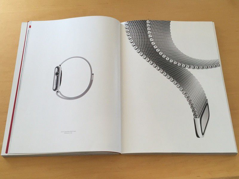
The above ad from Apple tells two things about the images you choose for your magazine ads:
- They are pretty crucial because the visual appeal they bring to your ad is unbeatable.
- The imagery needs to be creative and relevant to your ad. In this case, the clutter-free focus on the Apple Watch is one thing. The other is the perfect angle that makes something simple as the Apple Watch strap appear elegant and fashionable – perfectly suitable to appear on the pages of a fashion magazine!
So, yes, you need to use attractive imagery for your magazine ads to draw and retain a reader’s attention.
KIMP Tips:
- Ensure that the imagery you choose resonates with the target audience.
- Aim for emotions like nostalgia and excitement for an interactive ad that evokes a response from the readers.
- Use images that tell a story – they make your ad even more interesting.
- Experiment with illustrations, feature your brand mascot, use visual metaphors, and play with the alignment and perspectives in order to make your magazine ads hard to miss.
Want to create custom graphics and illustrations that make your magazine ads stand out? Get a KIMP Graphics subscription!
4. A well-defined goal
A clear goal for magazine ads tells readers what to do with the ad and what step to take next. And for this, prioritize a singular focus rather than creating ambiguous ads with vague messaging. From imagery to text to the colors and layout, every little design detail should align with this singular goal.
At the same time, focusing on just one message, a single product, or just one feature per ad ensures that you do not overwhelm your audience.
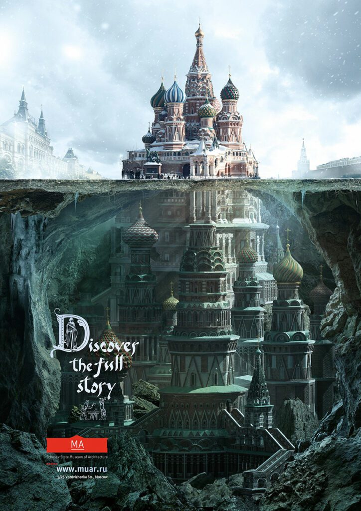
The below ad for the Shchusev State Museum of Architecture plays with the “tip of the iceberg” theory to communicate the single idea of the museum helping people “discover the full story”. It shows how having a clear message makes it easier to find the most creative visual representation of the message.
KIMP Tips:
- Ensure that the core message of your ad does not deviate from what your brand stands for.
- The headline in your ad copy should give a glimpse of the core message and the CTA should help readers process the message and take the next step.
5. Keep it simple
Once you have the message clearly laid out, find the simplest way to deliver it. Yes, we spoke about the need for using the right colors and imagery to communicate the message. However, you need to tread cautiously when choosing the elements. Because too many of them (too many colors or too many images or even too many fonts) end up cluttering your design and distracting the reader away from the main message.
What can you do to avoid this when designing magazine ads? Aim for simplicity!
Now is a good time to remind you that in the print magazine advertising world, “less is more”. Unlike the digital landscape, where multiple references are just a click away, magazine ads demand immediate impact. Therefore, a simple design is what conveys the essence of the promotion.
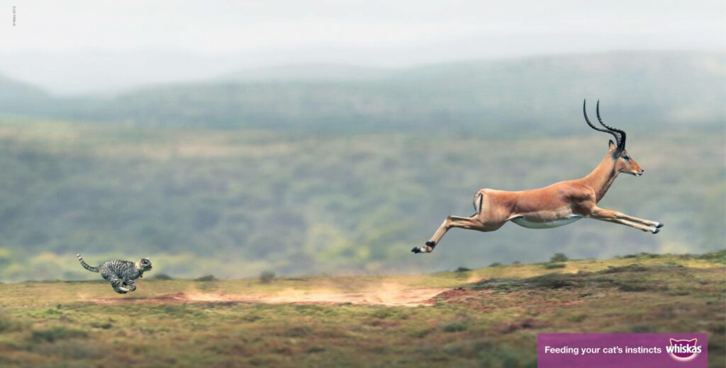
The below ad from Whiskas shows that one image where the copy and the imagery are perfectly synchronized is all it takes to imprint your brand in a reader’s mind!
KIMP Tips:
- Effectively embrace negative space in order to create a clutter-free layout and to draw attention to the core elements.
- Employ typography and design elements to create a clear visual hierarchy that guides the reader’s eye.
6. Consider the print ↔ digital transition
While print advertising, such as magazine ads, holds significance, the rise of digital advertising is undeniable. Establishing a robust digital presence has become vital for brand expansion and popularity. To bridge this transition effectively, seamlessly integrating print ads into an omnichannel marketing strategy is key.
So, how can you tailor magazine ads for the digital era? Incorporate a digital touchpoint. This could involve a QR code, allowing users to effortlessly navigate to your website. Or prominently feature your social media handles, enabling users to connect with your brand on social platforms. Yet, maintain visual consistency across these print and digital avenues. This ensures a smooth continuation for customers, effortlessly transitioning from print to digital engagement.
KIMP Tips:
- Find the optimum placement for the QR codes in your ad. This should be such that the code gets easily noticed while also blending into the harmony of the magazine ad design.
- When you incorporate a QR code, create a custom landing page that welcomes the users arriving from the print ad and smoothly navigates them to the next steps. This helps ease them into the digital marketing funnel without friction.
Considering the need for cohesive designs and themes across print and digital ads, working with a designated design team helps. Sign up for a KIMP subscription and work with a designated design team for all your marketing and branding designs.
7. Take the context and placement into account
Visually engaging designs are important for magazine ads but for these visuals to make sense, you need to consider the placement of these ads. Every magazine has different specifications and ad placement criteria. Taking these into account, your ad design should be such that it stands out effortlessly while also fitting well into the environment.
Designing magazine ads that prioritize context and placement ensures that they resonate with readers who are already engaged with the prevailing theme.
We’ll give you an example from Adidas. The below image shows a set of double-page ads from the brand. The intent was to align with the brand’s philosophy, “Forever Sport”. And the design was executed creatively so as to capture the illusion of motion as a reader flips through the pages. That’s the kind of magic that happens when your design is relevant to the placement of the ad.
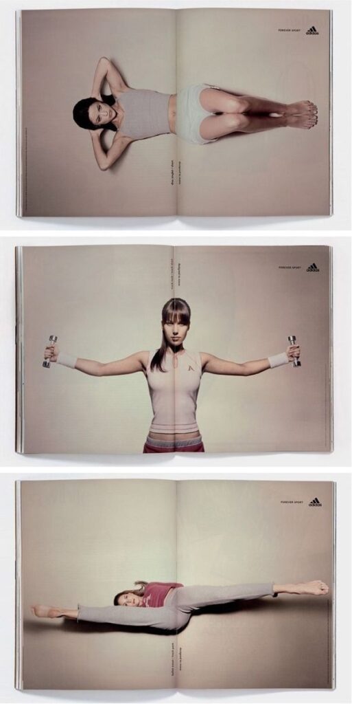
KIMP tips:
- Before you start designing the ad ensure that you flip through a few copies of the magazine to understand the overall aesthetics and mood of the magazine. This helps you better plan your ad’s theme.
- Find the optimal placement for your ad based on reading patterns and the rest of the content in the magazine.
Wondering what your ad would look like in the magazine before freezing your ad design? Work with your designer and visualize the design on a mockup for better visualization of the design and to make any updates required.
Create stunning magazine ads for your brand with KIMP
With that we come to the end of our magazine ad design tips discussion. And we are hoping that these easy tips sparked your creativity and encouraged you to refine your magazine ad ideas. Now all that is left is a plan of action to source these designs.
As we discussed earlier, stock designs do not work. DIY designs can be tedious. Freelance designers might not help create consistent designs in the long run. So, what other option do you have? An unlimited design subscription like KIMP. For a flat monthly fee, you collaborate with a dedicated design team that works on print ads, digital ads, branding designs, and more.
Want to explore how this works? Sign up for a free 7-day trial!