Japanese Design: How To Use It In Your Marketing + Examples
Japanese culture has fascinated the world for a long time. The emphasis on serenity, the beauty in their art, and the culture in itself is a worldwide phenomenon. Even though western designs get a lot of attention in mainstream media, a lot of them derive their inspiration from Japanese art. And as the world of business evolved and these artistic features seeped into Japanese graphic design.

A great example is the influence of Japanese culture on mainstream pop culture elements. Be it anime-esque illustrations, colors, or design style, you can see it anywhere. Its popularity also makes it useful in branding and marketing designs. There is a wide audience for this design style, and you can leverage this to promote your brand.
But adopting a new design style can be tricky. It is important to understand the meaning, intention, and layers before you replicate it for yourself.
So here is a quick recap and highlight reel of Japanese design and how to use it in your marketing campaigns.
Japanese Design’s worldwide Fame: The Origin story
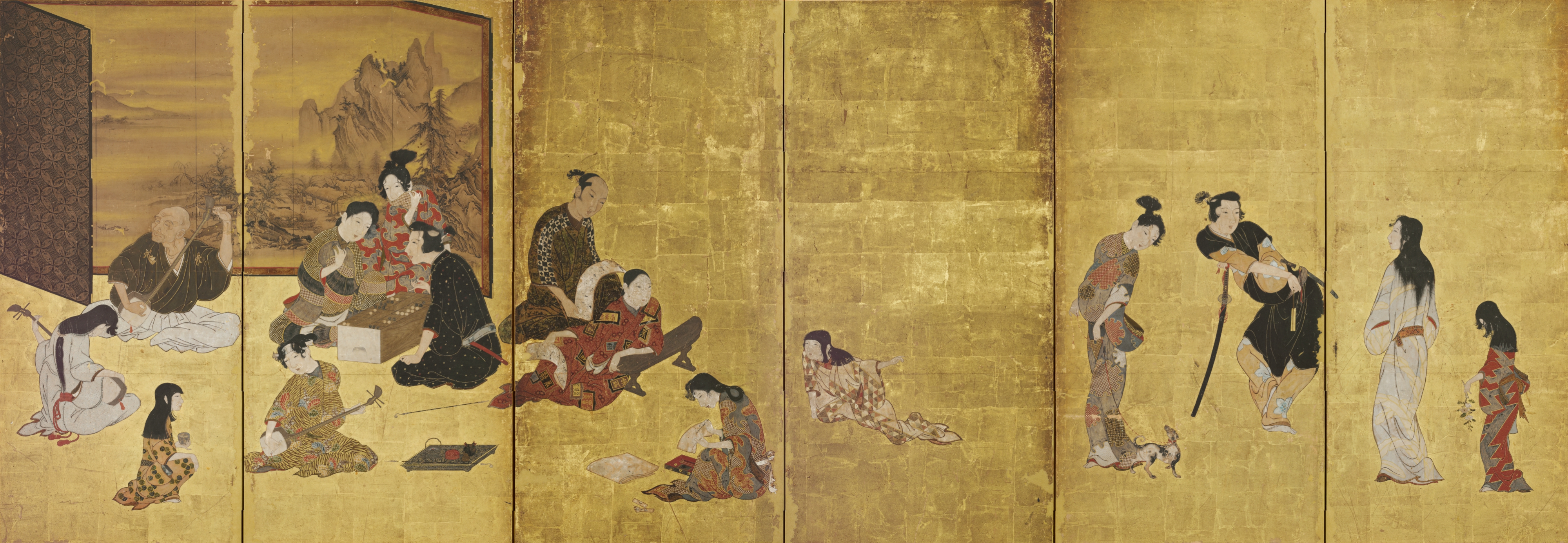
Anyone who has followed South Asian culture will tell you that Japan holds a special face for everyone. It is a country with a diverse culture and a rich artisan heritage. Many popular art techniques originated here, including but not limited to calligraphy, origami, manga, anime, and even ceramics.
So it goes to say that the Japanese influence on modern design traces back to a rich history. Exploring and understanding this history will help you see the relevance and significance of Japanese design. This way, when you apply Japanese design elements in your marketing campaigns, you will create a much bigger impact.
Early History
Tracing the Japanese design trajectory back 200 years, we have to start with the 1800s before the world opened up to Japan. In this period, Japan was a close community with no influence from outside. This led to the flourishing of arts and crafts, specifically at a time when Japan was growing economically and culturally. Records showing the presence of posters and designs to market products were already present in this period.
The world eventually opened up, and Japan came under heavy western influence during the late 1800s. This was the Meiji era, and there was a rapid exchange of cultural and design ideas. Japanese design grew, propelled by the western design influence and the newfound knowledge of the world.
And this knowledge exchange was two-way. Most prominent French and European artists took huge inspiration from the popular Japanese artform Ukiyo-e.
The Post War 1950s-1980s
This era brought economic boom, industrialization, and the influence of Constructivism and Bauhaus styles. Based on these factors, the Japanese design industry continued to grow. During this period, the usage of geometric shapes and symbolism came into existence. These characteristics are popular to date, and used widely in marketing and branding designs, as we will detail in the next section.
1990-2000
As the Japanese design continued to evolve, the 1990s brought in the postmodernism period along with the economic difficulties that arose in 1991-92 in Japan. In this background, Japanese artists came together to develop a cohesive design style that celebrates their identity. They adopted principles like minimalism, positivity, and socially conscious design to create relevant designs. These designs became popular worldwide with the advent of the internet, Photoshop, and other editing software.
The late 2000s adapted socially relevant issues and brought in the cute aesthetic to spread positivity while spreading awareness of Japanese culture.
As you can clearly see from this quick recap of Japanese history and its impact on Japanese design, they are both very closely related. The design elements, style, and even the color choice are rooted in history.
In the next section, when we list out the different techniques from Japanese design for your brand to leverage, we hope the small history lesson comes in handy.
How to use Japanese design in your marketing campaigns?
We were not exaggerating when we said the usage of design in marketing dates back to the 1800s in Japan. Most of the elements in Japanese design are actually perfect for marketing and branding usage. All it takes is a little understanding, and you are good to go.
So the Kimp team has put together a list of the best ways you can incorporate Japanese design in your marketing campaigns.
Sit back, read, and then start creating.
Let’s go.
1. Go Zen in marketing with the minimalistic designs
Did you know the Japanese design style was one of the first to popularize minimalist designs? Born of the nation’s popular Buddhist tradition of Zen, Japanese designs embody the “less is more” principle.
This design principle evolved during the nation’s economic difficulties to keep design alive even without a lot of elements. The key to getting Japanese minimalist design right is to maintain aesthetics, balance, emotion, and messaging even without too many elements. It is truly about making less into more.
In our world where chaos is truly everywhere, customers actively seek out brands that can communicate in the most simple way possible. So how can you incorporate this concept in your marketing designs?
- Ditch the frills and keep the design simple. Retain only the central element and let it shine.
- Design a minimalist logo that intrigues the customers and makes them want to know more about you.
- Choose a minimalist package design to deliver an elegant experience to the customer.
Kimp Tip: When you choose to go the Minimalist way, you have very design elements to bet on. So ensure that each of them does their job well, and the composition works well even with a few elements. Color, font, and imagery take all the attention here, so make wise choices.
With a Kimp Graphics subscription, you can examine a few mockups before finalizing with our unlimited graphic design service offering.
2. Adapt bright colors and busy designs too
We have already mentioned that Japanese culture is extremely diverse. And a great example of that diversity is the existence of both minimalist designs and bright color usage within the same design style.
As much as the Japanese love simple and chaos-free designs, they also adore designs that are brimming with life. This includes designs in bright colors and extremely busy compositions with overloaded design elements too. Some colors you will see often in Japanese designs are red, gold, and back appearing together. But some designs utilize the complete color palette as well.
This explosion of colors and elements within a design speaks of the vibrancy and life in Japanese culture. You can see streets brimming with colored landscapes and buildings, so it is no surprise that it comes out in Japanese designs too.

If your designs have to convey happy emotions or depict the vibrancy/ abundance of a product line, we suggest you opt for this design style.
Kimp Tip: We know the temptation to truly let loose and bring out all the hues on paper for this trend. But it is important to understand your audience and choose colors carefully. They must reflect the sensibilities of your customers, your brand identity, and the marketing intent as well.
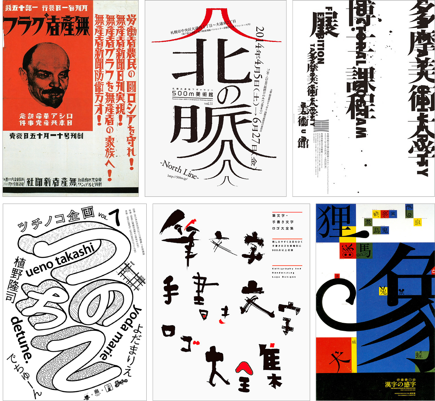
3. Experiment with Custom typography
Designers very well know the struggle of finding the perfect font and typeface for a design. A lot of times, they choose to create their own typography so that it matches their vision well. Well, guess what? Japanese design has had this principle by default for a long time.
Some of you may know that the Japanese language is very complex, more than it sounds in anime. It has over 2000 characters split across these different alphabet systems – Kanji, Hiragana, and Katakana. So it is sort of impossible to develop individual typefaces for each character. And as a result, designers choose to design custom typography to match the design in place.
Another trend that came out of the need to handle this complex language is the use of mixed languages. Yes, in this style Japanese words occur in conjunction with Roman characters that everyone knows for ease of communication. Sometimes, English characters also make an appearance.
So what is the takeaway here?
Well, the lesson from Japanese design you must understand is that it is time to throw the rigid rules of language, typography, and fonts out the window. Do your own thing, and if it works, it works. Don’t complicate it.
Wondering if you can invent custom typography for your branding and marketing needs? You can. And Kimp Graphics will be happy to assist you in that.
4. Nature influence
If there is one thing that Japanese culture considers sacred above all, it is nature. Japanese revere nature and its influence on their everyday life. One of the earliest designs to come from this nation featured the beauty of nature in its abundance. Even today, most Japanese designs feature mountains, rivers, the sea, forests, and more.
So if you are looking to replicate Japanese designs, that is a great way to start.

Everyone loves nature, it makes them feel at peace. Japanese design has taught us that you can celebrate nature in any context, and it will work.
You can leverage this design technique in logo design, branding, posters, social media posts, packaging design, and more.
Wondering how to fit nature into your marketing designs? Sign up for the Kimp Graphic plan so that our team can guide you with samples.
5. Symbolism
Symbolism in design is highly popular across the world currently. Customers love deciphering the hidden meaning in designs, and this makes them feel connected to your brand. It also aids brand recall.
Japanese design has a strong history of using symbolism. Based on their local tales and cultural significance, many shapes, natural elements, and products have salient meanings in design.
As per the symbolism technique used in Japanese design, artists are also known to animate and denote human qualities to inanimate products. It can range from adding eyes to soda cans to adding an entire face to the packaging design.
While there are thousands of elements with symbolism in Japanese design, some important ones are the sun, flowers, and geometric shapes. You can see them feature repeatedly in Japanese designs.

If you are looking to represent good luck, you can use the sun and add a cloud to represent elegance to follow the Japanese’s footsteps. Another constant occurrence in Japanese design is the usage of Mount Fuji to represent hope and fortune.
6. Cute Aesthetics
Do you remember Hello kitty? Pikachu? Then you are already familiar with the cute aesthetic and culture in Japanese designs. But what you may not know is that it has a name – Kawaii and is one of the reasons for the popularity of Japanese designs worldwide.
Right from a cereal mascot to that of a Tofu brand, Japanese design leverages the popularity of cute characters and makes people fall in love with the brand. And this popularity spans across kids and adults alike. The aim is to make the brand lovable and approachable for customers, and it works brilliantly.

Many Japanese brands have capitalized on this phenomenon, and you can too.
If you are looking for branding ideas or just a mascot or an illustration style, cute aesthetics can work for you. It makes the brand memorable and an overall crowd favorite instantly.
Kimp Tip: Adapting the Kawaii form of life is harder than it sounds. For it to work, your target audience, brand personality, and product type have to align with the theme. But you can always explore this aesthetic for a one-off marketing campaign and check the reception.
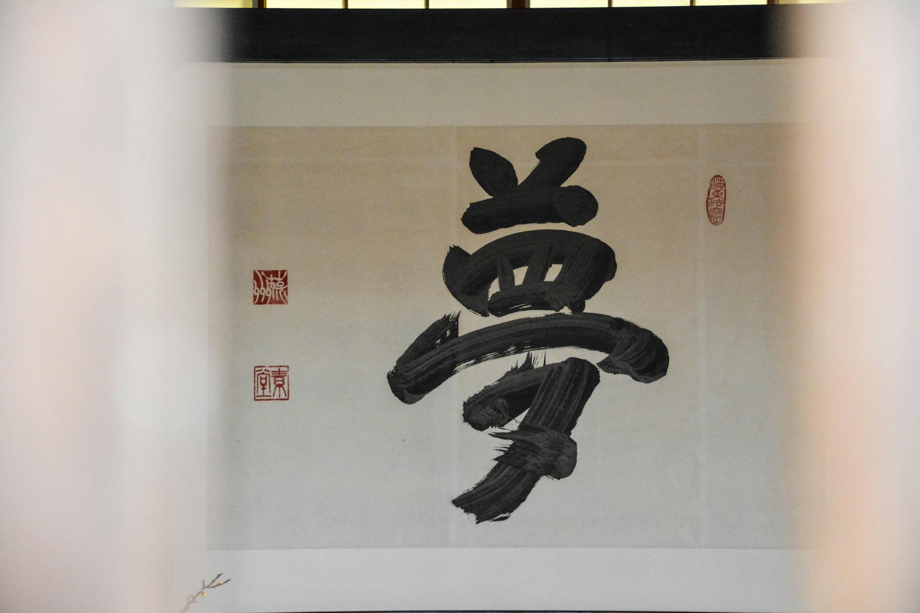
7. Brush Strokes
Based on what you read now, if I ask you one salient feature of Japanese design, what will be your answer? We are sure it will be culture and tradition. And this technique or characteristic of Japanese design is an ode to that. As much as Japanese design took influence from Western culture and the Internet culture, it always goes back to its roots.
Japanese designs use brushstrokes as an attempt to present their ancient design styles and techniques. Calligraphy is a part of this design style and is a major part of the Japanese curriculum as well. It can enhance the value of your graphic design attempts as well.
But even beyond calligraphy, Japanese designs use a lot of thick and strong brush strokes. These strokes are a statement in themselves. You can use this design technique to bring the feeling and vibe of watercolors and paintings to your digital art.
Kimp Tip: With brush strokes and calligraphy, we are entering art territory. And that is tricky business. While marketing design will always drive inspiration from art, it needs the care to deliver your message succinctly. Why don’t you hire the Kimp Graphics team so that our team can bring you a happy marriage of art and design?
Celebrate Japanese design in your marketing with Kimp
We hope you found this rundown of Japanese design in the context of marketing as fascinating as we did. Exploring new styles allows you to stand out in a competitive market. You can also provide a fresh face to your customers who are probably bored of seeing the same designs rehashed over and over.
But a new style also brings challenges to handle in the initial stages.
Allow us to make this journey easier for you. The Kimp Graphics and Kimp Video teams will be happy to deliver high-quality Japanese-inspired designs for you.
Sign up for the free trial now and start exploring right away.