Design 101: What Makes A Good Or Bad Logo Design?
Max is starting a jewelry business. He exclusively works on bespoke designer stone jewelry inspired by the ’70s and 80s eras. This is a passion for him. And it has taken him a lot of years to take the plunge and launch his brand.
But before he moves ahead – something is bothering him. He read that logo design is not just art but a strategic part of branding.

Knowing that art, design, and styles are subjective – he is at a loss on what makes a logo design, a good or bad design. The logo is honestly his biggest concern, given its extensive presence in marketing and branding.
If you are sailing in the same boat looking for an anchor or a life jacket, we got you. This Kimp Guide on good and bad logo design will lay to rest all your questions. And help you find the right logo for your brand.
Judging a Logo Design
Art is subjective, yes. But a good logo design is not. Designers use art principles to create logos, but that’s where the connection ends. Logo design is a branding tool for your business to build a connection with your audience, and gain a firm footing in the market.
Experts believe that a good logo is Simple, Memorable, Relevant, Timeless, and Versatile. But again, these traits mean different things to different people. The better way to understand this is via what a good logo design can do for you.
Logo design has clear objectives, and understanding them will help you stray away from the “art is subjective” debate.
Before we delve deeper into what makes a good logo design, let’s understand what a logo’s role in your branding is. That will make it easier for you to define what good logo design is for you and your business.
So, what does a logo do for your brand, if it is a good design?
Identification and Influence
A logo is an identification and association tool in your branding toolkit. What do we mean by that? Its major purpose is to help customers identify your products, advertisements, and store and build positive associations with them in their minds.
There is a lot involved in logo design – imagery, color, typography, and style. All of them must serve as unique identifiers for your brand and generate the emotion/reaction you want customers to feel about you.
Information
You need your logo to attract your customers towards you. It takes less than 10 seconds for someone to make an impression about a design. So your logo has to adequately inform the customer about your brand. Conveying what you do, what your brand personality is, and what customers can expect is the logo’s responsibility.
Recognition
When a business launches, marketers operate with a single aim – brand awareness. A recognizable brand is a sellable brand, and logos build that recognition. Logos are one of the vital tools in creating brand awareness in the market. Customers need visual aids to remember you, and the logo is what they see anytime they connect with your business.
Distinctiveness
In a competitive world, you need all the edge you can get. Unique, memorable, and meaningful logos help you carve out a niche for your brand. Logos are one of the most viewed visual identity tools, so they set the tone for all impressions customers have on you.
A design that reflects your brand in style, tone, and format will shine the spotlight brighter on you. You don’t want to be one among the millions. You want to be the one in a million.
Analyzing good and bad logo designs
Brands and marketing teams debate, analyze, and stress on logo designs because we live in a visual world. An image will speak louder than any other content you produce.
So we want to show you what works and what doesn’t to help you grasp these concepts faster.
Let’s get started.
1) PWC

If you are familiar with the professional service and accounting world or closely follow the financial industry, you know PWC. PWC or PricewaterhouseCoopers is one of the largest professional service firms in the world. They work with multinational companies and large businesses, but their logo does not live up to that standard.
The company uses a combination of an abstract design and a wordmark. As you can see, the logo is quite plain and does not adequately convey any information about what the brand does.
Additionally, the colors used in the logo make it non-scalable and complex to reproduce consistently across web and print mediums.
2) KIA

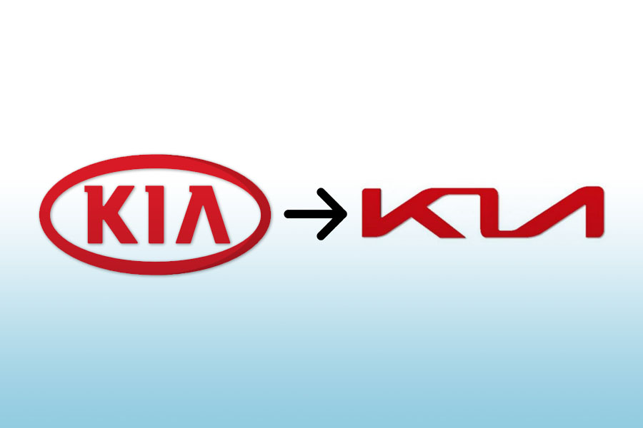
Kia is a beloved automobile brand that recently did a logo and brand redesign to appeal to the digital consumer base. While the company had its heart in the right place, the end result did not turn out as expected.
From an emblem-type model, the company moved to a designer wordmark. If you look closely and compare both the logos, you will see that while the new one has a stylish tone to it, the messaging and recognition are all lost.
Imagine it on a car, and you can imagine the brand may end up losing brand recall because of the logo redesign. On a fast-moving road, the logo may not even read as KIA, to many.

Kimp Tip: When you design a logo, understand your messaging and ensure it connects with your brand. A logo shows up in many places in your branding, so a good logo design must be versatile. Simplistic and memorable design improves brand recognition and brand awareness in the market.
Kimp Graphics allows businesses to work with a dedicated design team that comes to understand the essence of their brand. And then transfer it via design to their audience.
3) Pepsi Redesign

There is hardly a person who does not know Pepsi. A brand that has been around for more than a century, it is a household name today. The company spent a lot of money sponsoring sports events, roping in celebrities, and launching innovative campaigns to achieve this.
That is why when the company experimented with its logo, many grew concerned. The original logo was iconic, but the new logo left a lot to be desired.
The new Pepsi logo changed the familiar imagery, chose a different typeface, and altered the design style, as well. The older logo was symmetrical with a traditional typeface and was a familiar sight.
With the revamp, the company seemed to have resorted to a generic ball design with no major symbolism attached to it. Not to mention the image of belly fat that matches the Pepsi logo, putting the brand in trouble for associating with unhealthy beverages and lifestyles.
4) SONY

We know the Japanese conglomerate for its innovative work in the field of electronics. The brand is one of the oldest in the market and is at least a century old. But, when you look at the logo, you will find none of these traits.
The Wordmark logo is plain, uninspired, and does not do anything to connect with the audience. The color of the logo is also quite unimpressive given the exciting market the brand works in.
They did the last logo update in the late 1900s, and it is not a design that will appeal in the current market.
Sony might be a popular company, but as the market becomes competitive, it is important to reevaluate and fine-tune its branding. Otherwise, people may perceive this bad graphic design logo as a measure of the company’s capabilities.
Popular examples of Good Logos
1) Coca-Cola

Coca-Cola’s logo is a classic example of a good logo design. It is simple, timeless, and easy to remember. The colors in the logo inspire energy and excitement, just what the brand wants to make you feel.
While Pepsi reinvents the logo every few years, this brand has stood its ground since the beginning. Even though it is pretty old, the color, the typeface, and the overall design still works.
This logo is also versatile as it works in a standalone form while the color inverse of it works well too. This makes it easier to use on websites, social media pages, and product packages printing it too. Want to learn more about the printability of a logo? Check out Kimp’s guide on how this impacts brands.
Kimp Tip: Be creative with your logo design even if you choose a Wordmark format. Color and typeface are crucial in such designs and can save you a lot of redesigning efforts if done well in the beginning.
Curious how color and typeface can influence customers? Do you want to leverage this phenomenon for your brand?
Get a Kimp Graphics subscription and you’ll be able to get a logo design + variations, and all their source files.
2) FedEx

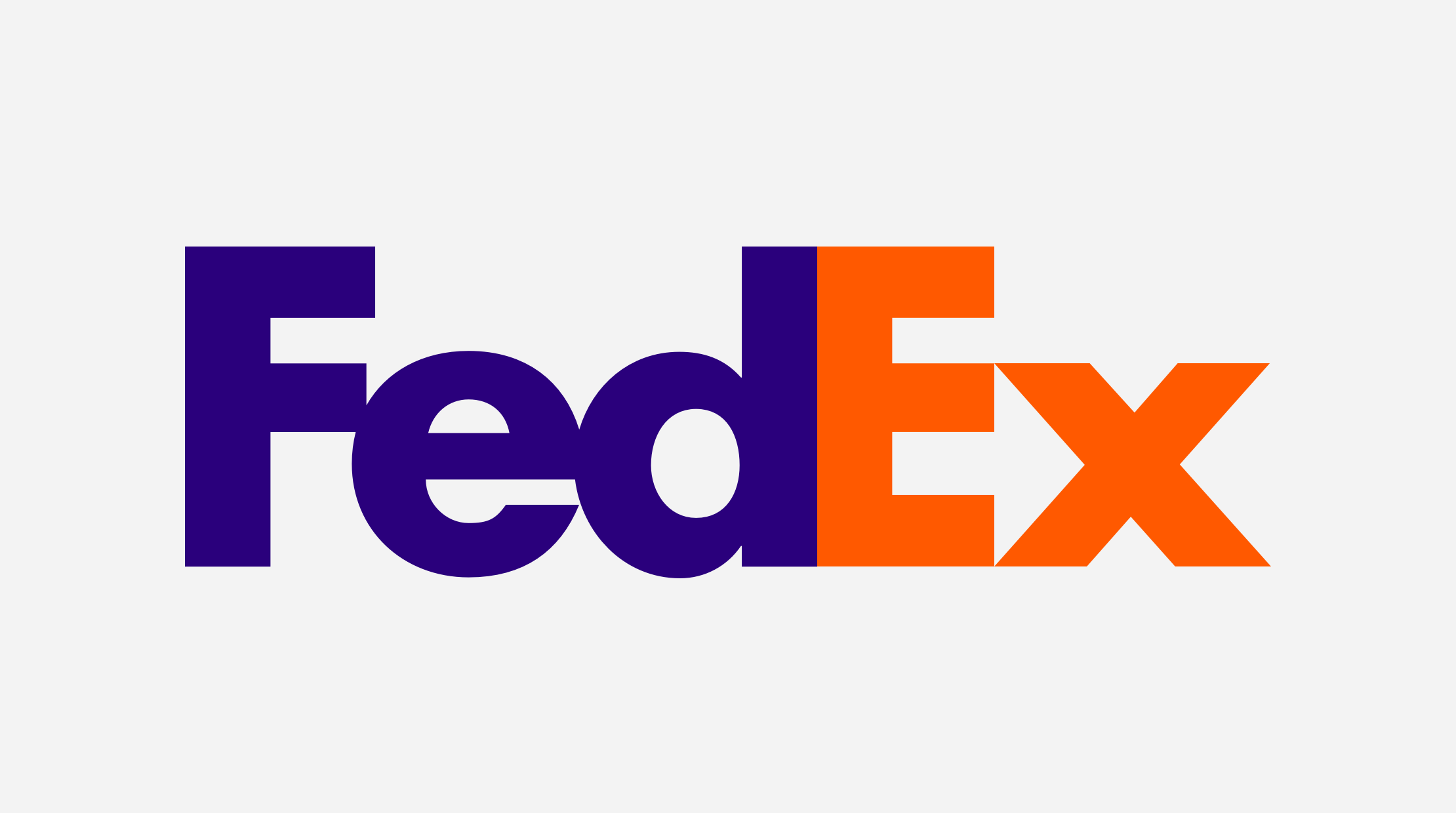
FedEx is a logistics brand and one of the oldest ones. Most people expect the logo for a company in this niche to be fairly conservative such as a monochrome wordmark or a simple brand mark. But FedEx has a very interesting logo.
The company uses its own name as the logo but with a hidden significance. Here, the arrangement of letters forms a hidden arrow that is in line with what the brand does. Colors like orange and purple also signify action and movement, making you feel you are on the move with FedEx.

Even if you do not want a logo with heavy imagery, you can try this. Such hidden meanings and symbolism excite customers, forming an emotional connection with the brand.
Kimp Tip: If you want an Easter egg in your logo design, let your designers know as much as you can about your industry, your logo ideas, and your target audience. The more context you give them, the more they’ll be able to experiment and provide you with unique ideas.
3) ED
While FedEx went a little easy on the symbolism, the brand ED or Elettro Domestic (translated as electrical appliances) is not taking any chances. The company works with electrical appliances, and it is a fairly crowded industry.
ED’s logo is a combination of a monogram, and abstract logo design. The logo uses negative space to make the ultimate logo design that resembles a plug. It is easy to make the leap from electric plug to a brand in the electrical industry, a fact that ED capitalized on.
The design is also simple and unique enough that you can use it across different mediums without color distortion or resizing issues. If you saw this design from a distance, you would know what the product is, hence association becomes easy.
Kimp Tip: You can choose to make your logo design look like art. But, it is important to consider the practical side too. Talk to your design team and understand the constraints a logo design has to create a final product you like and know that your customers will love too.
Kimp – Your path to a Good logo design
Logo design is ultimately not subjective. Sure you can think something looks great and your colleague might think it looks awful. But the success or failure of a logo lies in what your customers think.
This is why a good designer will take the time to understand your business, market, customers, and brand personality. With Kimp, you get this and the ability to work with a dedicated design team for all your designs, unlike most agencies.
Kimp Graphics offers its expertise in marketing design to help you make the best first impression you can on your customers.
Our subscription-based design makes it easy for someone looking to explore the world of design and not just stop at logo design.
What’s more with our 7-day free trial, you can test out our design capabilities before upgrading to a full subscription and getting your logo designed.
Sign up for the free trial today.
