Design Inspiration: The Top 15 2021 Email Design Trends
No matter what hot new trend or content marketing tactic pops up, emails continue to be one of the most effective ways to engage leads and customers and nurture relationships with them too. So in this blog we’re going to be talking about the 2021 email design trends you need to know.

When you think about how you want to approach your marketing in 2021, sending out better emails might not be the first thing that comes to mind. But they’re often the unsung hero when it comes to keeping you top of mind for your audience. Add to that the fact that over the years they’ve become a lot of fun to pull together too, because you can incorporate content like GIFs and videos.
1. Keeping it bold with typography
Compelling high quality images are a very important part of email design. But the image alone doesn’t get your message across to your subscribers. Engaging, imaginative copy is key. As is making sure that it’s highlighted in your 2021 email designs. It’s expected that we’ll continue to see the use of bold typography through 2021.
When bold typography came into being in the 19th century there weren’t actually any bold weights to match. So designers resorted to using a generic bold such as slab serif or Clarendon. However, today, the bold typeface gives a significant effect to the message that you want to tell your customers. The customization of fonts makes your email designs come across as immediately more appealing. And beyond being aesthetically appealing, they help to grab the attention of the viewer and guide them through your messaging, from the most important headlines and descriptions to those that are secondary in importance.
2. More animation
The human mind processes visuals at least 60,000 times faster than it does text. And since video marketing is so effective, it might seem like a no-brainer to embed videos in your 2021 email designs. But there’s one big snag that you’ll hit. Embedding videos in your email can actually negatively impact your emails’ deliverability and send them straight to the spam folder.
So what is the solution here? Animations! And not just any animations. Ones that are interesting and engaging can go a long way. While GIFs happen to be the most popular form of animation in newsletters, Animated PNGs, aka APNGs, are quickly catching up. One of the reasons why is that APNGs allow for more color choices than the normal GIFs. They also have the perks of transitions that are smoother and file sizes that are smaller.
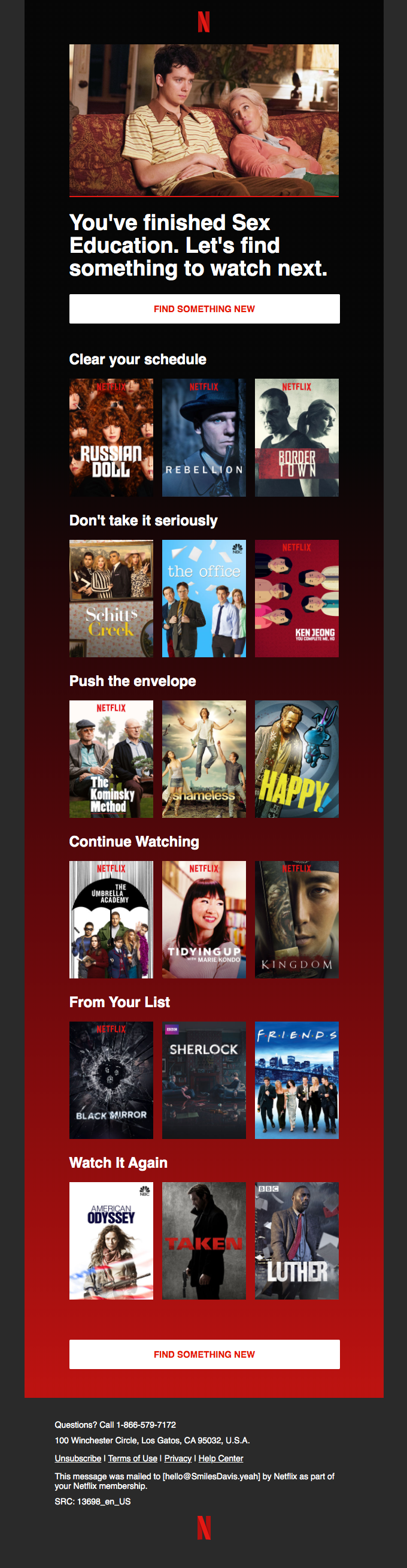
For some time now, many big-time brands have been using animation in different forms to make their emails more engaging. This is especially the case when it comes to sharing promotions or revealing new updates and products. For instance, in the example below, Starbucks uses a simple animation to spark some interest in their holiday cup campaign. Most readers will skim through copy at times, but when there is an image that is animated, it tells the customer what they need to know automatically. Or it hooks them so that they’ll read your message.

3. The use of 3D imagery
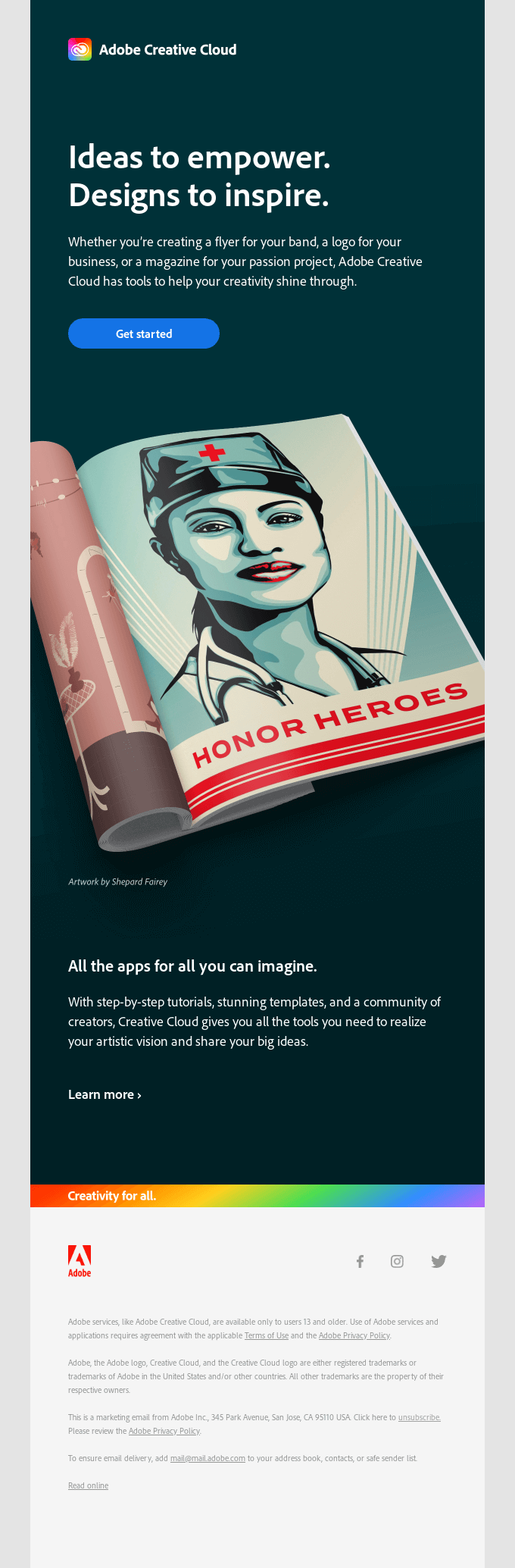
Images are powerful, and can make or break a design. No doubt about that. And 3D images are perhaps the most powerful type of image you can use. They are visually appealing for sure but they also have practical applications as well. For ecommerce businesses, they provide a better chance for increasing conversions and decreasing returns. This is because you can present your products in ways that reveal their features and different angles that are simply not possible for email designs which use flat images.
In the case of businesses that sell software or services, 3D imagery can be used to display the types of outputs made possible by the particular software or service. Using this tactic, companies like Adobe include examples of designs you can create with their software. So think about how you might be able to utilize this trend because having 3D images in your 2021 email designs will definitely make them more intriguing for your subscribers.
4. Gradients as backgrounds
If you want to make your 2021 email designs stand out, thinking about using cool gradients for their backgrounds. Using gradients in the backgrounds for your email designs will help you get the attention of customers and also keep them engaged as they read through your messaging.
Gradients are said to have emerged from the psychedelic culture of the 1960s. And in 2021 we’re going to see a throwback to this trend in aesthetically pleasing ways that also play with nostalgia. The result? Emails that bring about positive emotions, a sense of comfort and inspire imaginations.
To really make an impact with your gradient backgrounds, consider using animated gradients. You’ll want to opt for this approach with minimal designs to make sure that your emails don’t become too busy and create cluttered experience. But done right, these kinds of email designs can really make an impact.
You can also make use of gradients in single elements rather than as part of the background of your email designs. For instance, in your CTAs. Instagram is one brand that has done this effectively with their brand colors.
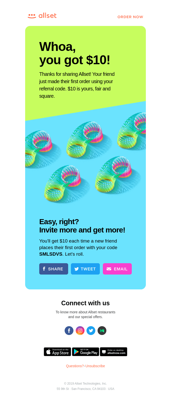
5. Appealing to emotions with design
A design can look awesome but if it doesn’t trigger the right emotions it’s just not going to work. So think about the goals of your emails when you set out to have them designed. And make sure you let your designer know how you want your subscribers to feel when they see and read your emails. To get the most impact from your 2021 email designs, here are the emotions you’re going to want to appeal to:
- Belonging
- Greed
- Guilt
- Trust
- Curiosity
- Fear (as in FOMO or fear of missing out)
- Hope or Optimism
- Love/Lust
- Vanity
So how exactly do you trigger these emotions? There are two primary factors to consider here. Color and imagery. As you may know, certain colors are associated with certain emotions. For instance, blue is a color that speaks of serenity and peace while red is all about urgency, passion and excitement.
Similarly, certain images are associated with certain emotions. For example, if you’re looking to evoke a sense of trust, using an image of a person who is facing the face camera with a friendly expression can go a long way. Be sure to factor in what appeals and feels relevant to your target audience, while reinforcing your brand, when you choose your images and colors.

In the example above, MVMT makes use of a subdued color palette that allows the text they wanted to highlight in blue to stand out. At the same time, by using the color blue to emphasize their message they reinforce a sense of trust and comfort. This is complemented by the image of a user in a relaxed position, looking out a window, seemingly envisioning the possibilities of a revamped site. All in all they’ve brought together a cohesive message that excites the recipient, while reassuring that their experience is only going to get better.
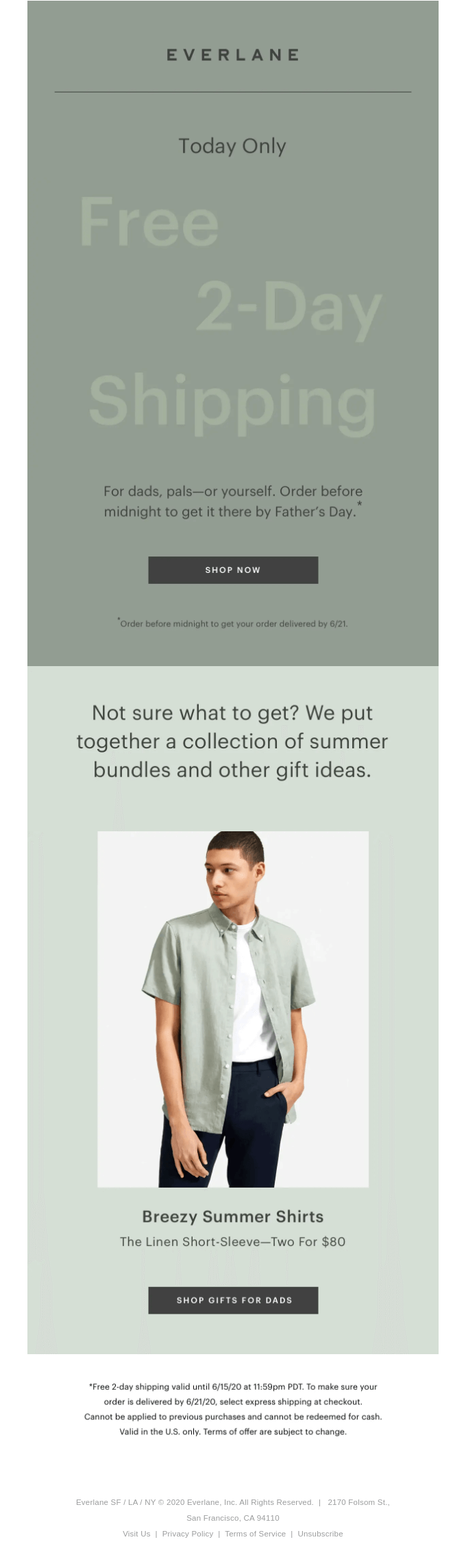
6. Minimal email designs
In 2020 minimal email designs cropped up quite a bit. And there’s more to the trend than meets the eye. While minimal designs can look really great and be really impactful, they also come across as authentic.The more polished and perfect your email design looks – i.e. with fancy formatting – the more your subscribers are likely to think of it as marketing email that is just pushing for a sale.
By opting for a minimal email design that has slimmer margins, you’re signaling to your subscribers that your email has more substance than just flash. According to Sprout Social, almost two-thirds of consumers, or 64% of them, want brands to connect with them in meaningful ways. Your customers want to know that your brand is made up of real people too.
7. Neomorphism aka neo-skeuomorphism
This 2021 email design trend helps to reinforce the hierarchy in your designs. Neomorphism involves using effects that are not obvious for the various objects in your design. They include a variety of shadows and colors. The result is that they don’t come across as heavily emphasized. And they have the intriguing look of clay renderings.
To date, neomorphic designs have been mostly commonly seen in different types of UI design, but we’re looking forward to seeing it crop up in emails. If your brand is defined by minimalism and subtleties, be sure to ask your designer to try out this effect for your 2021 email designs. It’ll create a unique effect that helps you break past the barriers that many consumers put up when it comes to marketing emails.

8. Hyper-personalization
We’ve all heard of personalization when it comes to emails. And we know how and why we should do it. Addressing your subscribers by name makes your emails much more impactful. But in 2021 email designs we’re going to see an increasing shift towards hyper-personalization. This means emailing your subscribers content which is tailored to their interests. To do this, you’ll need to segment your email list based on the different categories and personas that exist amongst your subscribers.
This is one of the 2021 email design trends that you’ll want to jump on sooner rather than later. 33% of consumers hit “unsubscribe” when they receive emails that don’t recommend products aligned with their interests. And marketers who create personalized experiences see an increase in sales of 20%.
Add to that the fact that segmenting your list can help you tailor your emails to those with unique needs as a result of the pandemic. For example, sending emails tied to a store in a particular region for customers who live nearby and may be interested in services like curbside pickup.
9. Enhance 2D images with illustrations
The care and effort you put into your graphic design and marketing isn’t just about looking great. It represents the care and effort you run your business with to your audience. And while vectors and stock images have their place, there’s a 2021 email design trend that really kicks things up a notch.
2D images can get a much-needed bit enhancement with textured illustrations. By using texture to revamp your images you create a more visual and sensory experience. To use this trend you can ask your designer to try playing around with contrast or tints, gradients or patterns, to create depth. Just be sure to let them know if you have any limits as far as types of patterns or effects. And provide as much context as you can about your brand so that your designer can use this effect in a way that reinforces your visual identity.
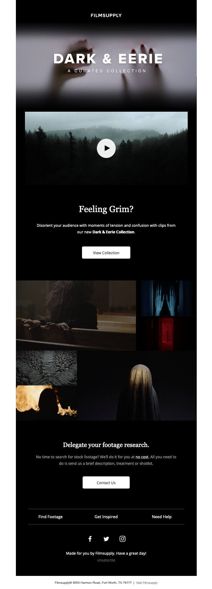
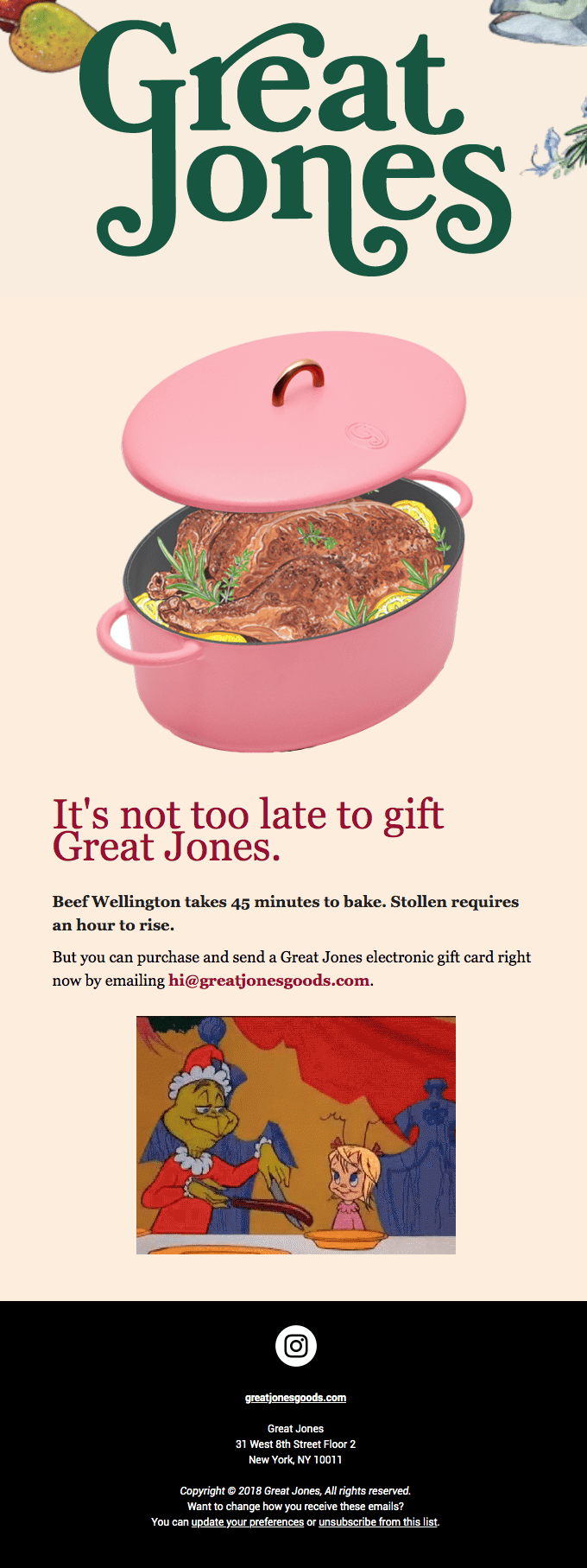
10. Going phantasmagoric
The term phantasmagoric refers to the way that images, emotions, ideas and even sensations can be used to create an experience. And it’s not just any experience, it’s one that is somewhere between where we are, where we have been and where we can be or become.
And phantasmagoric collages are essentially a collection of extracts from different images, to create one image. The whole concept creates a surreal effect, and so it’s one that is not necessarily for every brand. If your business has to do with entertainment, the arts and anything that’s about being creative, and thinking outside the box, you can definitely consider it. Just be sure not to over do it because that can overwhelm your subscribers and just make it hard to get any one message across. Your goal here is to ultimately create a cohesive experience.
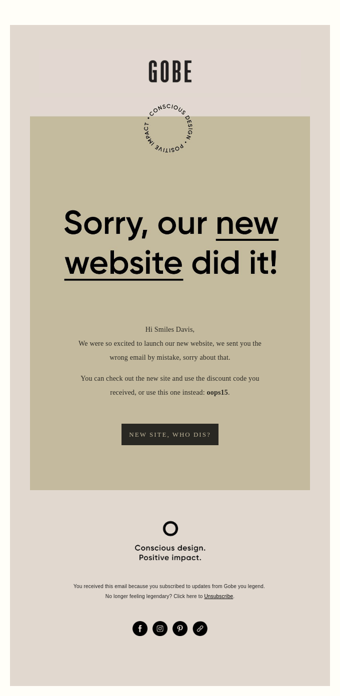
11. Add emphasis with muted colors
2020 has seen a rise in email designs that use muted colors. Their benefits include being able to portray a sense of ease and safety. In a year that’s been unsettling at best, and marked by upheaval at worst, this is not surprising. Health and wellness brands in particular tend to use these colors, but in 2021 we expect to see more brands jump on board as they want to provide a sense of reassurance to customers.
Color palettes that are muted are characterized by desaturation which involves adding in white, black or any other complementary color.
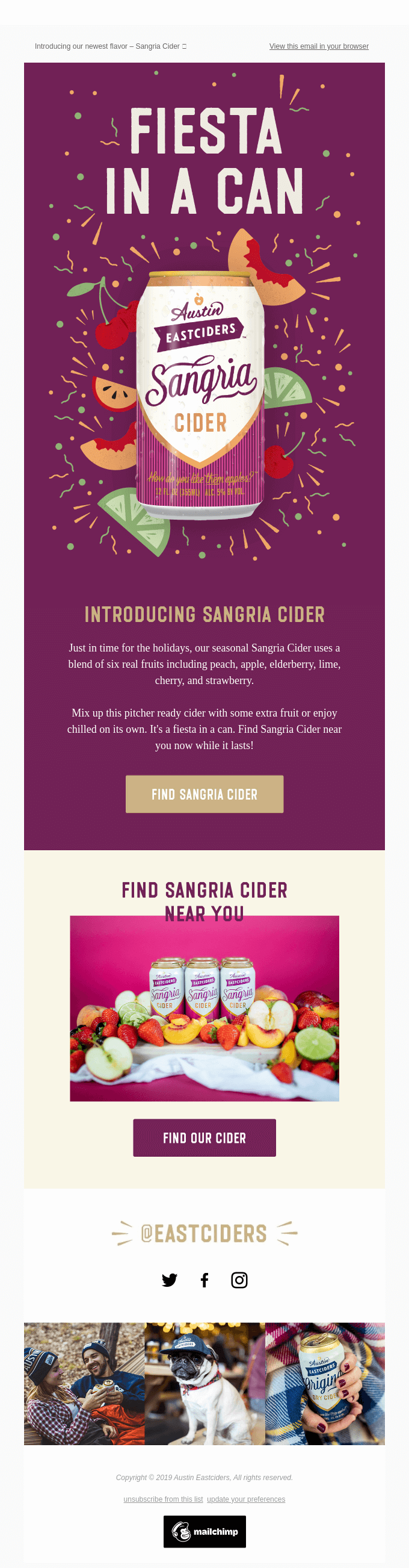
12. Bright and bold colors
And on the other end of the spectrum, the use of bright and bold colors will also be seen in 2021 email designs. One of the main reasons why bright and bold colors will be used, is that marketers want to create a feeling of hope and optimism. 2020 has been a dark year by all accounts, with few silver linings. And the popular sentiment across the world is a yearning for a normal life and the comforts of being able to move freely. Many designers are expected to embody an optimistic vibe in their email designs through the use of striking colors.
13. Monochrome layouts
From muted to bright and bold and now onto monochrome email designs. We expect to see different brands take on different approaches based on their particular goals. But monochrome email designs are ones that can be used widely by brands that span different industries. Reason being, they aren’t exclusively based on a black and white color scheme as many assume.
You can choose any color that makes sense for your brand and then ask your designer to build upon, and around it. The results come across as timeless and elegant. So if that rings for you, give this 2021 email design trend a try.
14. Tapping into different eras
A design trend that took hold long before 2021 is using styles from different eras. But it wasn’t one that was particularly prominent in email design. We expect to see this change in 2021. A combination of nostalgia and futurism is expected to land in our inboxes, depending on the brands we engage with most. And we can even expect to see a combination of the two with retro-futurism.
As far as elements from the past, this will range from typography (think serif fonts) to containers and solid drop shadows. And there will be a focus on triggering positive, comforting emotions. For brands that opt for futurism, their email designs will be characterized by bright colors, dark backgrounds, and imagery that relates to outer space. It’s all a bit speculative and fun because it involves imagining what the future will bring in an optimistic way.
15. More substantial shapes
Email designs, much like other types of designs, have long been using both geometric and organic shapes. The unique twist on this in 2021 is that shapes will play a much bigger role. They will be the primary visual element in an email design. By enlarging a shape and eliminating other imagery, it reduces the number of things to focus on in an email. This means that your subscribers can instead more easily navigate and take in your messaging. And they can do this without a lot of other things competing or their attention. The result is something more artistic and easy to consume.
Best practices for your 2021 email designs
Keep things on-brand
As soon as your subscriber opens your email they should be able to quickly and easily identify your brand. So as you consider the 2021 email design trends, and which you’d like to try out, there’s one thing to remember. You should only use those which align with your brand.
According to Campaign Monitor, around 126 business emails are sent and received each day. With so much to wade through it’s important that your emails are always consistent and provide value.
Ensure accessibility
When it comes to marketing emails the metrics that matter are whether your messages engage your audience. We’re talking open-rates and click-through-rates. Even the most beautifully designed email that you’ve ever seen could have a fatal flaw. If people can’t easily view it and access your content, the design really doesn’t matter.
Globally, over 1 billion people have a near or distance vision impairment. It’s important that you take every step you can to make your email designs accessible. Here are a few tips to follow:
- Have alt text or descriptions for images added if possible.
- Whenever possible, don’t include crucial details in your pictures.
- Nee to put important information in your pictures? Include a clear and direct caption or descriptive text to help those who cannot access the image.
Optimize your emails for mobile
Your emails are going to be viewed on devices of all sizes. So you need to make sure that they’ll look good and get your messages across no matter what. This includes avoiding having too much text, or any text that’s too small to be read on a mobile device. With nearly 50% of people using mobile to check their emails this is a step you can’t afford to miss. Always send out test emails to make sure everything looks as it should across devices.
Which 2021 email design trends will you try?
There are so many great trends that are being projected for 2021. Each with its own unique traits, and strengths, depending on your goals as a brand. And that’s what it ultimately comes down to. Your goals as a brand. Email marketing is indisputably a powerful tool. But it has to be used in ways that reinforce your brand’s identity and connect with your audience. So keep that in mind as you dive into the 2021 trends. Not every single one will fit your brand just right. But when you find the ones that do, you’ll create magic!