Outdoor Advertisement: Design Pitfalls Brands Must Avoid in 2023
Imagine investing time, effort, and resources into an outdoor advertisement only to find it falling flat or worse, receiving backlash. Sometimes the most straightforward design flaws and the smallest missteps derail even the most well-intentioned efforts. And we all know a marketing fail can lead to significant regression or sometimes, irreversible damage to the brand’s reputation.
But the good news is that you can avoid outdoor advertising blunders with a few cautious steps. To understand these steps, let’s talk about some of the most common mistakes that brands make when it comes to outdoor advertisement design. We’ll also be looking at some examples of how not to do outdoor advertising.
Of course, let’s first talk about the need for outdoor advertising in the digital age. Because it’s natural to doubt the effectiveness of a traditional advertising platform. After all, we live in times when AI can compose music and create ads with the least amount of intervention. Which means that brands have a lot of things to add to their budget. And you cannot spend on a platform unless you are absolutely sure it’s going to get good returns.
So, ready to explore the relevance and strengths of outdoor advertising in the digital age? Let’s go.
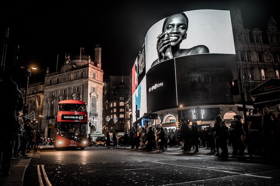
Is investing in an outdoor advertisement worth it?
While your TV ads, web display ads, and social media content can engage them when they are at home, OOH (out-of-home) advertisements communicate with them when they step outside. Evidently, a combination of both digital ads and outdoor ads means consistent engagement. And consistent engagement means better conversions.
Firstly, the global outdoor advertising market is projected to reach US $76.03 billion by the year 2027. This projection is based on the current rate of growth and the rate at which brands are investing in outdoor ads. This number and the overall upward curve in OOH spending only show that outdoor ads are not going anywhere now!
Secondly, amidst the shift to digital technology, outdoor ads have been evolving. The number of digital billboards in the US grew by a staggering 80% in the period between 2016 and 2022. This drastic increase in digital billboards is a sign that the outdoor advertising platform is adapting to the changing marketing realm and is therefore ready to embrace the digital-forward future.
All of these can be attributed to the benefits of outdoor advertising which include:
- Longevity – Data shows that about 82% of consumers find it easier to recall a DOOH (digital out-of-home) ad even a month after the encounter.
- Good ROI – A reason why some brands think twice about outdoor ads is that they can be more expensive than web ads and social media ads. But the good news is that the ROI for outdoor advertising is about 38% which gives a good reason to set aside a good budget for outdoor ads.
Given that outdoor advertising holds such prominence in marketing, it’s only fair to be cautious about the designs for these campaigns. On that note, let’s talk about the common outdoor advertising mistakes to avoid.
Outdoor advertisement – 6 blunders you cannot afford to make
Remember that you do not always have to have a sharp eye for design in order to pinpoint a design flaw. And that too when a scaled-up version of the design is displayed, as in the case of a billboard or a transit ad.
These outdoor advertisements are going to speak for your brand. They might make a first impression on a potential lead or evoke a brand recall in an existing customer. As you can see, outdoor ads carry a substantial burden of making a powerful impact in a fleeting moment.
Therefore, not making a bad impression matters as much as making a good one. And in 2023, with brands and screens competing with each other for a consumer’s attention, you cannot let even the smallest misstep push your marketing efforts backward.
So, what are the design pitfalls that you should look out for in outdoor advertisement design?
1. Wrong choice of colors and fonts
If you have been in the marketing industry for a long time you might already know that colors and fonts are the two crucial building blocks of any design, digital or print. In fact, these two matter irrespective of the scale of the design. Because together they help evoke all the right emotions while also accurately carrying your brand’s message. Additionally, these two factors also establish branding.
A few outdoor advertisement design mistakes you should avoid with respect to colors and fonts are:
- Using a complicated color scheme – don’t confuse your audience especially when they are on the road.
- Too little and too much contrast – without proper color contrast between your foreground elements and the background, the message is not clear. And when there is too much contrast between the colors, it can strain the reader’s eyes and that’s bad especially outdoors.
- Using too many fonts – this can be distracting. And wrong font pairings make your design look clumsy and unprofessional.
- Illegible fonts and small fonts – remember that your audience does not have a “zoom in” option for billboards. So for your message to be loud and clear, you need legible fonts and preferably a big font size.
For more tips on how to use the right colors for your outdoor ads, check out the KIMP blog here.
2. Vague messaging
Coming up with a single focused idea for each outdoor advertisement may be challenging at first. But the real trouble starts when you try to explain the concept to your designer and ensure that the design elements are carefully handpicked to corroborate the said idea.
To achieve this you should be sure that every single design element used in the outdoor advertisement has a well-defined purpose. Unwanted elements can create clutter and also confuse your audience.
In addition to choosing the right elements, you also need to pay attention to the little things. Graphic design principles can guide you through the process. Together all these help deliver the intended message clearly. Even when one of them is missing, the tower comes tumbling down.
Take the below outdoor advertisement from Barneys New York. While the creepy illustration is definitely a big turn-off, another is the weird placement of the words Marc and Jacobs. As a result, the idea here is not very clear. In short, customers do not know what to make of the ad. That’s wasted billboard space and a wasted marketing budget!

3. Cluttered design
While the above example lacks a clear message, at least the design does not cause visual strain. That’s because the layout isn’t cluttered. But every now and then we come across outdoor advertisements that display a large chunk of text in a small space. After all, given the difficulty in finding an optimal billboard spot, brands want to squeeze in as much information in it as possible.
But when there is a lot to convey, you end up creating clutter. Which further makes it difficult for a passerby to process the information. In this case, your outdoor ad does not make any impact after all.
Take a look at the below billboard design. Will you retain any piece of information or even have the patience to read anything on the billboard when you walk or drive past it? That’s what clutter does!

KIMP Tip: Work on creating an organized design where the visual hierarchy is clearly established. This navigates your users through the design without any hassle.
Looking for professional billboard designs to help shape your brand image? Get KIMP!
4. When the CTA is missing/unclear
A good-looking outdoor advertisement gets customers to notice your brand. But the contents of the design are what determines whether the customer progresses to the next stage in the purchase funnel. And one of the essential elements in this is the CTA (call-to-action).
An outdoor advertisement without a CTA is a marketing cul-de-sac. As a result, this can be a huge blow to the customer experience.
So, when the CTA is missing, your ad does not fulfill its purpose. Remember that outdoor ads do not come with a “click here” button to simplify your customer’s job. They need to switch from the outdoor advertisement to your website or social media page or place a call to get to the next step. You do not want to make their job even more difficult by leaving out the CTA or not clearly defining it.
What would be the next step you would take as a consumer if you encounter an ad like the one below? You might perhaps read the ad and pass by without giving any thought to it. That’s because of the missing call-to-action.
KIMP Tip: A similar problem occurs when the design does not emphasize the CTA. This can be due to poor contrast, illegible fonts, or a lack of hierarchy, leading to the audience missing out on the CTA. To avoid this, the elements should be arranged such that the eyes are naturally drawn to the CTA. Without a doubt, CTA design is an art worth acquiring!
5. Ignoring the placement of your ad
One of the striking differences between digital ads and outdoor ads is that with the latter you get to take full control with respect to the placement of the ad. Whereas in the former, you are entrusting ad placement to the respective algorithm. This difference can be both a good thing and a bad thing.
With algorithms, though you are not in the driver’s seat, you know well that the ad will be delivered in the most optimized manner. As in, the relevance of ad delivery is ensured based on the user’s browsing behavior and other factors.
On the other hand, with outdoor ads, the placement part is entirely in your control. Done right, this can be hugely beneficial to your brand. However, with one wrong placement, your brand’s reputation goes for a toss.
Take a look at the below ad and you’ll immediately get our point here.
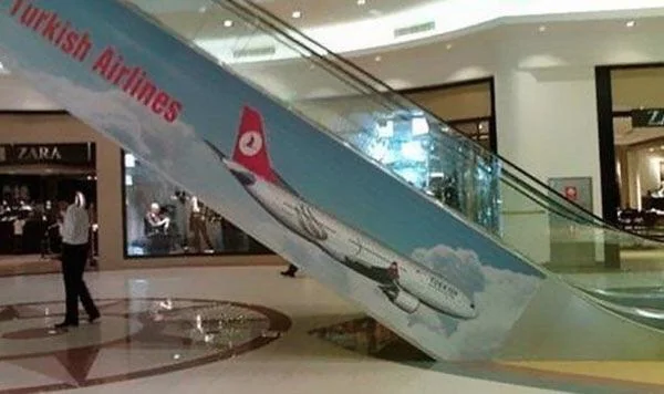
The image of a plane going down is not exactly the kind of picture you would want your audience to remember when they think of your brand! That’s how even with a simple and effective design a harmless ad concept ends up ruining a brand’s image. In this case, something as simple as the reversal of the alignment to have the plane soaring upward would have made a mound of difference.
Such last-minute revisions, an unlimited number of changes to your design, and the option to revisit an old design and update parts of it are all possible when you choose a long-term design outsourcing solution like an unlimited design subscription.
6. Typos in the outdoor ad copy
Every time a customer encounters an ad, they are judging the brand, its services/products as well as the brand’s quality. All of these are happening by default even without the customer realizing it. An ad that impresses them makes the brand easier to recognize in the next encounter. An ad that emotionally moves them makes it easier for them to remember the brand and trust it.
Therefore, all these design mistakes that we are discussing matter more than you think. Because these blunders might appear small but they have a measurable impact on your audience. On that note, the next such blunder on this list, one that annoys almost everyone is a typographic error. In fact, typos in outdoor ads have often been the reason behind brands being ridiculed on social media.
How many times have you come across posts mocking funny spelling mistakes or grammatical errors in ads? Several we’re sure. Here is one such ad.

Mistake in an ad that’s meant to promote a product of educational value for children – the irony of it!
Would you as a consumer go back to this brand if you come across this ad? Probably not. Your customers wouldn’t either. If your ads have such easily noticeable typo errors.
KIMP Tip: Don’t let typo errors undermine the trust in your brand! It’s crucial to be vigilant and avoid them at all costs.
The first step is to proofread your copy several times before you hand it over to your designers. The second is to work with professional designers who pay attention to every detail in the design including the accuracy of the copy. And once the design is ready, triple-check every word before sending the design out to print.
Elevate your outdoor advertisement designs with KIMP
So, when you set out to create an outdoor advertisement for your brand, no matter the purpose of the ad and the format or even the location, ensure that you avoid these blunders we spoke about. Better safe than sorry, right?
After all, when your brand’s reputation is on the hot seat, you would want to take every step cautiously. So, it’s important to learn not just from your mistakes but also from the mistakes that other brands make.
With all those precautions laid down, we’re sure you are ready to hit the ground running. If you are looking for a professional design team that can help create stunning graphics for your outdoor campaigns and align the rest of your marketing collateral with the campaigns, sign up for a KIMP subscription.
Register now and start your 7-day free trial.