The 17 Elements And Principles Of A Good Design
If you’re not a graphic designer, chances are you might not know what makes a design a good design. Graphic design can seem kind of simple from the outside looking in. But it’s a combination of both art and science that produces the results your customers love. It’s the combination of creative flair and the principles of a good design that produce the best results.

To help you become more familiar with all of the pieces of the puzzle, Kimp’s unlimited graphic design team put together a list of the elements and principles of a good design. Keep them in mind so that you know what you must look for in your next design.
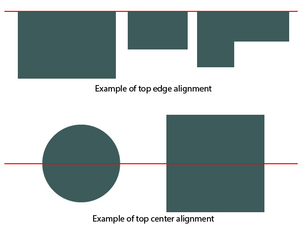
1. Alignment
This is one of the fundamental principles of design. Without it your design will lack the defining characteristics that make it pop. Alignment helps give that sharp and ordered look to a design. It results in a design’s elements having an aesthetically pleasing connection with each other. When you have the right alignment, you immediately remove any kind of messiness or amateurish look. And no matter the type of design, your designer’s preferred software will allow them to align the elements in your design to make it look its best.
2. Hierarchy
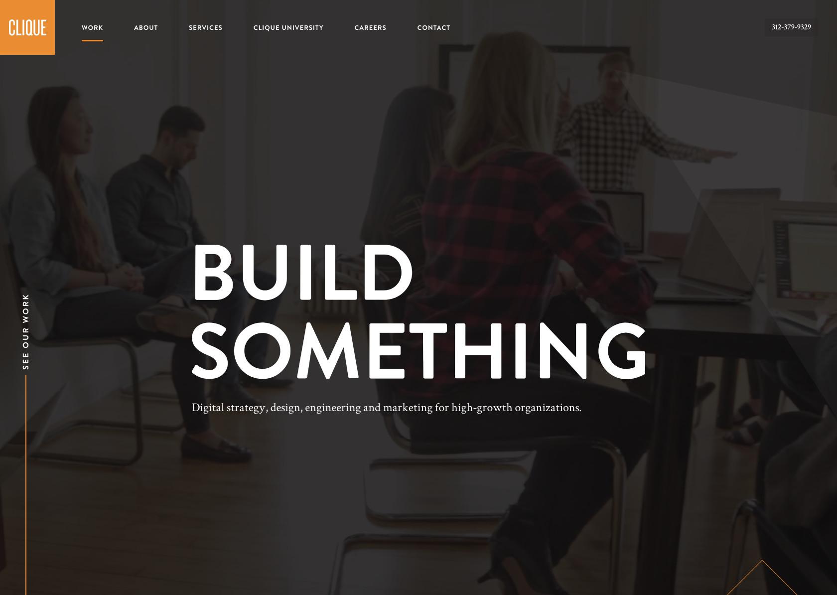
Your design will most probably have multiple elements in it. This means you need to make sure that you are giving your most important element(s) the chance to have the most weight visually. In other words, the focus of the person seeing your design, should immediately be drawn to the most important component.
This is called hierarchy. Hierarchy can be achieved in more ways than one. For example you can use larger and bolder fonts, you can pick the best placement to highlight a particular element of the design, or you could use various shapes to frame out the element. Be sure to let your designer know what the most important part of the design is.

For example, you want to highlight a promotion, but you also want to draw attention to the dates and times during which it is valid. Ask the designer to perhaps virtually establish the main point which would be the details of the promotion itself with a large text or the use of shapes. Now work to make the secondary messages, which are the dates and times, also draw attention without overpowering the primary point of focus. If the post is being done for social media, you can also communicate the secondary message in the copy itself for the caption or in the comment section.
3. Contrast
Another very important principle of design is contrast. This is one of the principles of a good design that allows you to draw out the most important elements of a design. When used correctly, it brings emphasis in just the right amounts. If you’re ever in doubt about whether more or less contrast will work better for your design, ask your designer to show you some variations.
In order to achieve the best contrast, two elements in a design must contradict each other. For example black and white, modern and traditional, or thick and thin. You get the idea right? Basically, the right amount of contrast will help the eyes of the viewer see the most important parts of the design. And it’ll make the design feel more aesthetically pleasing, overall.
4. Repetition
Repetition as a design principle refers to using the same or similar elements throughout your design so that there is a sense of cohesion. This an be the same shapes, colors, typefaces, shapes, or other elements. When you have some repetition in your designs, it will help fortify the overall look and feeling. It gives a feel of consistency and organization, that ties in all of the elements together.
And when it comes to branding, consistency and repetition are very important, because this will ensure that your customers can recognize your designs instantly when they see them. For instance, you can use similar imagery, fonts, and colors so that there is some uniformity across your designs. If you look at the example below, the use of pink is what stays consistent in all the brand posts.
5. Proximity
Similar objects or objects that show a relationship to each other, need to be grouped together to create a cohesive flow between them. And this in turn will help to create a sense of professionalism and organization in an image. In other words, you can cluster elements that go well with each other so that the design is not cluttered. To see how this can be done in your designs, ask your designer to show you different options for how proximity can be used. A bit of creativity with color, fonts, and sizes can create a connection amongst elements that may not seem like they can be arranged together.

6. Balance
Amongst the principles of a good design, balance is something that will create stability and form through the distribution of elements evenly throughout a design. When there is even spacing, the final result will be professional and clean without all the untidy and amateurish feels. Most people would think that balance refers to symmetry. That’s not the case. The design could be symmetrical or asymmetrical, and elements do not need to be the same size either. When the elements are symmetrical, you can balance it in equal weights on either side of the design. When it is asymmetrical contrast can be used to even out the general cohesiveness and balance.
7. Color
This is one of the most significant factors in any design and needs to be thought out really carefully. Colors dictate the mood of a design and every color that you pick will have something different that it evokes. Green for example, makes people think about the environment and non-profits, red causes excitement, anger, or energetic moods. Blue is all about calm and trust while yellow represents happiness.
A quick bit of reading on our color theory blog is all you need to understand color psychology in marketing. Playing with the use of color can help make different elements stand out and pop. Talk to your designer about different options for this. For example, if you want more legibility you can ask them to add a gradient background behind the text that you use. This is especially helpful if the text color is similar to the background.
8. Space
Space, also known as white or negative space is the parts of the design where there is an absence of elements. This is what gives the elements breathing room so that they can stand out. This negative space can also create shapes and can help you highlight the most pivotal parts of the elements in your design. This is why simplicity and minimalism are important in a design. Cramming a design to the brim because you feel like it needs to fit in everything possible will actually make your audience tune out. Like much in life, less is more when we talk about the principles of a good design.

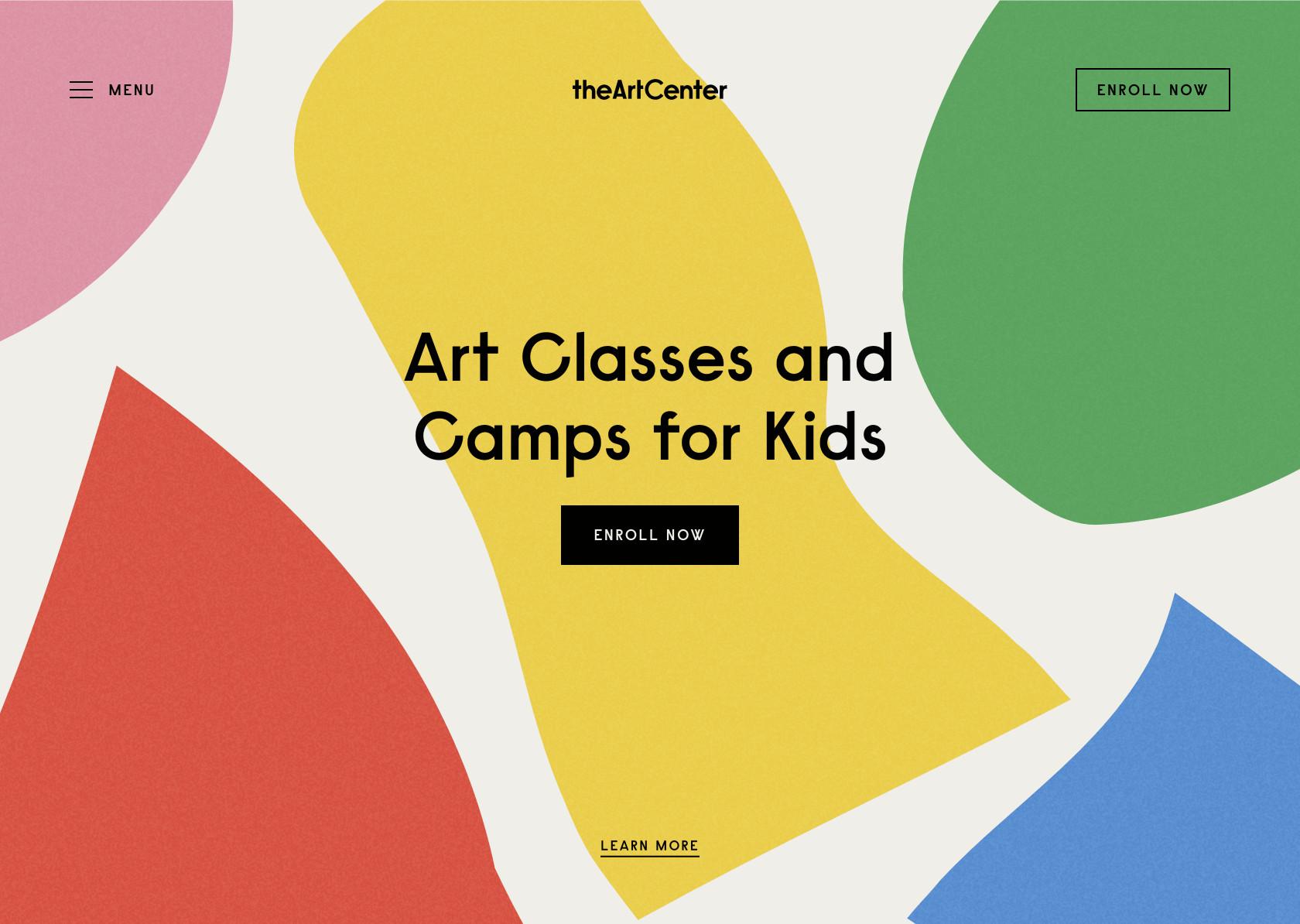
9. Emphasis
Just like how we spoke about hierarchy, emphasis in a design can be used to pull focus to the most important elements. It can also take focus away from information in a design that is not meant to be highly visible. Think of things like fine print. You’ll see emphasis at work in the example below when you see how your attention is drawn to the big, bold font vs the tiny lettering below.
10. Proportion
Proportion is one of the principles of a good design that is simple and easy to understand. Essentially it refers to the size of elements in relation to one another. The larger the image, the higher the amount of importance that is associated with it. Proportion is comprised of:
- The height, width and depth of one element in the design in relation to that of another.
- The relationship between the sizes of two areas in a design.
- The size of one element as compared to the size of another element.
- The amount of space that exists between two or more elements.

11. Rhythm
You know how the musical notes in a song creates rhythm? Similarly, the spaces between repeating elements in a design also give a design a sense of rhythm. There are five main types of visual rhythms.
- Random – No clearly distinguishable pattern.
- Regular – The same spacing between each of the elements in the design. There will be no variations or exceptions.
- Alternating – A set pattern that repeats itself. There is also variation between the elements involved. For example we can say that a pattern could be identified as being 1-2-3-1-2-3.
- Flowing – Bends and curves, just like how waves flow.
- Progressive – This type of rhythm will change as they go along and they will change while adding to the former iterations.
These rhythms in designs can be used to evoke certain feelings. For instance, they can evoke excitement (especially the progressive and flowing rhythms). They could also create reassurance and consistency. The feeling evoked, will depend on how you have implemented the principle. So be sure to let your designer know how you want your audience to feel when they see your design.
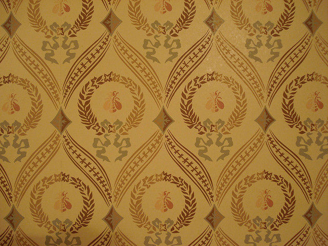
12. Pattern
When there is a repetition across multiple elements in a design, that work together, patterns form. Wallpaper patterns are among the most common patterns that almost anybody is familiar with. When it comes to design, patterns are also referred to as standards for how some elements are designed. For example, top navigation is a design pattern that we all encounter when we browse different websites.
Seamless patterns are those in which every element of a design is repeated and combined to form a whole. This is most common in backgrounds on websites, landing pages, and app pages.
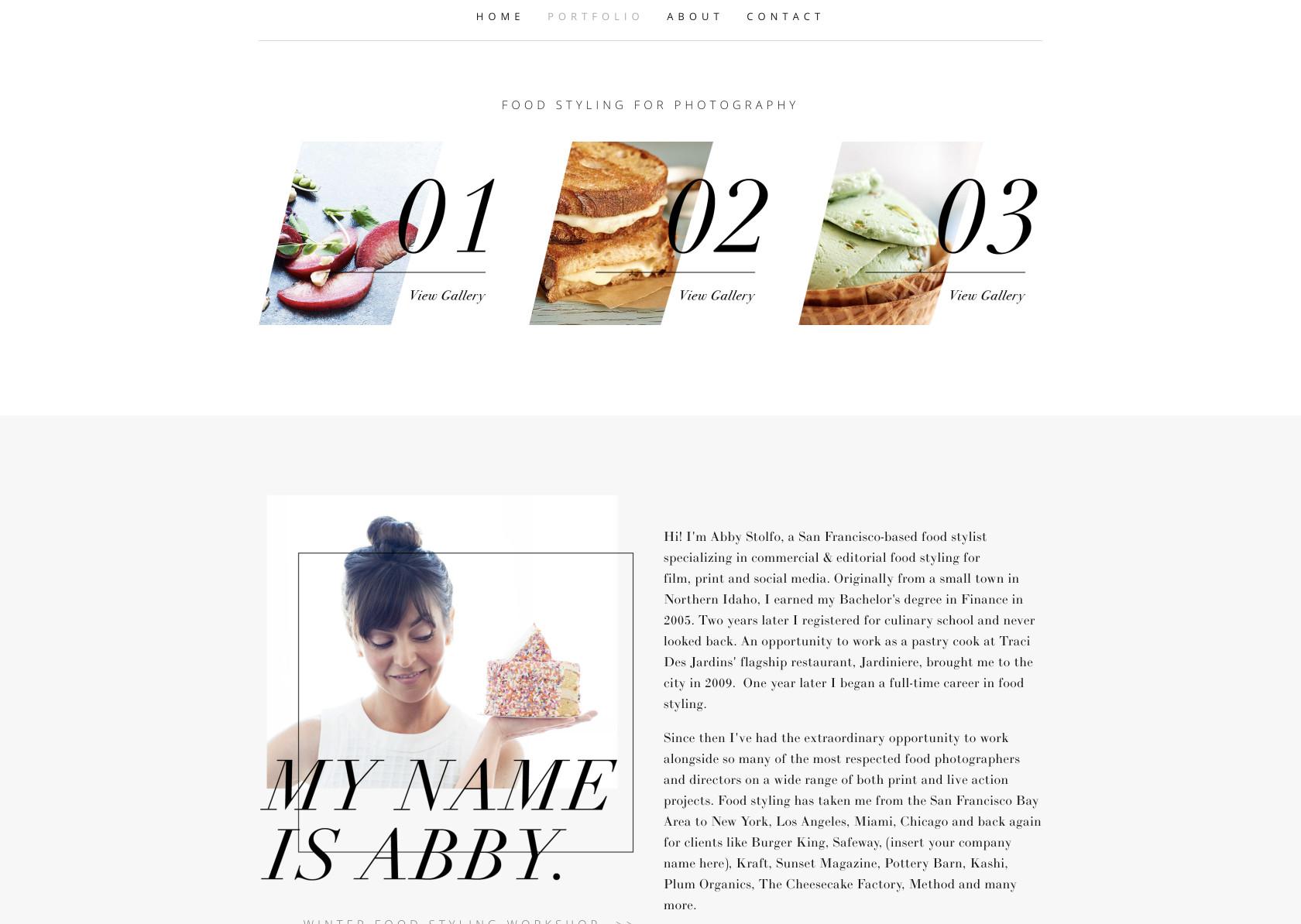
13. Movement
This refers to the way in which your eye will travel over a completed design. The most important elements in a design should be noticed first and should get the most amount of focus. You can achieve this with the correct positioning. For example, usually those who see a design will look at the top left corner, then the top right, and so on. So arranging your design elements accordingly can help to create movement in the design. In the example below, the italicized effect in the numbers gives it movement and emphasis.
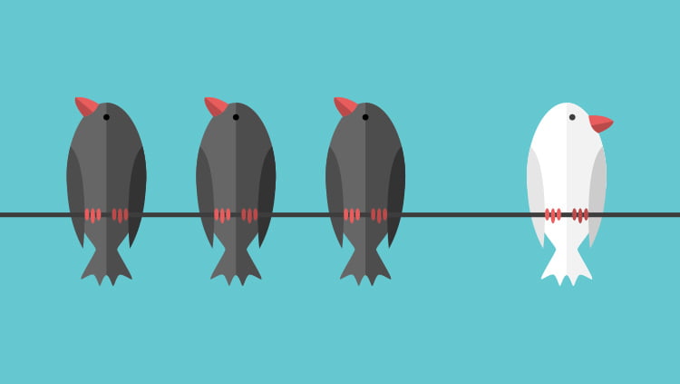
14. Variety
This is usually used to generate more visual interest. Without the right amount of variety, a design can become very monotonous and cause the viewer to lose interest. Variety can be created in many different ways. You can use elements like color, fonts, shapes, images and any other component of the design to bring in a sense of variety.
That said, do keep in mind that if you are simply trying to add variety for the sake of it, it will not make sense. The kind of variety that is best for a design, is when it reinforces the elements to create a better user experience. And of course the use of variety should reinforce your goals for your design. Asking your designer for some variations can help you see how you variety to produce outcomes that are easy on the eyes.

15. Unity
Have you ever come across a website, or any other design, in which elements seem to be used in a haphazard or random way? A good example is newspaper ads, where almost ten different fonts can be thrown together. The principle of unity is all about how well the elements in the given design work together. The visual elements should all have clear relationships with each other, meaning that they cannot be mindlessly used. This will help you communicate your message ina clear and a cohesive manner to your audience.
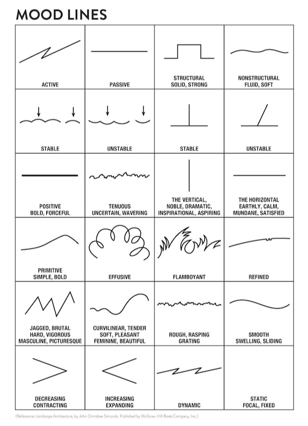
16. Line
One of the most fundamental elements of design would be the line. In graphic design, this is any two points that are connected. Lines come in handy when you need to divide spaces and draw the eye to a particular area of the design.
17. Shapes
Whether they are organic or geometric, shapes can add a lot of intrigue to a design if you know how and where to place them. Geometric shapes are defined by uniform proportions. Think of circles, squares, and triangles. Organic shapes have less well-defined edges, and have free-flowing proportions. When it comes to organic shapes there are no rules. Think of wiggly and blob-type shapes that don’t fit into particular categories.
Whether geometric or organic, shapes can be intentionally included or formed naturally, around elements. They can be defined by boundaries, lines and colors and will often highlight a part of a design. And they can even be used to create visual metaphors in a design.

Combine these elements and principles to create the best designs
They certainly are integral parts of a design. But it’s important to remember that design is a bit of an art and a science. While the elements and principles of a good design are important to know and follow, design also requires effective storytelling. As a result, each design will be different and for that reason, what constitutes the basic principles for each design can also differ. So be sure to share the story of your brand, and the goals of your designs with your designers. And together you’ll produce creatives that help you engage your audience.
Need an experienced design team? Try Kimp’s unlimited graphic design service with a Kimp Graphics subscription!