Everything You Need to Know About Icon Design
Icons are small but powerful, and that is why it is important for you to think through icon design carefully. Designers everywhere will bear witness to the amount of creativity and effort that goes into creating a good icon. This is because it has to be expressive but also simple at the same time.
A background on icons
An icon design is actually just a small image that will represent either an object or a program. They are really simple images that communicate a powerful message. Icons are very easy to remember usually, and also happen to be a main feature in almost all graphical interfaces.
Fun Fact: The origin of the word icon comes from the Greek work ‘eikona’ which means image. Digital icons started making an appearance when the very first GUI operating systems like Macintosh and Microsoft came out.
What are the different types of icons?
There are three main types of icons that you should know about. Here is some insight about each one of them, and the kind of impact they bring to a user experience.
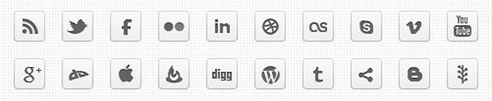
Universal icons
These are universally recognized icons. For example, the icons for search, print, home or shopping cart are such icons. But there is just one tiny problem. Universal icons are rather rare. When we mean rare, we mean that apart from the examples given here, most icons happen to be ambiguous and can differ in meaning based on the interface.
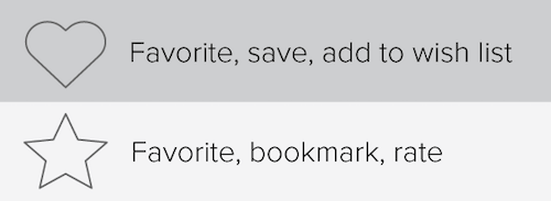
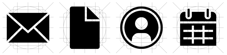
Icons with different meanings
Just like the name suggests, these icons have multiple meanings which could make them conflicting or contradictory. For example the icons that are a heart and a star are conflicting. The functionality of these two icons will change from one app to another, and sometimes they can also compete with each other. Because of that, these icons become rather hard to interpret with precision. Even in an app, these symbols can become confusing, when the user clicks on them hoping for one specific outcome and instead, gets something else.
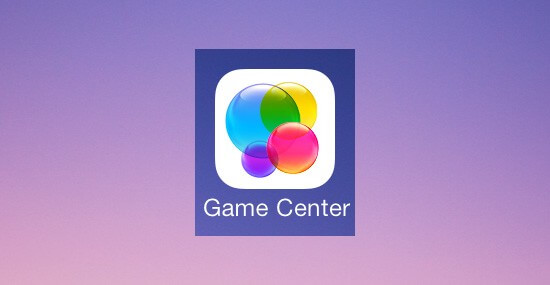
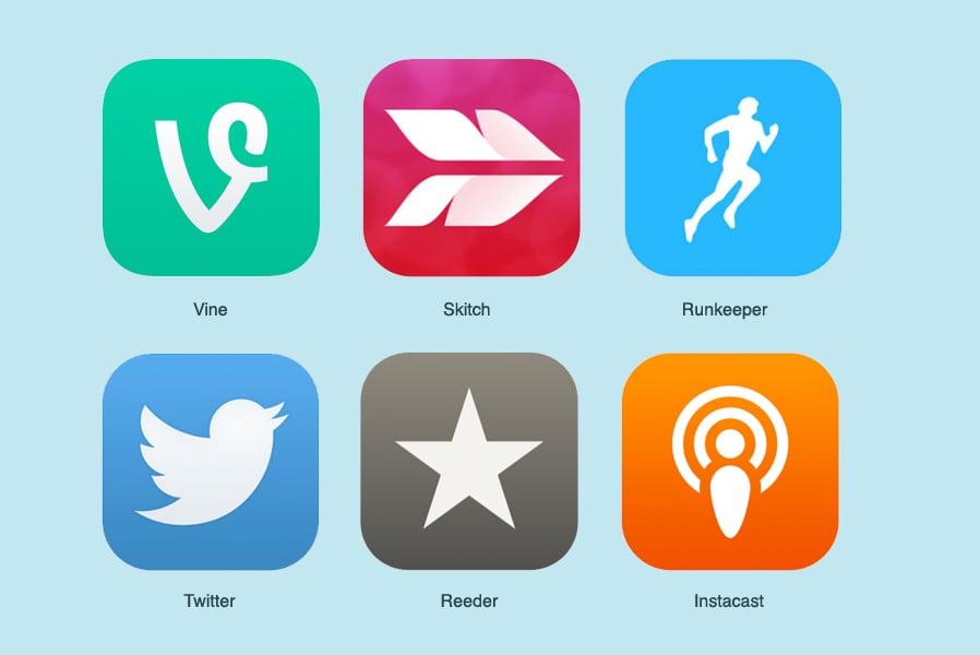
Unique icons
How can you describe a unique object or an action using an icon? Using a unique icon design. But it’s important to note there are many examples of where this has failed. For instance, the meaning was lost when Apple decided to represent their game center through a bunch of colored circles. What do these circles even mean and how are they related to the game center?
Which icon formats can you use?
There are several types of icon formats that you should know about when you ask for an icon design.
- SVG – these are Scalable Vector Graphics and provide the perfect base format. Because it is scalable, it essentially means that you can change the size of the icon without losing out on the quality.
- PNG – Portable Network Graphic format is the option to go with if you want complete compatibility. This is a raster format which means that it is based on pixels and you cannot upscale without impacting the quality. PNG will work on Word, PowerPoint, and on emails. They can be added on top of any colored background without editing.
- ICO – the Microsoft Windows icon format is great if you want to use your icon for any Windows application or even as a favicon for your own website.
- ICNS – this format is used for very specific purposes. This is an Apple-specific format that can be used with Mac OS X documents as well as apps.
Kimp Tip: Keep your icon design as simple as possible. Try to use real-world items in your design that clearly represent your intended meaning. For example, you could use a bar chart to indicate finance. You could use a work bag to mean business. To help your designer come up with the right icons, give them as much context as you can. Let them know exactly how your icons will be used.
What makes an icon effective or ineffective?
Since you now have an idea about the formats of icons and the types of icons, let’s also look at what makes for an effective or ineffective icon. This way, when you work with your designer you can look out for these properties.
Clarity
An icon design should communicate a message immediately when you see it. If the metaphor that you use in your icon is unknown or obscure, people will be confused about what it means. For example, the icon used for Home is known to everyone – that is clarity. Now imagine what would happen if the icon for Home was depicted as a circle with a dot in the middle? That would make it confusing right? Confusing icons are ineffective.
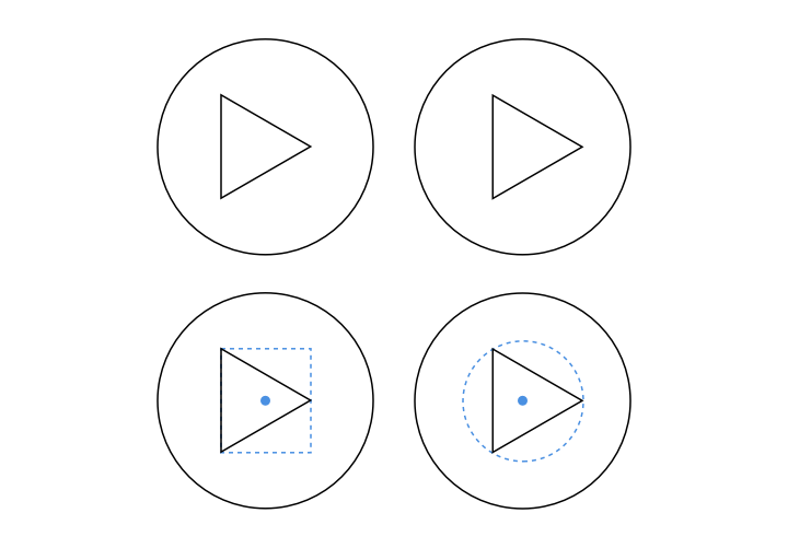
Readability
After you have sorted the clarity factor, you now must ensure that the icon is easily readable. If you look at the example below, the very first icon is difficult to understand because the detailing is too fine, making it a blur. A good example of small icons done right, would be the ones on Google maps where there is excellent readability. Using thinner strokes, not leaving enough space and adding too much detailing to small icons will render them ineffective because they lose readability.
Alignment of the icon
An icon design should have a sense of balance and this can be achieved by aligning all of the elements optically. This means that the design needs to be aligned according to how the viewer will perceive the elements.
Brevity of an icon
The brevity of the icon will be determined based on the amount of detailing that you put add. Keep your icons as simple as you can and avoid adding in unnecessary linework and details that will make it unreadable and blurry.
Consistency
If you are getting the designing done for icons for an app or a particular interface, make sure that all of your icons maintain the same consistency. If some icons look more detailed, or sharper than others, you lose consistency. This will make the interface suffer in terms of user experience.
Personality of design
Again, with the interface or app that you are designing for, you must make sure that each icon embodies the personality of the brand. You can go from professional to fun and preppy based on what kind of brand style and voice you have. This is a very important part of the briefing that you should provide your designer with when getting icons designed.
Your icon should be easy to use
Even after the drawing has been done to a ‘t’, the icon is far from being complete. The icon your designer did, will need testing and preparation before you can let clients use it. This testing and preparation will ensure that the icon is easy to use. Signs of a an easy-to-use icon are that it is:
- Well-organized – here you need to make sure that your designer has placed master files for the design in a well-organized manner so that you can refer to them later if needed. You can ask for them to be put in alphabetical order, or in some other order so that they can be found easily when you need them.
- Well-documented – ask your designer to communicate the key principles of the icon family and also layout the technical rules. You can also make this documentation public once it is complete, so that people could refer if they wanted to.
- Tested – make sure that you run through this with the designer. Get them to place all the designed icons next to each other, which will help you see their consistency and the relevance that they have.
- Supported by custom tools such as an icon manager. If you can provide any custom tools that will help the usage of the icons, you should make them accessible.
What should your brief for icon design include?
Consider all use cases
Know where your icons will be used, and what they would need to represent. You would also need to differentiate between which icons will need a metaphor, and which icons will be done based on real-life objects. Once you are clear on these factors, you can communicate this to your designer through the brief.
Brainstorming concepts & metaphors
First, make a list of all the depictions that can be used to describe the icon as best as possible. Resources like word sets and dictionaries are helpful to find things like keywords, similar words, and definitions of the concept that you are looking to convey through the icons. You can then start on simplifying these ideas so that the icon (which needs to be abstract and simple) will send the message clearly and effectively. Try to get through as much of the research and brainstorming on your own as possible, and then enlist the support of your designer for the rest.
Find useful references
Always invest in research to find quality references. Chances are that somewhere, somebody has already done a fantastic version of the icon that you are looking to get designed. If you can find these, you can also find your inspiration. When you provide these references to your designer he/she will find it easier to understand your perspective.
Choose the style of the icon
Some of the styles that are popular are glyph, flat, outlined, material and hand-drawn. When you finalize on the style, you will need to think about two important factors. One would be the UI interface on which these will be displayed and the style of it. The second would be the requirements for that interface, like whether it is Material or iOS.
Discuss in detail with your designer
Make sure that your designer maintains consistency across all of the icons that you are having designed. To make things clearer, get them to do a full sketch of all of the icons to be done.
After approving the concept sketches of your icons, you should request vectorized versions. Then finally, get some mockups of your icons so that you can see if they suit your various use cases well.
Now we’ve gone through what you should include in your briefing to make your icons look sharp. So next let’s go through the main things that need to be embodied in the icons that you design, so that your final result is just spot on. Be sure that you discuss these with your designer.
Checklist for creating new icons
The steps described below will be taken by your designer to create your icon design.
Avoid blurry icons
For icons to look sharp, spick and span, they need to be positioned on pixels. This will get rid of any blurry hiccups.
Check dimensions and weight
We recommend that you use the squint test to make sure that all of your icons have the same weight and dimensions. Basically just squint, and take a look at how your icons appear relative to one another. If any adjustments are needed make sure to get your designer’s help. One tip here is to use a perfect circle and a square to make sure the weight is the same across your set of icons.
Using geometric shapes
Get your designer to use geometric shapes that are simple and firm to draw out your icons. This will make the icons clear and look aesthetically appealing.
Avoid over-detailing
Remove any details that make your icons look busy and heavy, when you run through them with the designer. Instead, maintain the basic and simple details only, that will make the icons look clean and clear. Icons are small and they can just turn into a blob with too many details.
Keep space
All of the fine details within an icon need breathing space. If they all stick together too closely, they will make the entire design muddy. When you look at the icons, see if they all have enough space so that details are clear and whether their meaning is clear to you immediately.
Contrast in icons
Make sure that there is enough color contrast in the icons. The balance of black and white should be just right. If there is not enough contrast, the icons will look unclear.
Look at visual unity
Another factor that you should be looking into is called the visual unity of an icon. What this basically means is that the weight of the lines, the sizes of the corners, the color palette being used, the level of details included and the elements of the design stay consistent through the complete set of icons. Be sure to chat about this with your designer as it’s a lot to keep track of!
Icon design is fun, but tough to get right
We’ve taken you through a whole lot of information so that you can get started with icon design. It’s a lot to take in and familiarize yourself with so be sure to work with a good designer to get your icons just right. And provide them with all of the details they’ll need to understand how your icons will be used, and who will be viewing them. And soon enough you’ll have a great set of icons that are strong, clear and easy-to-use designed.