How To Optimize Your Black Friday & Cyber Monday Landing Pages
Of all the holiday sales coming our way, customers are most eagerly awaiting Black Friday and Cyber Monday. That’s why brands can’t leave any stone unturned if they want to achieve their best sales.
And that usually translates to increased ad spends across different advertising and marketing channels.

Brands allocate a significant portion of their yearly budgets only to these two campaigns because the ROI here is unmatchable.
But are ads alone enough to ensure sales? No, there is actually one more magic ingredient to success during Black Friday and Cyber Monday campaigns. And that is your landing page design.
Before we tell you how to optimize your Black Friday and Cyber Monday landing page designs, let’s take a quick look at their impact on your sales.
Black Friday & Cyber Monday Landing Pages
Landing pages are a staple for every digital ad campaign out there. Or they should be anyway. Digital ads are getting more expensive by the day, and landing pages play a very significant role in ensuring their success.
These are web pages, serving as an extension of a particular marketing and advertising campaign. They serve as the bridge between your advertisement and your entire site.
For example, consider you have an apparel ecommerce store and are running a Black Friday Facebook ad on boots. When the customer clicks on your ad, they do not want to see the entire store. They are only interested in the boots. So, a specific, standalone web page that caters to these specific criteria will be more effective. And that specific, standalone page is a landing page.
As an ecommerce brand, you will run a lot of different ads before, during, and even after a sale is over. The intent behind your campaigns may not always be sales.
It can be to increase sign-ups for a sale announcement, provide a sneak peek on an upcoming discount campaign, launch a new product, and so on.
Without a meaningful and relevant landing page, the advertisement will not have a purpose or a path to lead the customer to.
TLDR: Why do you need a specific Black Friday or Cyber Monday landing Page?
- It is a dedicated page specific to a particular campaign focusing on a single CTA
- Landing pages enable an easier shopping experience for customers
- You can track inbound leads from different channels with ease
- Improves your advertising conversion rates
- Ecommerce brands can ensure a faster checkout with product-specific landing pages than redirecting to the site itself

7 ways to Optimize Black Friday and Cyber Monday Landing Page Designs
Okay, you have your sales plan in hand. The discount codes are ready to go. And the ad designs look amazing. Your design team really came through this time. You are confident about the upcoming Black Friday and Cyber Monday sale season.
But what about your landing page design? Don’t worry. You’ve come to the right place. We’ve got all the details you need on how to elevate your landing page designs for Black Friday and Cyber Monday.
This way, all your effort, right from product launch to sale plans, will get the returns they deserve.
1) Choose the right landing page type
Based on the purpose of your advertisement and the CTA you are targeting, you have many options in landing page designs. Let’s take a look at the best landing page types for different ads:
- Squeeze Page – This landing page is ideal for collecting details from customers, so pair it with your sale announcement, early access, and exclusive deal-related ads. Brands typically use it for the top of the sales funnel customers where there is no sales intent as of now.
- Product page – Here, the focus is on a product or a product set that the customer is looking for based on an ad you published. This is ideal for ads that promote gift guides, or a particular product via video/social media ads. You can use it for the bottom of the funnel customers who are considering a purchase but have yet to decide. They can look at the options and pricing available before making the last call.
- Click-through landing page – This landing page is a detailed page that focuses on a particular product with all its features, pricing, benefits, and social proof surrounding it included to close the deal. Brands aim this at the bottom of the funnel customers where purchase intent is high, and just a small push is all it will take.
Kimp Tip: If your Black Friday and Cyber Monday campaigns have different advertisements targeting people in various stages of purchase intent, you must vary your landing pages too. Having a single landing page for all means grossly underutilizing the power of landing pages and what they can do for you.
2) Craft the design brief
Yes, we completely mean it when we say craft the design brief. A design brief is easily the most important document in all design discussions. This will determine how your design turns out.
If you are looking for optimized and effective Black Friday or Cyber Monday landing page designs, your brief must include:
- The advertisement details that the landing page must support.
- Details of the existing website you have in place.
- A list of your favorite and not-so-favorite landing pages from your competitors. Or a list of best performing and worst-performing landing pages from your peers.
- Brand style guidelines, if any.
- The intent of the landing page – must it engage, educate, or just serve as a filler in a sales journey?
- The copy you want to include in the landing page to design the layout accordingly. Ensure you segregate it by headline, content, bylines, and CTA.
Take time to sit with your design team and explain your exact requirements. If you have more than one type of advertisement in your campaign, then ensure you share all of them with the design team. This is in case the team has not done the work on the ads and needs more context to create the best possible landing page for you.
We recommend working with a single design team for the entire campaign to maintain branding consistency and ensure the customer has a seamless user experience.
With Kimp Graphics and Kimp Video subscriptions, you can design your entire Black Friday and Cyber Monday campaigns with a single team. From social media to advertisements to print ads to landing pages, we do it all. And all for a flat monthly fee.
3) The headline is key
Most of us skim more than we read. That most definitely includes your target audience. So your Black Friday and Cyber Monday landing page designs have to be skimmable for you to have a fighting chance.
In a world of TLDR, your headline has to be the showstopper. An attractive and precise headline will ensure that the customer does not stray away instantly. The headline must spark their interest to read the rest of the message. It’s one of the most vital elements in squeeze landing pages and click-through landing pages.
But isn’t the headline more of a copywriting concern? What does design have to do with it? Well, we strongly believe design has something to do with everything. And below you’ll see why.
Things to remember for an impactful headline in landing page designs:
- The placement of the headline on the landing page: Yes, it must be front and center, but the alignment and its relative position to other elements also plays a role. It must be in place so that it grabs the attention instantly and makes the wandering eye stay put.
- The design of the headline: Its color, font, and styling will impact its effectiveness in the overall landing page experience. Are you choosing the same font and color as the rest of the copy? How is it working with the background image/color? As for styling, the less the better. Excessive styling can take the focus away and also make it harder to load.
Visual Hierarchy in design is a concept where we leverage the design elements to guide the customers’ journey on the screen. Read our detailed guide on visual hierarchy here.
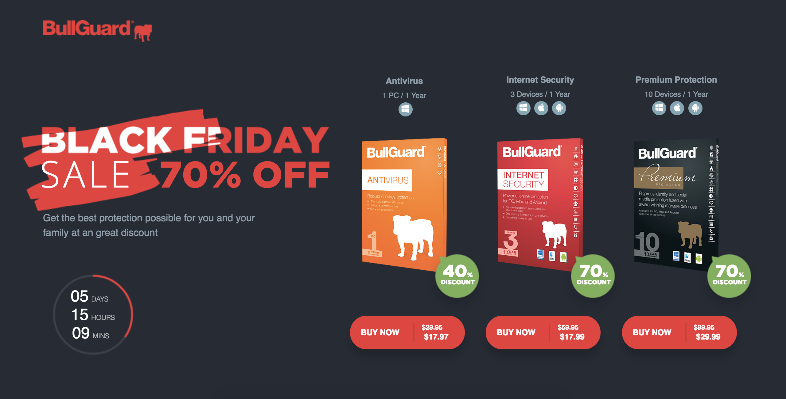
On the landing page above, the styling of the headline is unique and immediately catches attention.
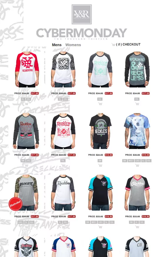
In complete contrast to the BullGuard landing page, the landing page above has a very high visual appeal but misses the mark with the headline. Now the user has no context at all with the landing page and has no guidance on the flow.
4) Keep the message clear and simple
Coming to the actual content of the landing page, this is usually where the business happens. What you say here will convince the customer to either proceed or abandon the process midway. While all of us hope for the former, we must work towards it too.
Usually, landing page content must be short and sweet with a focus on the benefits of the product, offer, and service for the customer.
Keeping the landing page content and message straight to the point allows the customer to actually interact more with the content on the page rather than reading lines and lines of text.
If you feel you have a complex message to convey, consider incorporating pictures, infographics, or other visual aids to do the same instead of relying solely on the copy.
Kimp Tip: Many experts believe visuals work better than text on landing pages. Customers are here after clicking on ads. And with Black Friday and Cyber Monday, they are there for the sale information or product purchase. So, limiting the text will definitely play in your favor. It also makes the landing page design clutter-free and makes the other elements shine.
When you have a Kimp Graphics subscription, you have an endless supply of visual aids to make your advertising and marketing campaigns better. That is the power of unlimited graphic design services. No additional charges for these value-added services. Book a call to find out more!
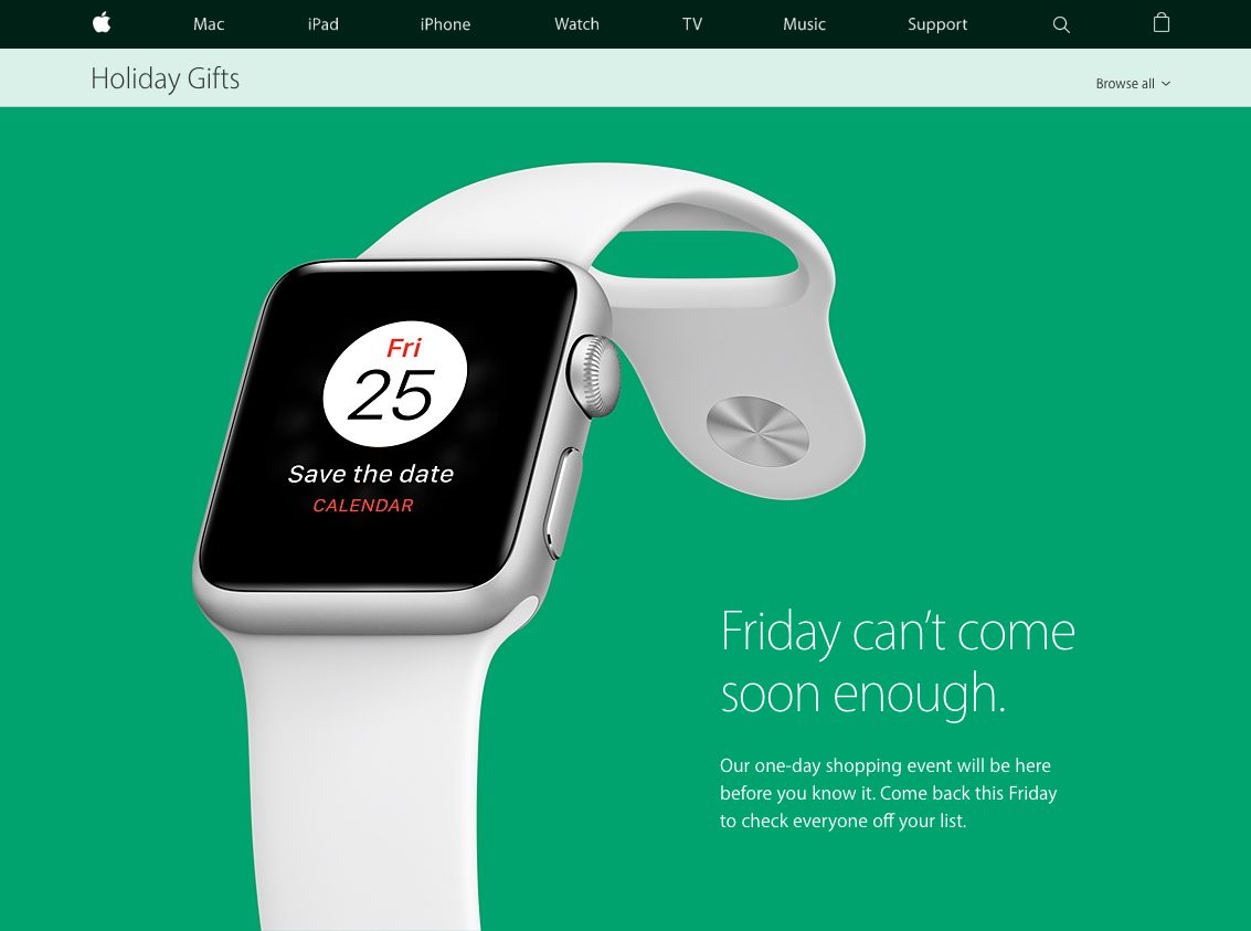
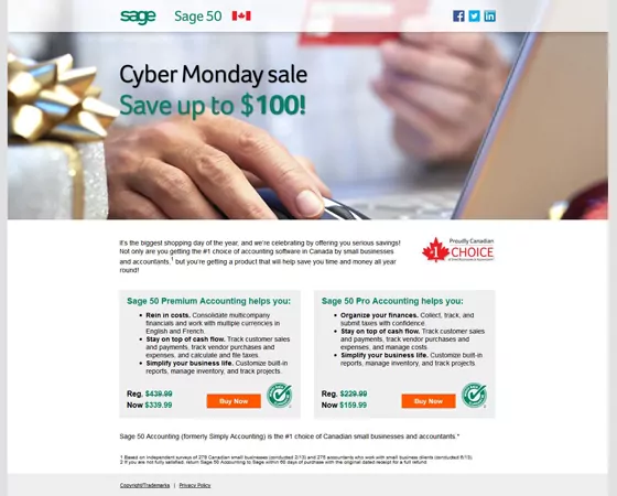
Apple knocks the design above out of the park with a very clean and simple message. However, we think that the landing page below could have gone a little easy on the content and substituted it with icons, images, and graphics instead of loaded text.
5) Focus on the look of the layout
Your Black Friday and Cyber Monday landing page designs’ effectiveness is only valid when the customer has a wonderful experience. And for that, you need to consider the big picture too. Yes, we are speaking of the landing page design layout.
Before finalizing the landing page design, evaluate these parameters wrt the layout:
- Does the landing page design provide a consistent experience in its desktop and mobile versions? Are the placements and their roles intact in both these versions?
- Are your most valuable designs and pieces of information staying above the fold (first scroll) in the final design?
- How does the landing page look in its entirety? Is there balance, uniformity, and harmony in design? You don’t want customers to see a spaced-out design in the first fold only to meet a crowded second half.
Speaking of harmony and balance in the layout, designers achieve this by including sections, different colors for different sections, or even varying the font across sections based on how the visual flow is meant to be.
As a client, you must check if the resultant design is consistent with your brand, existing website, and advertising design.
Kimp Tip: The landing page layout in the first fold must have a design that is consistent with the advertisements, customers just came off. This way customers will know that they’ve landed in the right place to take their next step. This first impression is crucial to ensure they stay on the page and actually click through it. All vital elements such as brand logo, brand name, headline, CTA, and a small sales copy must come in the first fold for best results.
6) Visuals can be game-changing
When we talk of optimization, we don’t just mean making it function well. No, we want your landing pages to shine through and make an unmatchable impact on the user. And the best way to achieve this is by centering your landing page designs for Black Friday and Cyber Monday completely on visuals.
A checklist by Google on landing page best practices clearly states that having high-quality images for landing pages is a must-have element.
So, here is a compilation of game-changing visual elements you need for your Black Friday and Cyber Monday landing page designs:
- A high-quality and branded background image: This can be a product photo, an abstract background, or a custom-designed image that matches the theme of your landing page. If you are working on a holiday-themed landing page, opt for custom images. For Black Friday and Cyber Monday, visuals consistent with the advertising campaigns will work brilliantly.
- Product images: Most of your landing pages will revolve around a product category or a particular product. Ensure that you use only high-quality product and catalog images for this. For the best impression, only the best will do. If you are short on good images, work with a design team at Kimp Graphics to enhance what you have on hand.
- Include motion graphics: In whatever form that fits best, your landing page design for Black Friday and Cyber Monday must contain motion. It can be a small confetti animation, a countdown timer, a product range GIF, or a video ad. But these interactive elements must be present. Video landing pages are becoming a phenomenon in ecommerce landing pages, and they can definitely improve your conversion rates.
Kimp Tip: Over all these visual elements, you must also consider the quality of your branding elements. Your logo, branding colors, imagery, and illustrations, if any, must feature prominently and work cohesively with other visual aids on the landing page.
7) Bring it home with the CTA
The most important element of the landing page design is the CTA. There is no doubt about that. But, the CTA button has a lot of duties and responsibilities to play for a successful advertising campaign.
Your CTA will vary based on the intent of the landing page. But there are some rules about this CTA button that must remain consistent across all your Black Friday and Cyber Monday landing page designs.
- The CTA button must stand out against all other design elements on the landing page. You can achieve this by varying the styling, color, or background of the CTA button..
- Place a CTA above the first fold too. Do not make the customer go in search of the precious CTA button. Make it strategically available throughout the page.
- The design of the button itself must be consistent with the overall design aesthetic of the page for a seamless user experience.
Kimp Tip: The temptation to go overboard in highlighting the CTA button is natural. You want customers to click that button, yes. But it must be a seamless transition. If the focus is only on the CTA, they may never notice elements that have to persuade them to click that button. Visual flow is vital, and the CTA must be a natural ending point for the customer rather than a forced jump.
Create high-impact Black Friday and Cyber Monday Landing Page designs with Kimp
There is so much more to landing pages than you thought, right? But don’t let that put you off. You have probably spent a ton of resources in perfecting your Black Friday and Cyber Monday campaigns. Why stumble so close to the finish line?
Your landing pages will ensure that you don’t miss out on a single lead during this sale season when designed well.
Every element of the landing page design is equally important. So you need a design team that can perfect the minor details and look at the big picture too.
You need Kimp Graphics and Kimp Video subscriptions to create stunning landing pages to ensure all your leads convert this holiday season. And you get unlimited design requests, revisions, free stock images, and videos, and a lot more with Kimp.
Sign up for the free trial today to see how unlimited design can help you design better and scale faster.