Design Inspo: Logo Color Combinations You’ll Love
What is that one instance that tells a brand that all the intense nights and countless meetings over branding decisions were worth it? Well, we think it’s when your customers can recognize your logo instantly.
It’s the ultimate milestone and one that’s non-negotiable if you want to become a household name.
A logo has many elements that bring it together to portray the impression you want of your business. But color is one of the strongest and most impactful visual elements of your logo and exploring this in detail will help you see how you can strengthen your branding.
Color and Logo Designs
When you look at a logo, what do you remember about it first? In most cases, it is the color. Our brain processes visuals faster than text, and it has quite a unique relationship with specific colors.
We have discussed color psychology, and how our brain correlates specific colors to some emotions in detail already. Beyond this, there are many other reasons to choose your color for the logo design.
Color in a logo design can play the role of:
- Highlighting a significant element of the brand personality
- Representing the company’s product or service visually for better understanding
Brands usually stick to anywhere between one to three colors in their logo to make it easy to remember, recall, and relate to. Too many colors can be counter-productive in more ways than one.
Some popular color combination schemes that brands follow for their logo designs to be effective include:
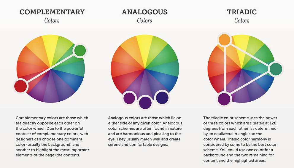
- Monologous – Pairing a primary color with either black or white. This scheme can also involve using different shades of the same color.
- Complementary – Pairing two colors on the opposite of the color wheel.
- Triadic – Pairing three colors equally distanced from each on the color wheel.
- Analogous – Pairing two colors that are next to each other on the color wheel
- Tetradic – Pairing four colors spaced equally from each other on the color wheel
These are only some of the basic color combination patterns. In logo design, designers spend a lot of time choosing one of these to get it absolutely right.
You may wonder, why so much attention to color combinations? Isn’t picking one color enough for a good logo design?
Well, it can be, but even then you have to understand color combinations for your logo design.
We discuss this more in the next section.
Why the emphasis on logo color combinations?
You may find the entire process of deciding color combinations tedious and say you want to stick to a single color like LG or Samsung. But do you realize that even those brands have a color combination at work?
Both these brands use a shade of white or black to make the logo complete. That’s what makes it pop and instantly recognizable from anywhere.
Logo color combinations can make or break your logo design. Let’s assume that you want to feature the color red in your logo design because it relates well to your brand personality. And you want it to be a deep shade of red. Well, a dark colored logo design needs a complementary color to be aesthetically pleasing and easy to perceive even from a distance.
Just think, how would the Pepsi logo look if it was just all blue or red?
You also need effective color combinations for your brand so that the resultant design works well across web, print, and other marketing mediums you choose.
That’s why most brands opt for using two or three colors in their logo design. Now, before we proceed ahead with logo color combination inspirations, let’s quickly dispel a myth.
While art is subjective and everyone has a different interpretation of colors, some poor color combinations can sink a logo design. Steering clear of those is better than experimenting here.
You can only know the bad when you know what works, and why it works. So with no further ado, let’s dive right into some of the most iconic logo designs. Understanding their logo color combinations will give you an insight into how you can make your logo shine too.
Logo Color Combination Inspiration:
There are thousands of popular logos out there, and finding inspiration can be tricky because of this. Everyone has a different approach to logo design, but understanding the principles behind some of those approaches can be quite helpful.
Kimp Graphics brings you an industry-wise compilation of popular logos and what their logo color combinations mean.
Logo Color Combinations in Food and Beverage Brands
Subway
Long before the brand “Subway” existed, the name was only thought of in relation to a means of transportation. When the brand first started they had their work cut out for them. So their logo color choices left little to chance.
The usage of yellow and green clearly shows that the brand deals with fresh produce that brings happiness and cheer to everyone’s life. The color green works quite well with the slogan “Eat Fresh” and the yellow makes it pop out on all mediums, right from their website to the packaging they use.
McDonald’s
We can’t talk about brilliant logo color combinations in the food and beverage industry without talking about McDonald’s. Like most brands that work in this industry, this beloved brand also has heavy domination of the color yellow in its logo design.
But, the brand took a detour from the regular path and paired it with the color red. Red often symbolizes energy, excitement, and passion. It is also a color that demands the most attention anywhere.
McDonald’s famous golden arches with the yellow color and red background ensure that people feel excited and happy to eat in the establishment and can spot the logo even from a distance on a dark night.
Heineken
We discussed a color combination scheme of using complementary colors of the color wheel in a logo. If you want to see the effectiveness of this scheme, check out Heineken’s logo. The trademark star features in the red color while the brand wordmark logo is in green.
The green denotes the brand’s bottles, and the choice of red is to make the star stand out. The star is an age-old symbol used by brewers, and the company’s decision to have it in red clearly shows the brand they want to build.
Logo Color Combinations in Logistics Brands
FedEx
FedEx is a household name today. But, the brand has spent decades building that image. The logo they have is iconic and is instantly recognizable wherever you go. You can spot it anywhere – on a building or a moving van.
Now, the color combination choice – Purple and Orange may not be one you’d choose right off the bat. But it is actually well-thought-out. They are both secondary colors and contrast with each other well. The aesthetic and visual value is on point here.
Purple also signifies power, ambition, and wealth, whereas orange stands for positivity, happiness, and comfort. All things you want from a big brand in logistics.
British Airways
A premier airline company, British Airways is known to be the epitome of service and a quality experience. Accordingly, the brand’s logo has two striking and complementing colors – blue and red.
The blue brings out the warmth of the brand, while the red swish is a pleasant touch to bring contrast and energy to the logo design.
This color combination tells us it is okay if one color dominates and one just exists to bring a little pizazz to the design.
UPS
The United States Postal Service is a brand that does not shy away from its roots. The company is well aware of its traditional and conservative image in the market. As it should be, given how long the brand has been operating.
The UPS logo has an unusual combination of brown and gold. Brown is a color that people typically associate with older establishments with a lot of reliability and trust built-in. Gold symbolizes wealth and high standing in society. This is perfect for UPS.
Now, this should tell you that you don’t have to be someone you are not, just because it is in vogue. Choose colors that truly reflect your brand and complement each other well.
Logo Color Combinations in Entertainment Brands

Pokemon
Pokemon is an iconic brand in the toy, cartoon, and entertainment industry. The logo is unique and is characteristic of companies in this industry appealing to a young demographic.
The logo is predominantly in yellow, the color of Pikachu – the central element in the brand. What’s interesting is the blue outline that makes the whole logo quite intriguing and attractive. Blue and yellow is a classic combination, and the Pokemon franchise built on it while also building significance to the actual product. A real win-win!
Netflix
The world of OTT is growing faster than ever, and who hasn’t heard of Netflix? A brand that is a part of everyone’s daily routine and has a very sophisticated and stylish logo.
If we ask you what color is the Netflix logo, you will instantly respond that it is red. But the colors black and white also play a significant role in making the logo design iconic. The shade of red brings out excitement, anticipation, and happiness in us. The black and white backgrounds do a great job of ensuring that the logo stands out across all mediums.
Netflix shows that just one color in your logo can do the heavy lifting when you choose something that can pair well with plain black and white backgrounds.
Logo Color Combinations in Tech Brands

PayPal
We just saw how Netflix rocks a single color logo, just by choosing the right background color. A brand that also uses a single color but chooses a treatment that is diametrically opposite is PayPal.
PayPal’s logo uses two different shades of blue to give it an interesting appearance. This subtle change in shades has brought a lot of character to the overall logo design. Also, the blue color works well with the brand perception of being trustworthy, market leader, and stable for their customers.
If you want to keep it simple for your brand, but still have a little movement and variety in the logo design, choosing shades that are close to each other can be just the thing you want.
/cdn.vox-cdn.com/uploads/chorus_asset/file/14666980/slack_white_black_purple.jpg)
Slack
Slack is a team communication platform for corporate companies. With the COVID-19 pandemic, this tool is a crowd favorite to make their Work From Home life easier. When you look at the company’s logo, you see it is one of the most colorful logos you will come across.
The brand mark itself has over three colors, and the logo also has a purple background in many interfaces. It actually has 11 colors but works cohesively. One may take it to be a statement from the company on how they can make team communications work efficiently, no matter the size.
Slack teaches us that the rules in logo designs only exist as mere guidelines. If you want to make a statement about your brand without fitting into the commonly used color schemes, create one. Innovate until you find a design that reflects your brand in the best possible way.
Choosing logo color combinations that work for your brand
Ready to choose a logo color combination that works for your brand? First thing’s first. Understand your target audience and how they perceive different colors and color combinations. Run a competitor analysis to see which colors are performing best in the market. This can be as simple as seeing what colors the top brands are using.
Once you have this information, work with a designer to come up with different iterations of your logo to see which colors work best. Be sure to factor in cultural, societal, and psychological perceptions of color before deciding on one(s) for your logo.
Run A/B tests, experiment, and revise based on your data. And be sure to check out how the logo looks on different mediums like print, web, and other digital mediums.
Design the perfect Logo with Kimp
Your logo is the face of your brand. Choosing its colors is not a decision to make in a day or without intense deliberation. Logo design is complex and nuanced work. That’s why you need a professional team that understands design and marketing in depth. You need Kimp.
Kimp Graphics’ unlimited design subscription plans allow you to experiment with no pressure or constraints.
Book a call with the team today and get designing!