Startup Logo Design: Tips To Make Your Brand Stand Out
Startup branding is kind of like dating. You have to keep trying to put your best foot forward. And make impressions that will get you from the first date to the second date and so on. You can never stop trying. It sounds incredibly hard, and it is.
When you are launching a new startup, you are the proverbial new kid on the block. Your competition is often outside your pay scale, and there is a shortage of resources on literally every front.
It sounds incredibly hard, and it is. When you are launching a new startup, you are the proverbial new kid on the block. Your competition is often outside your pay scale, and there is a shortage of resources on literally every front.
But as you stay the course with your branding you’ll find that customer loyalty, brand recognition, and innovation become easier to build.
Branding makes your business visible, makes customers relate to you, and brings out the best traits you have to offer in the market. If you want to make it big, this is one step you cannot skip.
Logos are essentially the face of your branding. That said, with all the constraints you face as a startup, we can’t blame you if you’re thinking twice about spending much time and effort on one. But you shouldn’t.
You can use this essential piece of visual identity to display your brand personality, tell your story, and build a loyal community. If you get it right.
So, let’s make it easy for you to get the best logo design possible for your startup.
This guide will help you with what makes a logo special for a startup and take you through getting it right for your brand.
Let’s start with brushing up on our knowledge of the different logos and their application.
Logo Design Types: Quick Overview
Popular logo design types include:

Wordmark logo design
In this logo design type, brands stylize their own name with a unique font and color combination as their logo. You can opt for this design if your name holds a significant meaning to your business and you want to build a brand identity based on this. However, this logo design does not work as well for businesses with personal, commonplace, or even complicated names.
Lettermark logo design
When a business’ name is too long or very commonplace, a startup team may opt to use their initials or an acronym as their logo. Designers uniquely style the letters and tie them together in a way that represents the brand best. The only caveat here with this logo is that the resultant Initials or acronyms must be short enough to be easy to remember and also work well together with no conflict.
Emblem logo design
Chances are you’ve seen quite a few emblem logos. They typically have a frame or design, inside which the brand name and tagline sit (think school and university crests). This logo design works great for businesses looking to show that they have traditional values and appeal to a conservative audience. But other brands do opt for them as well, with a modern twist. Popular examples are Starbucks, Harley Davidson, or even the Warner Brothers logo.
If your business wants to tie in a rich brand story, this is a great logo design option for you.
Brand Mark
Now brand marks include some of the most popular logo designs you come across every day. When a brand thinks out of the box and creates a unique identifier for their business, it results in a brand mark.
Brand marks are significant for building a unique brand identity in the market. Apple’s logo is a prime example of this. The only downside is that you need a credible brand story and a profound meaning to get people to relate to it. And this might not always be the case for a startup.
Combination Mark
As the name suggests, combination mark logo designs bring together one or more logo design types. You can combine an emblem and wordmark, lettermark and emblem, and so on. Businesses often choose a combination mark design so that the logo design is flexible to use across mediums.
Now let’s get down to the logo design process to get a design that builds a unique identity for your brand.
Before you get your Logo Designed, consider these ideas:
Before you rush off to your design team and tell them to whip you up a logo, stop and ask yourself these questions. The answers will lead you to understand your brand better and find a design that suits you the best.
What’s your vibe?
Startups survive and thrive because of their communities. And there are many stakeholders that actively invest in building, maintaining, and nurturing communities for this reason. But, if you are a budding startup you may still be building a name for yourself. And building your network. If you want people to recognize your brand, your logo has to give out the right vibe.
And that starts with you deciding your vibe or brand personality. Are you a chic brand or someone who stands for ruggedness and adventure? Your logo design takes off from here, so take time to understand this.
Who are your customers?
Each logo design appeals to a distinct set of customers. And this is no coincidence. Once you understand your customer base, your designer can create a design that engages them.
Customer acquisition is expensive for a startup, and if you can mitigate that cost with the right logo, all the more reason to go all in.
What are your competitors doing?
A great way to understand what works and does not work in your industry is analyzing your competitors’ branding experiments. Conduct research on their logo evolution and brand sentiment. Understanding their branding, marketing, and advertising campaigns can truly help you gauge what works. Bonus points if you can find audience reactions/feedback and comments on the same.
Competitor research can also help you understand what doesn’t work. And what you should avoid altogether. Insights like these help you build a design brief that results in the best logo for your brand.
Kimp Tip: The right design brief can make the logo design process easier and more productive. A mood board with designs you like and dislike is one of the best ways to get the designs you want. Check out more about writing design briefs that result in the best creatives here.
Where will you be using this logo?
Logos have to be versatile, functional, and flexible enough for you to use everywhere. As a startup, you have to always think ahead. But, the question to ask is what are your immediate uses for this logo and what are your future plans. These questions will help your design team work on a design that is appropriate for your current status and also scalable in the future.
Kimp Tip: Understanding if your logo is for web or print usage helps your design team choose the right color scheme, size, and format. Getting your logo printed becomes tough if you choose a web-only format. But it is possible. With Kimp Graphics, we can help walk you through the entire process so that you can rest easy.
Startup Logo Design Tips: Making Your Brand Stand Out?
Now you understand the different logo design types and the process of arriving at the right logo design. So the Kimp Graphics team has curated some tips and tricks for you to keep in mind for your logo design.
These hacks will lead you to the best logo design for your brand and help you build a unique identity in the market.
With no further ado, let’s dive right in.
Startup Logo Design: Get the Font right
As a startup, it is important to get the first impression right. You have a limited window to impress your customers, and advertising is very, very expensive. To make the most of every interaction, capitalize on the power of fonts. Based on your brand personality and your target audience, choose a suitable font.
With the right font, you can distinguish yourself in the market and reinforce your brand personality. Fonts evoke unique emotions in customers, so if you want to tell your customers you are modern and sophisticated in the shortest way possible, font selection is your savior.
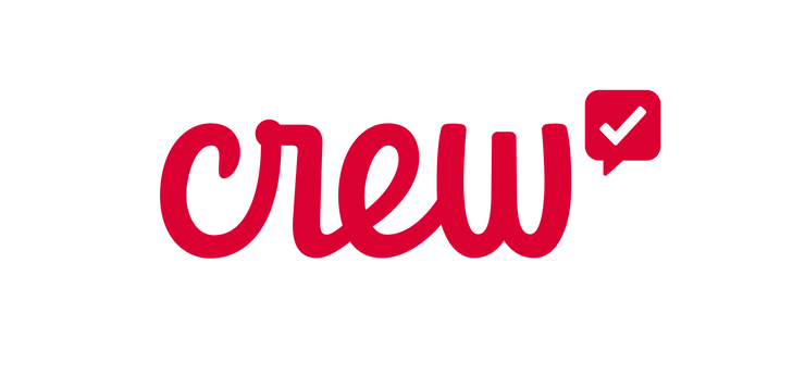
For example, Crew is an app that motivates office teams and makes the work environment more supportive. The vibe they want to give out is happy, fun, and friendly. Their cursive font logo does just that through its flowy nature, joined to show teamwork.
Startup Logo Design: Leverage Color Psychology
You cannot afford to discount the power of color psychology. The secret behind every startup’s success is its customer acquisition rate. For that to happen, you need customers to notice you and engage with you. Using the right colors in your logo can make them instantly connect with you and trust your brand too.
Brand colors in logos improve brand awareness, and designers also play with colors to bring out the purpose of a company.
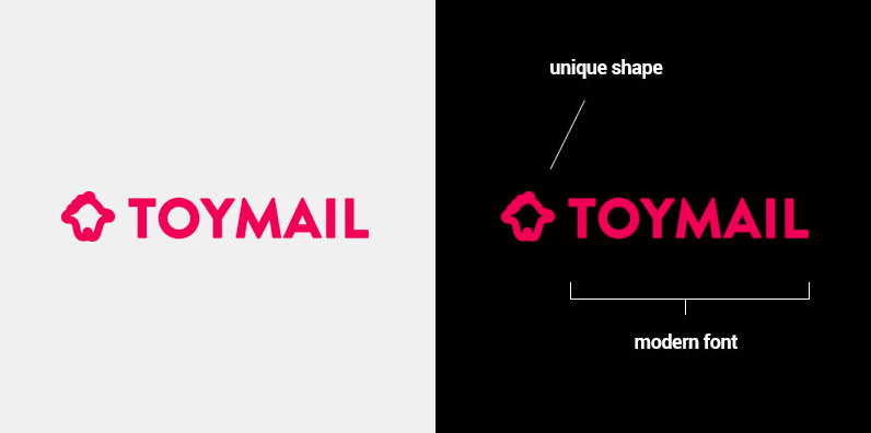
For example, Toymail is a startup that works on creating toys with hidden compartments to send messages to your kids. The pink color of their logo is appropriate for its audience and tells people they are a child-centric brand.
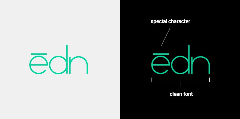
Next, EDN is a company helping people grow their indoor gardens. While their logo design type is a wordmark, the turquoise color brings out the meaning and purpose of the brand to connect with the audience.
Startup Logo Design: Be creative with Lines and Shapes
Anything personal that hooks your audience in, is always good news for your logo design. Lines and shapes are the building blocks of any design, and the logo is no exception. Play with these to create something meaningful for your brand.
Shapes and lines always fascinate people, and if you can tell a story with them, you win the logo design battle.
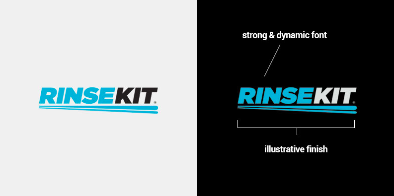
Take Rinse Kit, for example. They make portable showers that give you great water pressure. The brand captures both these functions using line design in their logo. The streak gives you a sense of movement, and the double line design denotes water clearly.
Startup Logo Design: Your imagery is worth a thousand words
A picture speaks a thousand words, yes. But, are they the right words? While using images in your logo does not improve its recall-ability, if you do opt for imagery you have to get it right. Do not opt for random images or worse, stock images. You want a unique identity, not just any picture next to your image.
Custom illustrations and graphic design works that speak of who you are are how you truly make the imagery work.
Take a very popular startup for an example. Dropbox. The brands revolutionized cloud storage even before it became mainstream. By choosing a simple custom box image, the brand connected with its audience and displayed its product in simple terms. That’s how you do it.
Startup Logo Design: The magic of Negative Space
Designers love negative space. As they say, cliches are cliches because they work. Best practices are best practices because they work too. And in this case, they can lead to some great results. Creating a design out of the space you get from arranging elements can become magic.
By using negative space, you can catch someone’s eye quite easily and show them you think outside the box. This design tip also helps you bring attention to the other design elements without seeming too obvious.
Check out the design below by Kimp. This plumbing service’s logo manages to draw attention to R in their company name through the use of negative space.

In the example below negative space is used to create the image of a guitar.

Startup Logo Design: Versatility is key
A logo is one element that you will use and overuse in every piece of branding, advertising, and marketing. As these span across mediums, versatility is an important trait to possess for a startup logo design. All this said, being a startup company, redesigning and creating logo designs for different mediums is going to hamper your budget and kill your brand awareness.
So, a logo that can work on every medium with some minor tweaks is what you need. Check out the example below of Colesville Travel’s logo. Colesville’s logo is a combination mark that combines both a brand mark and a lettermark. The brand can use the full-fledged logo in most places, but the icon itself is good enough for social media and favicon placements.
Startup Logo Design: Simple, Scalable, and Sensible
The important thing to remember about logo design is that its purpose is to make your band memorable, easy to understand and connect with. So, the simpler the design, the better. Complicated designs always put off customers from understanding the true intent behind the design.
Detailed logos are also not scalable for social media or print mediums making brand recall difficult. Take a look at the logo design below by Kimp for a photography brand. The logo is simple and tells you what to expect from the brand from the get-go.

Startup Logo Design: Experiment and Evolve
Last but not the least, remember that you are a budding company with lots of turns and exciting events in your future. Be open to experimentation and feedback loops. Work with your audience and give them what they expect from you – they are your biggest critics and cheerleaders.
Amazon did a recent revamp of its logo, which did not go well. The company took it in its stride and changed it within a week. Now, that’s a good startup attitude, right?
Getting the best Startup Logo Design for your brand
Running a startup is no easy feat. There are so many balls to juggle, and the design process is another marathon altogether.
Get a dedicated design team at your fingertips with Kimp and get design off your to-do list. Plus we offer unlimited revisions so you can see your logo is as many different variations as you’d like. Our Kimp Graphics and Kimp Video teams will not just help you design the logo, branding material, but also design unique marketing material with these too.
Unlimited revisions and unlimited happiness. Just with Kimp.
Sign up for the free trial today.