How To Choose The Right Fonts For Your Logo & Branding
When you think of your friends, do you think of their faces or names first? Your answer is, of course, their face. What seems so natural actually has a substantial scientific reason behind it.
Our brain’s visual area is much more active than the textural memory side. So, most people remember visuals and not their associated names first.
This is also the reason marketers and branding experts insist on building a powerful visual identity. It makes it easy to build brand recognition, recall, and awareness – all that you need to establish a forceful presence in your customers’ minds.
In our blogs we have spoken a lot about the roles of color, imagery, and design style. Now, we’re going to tackle another part of the foundation of your visual identity – fonts.
Maybe you’re wondering if a font is really that important. To answer this, we want you to do a small experiment. Think of eBay. Close your eyes and notice what comes to your mind. The website, its products, advertisement, or that iconic logo? It’s the logo, isn’t it?
Now try to imagine the word eBay written in any other font. No, so easy huh?
eBay’s font tells us a lot about the brand’s personality itself, whether or not we realize it. So, changing it is close to blasphemy.

That’s the power of choosing the right Font. Iconic brands have transformed their brand identity with the right font. You can do it too with this guide on choosing the right font for your logo and branding.
Excited? Us, too.
Let’s get this show on the road.
Choose the Right Fonts for your Business
Contrary to what most Pinterest boards and DIY sites tell you, trying to choose the right fonts for your brand is a complicated affair. It takes time, creativity, font psychology knowledge, and a lot of experimentation before you hit the jackpot.
There is a thin line between being innovative and choosing an obscure font that ends up alienating your audience. And a generic font that is “best for your industry” as many websites claim, can turn your brand into a commonplace company with no unique identity.
So, how do you do this?
Before we give you a rundown of the different fonts, font styles, and variations, let’s take a look at the different factors to consider.
Choose the right fonts for your Brand Personality
The intention behind your typography choices is to convey who you are as a brand to your customers. For this, start with understanding your Brand personality.
Customers relate to a human version of the brand. Personality traits make it easier for customers to understand the brand in terms of human characteristics like conservative, rugged, playful, and modern. The font you choose spreads this message to your target audience. So, to get the font right, you have to first get the message right.
Making typography decisions is an essential step in branding. Typography in design borrows from the semiotics principles of creating values and deriving meanings from symbols. Brand personality builds on the principles of font psychology, i.e. the emotions and perceptions customers associate with fonts, and then capitalize on this to convey your brand characteristics.
Choose the right fonts for Flexibility
Branding needs consistency to create an impact on the market. Each of your branding elements plays a vital role in building consistency. The font must be flexible enough to look good in different weights and variations to suit different types of marketing material.
For instance, some of your content may just include headlines, whereas others, like blogs and brochures, include long-form content.
The font must be possible to tweak without losing its identity. That way, you can use them in headers, subheadings, page breaks, and more without losing visual hierarchy/flow.
Choose the right fonts for Versatility
Alongside flexibility, versatility is important too. If you want customers to recognize your brand on a crowded supermarket shelf or pause their screen for an advertisement, you have to make it easy for them.
Ideally, you can use the same font in a TV advert, website, printed posters, or SWAG without worrying about distortion or quality issues. Otherwise, you’ll have to resort to switching fonts when you advertise on digital vs. print.
When you’re deciding on which font, or font variation, to use in an ad campaign, try out a few samples in each design before you make your choice.
Did you know that with Kimp Graphics’ subscription-based plans, you get unlimited requests to try out a font across print and digital designs?
Choose the right fonts for Readability
The rule of thumb is always to put legibility and readability above any design preference. In your process of choosing the right font for your brand, keep the principle of design thinking at the helm.
Understand how the font will affect the user experience when you use it on a mug and a poster. We view posters from a distance, while mugs have curved surfaces and a close-contact relationship.
The right font is readable in every instance or can take the modification to make it readable without losing its identity.
This font will be a part of all your written content too, in most cases like social media posts, blogs, and newsletters. So, the font type, size, style, and the resultant line spacing will impact your content consumption rates too. So, choose wisely.
Choose the right fonts for Public Perception
The Internet feels strongly about certain fonts, to the extent of making films or running campaigns about eradicating them. One such campaign was for Comic Sans, and it made the Wall Street Journal’s cover.
Font psychology tells us that typefaces and fonts elicit some rather powerful emotions in people. It can make your messaging look intelligent or frivolous. Some font designs also don’t fit the general convention of balance and beauty. So, it is best to avoid such controversial fonts. The last thing you want is to get canceled over a font choice.
Source: Walmart
How Fonts impact Branding
Customers psychologically or subconsciously derive meaning from the designs they see from your brand. Every little design, stroke, style, and format conveys a hidden meaning to the customers. So you must choose the right fonts intentionally to avoid any miscommunication.
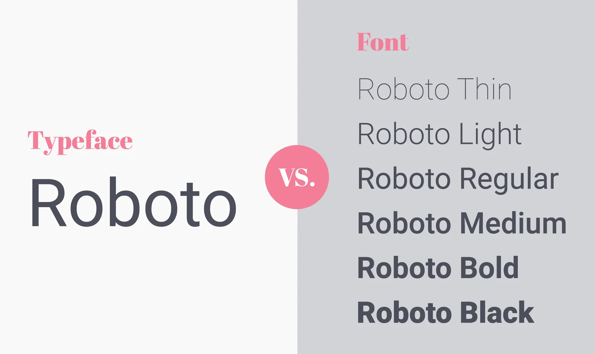
Now before we go any further, let’s clear up the difference between a font and a typeface, and typography, as you will encounter these terms often in this guide.
A typeface is a complete set of alphabets or glyphs that share the same design properties. The font is a subsection of this category. Typography meanwhile refers to making copy aesthetically pleasing and legible through the arrangement of text and letters.
With that out of the way, let’s move on to the font types designers prefer to make your brand personality shine through them. These four broad categories make it easier for you to understand your options and what would work best for you, and the brand personality you wish to project.
Serif
The debate between Serif vs. Sans-Serif is an age-old one. Whatever die-hard fans of each will claim, there is a place for both Serif and Sans-Serif fonts for a specific brand personality.
Serif is one of the oldest font types and projects the same image for your company too. The font has a small decorative line or leg, as some like to call it. If you are an established brand or an upcoming brand with traditional values, then Serif is the right choice for you.
For brands with personality adjectives like traditional, honest, classy, leader, trustworthy, high-end, and literary, Serif feels like the perfect fit. The most popular Serif font is Times New Roman, a staple in every Microsoft document.
Serif fonts are also highly readable, so you can use them in books, brochures, posters, flyers, and fine print on your product manuals.
Industries where Serif fonts are commonplace include traditional fashion brands, luxury goods firms, law firms, financial companies, newspapers, and insurance companies.
You can find this font in brand logos like Cartier, Vogue, Canon, Sony, Rolex, and The New York Times. All these brands are traditional, established, and leaders in their market that people trust and rely on.
Sans Serif
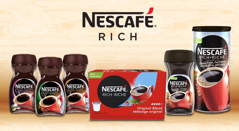
Sans Serif is Serif’s youthful and modernized version. Both the font types do look similar, if not for the small leg at the end of each letter. These fonts dominate the digital world and reflect just what the customers and industries here need.
This font type brings out emotions and actions that you can associate with brand personalities like modern, elegant, contemporary, and chic brands.
Customers perceive the brands with these font types of usage to be sophisticated, technologically oriented, and in line with the current generation.
This font appeals to the younger generation that looks for an updated, sleek, and futuristic brand identity.

The most popular variations for this font type are light and ultra-light models that bring out a polished look for the branding.
Startups, Tech companies, Modern Fashion brands, Entertainment companies, and other companies that have a largely young customer base benefit by choosing this font type.
Popular brands that use this font type as part of their visual identity have some notable names like Nestle, Netflix, Levis, Samsung, Nike, and Adidas.
Script
While you can consider Serif and Sans-serif fonts to be universal and mainstream, the Script font-type is indeed a little experimental.
This font type has calligraphy and handwriting roots, giving it a very personal and intimate feel. If you are a brand wanting to display feminine, intimate, classical, elegant, whimsical, playful, and/or exquisite personalities, this font is the right choice for you.
Branding experts agree that gendering your brand helps you connect with your niche audience, and this font type helps you accomplish that quite easily.
Moreover, designers can tune this font to look formal or casual without losing the essence. Just thinking about how effective the Coca-Cola and Ford logos are.
Pampers is another such example. The font the brand uses is a classic example of the Script font type. The brand’s styling tells you it is an intimate, playful, and personal brand as one would want them to be. Mothers instinctively reach for these products on any supermarket shelf because it connects with them.
Other brands with script fonts include Disney, Kellogg’s, Sharpie, and Budweiser. All of them have a younger customer base and customers connect with them because of their playful and youthful personalities. Their advertisements also follow the same tone.

Display Fonts
The new kid on the block that many experts may caution to use with restraint is the Display Font. Display fonts look stylized, customized, innovative, and decorative. While innovation can set you apart in the industry, too much of anything is never a good thing.
You can use them to come across as a fun, unique, and adventurous personality. But the thing to remember is that your font choice makes or breaks the brand awareness campaign.
Too much detail makes it harder to remember or scale across mediums.
Best to stick to it as part of a combination typeface where Display fonts feature in the title, heading, and some notable phrases alone. That way you get the eyeballs with innovation without compromising brand recall or readability.
The IBM logo is stylish, unique, memorable, and a great example of using display fonts in restraint. As the company name is made up of just 3 characters, the logo is impactful without being overwhelming.
Combining Fonts – Dos and Don’ts
When picking one font itself becomes a massive battle, imagine how hard it is to combine fonts. So, why do it? Why not stick to just one font?
Well, you can. But if you want an effective design that is readable, actionable, and easy to skim through, then you need a combination of fonts.
Combining fonts:
- Builds visual hierarchy inside a document or design. It helps readers navigate a document easily.
- Help understand the importance and weight each section or piece of information has. For customers who want to skim through, this is very helpful.
- Avoids monotony in the design.
So, how should you combine fonts? Can you combine any two fonts? Some best practices that answer these questions are:
Well, the rule of thumb is to choose fonts that belong to the same bigger family tree but have some differentiating factors. Also, don’t go for fonts that look like each other because then you eliminate any visual hierarchy.
Use a combination of fonts only if there are significantly different sections, both in weight-age, and context to avoid confusing the readers.
When you design your font brand style guide, include options for colored fonts on various backgrounds, and plain black and white fonts too, as this has a significant impact on the result.
Be wary of changing line spaces and alignments that come from combining two fonts. Line spacing and alignment affect a content’s readability so you have to consider this before finalizing the combination.
Experiment and debate the aesthetics, readability, and brand personality that comes out of the combination before locking it down.
Choose the right Fonts with Kimp
Typography decisions are hard, complicated, and time-consuming especially since there are so many subtexts to consider. That’s why experimentation is the best way to figure out which fonts and font combinations will give you the best results.
And Kimp is your partner in A/B testing every part of your designs. Our design teams have worked with scores of businesses in a wide range of industries across the world and they have this down pat. This and our unlimited design subscription packages ensure that you get designs that are just right for your brand.
So why wait? Sign up and find the right font for your brand today!