The 5 Types Of Logos + Finding The Right One For Your Brand
First impressions are important, right? That is why you put on your best suit when you meet a potential client. And why you choose the best angle for the pictures you post on social media. To start conversations off on the best foot.
No doubt you want great first impressions for your brand as well. To make customers approach you with ease and make heads turn whenever your brand identity comes up.
Now, to understand what can make this a reality for you, think of your five favorite brands. Go ahead, close your eyes and think.
What popped into your mind? Was it the Big M of the McDonalds logo or the four rings that represent the majestic Audi brand?
Logos are one of the most influential elements of any brand identity. It can be a symbol, a combination of words and images, or an abstract image. A logo aims to represent your business accurately in the market and project the brand personality you choose.
And this is why marketers and branding experts truly believe that having the right logo design can affect a brand’s success.
You may wonder, how can something as small as a logo have such a profound effect? As it turns out, logo design is actually a bigger deal than most consider it to be.
Why your Brand’s Logo Design matters
Your customers remember your logo more than they remember any other branding element. So, make the right choice to give the right impression.
Over 75% of people agree they recognize a brand by its logo, making it the number one most recognizable brand identifier only to be followed by visual style.
And get this. It takes less than 15 seconds for someone to judge a logo. So, the design has to be just right to connect with potential customers.
The role of logo design in your brand’s growth goes beyond being a visual representation. Logos form the basis of your brand identity, appear across all your marketing and branding materials, and help you stand out from the crowd.
They are the foundation on which you build a strong brand, and establish brand awareness across your audience.
Logos and Branding – an unbreakable bond

When you launch a new business, you want everyone to know about it and talk about it. It’s not easy to create a presence like that. And it certainly doesn’t happen by accident. Businesses spend eons developing a relatable and unique brand to generate unshakeable brand awareness. This is why it’s not surprising that over 845 marketers agree that one of their principal business objectives is to get brand awareness on point.
Without a logo this process is just about impossible.
As humans, our world has always been very visual. And this has only increased with the role that the internet and image-dominated social media platforms play in our lives. Pictures are easier to remember than words, just like faces are easier than names.
You can use logos across all marketing materials, advertisements, and visual marketing tools like signages, storefront designs, and collaborations to familiarize customers with it. Familiarity builds recognition which then brings business.
One in every two customers agrees they would rather choose a brand with a logo they recognize, than an unrecognizable brand. And it makes sense too. In a crowded room, we all look for a familiar face first. For your business to become a well-known brand in a crowded market, you need the right logo design.
The top 5 Types of Logos + choosing the right one
Think of famous logos like Google, Amazon, McDonald’s, BMW, or CNN. Not one logo is like the other. In our day-to-day lives, we come across many instances where sometimes words, sometimes images, or even a combination of these, represent a brand.
Let’s clear up this confusion and help you settle on a logo design that will work for your brand, shall we? The Kimp team brings you a detailed guide on popular types of logos and their uses. And we’ve curated some examples of these in well-known brands too.
We are sure you are eager to dive into this and get started on a logo design for your brand. So, let’s get going.
1) Types of Logos: Wordmark
:format(jpeg)/cdn.vox-cdn.com/uploads/chorus_image/image/47070706/google2.0.0.jpg)
This design uses a stylized typeface and arrangement to depict the company’s name itself. You may also know it as a logotype. Now, this may look quite ordinary to you, as it is just the brand name written in an aesthetically pleasing font.
But, remember this is also how major brands’ logos look. This includes but is not limited to, Google, Yahoo, eBay, IBM, VISA, and Sony. In fact, the first well-known wordmark design dates back to Johnson & Johnson in 1887.
This logo design comes in handy for big brands to make their name an element of branding and brand awareness. This logo design is simplistic, unique, and easily recognizable because of the brand’s fame.
So, which brands should choose a wordmark logo?
Well, any brand can convert its name into a logo. But, this type of logo is best suited for brands with a short, unique, easy-to-remember name that has a direct connection to the type of business it represents. It is ideal for new businesses, as it helps to generate brand awareness.
Wordmark logos tend to use one main brand color, and at times two. If you haven’t figured out which of your brand colors you’d like to emphasize most, and use in your logo, check out our blog on color psychology.
The impact of a wordmark logo lies in the font that you choose to use or create. Think long and hard about how you want to represent your brand before choosing the particular font you want to work with.
Kimp Tip: To figure out which font is the right one for your wordmark logo you’ll want to see a few different concepts. Provide your designer with a detailed brief, and then request to see a few options so that you can then determine which represents your brand best. Rather than decide this alone, be sure to run the concepts by different stakeholders, and members of your target audience if possible.
With a Kimp Graphics subscription, you get unlimited requests, and so you can ask to see multiple versions, and mockups, of your logo to figure which one works best.
2) Types of Logos: Letterform
When your business’ name is common, complicated, and not so easy to remember, you can choose a letterform. In the letterform logo design, you choose the brands’ initial or the first letter to become the logo.
For best results, you can design the initial or the letter to bring in symbolism and a connection with your brand too. There is no reason that this design has to be plain, as evident from HP’s logo design.
Even though HP uses the letterform logo design from the brand’s name Hewlett-Packard, it is well-designed and is one of the most recognized brands in the IT industry today. In fact, most people know it to be HP rather than Hewlett-Packard.
The rounded edges of the logo and the blue color symbolize security, safety, and trust – all core principles of the brand.

The HP letterform is an immortal design that works across products and marketing materials.
Should you choose a letterform logo?
Take the example of HP itself. The brand knew that expecting customers to remember and pronounce Hewlett-Packard every time they think of their products is unrealistic. The letterform HP, however, is easy to remember, the letters look good together and represent the brand well.
If you have a complicated name and want to build brand recognition that still connects to your name, choose a letterform logo.
Another perk of letterform logos? They make great favicons and can easily, and distinctively, be used on social media and other placements in your digital marketing.
Kimp Tip: Experiment with fonts, typeface, and colors to make your letterform logo really pop. Play with the arrangement of the letters, the size of the font, and different weights of the font to make a standout logo design.
3) Types of Logos: Emblem
This type of logo design is pretty self-explanatory. And we often see them all around us. Maybe in the form of a school crest (think Hogwarts from Harry Potter) or as part of the brand identities of the likes of Harley Davidson or any number of sports teams or leagues. It is a great identifier and also builds a sense of community.
Emblem logo designs typically have an image and the brand’s name confined in a border like a seal or a crest. It has been in use since the time of monarchs. And it is a popular design among brands that want to signal they are aligned with traditional values and ideas. Or have a rich history.
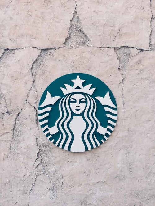
Interestingly enough, brands like Starbucks have also taken this type of logo and modernized it.
Which brands should choose an emblem logo design?
Now, as we said, this is a logo design that gives off a sense of tradition and rich history. So, if you aim to appeal to a more conservative, traditional customer base, this is your go-to. It will help you communicate that you share and/or are aligned with their values.
Emblems are also elaborate, meaningful, and hold a lot of scope to work in heavy symbolism. This is true from the design of the crest to the colors used. So, if your brand values and identity center on meticulous details, emblems allow you to bring that out via your logo design.
Some popular brands with emblems in their logo include BMW, Harvard, Warner Brothers, and NASA.
As you can see, these are all traditional businesses like automobiles, production houses, and coffee shops. They exude professionalism and convey that they mean business at every interaction.
Kimp Tip: Emblem designs can leverage your traditional values and allow you to experiment with text placements too. Work with your designer to try out different combinations of a bit of modernity with a touch of tradition to create an evergreen design.
With a Kimp Graphics team on your side this will be an easy task.
4) Brandmark
Some logo designs go heavy on symbolism to create a unique but relatable brand identity. Brandmark logos belong to that category. In these types of logos, designers and marketers choose to create an original and symbolic pictorial representation of the brand.
This model aims to transfer the brand’s values, USP, and personality visually. And to have this visualization represent the brand on all platforms. The visual does not have to be an everyday object. In most cases, designers creatively come up with bespoke ideas to bring the branding to life.
Popular logos like Apple’s (an apple with a bite taken from it), Pepsi’s iconic circular logo, Nike’s swoosh, and Twitter’s bird are also popular examples of this.
Should you use a Brandmark logo for your brand?
The brand mark is a highly creative and artistic logo design type. For a startup itching to carve out a unique niche identity, brand marks are the way to go. It can hook the audience in and make the brand more memorable by building symbolism.
You can also carve a unique identity among your competitors that goes beyond your name and speaks of your values too. But remember, you’ll need to spend quite a bit of time and effort building on the visual and the brand story it is part of. Startups that are more strapped for time and resources, might want to consider a lettermark to help achieve brand awareness.
5) Types of Logos: Combination mark
In some cases, a brand benefits by bringing the best of both worlds together as it so happens with a combination mark. A combination mark logo design brings two types of logo designs together. One of these forms will be image based (e.g. an emblem, brandmark) and the other will be text-based (e.g. letterform or wordmark).
The idea is to reinforce the brand identity in the market by bringing the power of images and words together.
Popular examples of this logo design include Pizza Hut, Puma, Habitat for Humanity, and Doritos.
With Habitat for Humanity, the logo combines an emblem and wordmark. The emblem depicts the company’s connection with providing shelter and community while the wordmark capitalizes on the popularity of the organization. This combination of elements makes it easily adapted for its many different locations.
For a non-profit business, such symbolism and practicality can be a huge asset.
Another brand that uses the power of wordmark and images is Gymshark. The fitness brand’s logo reflects the brand’s value right from the font style, the image used, and the color scheme. The usage of the wordmark in the logo makes it a household name today.
What kind of brands should use a combination mark logo?
Combination marks offer your brand versatility, flexibility, and a universal sensibility. For brands looking to build a larger-than-life business that appeals to many different groups of people, combination marks can be useful.
If you are looking for something creative but also include your brand name for popularity, go with this type of logo. You will not regret it.
Say “I do” to your logo with Kimp
With something as important as a logo for your brand, your design partner matters a lot. You need someone who understands you, stands by you, and gets you unlimited iterations until you get just what you want.
At Kimp, our clients are our partners and their success is always our first goal. That’s why our Kimp Graphics subscription includes unlimited designs from a dedicated design team.
No limits. No constraints. Unlimited designs and boundless creativity. With quick turnaround times to boot.
That’s Kimp for you.
Kimp, as a comprehensive design service, understands logo design and designing something that is uniquely yours and is also compatible with different marketing and branding channels.
Our subscription-based plans make it easy for you to be creative without worrying about the bottom line.
Sign up for the free trial today to test out the service. And when you’re ready to create your logo, upgrade to a full subscription!