Design 101: Why Visual Hierarchy In Design Matters
The amount of content that we all see on a daily basis is staggering. So we rely on how it’s organized to understand it. This is why books come with chapters, movies have scenes, podcasts have episodes and why there visual hierarchy in design.

Visual hierarchy is all about the organization of your content. You can use it to make it clear what’s most important, what’s least important, and everything in between. It’s possible that each member of your audience could interpret your creatives in a slightly different way. But through visual hierarchy in design you can give them some hints to guide them along.
What makes this so important? Well the content that the viewer’s eye is drawn to first, will be assumed as most important. And the elements that grab their attention afterwards, will be ranked accordingly.
Defining visual hierarchy in design
According to the Nielsen Norman Group, “Visual hierarchy controls the delivery of the experience. If you have a hard time figuring out where to look on a page, it’s more than likely that its layout is missing a clear visual hierarchy.”
In other words, visual hierarchy involves arranging design elements in order to show how important each of them are, in relation to one another. Designers structure their designs so that people are able to read and understand the messages being communicated easily.
When elements are laid out in a cohesive and logical manner, designers are able to influence viewers’ perceptions. So now that we’ve introduced you to visual hierarchy in design, let’s take a look at how you can achieve it.
The importance of visual hierarchy
At its most fundamental level, visual hierarchy helps to guide a reader through the content that they see. It tells them the parts of the information presented that are the most important. It also shows them how the information has been broken down into sections and categories. And which parts of the content they should check first.
This rule applies equally be it text, video, images or anything other form of design. Making information easy to understand, in the way that you want to present it, is the ultimate goal of visual hierarchy in design. It builds relationships between the various pieces of content you want to present. And helps you leave your audience with a particular impression or message.
When you increase readability and guide viewers visually, the messages that you are trying to communicate will be reinforced. Without the use of visual hierarchy, all your hard work in developing a marketing campaign could go out the window. So let’s take a look at how it can be achieved.
Ways to create visual hierarchy in design
In every one of your marketing assets, adhering to the principles of design is crucial. It creates a great user experience. Here’s what you need to keep in mind when it comes to visual hierarchy in design:
Keep reading patterns in mind
Most read a page from top to bottom and from left to right. Or they are at least familiar with this convention even if they also consume content in other ways. This may make planning a design sound like a straightforward process. But the task at hand for designers here is actually way more complicated.
Recent studies have indicated that people generally scan through a page, then decide whether it seems interesting enough for them to read. And the scanning patterns vary from what we know about reading patterns. They typically take one of two shapes: F or Z. So it’s important to focus on these areas when you’re trying to get your audience’s attention. Let’s look at what each of the patterns is all about:
The F Pattern

Have text heavy pages (think blogs and ebooks)? Then an F pattern would be the best way to lay them out. This is because the reader will quickly scan down the left side of the page and then look for keywords that are of interest to them. They’ll look for these either in the left aligned headings or in the first few topic sentences.
They will then stop and continue on to the right side, if they find something that catches their eye. The resulting scanning pattern looks like an F(or even an E). Wondering how you can factor this into your designs? Just ask for the most important information to be left aligned. The use of short and bold headlines, bullet points and other such criteria that pull the eye in will also be useful to break up otherwise heavy paragraphs.
The Z Pattern
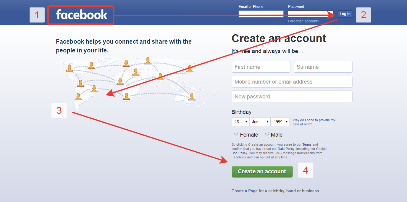
If there are no blocks of text like above, the Z pattern will be applicable. A good example of this would be in landing page designs and or on ad creatives. Here, the eyes of the reader will first naturally look across the top of the page . They know that this is where important information is most likely to be available.
Then they go straight down to the opposite corner in a diagonal line. And they repeat scanning across at the very bottom of the page. The majority of designers use this to their advantage. They do so by placing all the most important information across the very top and the very bottom of the page. And then they place all other information that needs to be read across the top and the bottom in a diagonally connecting line.
Consider size and scale
If something is loud and clear, you will hear it more easily right? There is no auditory volume in the case of visual hierarchy in design. But the size and the scale of the design elements used certainly have a similar effect. The bigger the element is, the more likely people are to see it and pay attention to it. This is why the elements at the top of the hierarchy need to be bigger.
The elements that are not as important can be scaled to appear smaller so that they get less visibility and emphasis. This will push them to a lower level on the importance scale. This does not mean that the most important things in a layout simply just have to be gigantic. This is why scaling is important. Sizes need to be used in moderation, in relation to one another. And also tastefully so that they do not take away the visual appeal of a design. Elements that appear too big can overshadow the rest of the design. And elements that are too small will be lost to the reader completely.
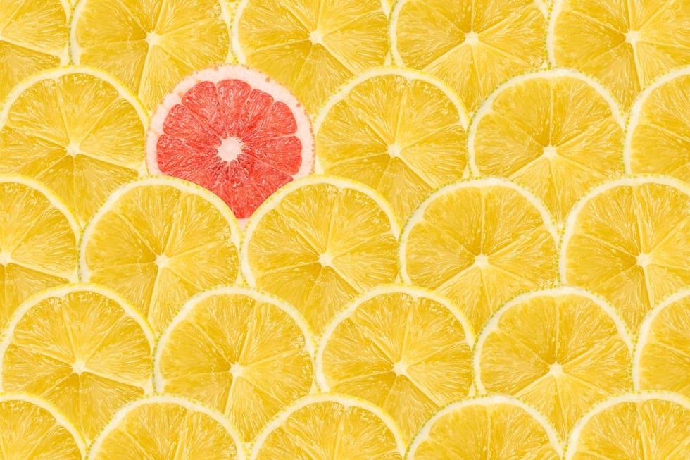
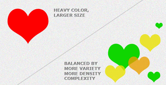
Use of color and contrast
Another way in which visual hierarchy can be implemented in a design is through the use of color and contrast. Let’s say that your design or website page is all black and white. If you bring in a bit of color to a particular area, that would become the main point of focus. Designers should ideally dress up the most important elements in a design with some bright color pop to make them stand out in comparison to the paler ones.
This is why students highlight in a textbook. It helps them focus on key points instead of reading through lots of text. Similarly, the brighter colored elements in a design will draw the attention of the reader before the other elements do.
If you see that there are a lot of bright colors in your design, competing for attention, be sure to connect with your designer. If they are unclear as to which pieces of information need to be higher up in the hierarchy, they may not be using contrast in the most effective way to achieve your goals.
Having high contrast in a design will pull focus to the specific elements that the viewer must see. Contrasting colors in visual hierarchy also have an impact on the perceived distance among elements. Warm colors will do better at standing out on a dark background. And they will look closer to the reader than the cooler colors do on the same background.
In contrast, cooler colors will appear brighter and closer on a lighter background in comparison to warmer colors. Designers should however, use color contrast in the right amounts only. If it is overused, everything in the design will look important and readers will not know where to look. They might even feel overwhelmed. And you know what that leads to – losing their attention altogether. Always remember that visual hierarchy needs to be the viewer’s guide.
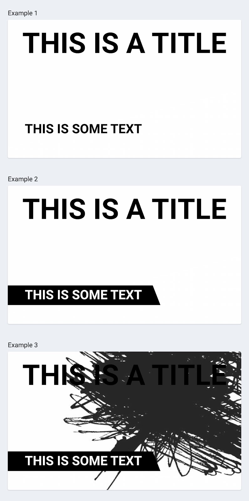
Playing with space and textures
A clever way to create visual hierarchy in design is to allow enough breathing room between the elements in it. For example, if there is enough negative space left around a CTA button, attention will be drawn to it.
Moving on to textures, when people talk about textures in design and in respect to visual hierarchy it has a very specific meaning. It refers to the overall arrangement or the pattern of space, details or even text in a design.
Similar to size and scale, texture is a useful tool to guide the viewer’s attention to specific parts of your designs. Through texture depth and shapes can be created that make your design more visually compelling. But you can have too much of a good thing. A design with too much texture can end up being confusing, distracting and just difficult to understand overall.
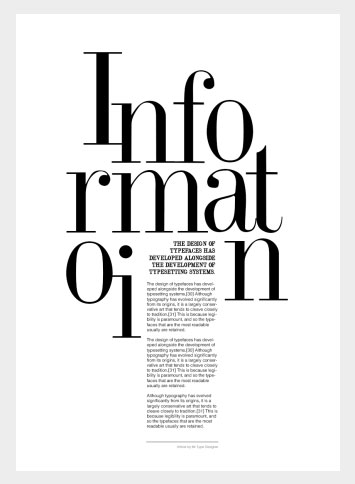
Use different fonts and typographic hierarchy
The fonts you use should not be competing with each other for there to be visual or typographic hierarchy. And it’s important to consider how different fonts pair, as well as the variations available for any given typeface.
For example, a font such as Times New Roman is made up of different typefaces that come in different weights, styles and sizes. Your designer needs to consider visual hierarchy in design when they decide which options to go with.
In a good design, different sizes, styles and weights of the same font can be used in combination to make some words stand out more than the others. Bringing together too many different fonts or typefaces will make a design unappealing and busy, so avoid doing that.
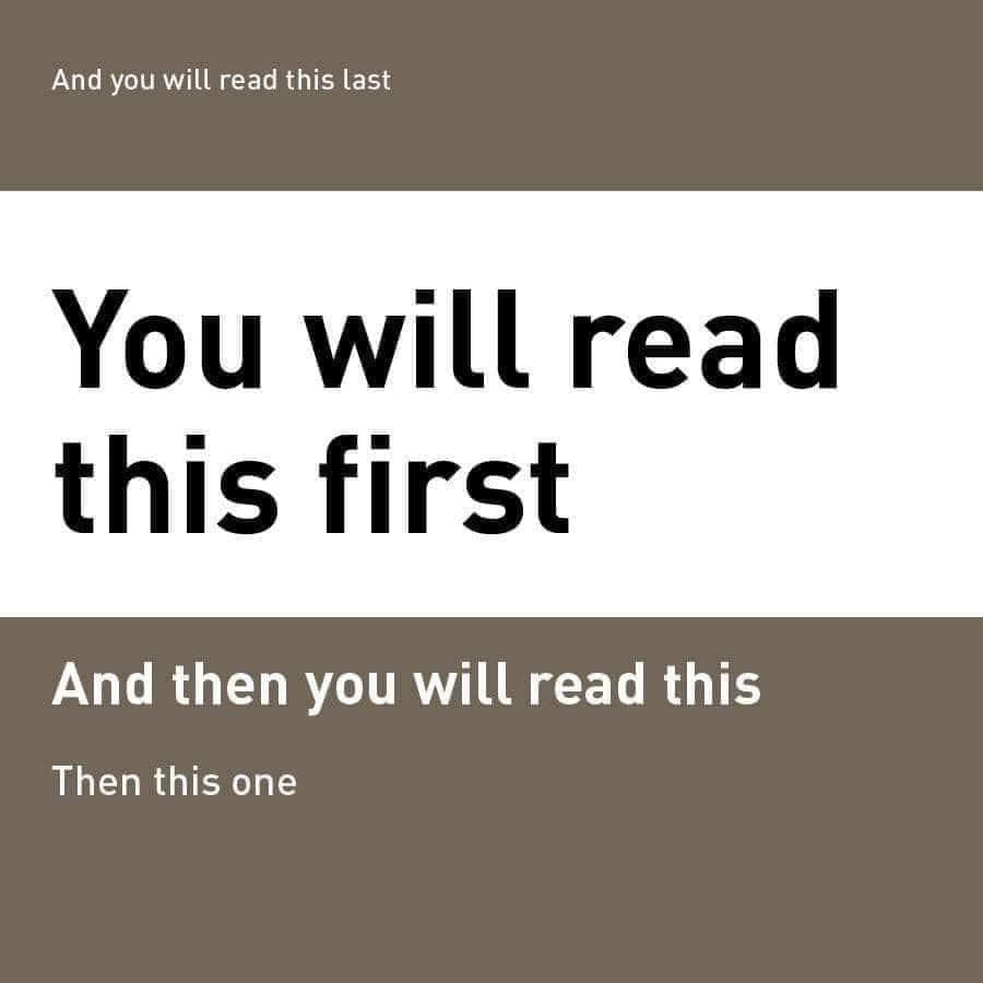
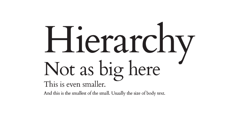
Usually bigger and bolder means that the information is interpreted as being more important. Smaller and thinner text, meanwhile, is assumed as being less important. If you just look at a magazine or a newspaper, it becomes very evident how the headlines appear on the top in big and bold letters while the subheading follows, finally with the copy in the smallest lettering. This is a foundation level approach that can be included in many different types of designs no matter what the design is done for.
Here’s a quick breakdown:
- Level 01 typography will be the most important on the page. This content usually consists of headers and need to be the very first thing that the customer sees.
- Level 02 typography also needs to be highlighted, but not as much as Level 01 is. These will help organize the design into groups with the right information that is related. It will also help to break up the text and give some sort of hint at direction to the person reading it.
- Level 03 typography is what makes the body of text. It should still be legible but will also be the smallest and the lightest out of the typography used.
When you have these different levels in the design, it becomes easier to show the readers what is important without having to be so ‘in your face’ about it.
Be mindful of balance and alignment
Any object in a design carries an amount of weight just like they do in the physical world. This is called visual weight in a design. The alignment of an element in relation to the other elements in a design can significantly change its visual weight.
For example, if the object is aligned to the left, that will get the attention of the user first. The rest of the elements in the design (at first glance) will just blend together. This visual weight in a design also needs to have the right amount of balance.
Balance can be implied by the clever use of size, shape and contrast. It can be achieved through symmetry, equality, and even asymmetry. Think about the asymmetry as the stark contrast of mirroring. Instead of you seeing a reflection, you will see something that distributes the elements evenly.
Factor in the style of your design
The style or the aesthetic of your design will help you reinforce the theme and engage your users. Style can actually include everything from the typography to the colors and even the spacing. Some of the most popular styles in design these days are organic, flat, minimal, skeuomorphic, illustrated or retro.
Another great way to make your content stand out even more is by matching up the style of the design to that of the content. If the content that needs to be incorporated is minimal and, the designs that follow can be done according to the minimalism theme as well.

Break the grid
Landing page layouts are designed according to a grid pattern, which is created when vertical and horizontal lines are placed on a design. In a system that is so established and structured, there is only one way to establish hierarchy – break the grid. Now we don’t mean completely destroy it. But text that is arranged in a curve or a diagonal line will definitely stand out among all of the other text that is placed in the grid. So use this strategy for headlines in particular.
Play with composition
Designs fare better when there is structure to them to create visual hierarchy. This is what is known as composition in design. Artists have relied on many different composition techniques for centuries and many of these are still in use today.
- The rule of thirds is a great way to create a dynamic composition where the point of focus does not always have to be placed right at the center. Instad, this rule says that you can divide a grid layout into three parts that are equally spaced out and place the four points of focus where the lines intersect.

- The rule of odds states that an odd number of elements is more interesting to the human eye than an even number. Think of the focal point surrounded by two other items on either side. Look at the example below that uses 3 subjects.

Best practices to ensure visual hierarchy in design
Finally, here is a quick run through of some of the things that you should remember as best practices for visual hierarchy in design. Using these techniques will help create a better experience for your audience:
- In the case of mobile UX designs, users on smaller screens need to be able to see elements right away and they should be able to navigate through the content with ease.
- Be careful when you select fonts and typefaces. Elaborate, cursive fonts may be applicable to some industries like wedding planning for example. But decorative text along with certain effects can be distracting and can also reduce the readability.
- Know what the priorities of the users are. You want to be able to guide the users with information that is ranked in order of importance. It would be counterproductive if everything in the design is emphasized. You also would need to know the elements that need to be allocated the same level of importance.
- Always remember the end goal you want to achieve with each design and make sure you clearly articulate this to your designers.
Visual hierarchy is the way to bring order to a design
As you can see, there are a lot of ways in which you can incorporate visual hierarchy into a design. And by doing so you can get your messages across clearly. If done right, this will allow a design to stay balanced, and appear professional. And it will get the right amount of attention to the content that matters most. It may take some experimenting, especially with some of the unconventional methods of achieving this. But keep at it, because there is always a way to use visual hierarchy to make a design have more impact and finesse.