What Is Flat Design And How You Can Use It In Your Marketing
If you’ve been researching design styles to get some inspiration, you’ve probably come across flat designs. And you might be wondering what is flat design exactly? Owing to how minimalist this design style is, it’s become a staple for most web or graphic designers as well as developers.

Both small and large brands seem to favor their clean, bright and crisp 2D features. Flat design also stands out because rather than using strict principles, the technique is all about using simple options. These options naturally increase usability.
Both small and large brands seem to favor their clean, bright and crisp 2D features. Flat design also stands out because rather than using strict principles, the technique is all about using simple options. These options naturally increase usability.
The simplicity of these designs might trick you into thinking that flat design is boring, but that could not be more further from the truth. Flat design can help you cut off a lot of unnecessary clutter from your marketing designs, as well as the front and back ends of your website.

One of the best examples of a pioneering use of flat design is Microsoft’s design style. They used flat design on their Windows 8 interface. It was a solid come back for the Apple iOS interface. With so many brands making great use of flat design, here is what you need to know about this technique to do the same!
Flat design and semi-flat design
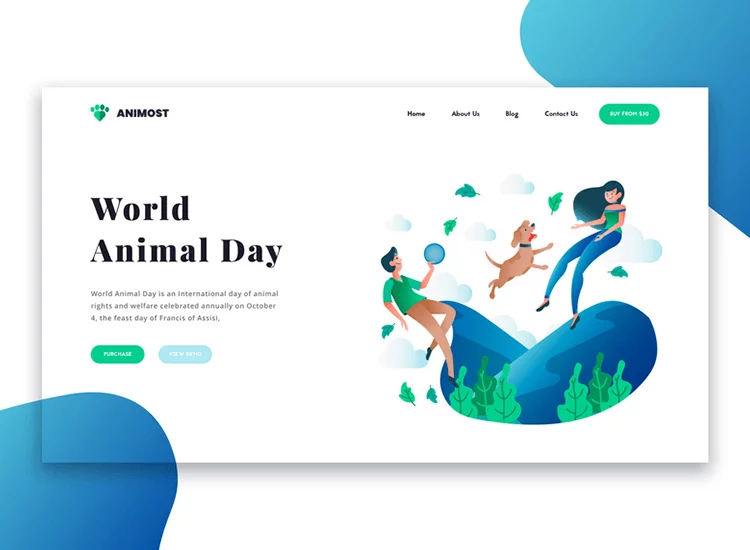
Flat design is two dimensional just like the name suggests. There is no shading, no highlights or added glare that give designs created in this style a 3D look. Instead, this type of design embraces its 2D look completely and as a result is able to communicate information clearly and quickly.
Because flat design isn’t conspicuous in the way that it comes together, it combines a lot of elements in design that might not be distinct and visible. Even though your target audience will engage with them. Here are a few examples:
- The shopping cart icon lets customers know that this is how they can end their checkout process. While they see the icon and automatically click on it, there is no ‘click here’ CTA.
- Making different sets of information appear distinct by using different background colors on the page. This allows you to make separate pieces of information easily identifiable and offers the opportunity to add some visual emphasis.
- The use of color combos to let the user know how they should respond or relate to different images or pieces of information is another use of flat design. For instance you can use red to suggest a sense of urgency to the customer. Or bue and green would indicate tranquility and calmness.
Now, let’s talk about semi-flat design
This is also known as flat 2.0, and is similar to flat design, but with a few realistic highlights added here and there such as shadows. It is an intermediary between 2D and 3D designs. You can select this option when you want to run with flat designs, but also feel that you need an extra something to make the design really pop.
One main reason why designers pick this option is to reduce the restrictions of flat design. In flat design, you would have to reduce the amount of information communicated because the design itself does not allow for too much. You do not want to risk users not figuring out where they need to click or scroll. And like we said before, semi-flat design also gives a more interesting character to the image. While flat design is efficient, semi-flat design will do the same, but with the space for you to add more style to the designs. For example, you can use color transitions more effectively with semi-flat designs.

Pros and cons of flat design
If you are interested in using flat designs for your brand, knowing their pros and cons will help you make the most of them. Below we’ve listed some of the main advantages and drawbacks of several aspects in flat design:
Flat design is a trend
Pros – it is certainly one of the popular trends today. Pages and applications that make use of flat design are quite popular. In fact, flat design really caught the eye of graphic designers within a short span of time for being so effective.
Cons – because it is a trend, you cannot guarantee that flat design will maintain the same popularity consistently. New updates and features are always coming into play and in the world of design, changes happen quickly. So you may want to use flat design for your marketing campaigns rather than the foundation of your brand identity.
It offers a simpler interface
Pros – flat design makes it easier for users to navigate your design. The elements are placed rather close to one another, which adds to this convenience. The links are placed in flat buttons and sometimes, there are arrows that make it easier for people to navigate.
Cons – the lack of definition in the icons of flat design could make people feel a bit confused. They may not be able to decide which icons are used for what purpose exactly. For instance, when Windows 8 came in, it took people a considerable amount of time to get used to the new interface.
The use of bright colors
Pros – brighter colors usually indicate a positive and higher mood. Flat designs are perceived as positive because of the bright colors that are used in them.
Cons – this could also mean that designers will find it challenging to find complementary colors. When there are so many colors in a given design, and they are all brighter, it can become quite challenging to identify the right combination.
-4.png)
The typography
Pros – flat design is simple. This means that choosing the correct typography and style of fonts is crucial. Simple fonts work well with flat designs rather than decorative ones.
Cons – because typography is so important, one small mistake in choosing the font can ruin the design. Everything is interconnected in flat designs, so picking the typography carries a lot of weight and there can be less room for experimenting.
Visuals in flat design
Pros – clean design is what makes this style really appealing. The simplicity of a flat design is what stands out the most because all of the icons, lines, elements, fonts and colors are very simple.
Cons – even though simple can be attractive, some experts see flat design as being too simple. They believe that this very simplicity hinders the level of messaging you can convey. That is to say, complex concepts can’t be conveyed as easily with flat design.
When to use flat design
With the pros and cons in mind, you should also look at where you can implement flat design most effectively. This way you’ll increase the chances of making this style work well for your brand. In general, you can use flat designs when you have any messages that you want to communicate efficiently. Some examples of messaging that flat designs communicate well are “click here”, “how the product works” and “swipe this way.”
- You can use flat designs in infographics where complicated information is broken into easy to understand snippets. This makes the readability so much better.
- Manuals or instruction pages through which you want to give customers a thorough, simple and step by step breakdown can benefit from flat design.
- You can also use this in advertising creatives so your audience can spot your key messages and value propositions easily.
- Logo designs and branding can also benefit from flat designs. This style of design will help you communicate it with clarity.
- Flat designs are handy for use in app icons and other such designs where you cannot have too much detail.
- They are also used in mobile gaming where people game casually for recreational purposes. They are not looking for a simulation that is complicated.
- If you have an interface through which you want to let users know what they should do next, flat designs are perfect. This approach may not work for you if you have a massive website with many pages. But if you have a simple a website, this is the way to go.
-6.png)
When not to use flat design
Even with all of its amazing benefits, flat design will not work for every sort of design. Here are some of the areas, where this style might just fall short.
- If you want to get a book cover designed, you may want to have more realistic artwork done, especially if it is fiction. However, self-help or entrepreneurial book covers can benefit from the use of flat designs.
- Do not use flat designs on full color t-shirts or any apparel, where customers would prefer something highly detailed.
- If you are designing a mascot or a character for your brand, don’t opt for flat designs. Such characters often need more complicated detailing to give them personality.
- Product packaging needs more detail. This is how they can compete on the shelves with other similar products.
- If you are creating content with social messages and public service information, the element of diversity and humanity is vital. Flat designs will not be able to pour in that life to your images.
-2.png)
Best practices for attractive flat designs
With a solid background on flat design, it’s time to look at the various elements that can be used in this style, and the best practices. Interestingly, research says that good use of flat design can increase conversion rates, improve the user experience and even shape user behavior. At the same time, poor flat designs can reduce discoverability for your brand and bring down the amount of interaction on page. So here are the key principles of flat designs and how you can use them effectively.
The grid
Using a grid is integral to enhance the usability and the success of this trend. Grids can be and should be used so that users can consume content easily. With the right use of a grid, a designer can provide a simple but powerful hierarchy through spacing and alignment. This can even support some complicated structures. Because of the minimalistic character of flat design, denser grids can be used to convey large volumes of content. Unlike more chaotic or cluttered traditional layouts, grids lead to easy to understand designs.
In the example below, Bootstrap offers a simple grid system that is also optimized for mobile.
-5.png)
The color
Flat designs rule when it comes to presenting your brand with vibrancy. Color is a very important component of minimal interfaces and with the option of having a broader color palette to pick from, designers can get creative. They can use colors to create a customer experience that is lively and also clearly defines content. Be sure to get your designers to test across a spectrum of colors to develop a cohesive and compelling color scheme. See how the colors behave in light and dark and experiment with stark colors as well as tone-on-tone colors.
The typography
San Serifs is a preferred typography style for flat designs. But there is also a wide variety of font families that you can use with different weights and styles that will work well. You do not have to restrict to just one style because the simplicity of flat designs can support more variety. To see how much you can experiment and push the boundaries, get your designer to test fonts to see which ones are the most readable and feel cohesive with the flat design theme.
Interactions
One of the issues that seem to have persisted from the advent of flat designs to date is the interaction between the interface and user. The trend is still popular though, and there are several steps that you can take to make sure that the interactions are improved. Designers can contrast colors with conventional box shadows, drop shadows, gradients and bevels. They can alternate font sizes and make strategic color choices. Flat designs also call for placement that is more traditional. The goal of the design should be to make the website or design as intuitive as possible, without losing the simple layout.
Illustrations
Using illustrations might not be something your brand does regularly. But, flat designs are enhanced by using vector artwork. This artwork features flat shapes and areas of color that are very distinct from one another. These combine to accentuate the simplicity and attractive features of flat designs. Another accompaniment to flat designs, is the use of icon fonts. Your design need not have images for icons necessarily. As long as the end result is a crisper look, even in different resolutions, you’re all set.
Motion
If you want to make your flat designs more user-centric, you should add in some motion to them. The simplicity of flat designs work well with motion. To figure out where to add motion, think about some of the questions that your customers may be thinking when they browse your site, or look at your design. They could be wondering about the point of focus and how they should navigate.
You can make use of motion to improve the customer experience. You can use motion to:
- Drive the attention of the customer and hint at what happens when they click on something, or complete a process.
- Offer customers guided focus between views.
- Help orient users better to the interface.
- Give customers visual feedback.
You can see motion based design elements in many different forms such as animations, transitions and textures that mimic the depth of 3D designs. Have a look at this example below and how motion enhances it.

Going flat?
Flat designs are deceptively simple but they can really pack a colorful punch. They can have a lot of personality and there are tons of inspiring examples that you can draw on. But before you go full-fledged with flat design for a project, try experimenting a bit with Kimp‘s unlimited design service to see if it’s right for your brand! Be sure to focus on maintaining the authentic simplicity of a flat design, while adding in the color and effects that will bring out the persona of your brand.