Less Is Always More With Minimalist Graphic Design
The statement ‘Less is more’ has never been truer. And when it comes to the minimalist graphic design trend, we can find an endless array of many stunning examples. From curating content for social media, to designing a landing page, or logo, minimalist design offers a lot of advantages.
“Simple can be harder than complex: you have to work hard to get your thinking clean to make it simple. But it’s worth it in the end because once you get there, you can move mountains.”
Steve Jobs
The trend is however, still somewhat new and came to be only in the 1960s to early 1970s. The first place that it emerged and became obviously visible was in American visual art. By definition, minimalism essentially refers to designs that are very stripped down. To the extent that designers will express only the most important and needed elements in a product or a given subject.
In doing so, they eliminate anything additional and remove features and elements that do not really need to be there. Many of the user interfaces of websites that we browse today, social media posts, packaging designs and all kinds of marketing and branding are examples of minimalist graphic design.
What exactly is minimalist graphic design then?
We can also call minimalist design the ‘art of less’. Let’s delve further into this idea. Designers know that design is not only about presenting something visually and the aesthetic that comes with it. It is also about communicating a message to the audience. Designers who are fans of minimalist graphic design tend to have the perspective that a message is best delivered when a design is concise. Their focus remains on the key essentials alone.

The business cards above are a great example of minimalist graphic design. They create balance, the perfect harmony of black and white, and have plenty of negative space. Striking, aren’t they?
Benefits of minimalist graphic design
Benefits of minimalist graphic design
There are many benefits of minimalist graphic design and that is why it has become so popular.
Minimalism allows you to actually respect the content
As they say, content is always king, and design should definitely be able to respect this. One of the biggest aims of the minimal design process, is to draw all the attention to the content. It also makes it easier for customers to consume the content that has been created. They do not need to spend any extra time trying to get all the information they need from loads of overwhelming detail.

Mastercard’s logo and branding are some of the oldest and most well known examples of minimalist graphic design. The red and orange circles that are interconnected represent seamlessness and connectedness. The logo is recognized all over the world and is impactful to this day.
Minimalist graphic design is versatile
Minimalist designs tend to load faster, since they include fewer elements. And minimalism also helps designers achieve better compatibility across different devices. This is increasingly important with the growing use of mobile devices. Since most of your customers and target audience will be viewing your creatives on their phones, you want them to look their best no matter the device.
Why is complex design not always a good idea?
We spoke about the benefits of minimalist designs. But for you to actually understand the benefits better (and appreciate them) knowing why complex design can be less effective is equally important.
Complicated designs can suffocate the customer
Minimalist and neo-minimalist designs provide lots of breathing room to your viewers. If a customer is visually exhausted looking at a design, they are prone to moving away quickly. Especially if the design is cluttered and requires their eyes to dart all over the place. When a design has this effect nothing really makes that ‘wow’ level impact, just because there is a lot going on.
Complex designs aren’t usually memorable
Simplicity makes a bigger and longer lasting impact than complexity does. The best example? Religious icons. These include the cross, the Om symbol, the moon and a star or just a star. In all these cases, the icon is truly simple and therefore powerful. They not only inspire followings, but also entire lifestyles. They are also all very simple.
The more complexity the less the persuasiveness
When you only involve one or two elements in your design, you allocate a lot of responsibility to each element. For example, you could be selling a product that has a lot of different benefits. However, when you have a minimal design, you are required to only feature the top one or two benefits that will really impress your customers. This will make the design more efficient and persuasive. In short, if you list ten benefits out, customers will just not be impressed as much as you featuring just two powerful benefits.
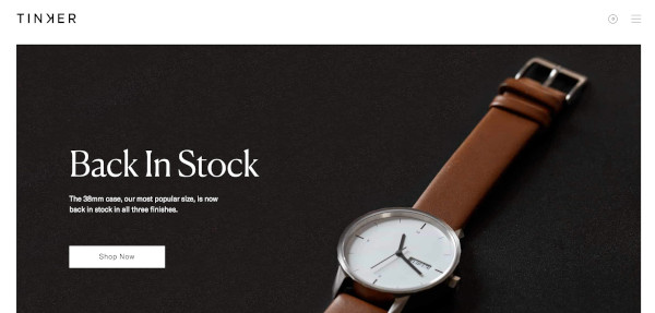
Minimalist graphic design is most effective when a brand is speaking directly to the needs of their audience. In the example above, Tinker knows that its audience is looking to browse or make a purchase. Keeping this in mind, the brand uses its design elements to drive the particular actions that its audience will be most inclined to take.
Neo-minimalism is all the rage now, but why?
People’s attention spans are now shorter than ever before. This means that the chances of them getting distracted fast is much higher. In addition to this, people are also really tech savvy right now constantly taking information in through a wide range of devices. And this brings about the idea that the less information that is delivered, the more is understood.
If you can get a minimum amount of elements to deliver the maximum creativity, your audience will appreciate it and pay better attention to the product or the service that you offer.
What is neo-minimalism in design?
Neo-minimalism is a trend that takes traditional minimal graphic design to a new frontier. This style entails eliminating even more details from the minimal style and using a lot of white or negative space. A popular approach is to do this while using attractive colors and powerful, edgy typography.
When would to use neo-minimalism in design
While you may be excited to get your designer to crank out some neo-minimal designs for you, let’s take a look at when and how they’re most effective:
- To appeal to a sophisticated audience
- To connect with a straightforward audience
- When you’re working with smaller screens or surface areas
- If you’re creating icons
- When you’re having logos designed
- To create websites that are simple but attractive
- If you’re designing impactful packaging

What are the different characteristics of minimal graphic design?
You are now familiar with the idea of minimalism, neo-minimalism and the benefits of each. And you’re also familiar with the potential drawbacks of complex designs. So let’s take a closer look at what makes up minimalist graphic design. Below are six of the most important elements and characteristics to know.
Minimal content and features
When you go minimal, you need to remove all unnecessary elements and anything that can be a distraction. When you provide your designer with a brief, if possible encourage them to conduct a content and feature analysis to decide what they should include. This will help prioritize content and features of importance. The areas that need to be looked at in this case are:
- The number of choices being offered to the audience. According to Hick’s Law, the more options that are given to a customer, the less the chance that they will actually make a decision. Reduce the number of options or offers given and make it easy for the customer, and your designers too.
- Don’t use generic stock images. Unless they make your message clear, avoid them. Look at each element and think about whether they actually serve a strong purpose.
- All messages should be succinct and clear without any excess.
- When it comes to landing pages in particular, think about the placement of your high level content. Your site visitors will decide whether to stay or go based on what they first see. So keep it simple, and keep it at the top.

The National Album cover design above features all the content and features in perfect harmony, as a minimal design.
Picking your imagery
While there are designers who think that minimal designs do not need imagery, nothing could be further from the truth. Choosing minimal graphic design does not mean that all illustrative elements have to be removed. It is more about choosing them carefully and placing them strategically.
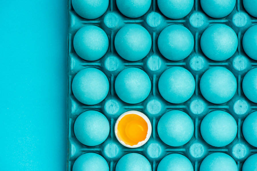
Images are actually great for communicating your ideas. When they are placed and chosen correctly, they can become the powerful focus of a design. Be picky with your choice of images and make sure that they follow the principles of minimalism. In the example below, the image creates a sense of asymmetrical balance while being minimal.
Choosing typography
Another element of minimal graphic design is the typography that is used. Because the designs are minimal, the font needs to be clean and easy to read. Just like how we spoke about imagery, the font that you use can also create focal points in the design.
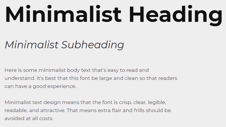
Your text needs to really grab the attention of customers. Here’s what you can do to achieve this.
- Select only one or two fonts that come from the same family. In any minimal design, there should not be too many things that are competing for attention. Using too many types of fonts will create a busy effect. If you feel like you need more variety, play around with weight and size of fonts instead.
- Legibility. The text needs to be legible no matter what kind of creative effects you choose to apply.
- Divide the text into blocks. Rather than having a long running copy, break your text up into blocks. This will make it easier for customers to understand and consume it.
Colors and contrast
Keep the selection of colors as simple as you can. You can use bold colors as an accent or to create an impact. It can also be used as a background texture like in the example below.

When picking colors, keep the following in mind:
- Experiment with colors. Minimalism is not always about just keeping things monochromatic. You will definitely need to use a limited number of colors, but don’t limit yourself too much.
- Choose colors that highlight the design. For example, you can add a contrasting color to a monochromatic mix, so that you highlight some key elements in the design.
- Use the right colors to convey a mood. Think about what emotions you want to induce in your customers and use the psychological effects of colors when you pick them for designs.
- Use high contrast colors. In minimalism, colors need to be based on creating good visual performance. Using contrasting colors will help you place content in the foreground.

Look at the stunning color play in the Vitamin Water branding. It’s bold, fun and edgy but also minimal.
The use of white space
You should avoid all clutter in minimalist graphic design. In any design that is too complicated, there will be clutter. Rather than getting the attention of the customer, too many elements only make for distraction. However, there is a very simple solution to this – the use of white space. This is also known as negative space, and is basically the space between elements. Here are some things you need to consider in this regard:
- Use the white space to get the attention of the user. All you need to do is increase the amount of negative space around an element that you want to draw the attention to.
- Do not use multiple focal points in a design. Give your customers just one thing they need to focus on at one point.

Huge Inc’s homepage combines vibrant color, and effective use of minimal text, with negative space. At the same the various elements’ shapes and colors work together to produce a sense of cohesiveness.
Visual hierarchy in minimalist graphic design
The visual hierarchy in a design is the relationship between the different elements in it. If your designer maintains an effective visual hierarchy it will help move the reader’s eyes across the space easily and will also pull their attention to key elements. One of the ways in which this can be done, is to implement a grid system.
A grid will have equally sized columns and the space between these, is known as gutter. Designers should place elements within these columns so that there is alignment with all the other content. With a grid system, they will have an effective tool that allows for very well organized layouts and will help structure all the elements. It will also help determine the right sizes and proportions.

The example above from Kinfolk, The Food Issue, is a great example of visual hierarchy in a minimal design. Notice how the eye is drawn to all the various elements, according to how important they are?
But, minimalism does not come without challenges
It can be easy to get carried away with minimalist graphic design and stunt your creative process. Here are some things to keep in mind to avoid this:
Minimal graphic design should not limit you
Sometimes, in giving you a minimalist design, your designer may remove some design elements that are essential. They certainly will make the design cleaner, but they may result in confusion for customers. So keep in mind, while you want to keep it minimal, keep your designs clear as well. Clarity is a key element of minimalism. If you want to test this out you can follow the rule of “subtract until it breaks”. Basically remove elements and then test the designs with actual users. Get their genuine feedback on what works and what does not.
Be intentional with minimalist graphic design
The line between simple and primitive is much like the one between love and hate. It’s thin, fragile and rather blurry. Designers should not be oversimplifying designs just because you need to go for a minimal feel. The design should feature the necessary elements (extra emphasis on the word necessary). The idea here is to make the design elements including content clearer to customers and not to just hide them away, or eliminate them.
Creating minimalist graphic design with balance and visual harmony
Minimalist graphic design can look deceivingly simple. But for you to achieve it you need your typography, imagery, colors and other elements to come together effectively. They have to create a sense of balance and harmony. And a design that is well balanced will not have any element that competes needlessly with any other. Creating great quality minimalist designs is something that takes a lot of practice. But if you pay attention to the elements and characteristics of minimalist graphic design, over time you’ll be able to create design briefs that will help you get the results that you are looking for.