Design Psychology: How To Convince Your Audience To Convert
First impressions can either make or break your business. Especially when you put so much effort into your ads to get them! But if the steps that you want your potential customers to take aren’t clear, you might just turn them off all together. This is why design psychology is so important.

The layout of your designs, the colors, lines, and shapes that you use, along with your copy and CTAs contribute to the first impression that you create. This is why it is really important to know how and why people gravitate toward certain things. And why some design aesthetics can actually persuade people to take certain actions.
The role of design psychology
Most people think that design only involves creativity. But there is a lot more to it. The success of any designer depends on their ability to understand how certain elements work, and how others do not, to achieve different effects. They must understand how a customer will see and interact with design and design according to this.
“We must design for the people the way they are, not the way we wish them to be.”
– Don Norman, Director of The Design Lab at the University of California
We cannot stress how true this is. It is very important to address the pain points of your audience and provide solutions through your designs. This will include the careful understanding of user behaviors and empathizing with the customer in order to create designs that will help them.
In this blog, we are going to be talking all about design psychology and giving you tips on how you can keep it in mind to get the best results.
You can use human behavior as a catalyst for your design
One of the first things that can get thrown out of the window when you need a design, is the idea that you are designing for your audience. More specifically, the fact that you are designing for your target market, not just your own preferences. A specific design component may mean a lot to you as the owner of the business but that does not mean that it will resonate with your audience. What does that mean? Let us explain.
If you look at Craigslist which is immensely popular, you will see that they have a very interesting design when it comes to today’s standards. Over time they have tried redesigning it but ultimately these changes didn’t go live. Why? Because Craigslist has two main purposes. You can post an ad or you can find an ad. They are a data driven company that is primarily based on familiarity and how convenient the site is to use. They also know who their target market is and are very clear about the purpose that their website needs to serve. And so they do it really well.
We can say the same about Reddit. While their platform may feel very bare and simple, the audience that they cater to, do not need a lot of design components to do what they want to do. So what can we learn from these two sites? The form a design takes has to follow from function.
Color plays a huge role in design psychology

Colors can convey very specific emotions and evoke certain moods. And this can be influenced by factors like personal preferences and history. The color chart above shows just how many variations there can be in what color emotes. And this is not even an exhaustive list. That said, when it comes to marketing, it’s important to unders the fundamental ideas behind color theory.
Blue:
Evokes a sense of security, calm and represents honesty, trustworthiness, strength and caring. Many corporate businesses use blue to achieve a neutral sentiment of trustworthiness. This can help create a sense of privacy and security even when sharing information (e.g. lead generation campaigns).
Red:
Evokes feelings of energy, love, excitement, action, being bold and passionate. Brands like Coca-Cola are examples of how companies can use the color red in their branding to convey that their products are exciting and energetic.
Orange:
Evokes a sense of being happy, feeling sociable, friendly, and being affordable. Customer service-oriented businesses can favor orange for how effectively it conveys their audience that they are happy to help
Yellow:
Evokes a sense of being logical, optimistic, progressive, confident, and playful. Yellow can be used by brands to communicate an innovative style, and having a sense of playfulness at the same time.
Purple:
Evokes a sense of being imaginative, creative, and nostalgia. Brands that opt to use purple can emphasize an imaginative and helpful nature.
Green:
Evokes a sense of growth, being organic, natural, caring, fresh, and earthy. For companies that want to play up a connection to nature or freshness, green is a great option for their dominant brand color.
Black:
Evokes a sense of sophistication, being luxurious, seductive and/or formal and authoritative. A sleek black-and-white design can help a brand get across the idea they offer exclusive, luxurious experiences or products.
Shapes and design psychology
Just like colors, people associated different emotions and meanings to different shapes.
Circles, Ovals, and Ellipses: These shapes suggest positive emotions and messages tied to community, friendship, love, relationships, unity, and femininity.
Squares and Triangles: These shapes represent professionalism and efficiency, stability, and balance, strength, power, and masculinity.
Vertical Lines: Vertical lines can be associated with squares and triangles, and similarity represent masculinity, strength, and even aggression.
Horizontal Lines: Horizontal lines tend to represent a sense of calm, as well as community, tranquility, equality, and peace.
Hick’s law: too many options lead to no decisions
Have you ever been in that situation where you are at the supermarket and trying to figure out which kind of chips to buy or what kind of detergent works best? But you just can’t make a quick decision? Chances are it’s because you are being faced with too many options.
Once faced with an entire aisle of products you might wonder whether what you want is the right choice after all. This is exactly what happens when you offer too many options to someone in your designs. You should always have a particular focal point/offer. If you present too many options to choose from, or even images to look at, you’re ruining your chances of a conversion.
So here is the takeaway. Remove all the unwanted noise from your designs. There does not need to be too many elements, or images, or fonts. Keep it simple, and keep only what is needed.
The Von Restorff effect: the oddball stands out
This effect refers to the notion that the odd one in the bunch is the object that will stand out and be remembered. If you want your audience’s eyes to be drawn to a particular place in your designs you may want to use a different color, or font, or size.
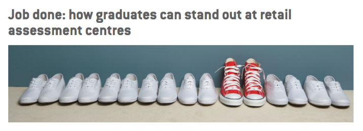
In the example below, a career and job-searching tool from the UK, Target Jobs, demonstrates how someone can stand out in the job market using the Von Restorff effect. By having a set of similar objects placed next to one different object, the different object is made to stand out. You can try using this example to make your CTA or a headline stand out.

The Gestalt Principles and design psychology
These principles look at how elements are understood in relation to each other. The Gestalt principles, also known as the Gestalt laws, focus on the meaning that is produced when design elements are grouped together in particular ways.

Proximity:
If objects are placed in close proximity to each other they are seen as a group instead of as individual objects. For example, the Unilever logo has many objects within the “U”. But the viewer’s eye will still understand that these different objects are a group which makes up the “U” figure.
Similarity:
When objects look similar, they are recognized as being one object collectively, or as a part of the same group. For example, when we take a look at the NBC logo, we see that the cones are perceived as a group, because they look similar to one another.

Closure:
This effect is achieved when a shape is recognized as being whole, even when it is not completely closed. An example of this can be seen in the Girl Scout logo. The shapes and whitespace in the logo create silhouettes even though only some of the shapes are actually closed.
Continuity:
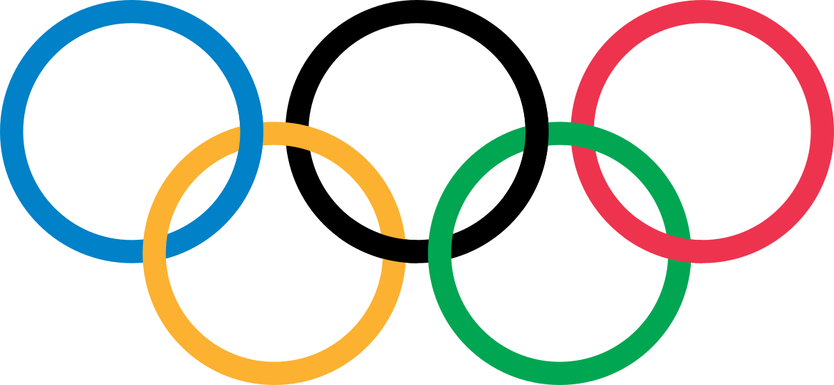
Continuity happens when the eye moves from one object to another naturally. One way that this effect can be achieved is through curved lines which allow the eye to flow with the lines. An example of this can be seen in the Olympic logo. Since the objects in the logo are linked, the eye perceives them as a grouped visual.
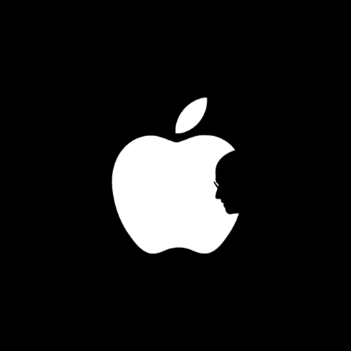
Figure & ground:
This effect occurs when the eye perceives an object, and then separates the object (the figure) from the surrounding area (the ground). In the example above, the audience sees the white space as the figure or the ground, based on whether they look at the apple or at Steve Jobs’ silhouette.
Make sure to optimize for mobile

More often than not your audience is interacting with your marketing on their phones. So be sure to make it easy for somebody to navigate your ads and your landing pages with their thumb. You can do this by having the specific call to action buttons and the copy within the thumbs’ reach depending on whether or not somebody is using a phone or a tablet. The image above gives you an idea of the dimensions to keep in mind. You should also, as a habit, play around with your website on different devices and then see if there are important buttons and links that do not fit into this idea of being within thumbs’ reach. If that is the case, edit and optimize.
Use pictures of people to convey sincerity
A smiling face is one of the most familiar and pleasant things that you can come across. And adding to anecdotal evidence, a study conducted by Caltech found that our brains have cells that only respond to faces. This part of the brain is known as the Fusiform Gyru. And believe it or not, no other object, or form can get this specific part of the brain to become engaged. Keep this in mind when you’re thinking about how you can inspire your audience to feel connected to your creatives.
There are many ways in which you can use faces in your designs. You can use them to visualize and evoke certain emotions and even create a certain sense of trust. Using employee or customer imagers can help you with these goals. To get the most out of your imagery, use images of people looking straight ahead (to engage your audience). Or you can choose images of people looking towards your CTA. You can use stock images as long as you select options that aren’t commonly used. And ask your designer to modify what they can to make the images complement your brand and look unique.
Keep vital info above the fold on landing pages
According to studies on eye-movement tracking, most users will first scan a horizontal line on the top of the screen (the headline). And then they’ll move down the page a little bit and read across the horizontal line for a short length (description text). So how can you use this information in the design that you would like to implement? Here are some important guidelines that you can follow:
- Highlight your keywords
- Use meaningful subheadings
- Use bulleted lists
- Have only one idea per paragraph
- Use the inverted pyramid style and have your conclusion at the beginning
- Include the least amount of text possible
Use design psychology to get results
If your designs look great, but don’t actually connect to your audience, then your design just doesn’t work as it should. By using design psychology effectively you can engage your audience and guide them towards taking certain actions. And that should be the ultimate goal of each of your designs. At the end of the day, creativity is great, and aesthetics are important, but if they are not implemented correctly, then all of your efforts won’t get you the results you want.