The Ultimate Logo Design Checklist Every Brand Needs
Logos are what represent your brand. And you want to be sure that your logo resonates with your customers and conveys the right message. With all of this weighing heavy on the scales, creating a logo can be challenging and sometimes, nerve wracking. Which is why a logo design checklist comes in handy.
Even professional logo designers will go through quite a process to arrive at a final product. This includes researching the industry as well as the client, making sketches and brainstorming creatives so that they can produce the best possible logo.
If you’re new to this process, it can seem overwhelming. So that’s why we’ve decided to take you through the process of designing a logo.
How to get started on designing a fantastic logo
Step 01 – Start with evaluating your brand
Sometimes, when you need to design a logo, you may not be able to communicate exactly what they are looking for. This is why you always need to ask these questions.
- What is the purpose of the logo that you want, and is there a problem that you are trying to provide a solution to?
- How can you personify and describe your brand?
- What kind of voice does your brand have? Is it funny? Casual or eloquent?
- What values does your brand stand by?
- Which value propositions set your brand apart from your competitors?
- How would you like your customers to describe your brand to their friends and family?
Step 02 – Do your research
Find out more information about the industry that you are involved in. Look into the backstory or history and the emerging trends in the marketplace. This could include new trends like NFT design or colors and shapes that are popular. Take on the visual research and check out the logos of your competition. If you do manage to find some kind of trend here, you will need to make a call on whether you will go with the trend or just be innovative and creative.
Remember though, that while trends will go out of style, logos are meant to last through it. Of course, you can always have a chat with your designer about this, but we suggest that you have a clear idea of what you need done, so that the process is smoother.
Step 03 – Sketch the design for the logo
You should always do a bit of a creative brain dump on to paper and sketch the ideas that you have for the logo design. This way you have some groundwork done, from which you can work up. You can use something like Adobe Illustrator to improve and refine, but don’t skip the sketching process. This will also help you conceptualize well. You should think about the preferences of the target audience, whether the logo should be trendy or timeless, whether it conveys the personality of the brand and whether it needs to look humorous or austere.
Now, it could be the case that you do not have enough experience or knowledge to work with the softwares needed to do the sketching part. If that is the case, we suggest that you simply collect references to give your designer an idea of what you want and skip this step. You can directly speak with the designer and give them the references you have collected, then work with them towards creating your logo.
Step 04 – Do a black and white version
Wondering why this is important when printing in color isn’t that costly at all? Well, for one thing you will be needing this for your business. Having a black and white version of the logo is important if you take part in any corporate sponsorships and the likes, as it will make sure that your logo can work well within any design. If there is a case where you would like to use the logo on textiles, laser engravings and the likes which have machinery that don’t do color, this will come in handy too.
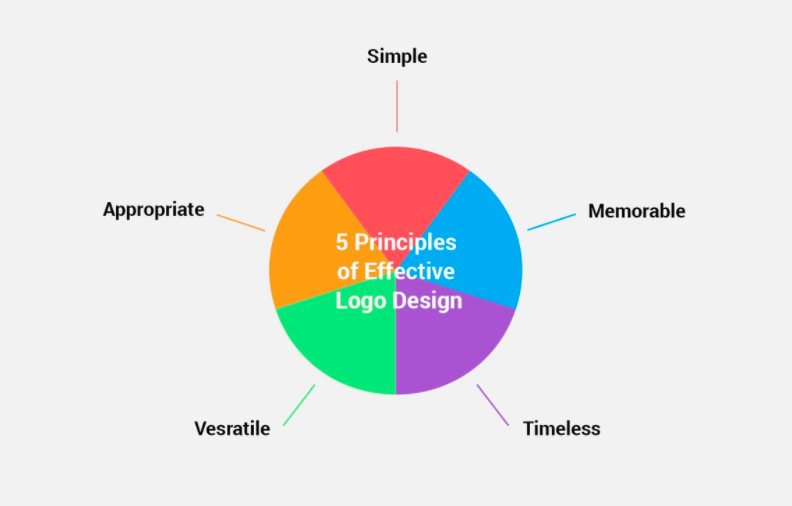
Step 05 – Keep it versatile
One thing to never dismiss on your logo design checklist is versatility. This means that the use of the new logo you are going to have designed has to be one that works in all ways. It should work well online, on billboard, next to other logos of businesses, on surfaces and on items like textiles as well.
Step 06 – Shapes, and more shapes
You need to think prudently about shapes that are being incorporated, even if it is a lettermark or wordmark logo. The shapes that come together to form the logo, will be something that lends it character. Think Target’s red circle or the 2 arches in the M of McDonald’s. Be sure to discuss this with your designer.
Step 07 – Colors and originality
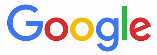
We’ve spoken about color psychology in marketing, choosing color palettes, and color theory a few times on our blog. That’s because it is a very important part of any designer’s job to pick the right colors that complement each other. You can use either one color, two or three, but they need to create an impact. Think of the colors in Google, Pepsi and Firefox for example. Next, also keep thinking outside the box. For example, even though Apple is all about high tech, their logo, the apple literally, has nothing to do with high tech. It still is a memorable logo known by pretty much anybody.
Step 08 – Typography
Just like color, choosing the right fonts is very important too. Don’t skip this step in the logo design checklist. And do not pick more than 2 or 3 fonts for 1 logo. Even if you pick more than 1 font, they should all either come from the same font family or complement each other very well and maintain good visual contrast. Don’t use any fonts that are difficult to read or are more decorative than they are functional. They should also convey brand identity and play well with all the elements of the logo. Get your designer to try out various fonts and see which ones you think will work the best.
Step 09 – The line between originality and obscure
While we did recommend that you stay original and think unconventionally, you shouldn’t go out of the box past a point. That point is where your audience does not know what your logo is supposed to convey. To stop this from happening, make the logo relevant. A relevant logo is intentional, clear about the message and well targeted.
Step 10 – Composition
Creating the right balance means that you are adding the proportional and symmetrical qualities into the design that you are creating. Some of the most aesthetically pleasing logos always take on these qualities. You will need to balance and distribute the weight on both the horizontal and vertical ends. It leads to better expression and people will read it better as well.
Step 11 – Ask your designer to vectorize your new logo
When you vectorize a logo, it makes it usable for many different uses. If you do have a vector based graphic, you can scale it to pretty much any size without the image losing the quality. There are different formats that are used for logo work and knowing them will help you.
- EPS : the Encapsulated PostScript is basically the standard in vectorizing the new logo that you have designed. We suggest that if you do ask for vectors, you do so in EPS format.
- AI – Adobe Illustrator Artwork is a modified version of EPS.
- SVG – because this has the W3G vector standard this format is fast catching up on with the other two we mentioned. An increasing number of browsers are in support of this format and the best part is that your logo will support any screen resolution with it.
Step 12 – Look into the use of white or negative space
Give the elements in your logo design enough breathing room. When you have too many elements that compete with or crowd each other, it will be difficult for your customers to make sense of your logo. Ask your designer to give you a few variations with different amounts of space between elements, so that you can choose the one that works the best.
Now that we’ve looked at the logo design checklist, let’s take a look at different types of logos that you can create using these tips.
What are the different types of logos?
There are 5 main types of logos that you could potentially choose from:
- Icons or symbols – a good example for such logos would be Nike or Apple. Essentially, they are made up of very simple shapes and are rather simple. They also have the advantage of being easy to remember, and being very recognizable.
- Wordmarks – Walt Disney, Coca Cola and Facebook are some great examples of wordmark logos. Such logos are made up of a word that uses a particular typography so that they stand out from their competitors.
- Lettermark – just like in the case of wordmark logos, lettermark logos are made up of a few different letters. HP, ABC and NASA all use this type of logo. They use letters that are stylized along with some geometric shape. If the name of a brand is difficult to pronounce, this kind of logo would be ideal.
- Combination mark – this type of logo comes with a combo of symbols and words – think KFC or Adidas. Designing this kind of logo could be a bit tricky because you now have two elements that need to sit perfectly with each other. If they are not done correctly, they could look like they are competing with each other instead of complementing each other.
- Emblem – Porsche and Starbucks are two very well known examples of emblem logos. This has a font placed inside a symbol and it works like a badge or a patch.
For you to get the perfect design done, you also need to have the perfect design brief to give your designer. We know that sometimes creating this design brief can be tricky, and we want to help. Here are some steps that will help you with this.
Creating the perfect logo design brief
Tell your designer about your brand
- You should always tell your designer why you would like to do a particular design. If you tell them the backstory to your brand, chances are that your logo will come out way better than you expected. Know that your designer is capable of understanding your brand story and tapping into the emotional and human element of it, if you let them know about it.
- Your product, target audience and industry are all crucial. If you are giving your designer the brief, make sure that you get into details about factors like the materials that you use for your products, the customer lifestyles that you promote and the competitors in the industry that you have. You can also tell your designer about the manufacturing process.
- Your brand style will also change according to your brand values. When you explain your brand values it will help the designer think of many different and relevant options.
- Give your designer your company name and slogan. If you need any spacing between the letters or words in your company name and slogan, please let your designer know this too. With the slogan, there are times where the slogan is embedded into the design and will not be removable. But, if you want this to be a bit flexible, let the designer know that you want an option where the slogan is part of the logo and removable as well.
Tell your designer the style of logo you need
- As we mentioned above, there are different types of logos that you can choose from. Letting your designer know what your preference is, will help reduce revisions due to miscommunication.
- Try and discuss what type of style you will need on your logo. For example, it could be skeuomorphic, vintage, minimal or flat.
- You should also give your designer any colors and the color codes (pantones) that are relevant. This will enable the designer to get you a logo that is just right when it comes to your brand color palette.
- Create a mood board and share it with your designer. Having this will help your designer realize the kind of inspiration that you have and the tone that you are looking for in terms of the design.
Determining the timelines and budget
- No matter who you hire to design your logo, you need to make sure their outputs align with your needs. While some designers will design with rush deliveries if you require them tp, your best bet would be to sit down, discuss the brief and then allow them to give you a timeline.
- When it comes to budget, this will vary based on the kind of service that you are using. If you have hired an unlimited graphic design service on a monthly basis, you will have a flat rate. If not, you may have to speak with the agency that you have chosen and see what your estimated spend would be.
Why is following a logo design checklist so important?
Your logo will tell the story of your brand and make it immediately recognizable. It is what people will come to know your business by. A good and strong logo can make your brand, while a poorly thought out logo can break your brand. This is why we suggest you follow a logo design checklist and work closely with your designer. It’s important to make sure that you are on the same page throughout the design process. Collaboration and communication is key, and will help you reduce the back and forth while creating a logo. And in the end, you’ll be able to proudly say that you have a logo that represents your brand in the best ways.
Need help with designing your logo? Check out Kimp’s unlimited graphic design services.