Design An Ebook Cover That Will Help You Generate Leads
Don’t judge a book by its cover? With ebooks you definitely should. If you want to grab the attention of potential customers, design an ebook cover that make an impact. It’s a worthwhile investment, because B2B marketers have found that 80% of users would provide their email address for an ebook or a whte paper.

Here are some compelling reasons why ebooks need to be a part of your marketing strategy:
- They will help you generate more leads.
- Ebooks allow you to establish yourself as a thought leader.
- They allow you to generate more awareness amongst your target audience.
What to keep in mind when you design an ebook cover
You need a brand style guide
When you have a consistent brand style guide, you can make sure that your customers immediately make the connection between your designs and your brand. The content in your ebook itself does hold a lot of credibility, and we are not saying that the style guide is more important than that, but, if you want your customers to know that what they are reading is from you, having this style guide is a must.
A brand style guide will give designers an idea of the colors, font and styles to use, what your brand is all about and also let them know about the tone that they need to maintain throughout. Ideally, if you’ll be producing ebooks on a regular basis, your brand style guide should also have templates for ebooks. This will make it easier for you designers to do their part when it comes to creating this. Make sure that the brand style guide also offers resources and links to your brand assets so that your designers are able to access resources easily.
Choose the correct colors
The colors that you are using on your ebook cover design will go a long way to make sure that it is successful. The concept of color psychology influences the people who see your cover and will compel them to have a look at what they can learn inside the book. Or to simply keep browsing on.
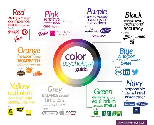
The effect of colors on the human mind means that people will actually notice the color before they even read the ebook, or look at the details of the cover. The color that you pick should not simply resonate with your brand, but also with the emotion and tone of the ebook.
You need an engaging title
Next up, when you design an ebook cover, you need to think about your title. And a catchy subtitle. Your goal here is to grab the attention of your target audience, and inform them of what you’re offering to them. Make sure that the title is indicative of what people can expect to learn from the ebook itself. The subtitle can be short yet descriptive and elaborate further on the title that you chose.
If your title expresses the value your ebook has to offer, more than any image ever could, you might just want to have a text-based ebook cover design.
Choose colors and fonts that make your title and subtitle easy to read. And limit your fonts to just one or two max, to stand out against your background design and/or image(s). While you shouldn’t use too many different fonts, you can play with bold or italicized fonts, and font sizes to engage your audience.
Find descriptive images to use
When you design an ebook cover, if you’ll be including an image you need to make sure that it is descriptive. Your audience has a ton of content competing for their attention. So make sure that image on your ebook cover can tell them a bit more about what you have to offer.
At the same time it’s important to keep the image simple. Your audience will often see a small thumbnail before they opt to share their email and download your ebook. So you need your message to get across, no matter how your audience comes across it.
A few other things you’ll have to consider about your images:
- Quality – the images you choose should be high quality. In case your audience opts to print your ebook, a DPI of 300 is recommended, with a ratio of 3:2 or 4:3.
- Licenses – if you’re opting to use a stock image make sure that you have the appropriate rights to use the image.
- Your brand – the image you choose needs to complement your colour palette, and the fonts you use.

Some general tips for your ebook cover design
- Consider Sans Serif fonts with uniform strokes. They are easy to read. On that make sure that size of your text makes it legible, regardless of whether it’s seen in full size or on a thumbnail or ad.
- Make sure there is enough contrast between the text and the image so that you have good readability.
- Try to avoid using too many effects when you design an ebook cover. You want to avoid anything that makes your cover look cluttered.
Leave lots of breathing/white space
When you design an ebook cover, leave plenty of white space, so that the different elements can breathe and are clearly visible. The canvas of the ebook will be rather small and you need your thumbnails to get your audience’s attention. Having the white space will make sure that things are clear and easy to read, as opposed to looking cluttered.
When you design an ebook cover, you will also have the ability to play around with some design techniques that you may not otherwise. For example, ebook designs do not need layering unless there is ample space between the colors and elements used. And you can use something like a container – a white box, so to speak – so that the lettering is set apart from the rest of the design.

Incorporate your brand in the design
We’ve spoken to the importance of a brand style guide, and using brand colours when you design an ebook cover. But there are other ways to add your brand into the mix as well. It could be as simple as placing your logo on your cover. And then following this with your logo in the bottom left or right corner of the inner pages of your ebook. And aligned, to the right or left respectively, could be your website.
This will help carry your logo, and brand recognition throughout your ebook.
Consider variations for audience segments
Depending on your particular line of business, you could have a pretty wide range of audience segments that you reach out to. Bearing this in mind, consider coming up with a few variations of your ebook cover design so that you can appeal to specific segments of your audience with your marketing campaigns.
And you can also create different ebooks tailored to different segments, and design the covers accordingly. By creating content that has been personalized to the different segments of your audience, you’ll be able to provide a more tailored experience.
Always have a standard shape
Your ebook cover should have a standard shape. There is nothing that looks more amateurish than having a shape that is irregular. First get the dimension specifications for the platforms where their book will be published. There will be things like image resolutions, file formats and different size requirements that you need to work with. Keep them in mind and design accordingly.
Once you have this info, design your cover based on the standard 3:2 or 4:3 aspect ratios that most readers are used to. Leave space along the edges so that the aspect ratio can work well across devices, without the design running into the frame.
So why does it matter how you design an ebook cover?
You can have the most amazing content within an ebook, but if that first glance does not create a strong impression, you’ll lose your audience. Your ebook cover design is the first and last chance that your ebook has to get people to engage with your brand.
At Kimp, we offer you a variety of services that includes ebook design and our expertise, together with your business goals and vision can help your design better, so you can scale faster. So if you need some help with your next ebook design, consider signing up for a free trial.