How To Get Started With Infographic Marketing
The power and impact that good data visualization can bring into marketing cannot be discounted. People are always looking for easy-to-understand information that can break down otherwise complex data, into attractive bite-sized versions. This is probably the biggest reason why there is a growing demand for infographic marketing.

Just think about it. Would you prefer browsing through a lengthy PDF or taking a look at a colorful and clear representation of that very same info, presented in a concise way? We’re guessing it’s the latter.
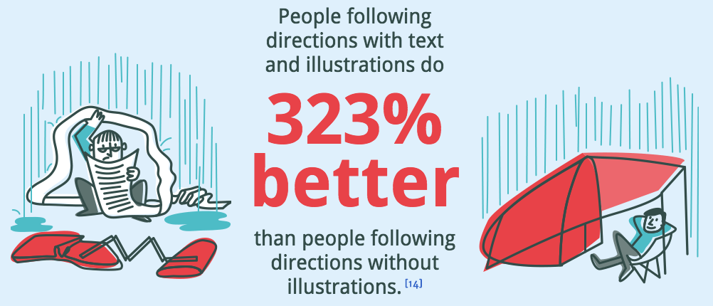
For example, according to Springer – a leading research platform – people who follow directions with text and illustrations perform 323% better than those who do not get illustrations!
With that in mind, let’s take a plunge into the world of infographic marketing.
What are the different types of infographics used in content marketing?
Because infographics have become such cornerstones of content marketing, it is worth knowing the different types that you can choose from. When you do select these styles, you should also know what purpose they are used for. Here are some different types of infographics that you can start including in your content right away.
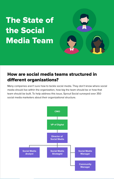
The flowchart infographic
These will come with detailed steps, sequences and procedures that will create visual cues which are easy to follow and comprehend. There are dots or lines that connect the visual elements here, and sometimes, you can also use arrows. The arrows will indicate the direction of the flow.
When to use: If you have single questions that will then branch out into different scenarios and other follow up questions, this type of infographic is ideal. It helps those who are reading quickly easily identify the answers they need, as opposed to perusing pages of information. These infographics also do really well on social media, allowing users to find answers to questions. They also facilitate picking between different options and reach the bottom of the flowchart at a pace that works for each reader.

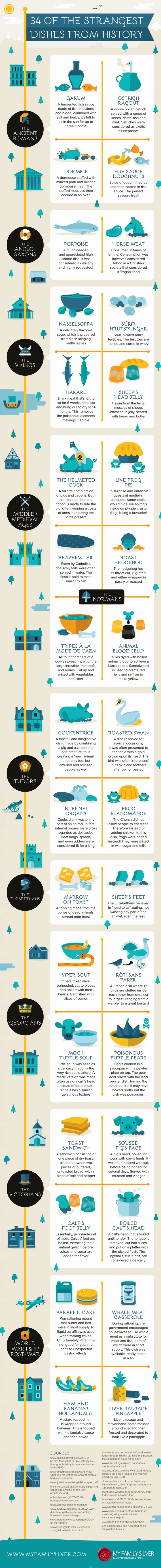
The timeline infographic

If you have linear storylines that you want to convey (both vertical and horizontal), a timeline infographic is perfect for you. Storytelling is really important for a brand, and when it is laid out with strong imagery, it makes a better and bigger impact.
When to use: If you want to tell the story behind your brand with dates, milestones and figures, for example, you can use this type of infographic. It makes for a rather compelling and easy-on-the-eyes narrative.
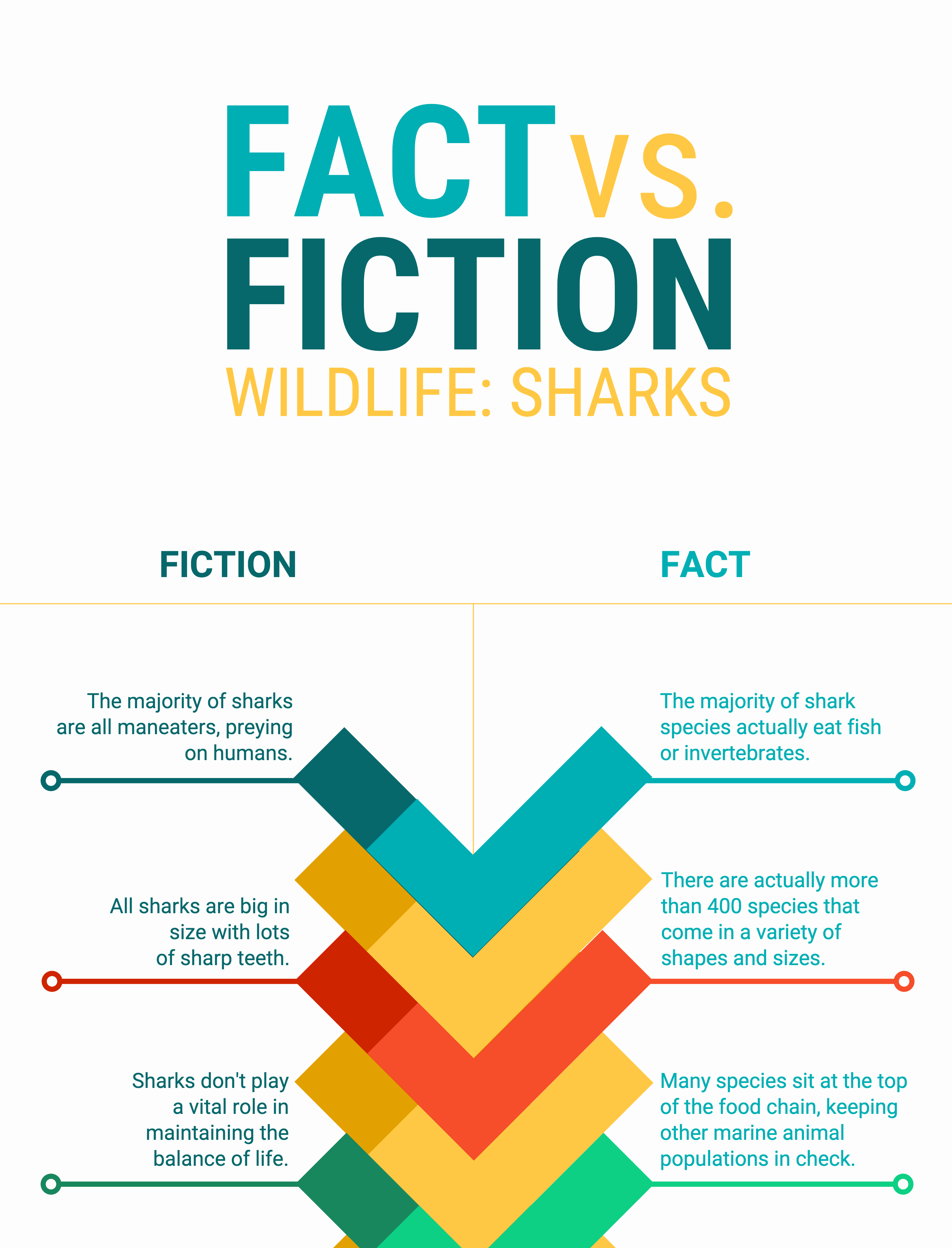
The comparison infographic
Just as the name suggests, this is great for comparing and contrasting two or more pieces of information. They are usually designed to compare and contrast side by side, or with several columns.
When to use: If you want to draw attention to advantages of a product or service your brand offers against another, this would be a good way to go. It can contain information such as the price, the technical aspects and expertise as well as customer service offerings. These infographics are perfect in helping customers make well-informed purchasing decisions.
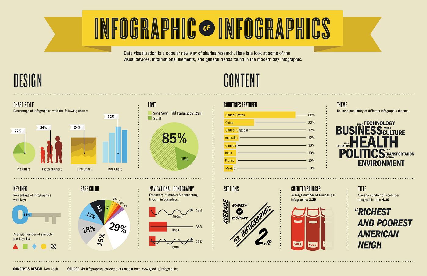
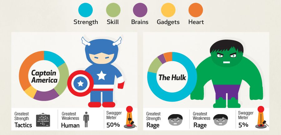
The data visualization infographic
Most infographics have numbers and statistical trends included in the design. But not all of them will use data as the thematic connection. When you use charts, plots, graphs and other such illustrations that are data-driven, you can pour life into the focal point of the infographic. With more visual components and less text, the numbers in your design will get more breathing room. And your theme can be depicted more effectively.
You can use large and bold fonts to highlight the important numbers. Readers will be able to interpret the infographic – both context and storyline – based on the numbers and the headers. You can also make this infographic interactive if you want the data visualization to have even more impact. In other words, all you need to do is incorporate some design elements that are responsive to the user’s click.
When to use: This type of infographic is great to raise awareness about the positive stats about your brand. It can also communicate complicated data points with relevance to a serious issue in your industry. It can also convey proprietary survey data to customers and prospects.
The list-based/informal infographic
This infographic can also be identified as a blog post that doesn’t go out of style. This is because it generally has a standard structure that consists of short infographic components, and a short section of text. Depending upon the space you have, you can decide how long the text needs to be. For instance, it could either be snippets or paragraphs. However, you don’t have to rely on text only to deliver resonating information. The use of colors, iconographic schemes and other graphical components will add character to this infographic.
When to use: You cannot always present ideas through hard numbers. Some of them require a more informal or conversational take. If that is what you are looking for, try out this type of infographic.
The process infographic
Very similar to an informational format, these infographics can be used for delivering a step-by-step ‘how to’ kind of guideline. Make sure that you provide directions in the right order clearly, with imagery that will help the reader get a clear picture of your process.
For example, you can include screenshots if you are taking a reader through a setup process. This will help them navigate their own setup process easily. This type of infographic has a very close resemblance to the flowchart type we spoke of above. In fact, both types use arrows and lines to navigate the flow of steps. There is definitely more importance allocated to the directions given in this type as opposed to visual elements.
When to use: If you want to outline steps to installing software, going through a legal process, setting up an online store, or even trying a brand new cooking recipe, you can resort to this type of infographic.

The geographic infographic
This one is pretty straightforward. If there is a need for you to use any form of map on your infographic, this is the style to go for. Essentially, it allows you to root your infographic’s idea to a city, for example, and make that data easily accessible to your customers. You can also use a map as the background and add charts, callout boxes and bullet points to get the point across. It is important that your designer uses color grading, line illustrations and tones that are dynamic. This will help improve the visual effect, categorize various borders and differentiate between shifts in the concept.
When to use: These can be used to visualize data like population density, income levels, literacy rates, tax levels, poverty and more.

These are only a few of the many different types of infographics that you can design. So get creative and figure out what information you want to present in its best light. With this in mind you can fine tune your infographics in the best way that suits your brand’s needs.
But how can you create a good infographic?
A big part of what will make your infographic effective is knowing what information to include. You’ll want to keep in mind how you can clearly define the various components that need to go into your infographic. We’re breaking down these steps below, so that you have your infographic design plan made easier!

Step 01 – Choosing the right topic
You need to have a solid topic in mind when you plan on either designing an infographic or providing a creative brief for one. To decide the kind of topic you want, you can look at these factors as a framework.
- What type of infographic would work the best for you? Analyze what information and how you would like to present it to readers. This will make picking the style easier.
- You can take a look through trending topics to decide what subjects would get the most attention. Google Trends, Reddit, Buzzsumo and Digg are great platforms to nudge you in the right direction. LinkedIn Pulse can give you industry-specific ideas.
- Repurpose your old blogs and whitepapers into infographics, especially if they have received a lot of engagement before. Lists and how-to posts are perfect for this.
- Keep in mind that an infographic must be designed to give value. Do not simply do a design to solely promote your brand. Use it to raise awareness and educate at the same time.
Step 02 – Do the research
If you want users to take your infographic marketing seriously, make sure that you use credible sources for your research. You will need to include components like:
- Stats and facts – use sources like WHO, non-profits, the World Bank and other such reputed sites, depending upon the information you are looking for.
- Quotes – if you want to boost the validity of the point you are trying to make, you can use some quotes from industry experts in the infographic.
Step 03 – Write your narrative
You need to now create a compelling narrative that will give personality to your infographic marketing.
- Think in terms of visuals – the text has to flow well with the visual components and be clear enough to add to them, not draw attention away from them. A copywriter with a background in design or infographic content creation will come in handy here.
- Become the reader – the best way to create a good narrative is to put yourself in the shoes of the reader. This will give you more insight on what appeals to them and how you can give them value through the design and content both.
- Proofread – while this may sound quite obvious, grammar, spellings and punctuation plays a big role in the design itself. If there are errors that you have missed catching, it could harm the credibility of your infographic. Go through the copy and ask someone else to be a second set of eyes for you as well.
Step 04 – The design component
Designing your infographic is not just about making it look good. It also has to be functional. This is why it is a smart move to lay out the content as a wireframe design to make sure that your narrative works well in the visual context.
- Maintain clarity – when there is too much copy or imagery in the infographic, it starts to look cluttered. Leave negative spaces to bring out clarity around images and text. You should also not place images and text too close to the borders of the infographic.
- An infographic is ideally between 800 – 1000 pixels wide and can be much longer when it comes to length. If you need more space expand the infographic vertically. An infographic that is too wide, will be difficult to share.
- Color psychology is important in your design. Choose the right color scheme for the topic. For example anything about nature can have green and earthy hues. If you are talking about something like mental illness leave out overly vibrant colors. Make sure to use only between 2 – 4 colors. Anything more will make the design look too busy.
- With fonts, stick to just 2 throughout the design. This consistency is very important. It is alright to move away from the font that is related to your brand, but make sure you choose clear and easy to read types like Arial and Helvetica.
- When you convey data, your main objective has to be effectiveness. It has to be clear whether what you’re presenting is a number or a trend. As long as they do not look like they were simply taken from MS Excel, charts and graphs will work well. A skilled designer can really do wonders here.

- Include the logo of your brand. This will immediately help readers associate the infographic with your business.
Getting a good ROI
Infographic marketing needs to give you a good ROI. To get the most ROI out of your infographics consider these 5 steps:
- Create a landing page that features your infographic.
- Use snippets of your infographics in your blogs, and have them link to your landing page.
- Include them in your emails to make them more engaging! You can use bits as opposed to the entire design, and then link to your site where the whole design is featured.
- Share it on social media. Infographics are 3X more likely to get shared then other types of content!
- Track all your infographic marketing results! Search visibility, time on page, and traffic are just a few of the metrics for you to consider.
Are you ready for infographic marketing?
Infographic marketing is a great way to market your brand without always having to just promote your products and services. It can help your customers gain knowledge in a fun and easy way and help you get a lot of engagement, while building relatability. If your infographics are really good, you also help build a great impression about your brand.
The catch is to create an infographic that is credible and attractive. Your narrative and design components have to be really strong for you to achieve this. We recommend that before you start designing, writing or even laying out the creative brief, you take the time to research, read and perhaps even put down a couple of drafts. The more effort you put into your prep, the better your outcome will be!