14 Design Tips Every Non-Designer Needs To Know
Found yourself in need of some design tips? Maybe you aren’t a trained and expert graphic designer, but you’ve been given the responsibility to create some designs. Now what do you do?!
The truth is that knowing graphic design is a useful skill for any digital marketer. And here’s the good news. You can create professional and stylish designs even if you may not be trained in the field of graphics. There’s a few tips and tricks to keep in mind when designing.

And we are going to be giving you some of these helpful pointers to get you started. Let’s take a look, shall we?
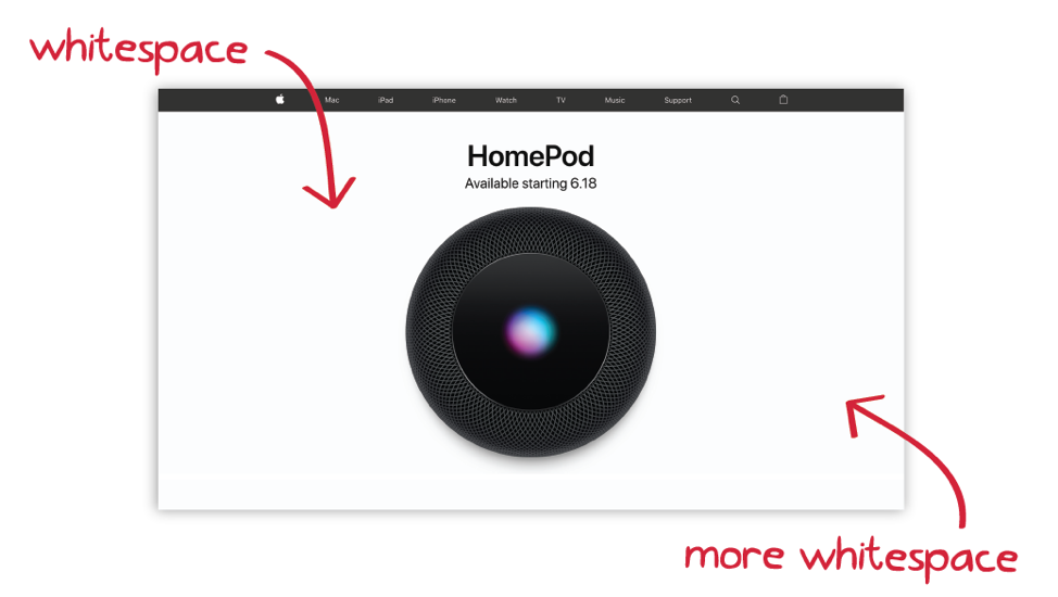
Make use of that white space
In any design, how the graphics are laid out is what will pull our attention to it. When you create a design, make sure that there is enough breathing room around the elements used. Leave white or negative space so that the text and graphics are clear and highlighted. Keep in mind that when we call it ‘white’ space, it doesn’t have to be white per se. It can be any color. What we mean, is that there is enough room and that it is not cluttered. This is true for social media, websites, or any other usage of graphic design.
Use just 2 fonts that are easy to read
Your fonts need to be easily readable. Don’t get too fancy and keep things simple. Also do not use more than just 2 different fonts that go well with each other. You should also try to use fonts that align well with the brand. Using the right font separates an expert designer from an amateur. This stands true for all web designs that you make as well. In addition to this, when you do have text to add in, make sure that each line has no more than 30-40 characters with spaces. If this is exceeded, readers may not really find it easy to get through the copy. Platforms (for example Facebook) also have rules on how much text can go into a design if you want to boost it. Pay attention to these.

Keep the alignment on point
One of the other design tips that will make your designs look professional is the right alignment, regardless of whether it is website design or otherwise. Most of the programs that you use will have lines that indicate the text box and graphic alignment. Otherwise, you can toggle the grid lines and check for it. If your program does not show lines, you still have the option to add them. Simply upload the vector image and send it to the back of your design. When everything is in the right position, you can delete the grid.
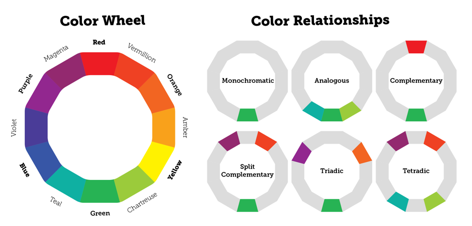
Use of colors
We’ve repeated this point many times in our blogs as design tips and we will say it again. Make sure that you understand color psychology. Colors are meant to bring out different feelings in the people who see them in your designs. For example:
- Blue: security, trust, safety and relaxation
- Green: health abundance and wealth
- Grey: professionalism and gravity
- Pink: youth, romance, and femininity
You also need to make sure that you have your brand’s colors according to the style guide in mind when you do the designing.
Use icons to add impact to your image
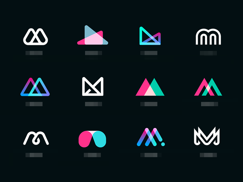
You know how an amazing garnish makes just that much difference in the dish that you have cooked for hours? That’s exactly what icons do too. Using icons in the right way like in the image above can actually help you to drive home a point that you are trying to make. This is especially true for the graphics that you create for blogs. Simple but direct icons will help deliver the message better. You also can make the icons 3D or flat.
Don’t be afraid to play by your rules
Ok, so you might not have expected this on a list of design tips. And we know that when you are not an expert in graphics, it can be a little scary to make your own rules. But that is also what creativity is all about. For example, in a design for your website, if you feel that using a particular color gradient is the best way to go, try it out rather than drowning out that muse in you. However, if you are playing by your own rules, be consistent with it so that the final output looks polished and not all over the place.
Save time with repurposing
Assuming that you are doing the designs for multiple social media platforms, you need to also be able to save as much time as possible. What you can try here is copying the design and then simply changing the elements that you may have used. This ensures that there is some level of uniformity across your channels, even though the components of the design may have changed somewhat.
Use lines to create an organized feel
When you use lines in your design, you will be anchoring items and bringing in a more organized feel. When you use these lines around the blocks of text in your design, it will help anchor the text well. You can also use lines to separate various elements in the design which will make the final effect a more coordinated one.
Going big is not always a bad thing
In your graphic design, the larger elements will automatically draw attention more than the smaller ones. If there are multiple elements in one design, the biggest element should be the one that serves as the focal point. However, when you are adding different elements of different sizes in one design, scaling is really important. This includes the text, any design elements, and even the buttons.
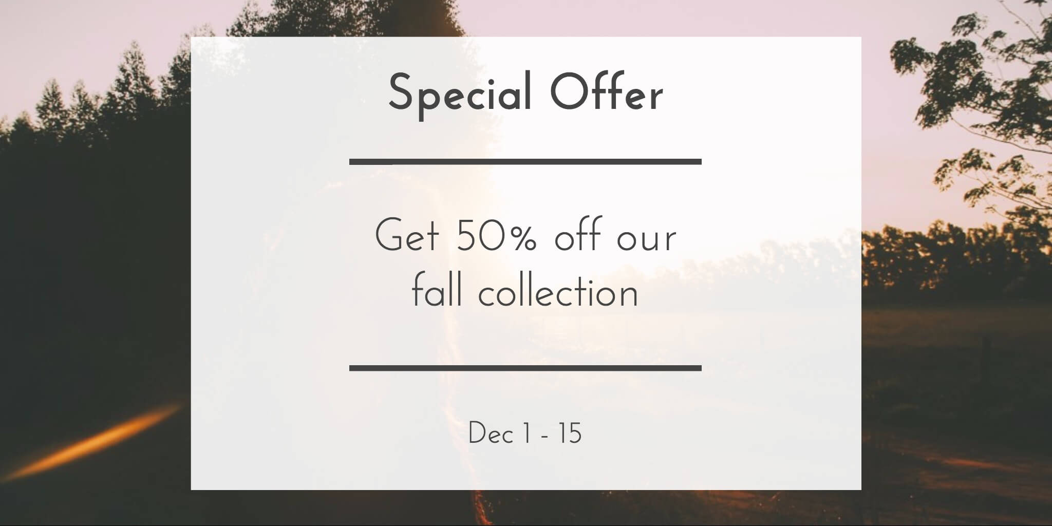
Adjust brightness and highlight the text on the image
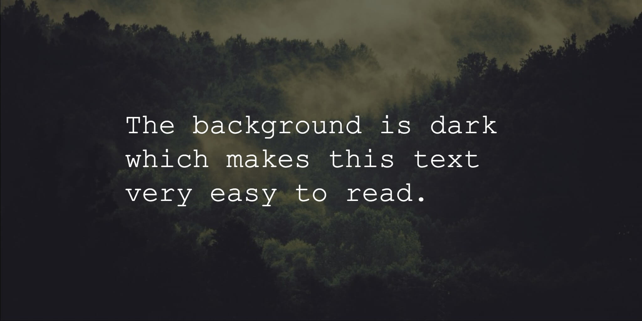
If you want to have text that is placed over the image, make sure that you are adjusting the brightness of the background image. This will bring in some color overlay into the design, and the image behind will perfectly offset the lettering. In other words, the lettering will be really readable and clear.
Now let’s talk design tips for accessibility
So you have an idea now of some of the main factors that your design needs to look good. But what about accessibility? When you do a design that is accessible you are allowing an individual with a disability to also understand and navigate, as well as interact with the design you have completed. Here are a few tips that you can get started on as a non-designer on accessible designs
Design for a diverse audience
When we say a diverse audience, we mean that your design should also be accessible to those who are visually impaired, color blind or have low vision issues. People with hearing issues, mobility problems and any cognitive development issues should also be able to perceive your design. The design that you do, especially on websites, should be enjoyable by everybody irrespective of age and their abilities.

Follow these design tips for an accessible design
- Color and contrasting – using text and background colors that do not have enough contrast makes it difficult for people to read. Use enough contrast with your colors.
- The scalability of your text – allowing for text scaling and zooming on multiple devices is important for users who have visual impairments.
- Usability – here you’ll want to think about the color, readability of the font, and the size of the text used in this case. As far as your text goes, you can make your text size adjustable.
For web design you’ll also want to consider…
- Keyboard navigation – can your website be browsed using just the keyboard? If not you might want to rethink your design. If a person has a motor skills issue they will find it hard to browse without this.
What does it all come down to?
You, actually. Don’t let the thought that you are a non-designer bother you. You’d be surprised how many entrepreneurs do their own designs after following courses, YouTube tutorials, or shadowing a friend. And in the case where you’re going to hire a designer, it’s helpful to know these aspects of design so that you can be sure you’re getting a design that meets your needs.
Design speaks to a lot of people – sometimes even more so than just plain text. If you have a keen eye for styles, colors and keeping things simple but impactful, these tips will help you create something that you can be proud of.