Deciding On The Right Layout For Your Brochure Design
Most of us have been handed quite a few brochures, or even picked them up ourselves to learn what a business has to offer. Brochures are designed for so many reasons. Some tell you what the business does. Others talk about a sale that’s running. Some are designed to announce an open house and a few are meant to delve into the details of a particular product.

Whatever be the purpose of your brochure, there is one main design aspect that influences the first impression your brochure creates – the layout.
Single fold? Or multifold? The right brochure layout can make or break the impact of a message. That’s why it’s worth the time to map out how you want to structure your content before you dive into the design.
If you think that print advertising does not need much of your time in the digital age, think again. Print ad spending in the year 2022 is projected to reach $51 237 M. Businesses love them and are getting great ROIs on them. Print ads are here to stay. So, brochures that give a solid introduction to your brand in a tangible form, are definitely worth focusing on.
When someone takes a brochure, they’re interested in learning more about the product, service, or promotion that’s detailed within it. Which presents you with the perfect opportunity to encourage your customers to take action. This can be anything from booking an appointment to placing an order. With the right layout for your brochure design, you can seamlessly guide your audience to the next step you want them to take.
Design Can Make Or Break A Brochure
The success of a brochure design depends on how long the customer decides to hang on to it. And what determines this? Presenting information that matters to the customers. And for customers to actually consume this content and take an action, there is one thing that matters the most – the brochure design.
Well, to put it bluntly, if the design isn’t good they’re probably going to toss it out without a second look. Even if there is a lot of useful information, bad design shrouds it all. A good layout leads to a strong design. So let’s take a look at what to consider when you want to come up with a layout for your brochure.
Define The Purpose Of The Brochure

Designed by Kimp
Before designing the brochure, you need a clear idea of what purpose it’s going to serve. Based on this you should then answer a few questions:
- Which specific segment of your target audience are you tailoring your brochure to?
- What is the call to action that you want to lead them to?
And based on your answers to these questions you can plan your brochure’s imagery and other visual elements as well as the copy. You will also be able to understand the tone to use in your messaging. All this helps in understanding how much content there will be and thus in picking the right layout as well.
While considering these, it is also important to consider your brand identity. Because you need to make sure that you appeal to your audience but that you also stay on brand.
Based on all these considerations you can also get a clear picture of what information to highlight and draw attention to. And this will be a valuable input in actually designing the brochure.
For example, if you’re trying to get customers to book consultations, you’ll want to include details on the benefits of a consultation. And back it up with details on how to go about booking one.
Or if you’re trying to drive website traffic, you can include a custom URL so that you can measure the traffic your brochure generates. Or to make it even simpler for customers to take an action, you can add a QR code that customers can scan and navigate to the website.
Your Brochure’s Text Copy & Content

Designed by Kimp
As we’ve mentioned above, your brochure’s text copy should be tailored to appeal to your target audience. And it should be structured to encourage them to act.
When it comes to tailoring your text, you’ll want to make sure you consider your target audience’s personas. Your messaging needs to get your ideas across in a language that appeals and feels relatable to them. Identify whether it should be a professional tone or a more casual one. Curate your copy accordingly. Ensure that it is descriptive but direct.
Where possible, try supplementing your text with charts or tables to visually explain some of the info you’re sharing. This makes it easier for your customers to skim through important information. So, even if they glance at the brochure in a hurry, the key information in it will be conveyed.
With all these notes in mind, remember that you can always tweak your messaging as needed to work with your brochure’s layout. Important elements like headlines and subheadings that make your content easier to scan through, may only occur to you as you try positioning your text in your brochure’s layout.
Having the core message ready and a draft of the copy will make it easier to understand what kind of layout you need for your brochure. If you want your brochure to play the part, you should pick the right layout that accommodates the essential information in an organized fashion.
Choosing The Right Layout For Your Brochure Design
Now that you’re clear as to the purpose of your brochure, and your messaging, let’s move on to your brochure’s layout. There are quite a few options to consider, and some of the most popular folds are:
- Half-fold
- Tri-fold
- Z-fold
- Gate-fold
- Double gate-fold
- Double parallel fold
- Roll fold
Each of these folds also has variations depending on the number of panels you’d require for your content. Your content and how your brochures will be delivered are the two most important things to consider when you’re thinking about layout.
Which fold will present your messaging in the clearest way? Don’t be afraid to sketch out your options. Just grab a pencil and sheet of paper and try out different combinations of your text to see which flows best.
In terms of delivery, think about how your audience will see and receive your brochures. How you plan to deliver or display your brochures will go a long way in determining which brochure layout is the best choice for you and your business. For example, will you be mailing out your brochures or displaying them at an event or at your business?
1. Half-Fold

Designed by Kimp
A half-fold or bifold brochure is one of the simplest and also the most common layouts you might come across. It is simply a design that folds in half.
You thus have four panels to spread the content across. If you have a lot of information, this fold can also be designed as a booklet with more than one sheet. But in general, this one works when you have a short amount of content that you want to present concisely to your audience.
2. Tri-Fold

Designed by Kimp
As you might have already guessed, this one has three folds and so you get a wider landscape to present your content. If you need more than four sections but also a more coherent or connected layout, this brochure layout works.
One of the main perks is that, when folded, the brochure is sleek and handy. And thus easier to store and easier for customers to handle too.
3. Z-Fold

Designed by Kimp
Sized very much like the tri-fold layout, this brochure also has three folds. The only difference is that there is a zig-zag fold instead of an overlapping fold as you see in tri-fold brochures.
You get the extra space that a conventional 6-panel design offers and the folded version is slim and handy. Along with this, there is a touch of sophistication that makes the z-fold a unique choice to consider.
4. Gate-Fold

Image Source: Pinterest
Another three-fold variation, this one is slightly wider when folded. The middle panels are wider than the ones on the sides. If you have a lot of images and text, this layout works. You can add the images in the middle panel and the supporting text on either side.
As the central panel is larger, it is naturally the one that most viewers are drawn to. So, present all your critical information on this panel.
Kimp Tip: To make the most of the wide section you get in a gate-fold layout, collate eye-grabbing visuals. Images and illustrations will not just draw your audience’s attention but also present the information you want to convey clearly.
Looking for a visually-rich brochure design that strengthens your branding? Try Kimp Graphics for all your print and digital design requirements.
5. Double Gate-Fold
In a double gate-fold brochure design, once the side flaps are folded like a conventional gate-fold, the middle section of the brochure further folds in half. So, when folded, this one is handy like the tri-fold design but you have a larger area to present a more detailed copy.
6. Double Parallel Fold
This is a straightforward layout where the brochure is folded in half vertically and then a further vertical half fold makes it an overall slim design. But you still have the large area to deliver an ample amount of content thanks to the 8-panel design.
7. Roll-Fold
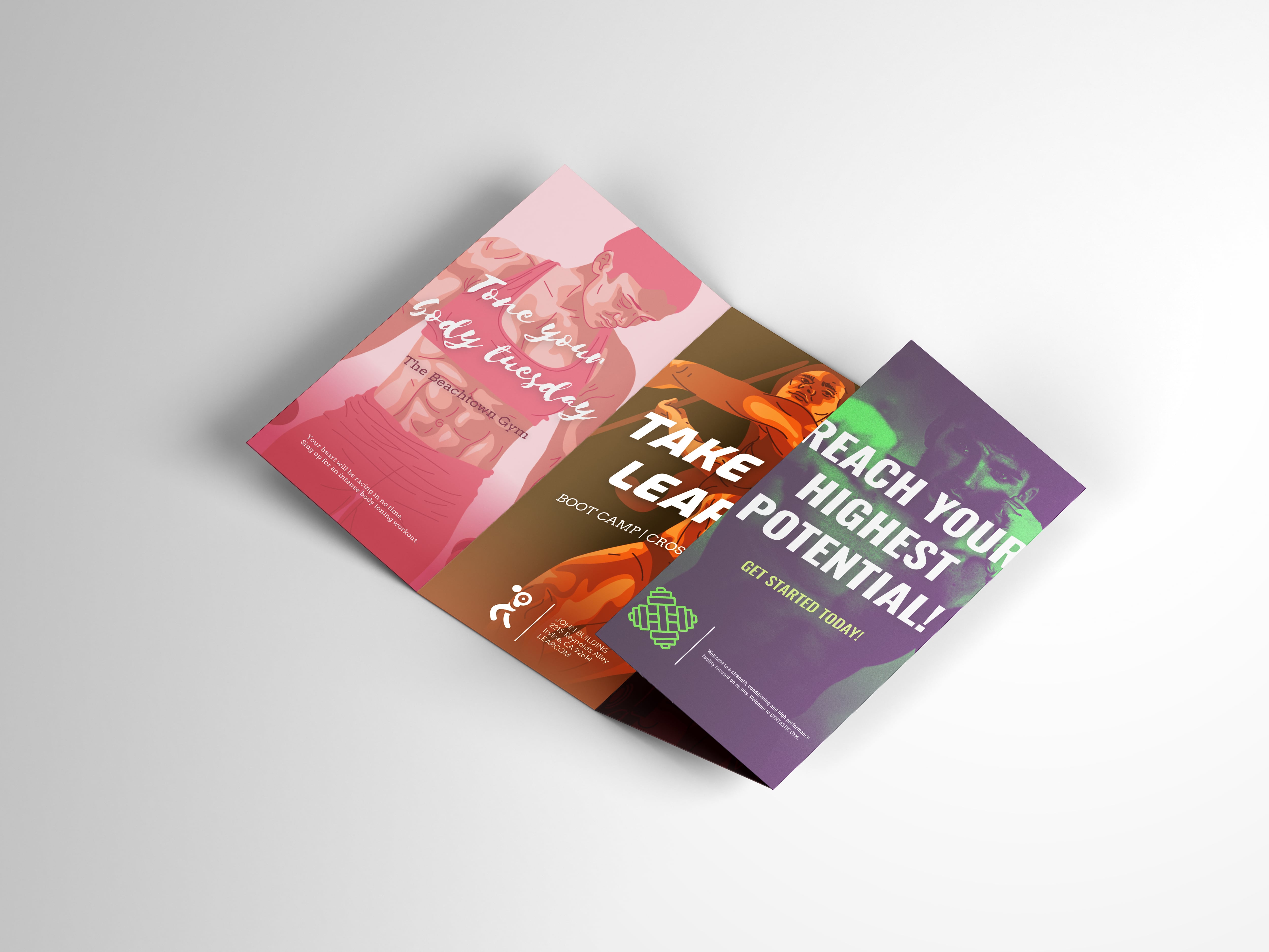
Image Source: Priority Print Service
Roll-fold brochures can have as many panels as you like. All of these are equally-sized panels and you start by folding one flap over the other. The rolling motion used to fold or unfold the brochure is what gives this layout its name. When you need to present a lot of information but still like to keep the layout slim, this is a great choice, and straightforward too.
Kimp Tip: When you have multiple panels, consider incorporating your CTA in some form in more than one panel. Having it only in the back panels or front panels increases the chances of customers forgetting about the CTA eventually.
Looking to design a brochure that will actually make your customers take an action? Book a call with the Kimp Team to know about our unlimited graphic subscription that comes with brochure design services and more.
Designing Your Brochure
Finalizing your layout makes it easier to perceive the space and thus choose the right size for your fonts and images. If you have a brand style guide, it’ll come in handy here. It will make it easier to choose the color palette for your brochure and the appropriate use of your logo and other brand assets.
The efficiency of any layout depends on the proper placement of your images and text content. That’s why, when you first start designing your brochure, it helps to divide the content into sections. Try to make a rough sketch of where you want the images to be. And what kind of text should come above or below the image.
You should also consider the relationship between the design elements. Depending on the layout you choose, at each fold, there will be a different visual element aligned next to a particular image. Look at the image below for example:
Designed by Kimp
Designed by Kimp
The orange, teal and blue elements are added on each side of the design to create continuity and unity. If the elements were only on one side, the design would have looked offset when only partly unfolded. Little details like these determine whether your overall brochure design looks coherent or not. You will not want a design that looks great in individual panels but clumsy and disconnected when placed in the intended layout.
For the text content, do not forget to divide the sections into a heading, subheadings, and body text. This will make it easier to read. And specifying all this will make it easier for your design team to create a stellar design.
Kimp Tip: Do not underestimate the power of solid backgrounds. They help emphasize your brand colors. It is much easier to choose the foreground colors for images and text. Or if you wish to make a statement, an image background works too.
Proofing Your Brochure

Designed by Kimp
Before you get set to print a few hundred copies of your brochure, make sure that you’ve achieved what you set out to do with it. Ask yourself a few questions. Also, get an external opinion from your stakeholders based on these questions:
- Is the design distinctive? Does it get a viewer’s attention?
- Does the design guide the reader to the CTA(s)?
- Is the brochure on brand and on point throughout?
- Are all of the images and elements necessary? Does everything feel like it’s in its place? Or does anything feel cluttered?
- Is the messaging easy to understand?
- Is the tone of the copy aligned with your brand’s tone of communication?
After reviewing your content and design, discuss your printing options with your printer. Be sure to ask about any specialty processes like embossing that can add an unforgettable touch!
Remember that when customers hold your brochures in their hands, they get to experience what your brand feels like. It might often be the first-hand encounter of your quality. So, you need to be extra careful about the kind of paper and print quality you work with.
Create Stunning Brochures With Kimp Graphics
You can have the best copy and a great overall idea for your brochure. But that’s not enough. The effective execution of your idea is what determines whether the design will be a success. And for this, you need your design team to understand what your brand exactly needs.
Working with a dedicated team that handles all your graphic designs means that your team gets to understand your brand’s style and tone easily. And in turn they can incorporate all of this into high-quality designs. Sound like something you’d love to have for your brand? Get all your print and digital designs done in one place with Kimp Graphics.
Sign up for a free trial and find out how it works.